USA Keynote Map Template: 15 State Slides - Instant Download | ImagineLayout


Type: Keynote Maps template
Category: North America
Sources Available: .key
Product ID: KM00172
Template incl.: 15 editable slides
What is a Keynote map template? A Keynote map template is a pre-built .key file containing editable geographic slides - in this case, U.S. state outlines, metropolitan area maps, and regional breakdown layers - that open directly in Apple Keynote for immediate use in business, educational, or government presentations.
What's Inside the Download
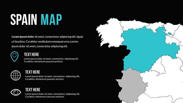
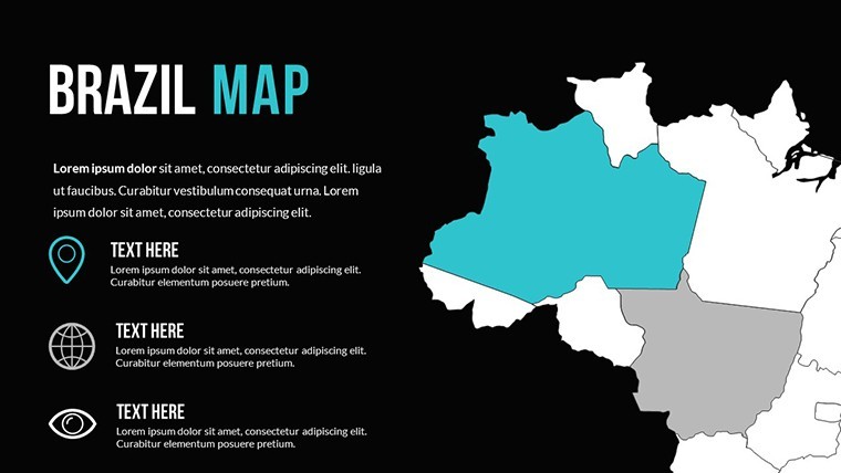
15 slides in a single .key file cover the full United States - all 50 states, regional groupings (Northeast, South, Midwest, and West), individual state focus slides, metropolitan area close-ups for major urban clusters, and a summary slide with call-to-action placeholder text. The progression is deliberate: overview first, regional context second, state detail third, urban focus fourth. That sequence gives presenters a complete narrative arc from national scope to city-level specificity within a single file.
Every state boundary is a native Keynote vector shape - not an embedded image. Vector format means any state outline scales to full screen without edge softening, holds its boundary precision when zoomed in for a detail slide, and accepts color fills without the color bleed that bitmap map images produce at state border lines. The metropolitan area slides include city pin markers and urban boundary outlines for major clusters including the Northeast corridor, Bay Area, Greater Los Angeles, Chicago metro, Dallas-Fort Worth, and South Florida.
Compared to single-state or state-cluster map collections in the North America category, the distinguishing feature of this set is the metro-area layer. Most U.S. state map files stop at state boundary coverage; urban analysts, real estate professionals, and regional marketing teams typically need city-level geographic context that a state outline alone cannot provide. The metropolitan slides address that gap without requiring a second purchase or a separate file.
Editing Capabilities at a Glance
| Feature | Details |
|---|---|
| Slides included | 15 editable slides at 16:9 widescreen, Full HD Retina-ready |
| File format | .key - requires Keynote 9 or later; full features in current release |
| State shapes | All 50 states as individual vector objects - recolor any state independently via Format > Fill |
| Regional groupings | Northeast, South, Midwest, West region slides with multi-state fills on separate layers |
| Metropolitan coverage | Urban boundary outlines and city pin markers for major metro clusters |
| Animation per object | Each state shape has individual animation options via Keynote's Animate panel |
| Color adjustments | State fills, region fills, and background update independently; master slide palette applies globally |
| Export options | .key for editing, PDF for distribution, per-slide image export for web or print |
Typical Use Cases by Role
A regional marketing director at a national retailer needed to present a store coverage map to the executive team - showing which states had physical locations, which were served by e-commerce only, and which were identified as expansion targets. Three color codes, three categories, 50 states. Building that from scratch would mean placing 50 individual polygon shapes in accurate geographic positions and then manually segmenting them into three layers for independent coloring. With the state shape slides already built, the process became: apply Color A to existing-store states, Color B to e-commerce states, Color C to expansion targets. Total preparation time: 25 minutes, including chart annotation. The deck was reused for the following two quarterly strategy sessions by updating only the color assignments.
A logistics operations manager at a freight company used the regional breakdown slides to explain a hub-and-spoke restructuring to operations staff. The South and Midwest regional slides isolated the company's primary territory; the metropolitan area slides for Dallas-Fort Worth and Chicago let him annotate the two new hub locations directly on the city-level map rather than on a national overview where city markers are too small to read clearly. Preparation time for the internal briefing dropped from an estimated three hours to under one hour.
Geography and civics instructors at the high school and college level use the full national overview and the regional slides for electoral college analysis, demographic shift presentations, and historical expansion lectures. The vector state shapes accept transparency fills, so overlaying a historical territorial boundary on top of a current state map - a common technique in American history courses - works without requiring a separate software tool.
Download the .key file and start editing immediately.
Edit, Brand, Present: The Workflow
Editing difficulty: Beginner. Keynote 9 or later on macOS is the only software required; full feature support is available in the current Keynote release.
- Step 1 - Open the .key file in Keynote (1 minute). All 15 slides load with state, regional, and metro shapes on separate, independently selectable layers.
- Step 2 - Apply brand colors via the slide master (3 minutes). Go to View > Edit Master Slides and update background fills and font styles to match your organization's palette. Changes apply to all slides that use the affected master.
- Step 3 - Color-code state shapes (4 minutes). Click any state polygon - or hold Shift to select multiple states - then open Format > Fill to apply your category color. Each state is a separate object; filling Texas does not affect Oklahoma.
- Step 4 - Add annotations to metro or regional slides (4 minutes). Double-click any pre-positioned text box to replace placeholder text with your market names, figures, or call-outs. Text boxes are ungrouped from map shapes.
- Step 5 - Export (1 minute). Use File > Export To > PDF for handout distribution, or retain the .key for further editing or iCloud collaboration.
What You'd Need to Replicate This Yourself
Building a 50-state Keynote map from a blank file requires placing all 50 state polygon shapes in geographically accurate positions, separating each into its own layer so states can be individually recolored, adding Alaska and Hawaii insets at the correct relative scale, building regional grouping slides that aggregate state shapes without losing individual state editability, and then adding the metropolitan coverage layer with city boundary outlines. A designer with map construction experience estimates that at 6-10 hours. Without that experience - relying on approximate freehand shapes or traced images - the state borders do not meet cleanly, and the result looks imprecise at the projection distances where the presentation actually needs to perform.
A specific structural note: each state in this file is a separate closed path rather than a cutout from a single national fill shape. That distinction matters for color segmentation. When 50 states are cut from one continuous fill, clicking a state to recolor it often selects the entire national shape instead of the individual state - a common frustration with map builds that use a single-layer approach. Separate closed paths mean clicking Texas selects Texas, not the contiguous 48.
The metropolitan boundary outlines use a slightly thicker stroke weight than the state boundary lines. That visual weight difference is functional: metro boundaries overlay on top of state lines, and matching stroke weights makes it visually ambiguous whether the viewer is looking at a state edge or a metro edge. Heavier metro strokes read as a distinct layer sitting above the state geography, which is the geographic reality - cities exist within states, not as alternatives to them.
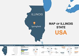
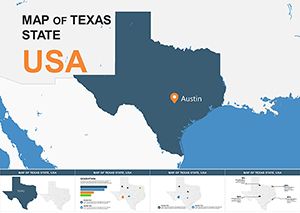
Browse the complete library at North America Keynote map templates. For deeper state-level coverage, the Illinois Keynote map template provides county-level detail for Midwest regional analysis. When a pitch requires both a U.S. national overview and Texas-specific county coverage, the Texas Keynote map template provides the state-level detail that complements the national slides in this collection.
Download the USA Keynote map template and begin customizing today.
Which Keynote version supports this file?
The file is compatible with Keynote 9 and later, with full feature support in the current Keynote release. Keynote 9 shipped with macOS High Sierra in 2017; most Macs in active use today run a compatible version. If you are unsure which version you have, open Keynote, go to Keynote > About Keynote, and check the version number. For the best experience - particularly with per-object animation controls and master slide color management - updating to the current Keynote release through the Mac App Store is recommended. Keynote is a free download for all Mac users.
How do I recolor individual states?
Click directly on any state shape on the slide canvas. Because each state is a separate closed vector path, clicking a state selects only that state without affecting neighboring states. Open the Format panel on the right side and choose Fill to access the color picker. To select multiple states at once - for example, all states in a single sales territory - hold Shift and click each state shape, then apply the fill color once to update all selected states simultaneously. The Shift-select method works across any combination of contiguous or non-contiguous states.
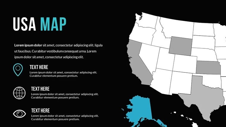
Does the template include Alaska and Hawaii?
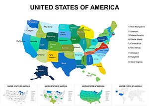
Yes - Alaska and Hawaii are included as inset shapes positioned in the lower-left area of the national overview slide, following the standard U.S. cartographic convention. Both states are vector shapes editable in the same way as the 48 contiguous states: click to select, Format > Fill to recolor. The Alaska inset is scaled to approximately one-third of its actual geographic size relative to the lower 48, which is the convention used in most U.S. presentation maps to keep the inset readable without dominating the slide layout. Hawaii appears as an island chain inset directly to the right of the Alaska inset.
Is this template licensed for commercial and client use?
The standard $30 single-purchase license covers use in presentations created for clients, including regional sales reports, investor briefings, market analysis decks, educational course materials, and government policy documents. The license does not permit resale of the template file, redistribution of the .key file to third parties, or sublicensing. One purchase covers one end-user. Organizations requiring multiple team members to independently edit the source file should purchase individual licenses per user. ImagineLayout's contact page handles volume and team licensing inquiries.
What is the refund policy?
Refunds are issued when the downloaded file is corrupted, does not open in Keynote 9 or later as specified, or does not match the product page description. Digital files are delivered immediately on purchase, so ImagineLayout does not process refunds for buyer's remorse or incorrect product selection. If you experience a technical problem - download failure, missing state shapes, or format discrepancy - contact ImagineLayout support with your order number and a precise description of the issue. Each case is reviewed individually and confirmed technical failures are resolved. Full terms are on the Refund Policy page in the site footer.
Are animations preset in the file?
No preset animations are included. The 15 slides are static by default, which ensures clean PDF exports and consistent rendering across Keynote versions. Each state shape, regional group, metro boundary, and text annotation supports Keynote's per-object animation system - select any element, open the Animate panel, and set a build-in style and trigger independently. Because each state is a separate object, individual state reveals are possible: you can build states into the slide one at a time, in any sequence, using On Click triggers to control the pace of a live presentation.