Global World Map Keynote Template - Instant Download | ImagineLayout


Type: Keynote Maps template
Category: World
Sources Available: .key
Product ID: KM00170
Template incl.: 13 editable slides
What is a Keynote map template? A Keynote map template is a pre-built .key file containing editable geographic slides - in this case, world-scale continent outlines, country boundaries, and region annotation layers - that open directly in Apple Keynote for use in international business, academic, or strategy presentations.
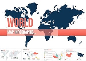
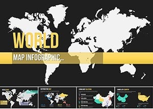
13 Slides Across 6 Regions: Full Contents
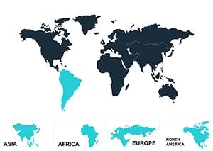
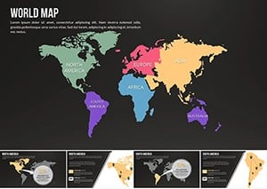
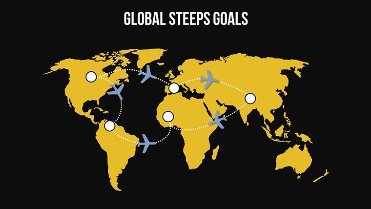
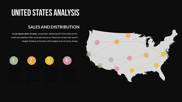
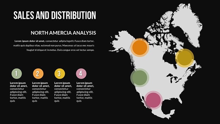
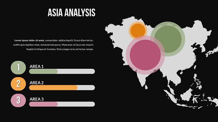
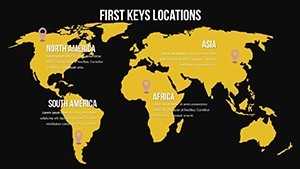
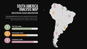
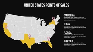
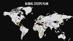
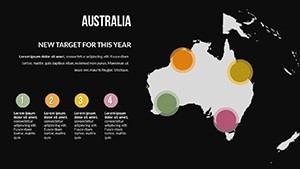
13 slides in a single .key file cover all six inhabited continental regions - Africa, Asia, Australia and Oceania, Europe, North America, and South America. The coverage moves from a full global overview slide through individual continent focus slides to multi-region comparison layouts. Country boundary shapes sit on an independent layer from the ocean fill, so recoloring a continent or isolating a specific country does not require rebuilding the surrounding geography.
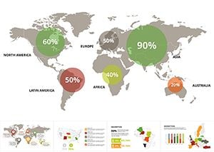
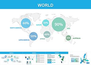
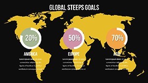
The design range across the 13 slides spans two distinct visual registers. A grayscale-dominant set supports financial reporting, policy briefings, and board presentations where color carries data meaning and the base map should remain neutral. A second set uses saturated regional color coding - each continent in a distinct hue - for conference keynotes, educational presentations, and corporate strategy sessions where visual differentiation across regions is the primary communication goal. Both registers are available within the same file, giving users the option to select the appropriate visual register per slide rather than per file.
Compared to single-continent Keynote map collections, this set provides the global overview layer that regional maps cannot. A logistics manager presenting Asia-Pacific supply chain coverage alongside North American distribution still needs a world-level slide to establish geographic scale before drilling to the regional detail. The 13-slide structure builds that full presentation arc - global context first, regional detail after - within a single download.
Format and Compatibility Details
| Feature | Details |
|---|---|
| Slides included | 13 editable world map slides at 16:9 widescreen ratio |
| File format | .key - requires Keynote 12 or later on macOS |
| Geographic coverage | All 6 continental regions; country-level boundary shapes on independent layers |
| Visual registers | Grayscale neutral set and saturated regional color set - both in the same file |
| Editable elements | Continent shapes, country outlines, ocean fills, annotation text boxes - all independently editable |
| Color adjustments | Region fills update via Format > Fill per shape; global palette via slide master |
| Export options | .key for editing, PDF for static distribution, per-slide image export |
| Animation support | No preset animations; all shapes accept Keynote's native build-in/build-out effects via the Animate panel |
How Consultants Use This in Client Work
A strategy consultant at an international management firm needed a world overview slide for a market entry presentation covering three target regions: Southeast Asia, West Africa, and the Gulf of Mexico coast. Building that from a blank Keynote slide - drawing continent outlines, placing country shapes, aligning annotation text boxes - would have consumed the better part of a morning. The global overview slide from this collection had the continent shapes already separated; she highlighted the three target territories in the client's brand color, left the remaining continents in grayscale, and completed the slide in 12 minutes. The same file was adapted for two subsequent client pitches by simply changing the highlighted regions.
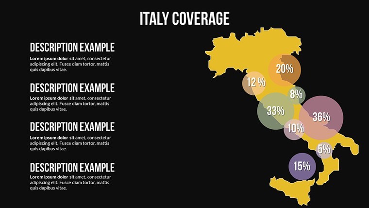
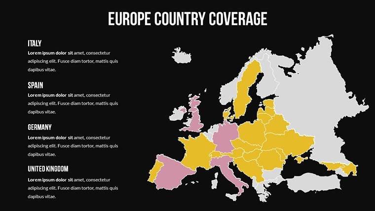
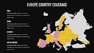
An international relations professor teaching a graduate seminar on trade bloc geography used the multi-region comparison slides to show students how the boundaries of ASEAN, the African Union, and MERCOSUR overlap with existing continent groupings. The country-level boundary shapes - available as independent objects - let her isolate individual member states and apply a consistent highlight color across non-contiguous territories on a single slide. That geographic overlay, built from scratch, would require vector drawing skills; the pre-separated country layer made it a click-and-color task.
Download the .key file and start editing immediately.
How to Make It Yours in Under 20 Minutes
Editing difficulty: Beginner to Moderate. Keynote 12 or later on macOS is the only software required.
- Step 1 - Open the .key file in Keynote (1 minute). All 13 slides load with continent and country shapes on separate, independently selectable layers.
- Step 2 - Choose your visual register (2 minutes). Decide per slide whether the grayscale neutral or the saturated regional color version suits your content. Delete slides from the register you are not using to keep the deck lean.
- Step 3 - Apply brand colors to target regions (4 minutes). Click any continent or country shape, open Format > Fill, and set your highlight color. Hold Shift to select multiple non-contiguous country shapes and apply the same fill in one step.
- Step 4 - Add annotation text boxes (4 minutes). The file includes pre-positioned annotation text boxes near each major region. Double-click to replace placeholder text with your market names, figures, or notes.
- Step 5 - Update the slide master if needed (3 minutes). Open View > Edit Master Slides to apply your organization's background color and font set across all slides at once.
- Step 6 - Export (1 minute). File > Export To > PDF for distribution or retain the .key file for collaborative editing.
Compared to Starting From Zero
Drawing accurate world continent outlines in Keynote from a blank file is one of the more technically demanding map construction tasks - continental coastlines are complex curves, country boundaries require georeferenced accuracy, and the ocean-to-landmass proportion must be consistent across all slides if the deck moves from global to regional views. A designer who builds world maps regularly estimates that work at 5-8 hours for a clean, presentation-ready result. Without vector map experience, the common shortcut is to embed a bitmap world map image - which recolors poorly, exports without crispness at full screen, and cannot be used to isolate individual country shapes.
A design observation specific to this set: the ocean fill and the continent fills are on separate layers, not merged into a single background shape. That structural choice matters when a presenter needs to place annotation arrows or flow lines on top of the map - merged layers push annotation objects behind the map surface, requiring manual z-order management. Separate layers mean annotation text boxes and directional arrows sit cleanly above all geographic shapes by default.
The grayscale continent register uses a single mid-gray fill for all non-highlighted landmasses. That choice is not arbitrary - using multiple neutral tones across non-highlighted regions creates a false visual hierarchy where some continents appear more prominent than others even before the presenter begins explaining. A uniform neutral gray keeps all non-highlighted regions visually equivalent, so the color applied to a target territory stands alone without competing visual weight from the base map.
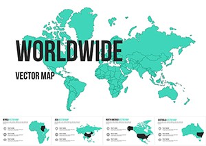
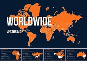
Explore the full range of world-scale Keynote geography tools at World Keynote map templates. For presentations requiring animated map reveals, the Animated World Map Keynote template adds pre-built motion sequences to a comparable global outline structure. The Worldwide Vector Map for Keynote offers an alternative global coverage set with a distinct projection style for presentations where map projection itself is part of the narrative.
Download the global world map Keynote template and begin customizing today.
Which Keynote version is required for this file?
Keynote 12 or later is required to open this file with full shape-layer editing capability. Keynote 12 is available as a free download from the Mac App Store and ships with macOS Monterey. Earlier versions of Keynote may open the file but risk layer rendering issues, particularly with the continent and country shape separation that makes individual region highlighting possible. If you are on macOS 11.5 or higher, update Keynote through the App Store at no cost before downloading the template to ensure full compatibility.
How do I highlight specific countries or regions?
Click the country or continent shape on your target slide. Because each geographic shape sits on its own layer, clicking directly on a country boundary selects only that shape without affecting neighboring regions. Open Format > Fill on the right panel and choose your highlight color from the color picker or enter a hex code. To highlight multiple non-contiguous countries - for example, all ASEAN member states - hold Shift while clicking each country shape, then apply the fill color in one step. The ocean fill and non-highlighted landmasses remain unchanged throughout this process.
Is this template licensed for use in commercial presentations?
The standard $26 single-purchase license covers use in presentations prepared for clients and commercial purposes, including investor decks, strategy briefings, conference presentations, and client-facing reports. The license prohibits resale of the template file itself, redistribution of the .key file to third parties, and sublicensing. One purchase covers one end-user. If your team requires multiple members to have independent editing access to the source file, each user needs a separate purchase. For volume licensing inquiries, contact ImagineLayout directly through the site's contact page.
What is the refund policy?
Refunds apply when the downloaded file is corrupted, fails to open in Keynote 12 as described, or does not match the product page specifications. Because the .key file is delivered digitally and immediately on purchase, ImagineLayout does not issue refunds for buyer's remorse or accidental wrong-product orders. If a technical problem occurs - download failure, missing shape layers, or format mismatch - contact ImagineLayout support with your order number and a description of the issue. The team reviews each case and resolves confirmed technical problems. Full terms are on the Refund Policy page in the site footer.
Does the file include built-in animations?
No preset animations are included. The 13 slides are static by default, which ensures clean PDF exports and compatibility across Keynote 12 and later versions. Every continent shape, country outline, and annotation text box in the file is fully compatible with Keynote's native Animate panel. To add a reveal animation to a continent shape - for example, a Wipe build-in that progressively reveals a target region - select the shape, open the Animate panel, choose the build type, and set the trigger to On Click. Adding or removing animations does not affect the underlying shape layer structure.
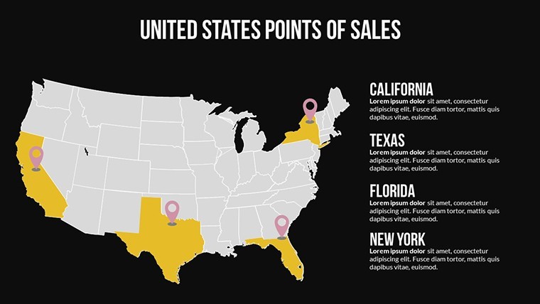
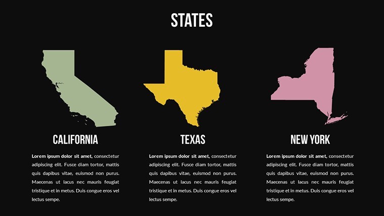
Are individual country shapes editable, or only continent-level regions?
Both levels are editable independently. Country boundary shapes sit on a separate layer from continent fills, meaning you can recolor an individual country - for example, highlighting Germany within the European continent shape - without disrupting the borders of neighboring countries or the continental background. The layer structure supports three common use cases: coloring an entire continent as one unit, color-coding individual countries within a continent for comparative data, and isolating specific countries across multiple continents on a single slide for trade bloc or alliance visualizations.