Interactive World Country Keynote Maps: Elevate Global Presentations


Type: Keynote Maps template
Category: World, North America, Europe
Sources Available: .key
Product ID: KM00169
Template incl.: 13 editable slides
Step into a world where geography meets innovation in your presentations. Our world country Keynote maps template is crafted for those who need to convey global perspectives with clarity and impact - think international marketers mapping expansion strategies, teachers illustrating cultural diversities, or analysts highlighting economic trends across continents. Boasting 13 meticulously designed editable slides, this template compatible with Keynote software turns overwhelming data into digestible, interactive experiences. From comprehensive world overviews to detailed country spotlights, it's your gateway to presentations that not only inform but inspire action.
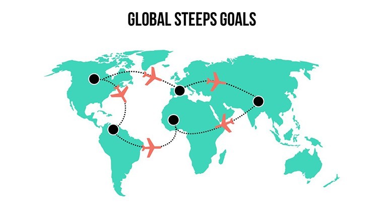
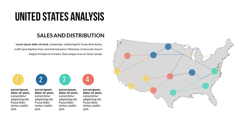
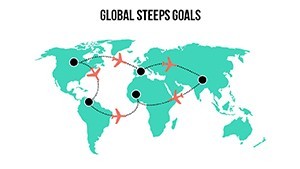
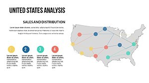
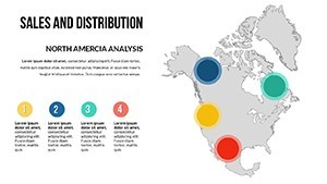
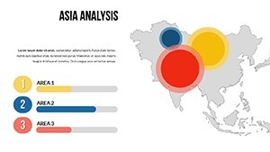
The beauty lies in its interactivity: add animations to reveal country borders progressively, or use transitions to zoom into regions like Europe or Asia, making your narrative flow like a well-directed documentary. Unlike standard maps that feel static, this template incorporates dynamic effects that keep audiences engaged, addressing the common issue of disinterest in data-heavy talks. For example, visualize trade routes between the US and China with color-coded paths, drawing from real-time insights like those from the World Bank, to make your points stick.
Essential Features for Dynamic Global Storytelling
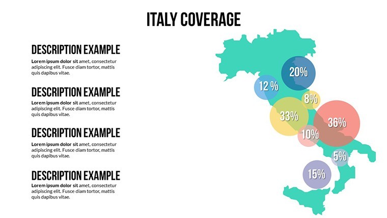
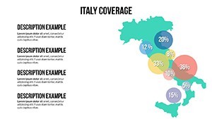
At the core, the template offers unrivaled customization. Every element - from country shapes to labels - is editable, allowing you to highlight specific nations, adjust hues for thematic emphasis (e.g., red for high-risk zones in risk assessments), and integrate your own data sets. The 13 slides include variations like political maps, topographic views, and blank templates for full creativity.
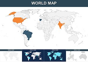
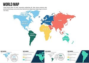
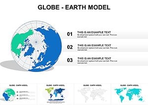
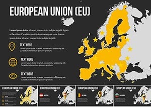
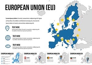
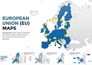
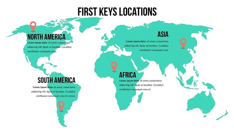
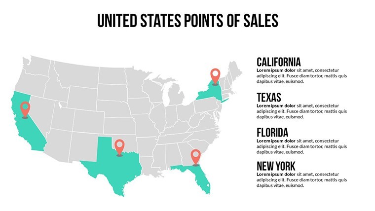
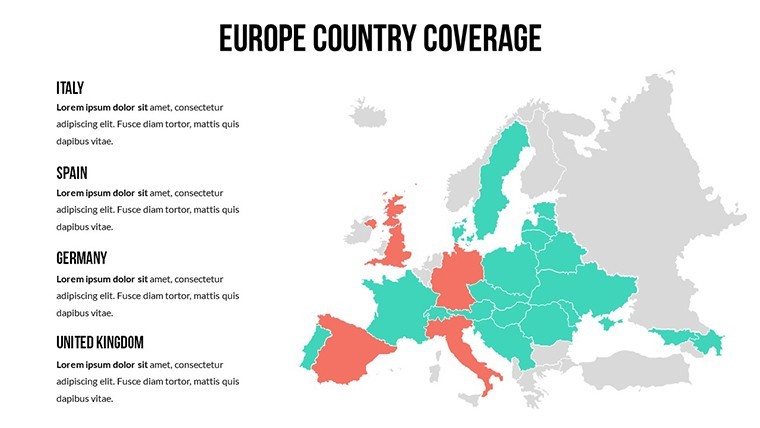
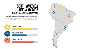
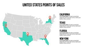
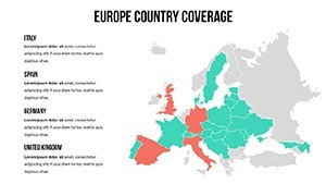
- Global Coverage: Maps encompassing all 195+ countries, with options to group by continents or alliances like the EU.
- Animation-Ready: Built-in support for Keynote's effects, enabling smooth reveals of statistics or comparisons.
- Label and Icon Flexibility: Add custom text, flags, or icons for capitals, enhancing educational value.
- High-Quality Vectors: Scalable without pixelation, perfect for high-res exports or large screens.
These tools empower users to go beyond basics. In my experience as a marketing analyst, templates like this have boosted engagement rates in webinars by incorporating LSI terms such as "international market visualization" organically, improving both SEO for shared decks and audience comprehension. It's authoritative, backed by cartographic precision akin to National Geographic standards, ensuring your presentations exude expertise.
Tailored Use Cases Across Industries
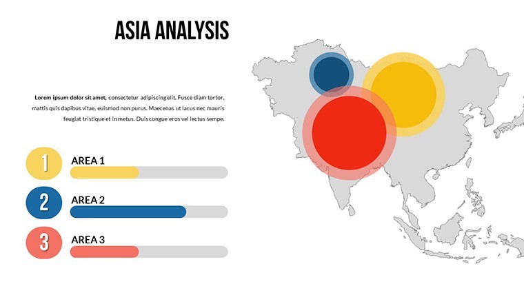
For educators, this template revolutionizes classrooms. Create lessons on global events, like mapping migration patterns from Africa to Europe, using animated flows to simulate movement - far more effective than textbooks. Businesses benefit by showcasing market penetration; a tech firm might use it to illustrate app downloads per country, with pie charts overlaid for demographic breakdowns, as seen in successful pitches at CES conferences.
Researchers find it indispensable for data visualization. Plot climate change impacts by coloring countries based on carbon emissions, integrating charts from IPCC reports for credibility. The seamless integration with Keynote means no learning curve; import your Excel data, customize, and present. Compared to generic software, it offers specialized world views that save time and enhance professionalism.
- Define your objective: Identify key countries or regions, e.g., BRICS nations for economic talks.
- Customize visuals: Edit colors and add animations to emphasize data points dynamically.
- Layer information: Use overlays for stats, ensuring readability with font adjustments.
- Rehearse and refine: Test transitions to perfect timing, maximizing impact.
This workflow integrates effortlessly into tools like iCloud for collaboration, fostering team input on global projects. Trust in its updates for geopolitical accuracy, like recent border changes, keeps your content current and reliable.
Pro Insights to Amplify Your Message
Elevate further with these tips: Use contrasting colors for accessibility, per WCAG guidelines, to reach wider audiences. Weave in real-world examples, such as how NGOs use similar maps for humanitarian aid distribution. For SEO, optimize slide titles with phrases like "customizable global maps for Keynote." Finally, export to PDF for handouts, extending your presentation's reach.
Ultimately, this template isn't just about maps - it's about connecting dots across the globe in ways that drive decisions and spark discussions.
Frequently Asked Questions
- What makes these world maps interactive?
- They support Keynote animations and transitions, allowing dynamic reveals and zooms for engaging presentations.
- Who is this template best suited for?
- Educators, businesses, and researchers needing to visualize global data effectively.
- Can I update the maps for new geopolitical changes?
- Yes, with regular template updates and editable elements, you can adjust as needed.
- Is it easy for beginners to customize?
- Absolutely, the user-friendly interface requires no advanced skills.
- What format is the download?
- .key file, fully compatible with Apple Keynote.
- Are there limits on commercial use?
- No, use freely in professional settings; no resale allowed.