Oregon USA Keynote Maps: 28 Editable Slides


Type: Keynote Maps template
Category: North America
Sources Available: .key
Product ID: KM00137
Template incl.: 28 editable slides
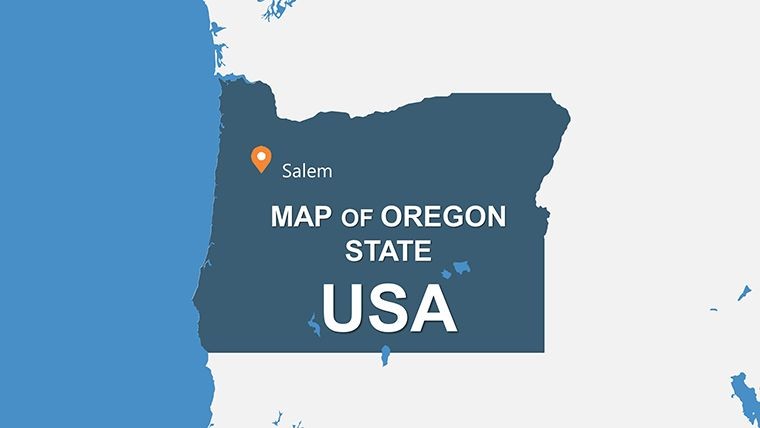
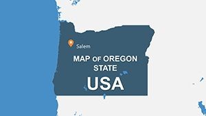
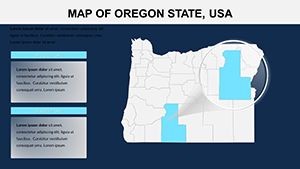
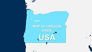
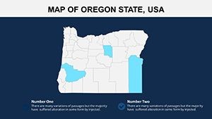
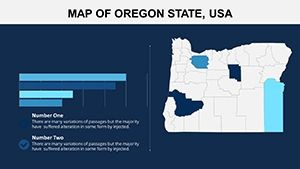
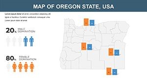
Step into the diverse landscapes of Oregon, from the misty Pacific coasts to the high deserts of the east, all brought to life in your presentations with our comprehensive Keynote maps template. Boasting 28 editable slides, this resource is a powerhouse for journalists, historians, and data enthusiasts who need to convey information with both beauty and precision. Whether unraveling economic disparities across counties or tracing historical trails like the Oregon Trail, this template equips you to create narratives that inform and intrigue. It's more than maps; it's a storytelling aid that addresses the gap between raw data and compelling visuals, helping users like reporters craft pieces that resonate, similar to how investigative stories in outlets like The Oregonian use mapped insights to drive home points.
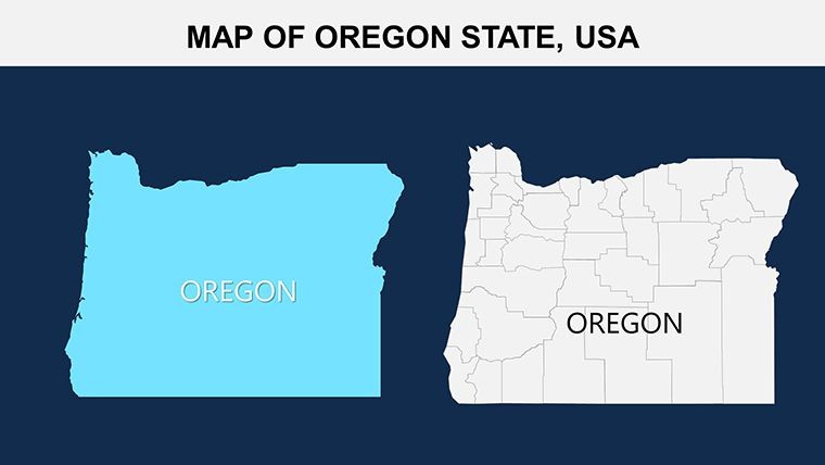
Anchored in cartographic expertise from organizations like the U.S. Geological Survey, each slide offers accurate representations with room for personalization. Vector elements ensure sharp details, even when zooming into areas like Portland's urban grid or Crater Lake's volcanic features. Envision a feature article on environmental conservation: Layer in data from the Oregon Department of Forestry, animating changes over time to show wildfire impacts – a far cry from static images that fail to capture dynamism.
Detailed Features for Versatile Mapping
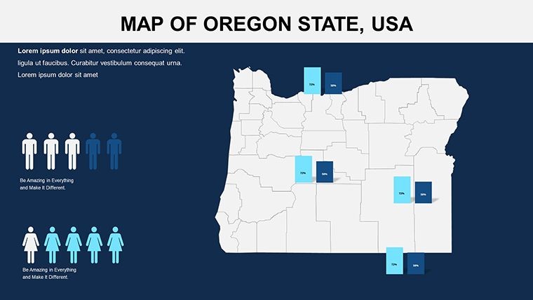
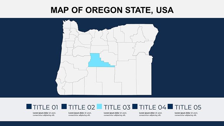
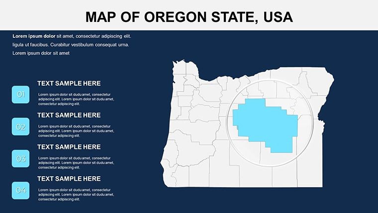
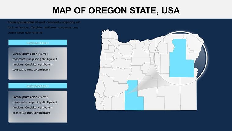
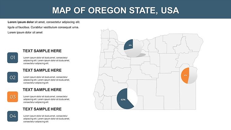
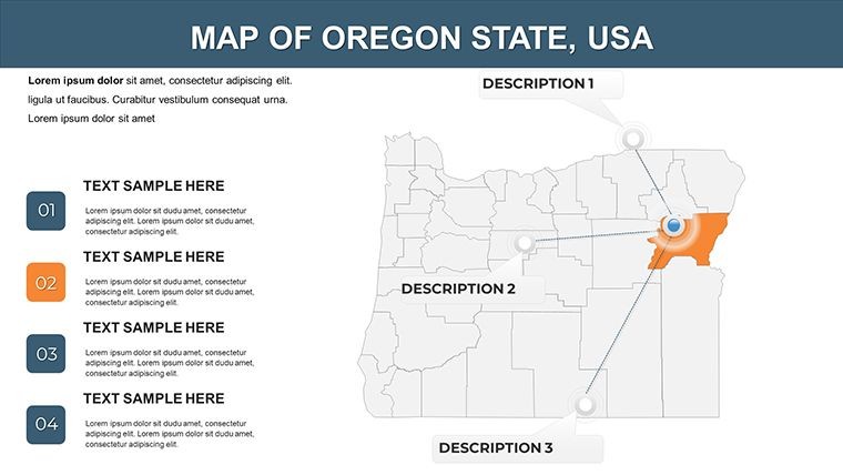
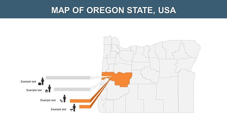
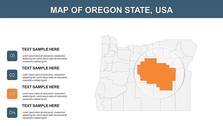
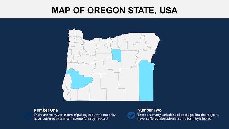
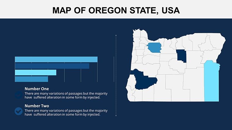
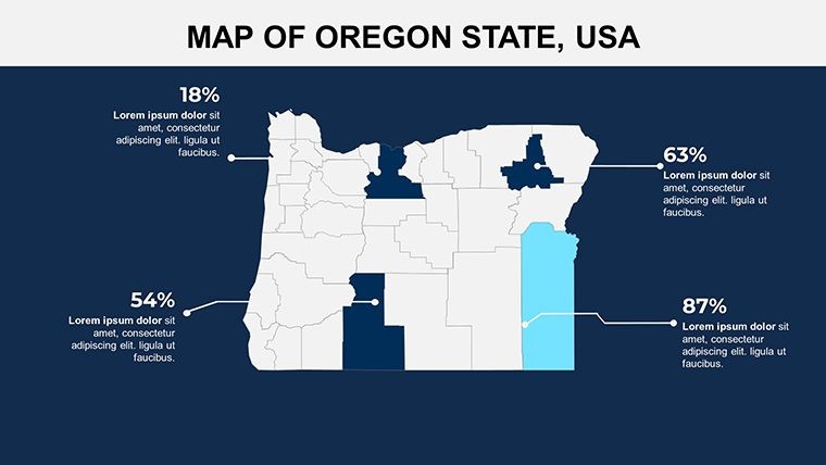
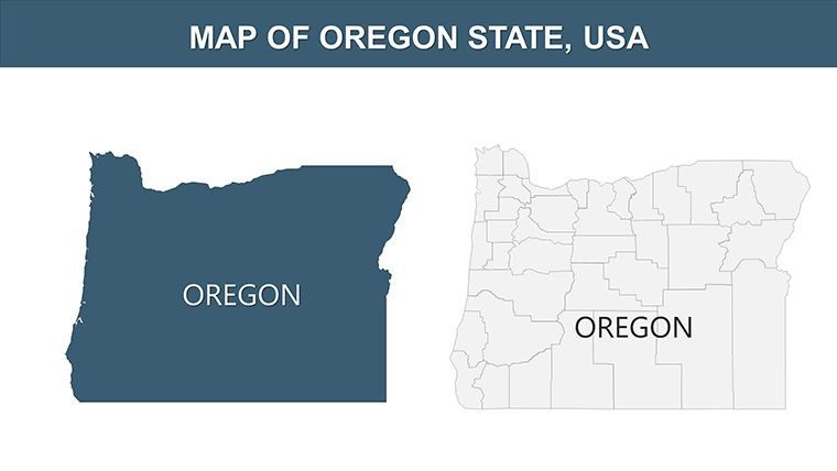
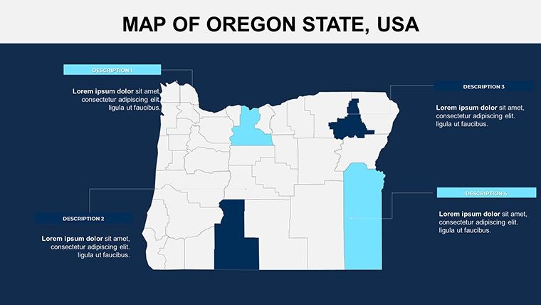
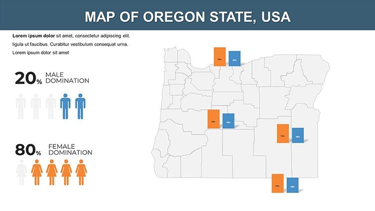
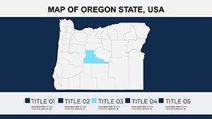
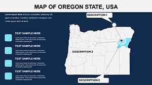
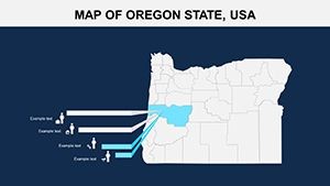
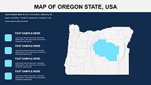
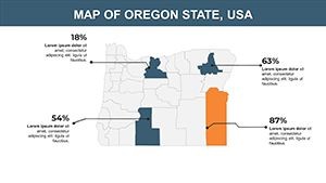
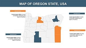
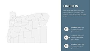
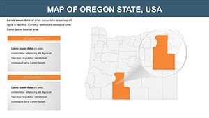
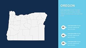
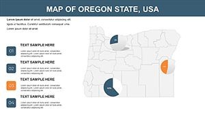
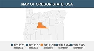
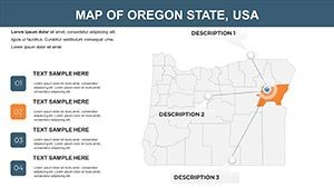
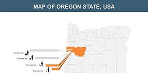
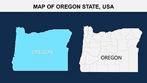
This template's expansive 28 slides provide depth unmatched in simpler tools, covering everything from state overviews to county-specific zooms.
- Universal Toolset: Editable vectors for routes, stats, and events.
- Informative Designs: Blend aesthetics with functionality for engaging slides.
- Customization Depth: Adjust scales, colors, and layers effortlessly.
- Narrative Support: Built for comparisons, timelines, and personal stories.
A historian recounting Lewis and Clark's expedition could customize paths with icons, drawing from National Park Service archives for authenticity. Unlike basic alternatives, it handles complex data without compromise, ensuring your audience grasps nuances.
Hands-On Use Cases and Implementation Steps
From concept to delivery, this template streamlines creation. For economic analysis: Choose a county slide, edit to overlay GDP figures, and add routes for supply chains.
- Import the .key file into Keynote.
- Select a slide and modify boundaries or add labels.
- Integrate data visuals like charts for stats.
- Enhance with transitions for sequential reveals.
- Finalize and share, optimized for impact.
Journalists might map election results, using colors from official Oregon Secretary of State data for unbiased visuals. Tips: Cross-verify with sources like USGS for accuracy, and use subtle animations to maintain focus. This resolves common issues like data overload, turning presentations into guided journeys.
Unique Value for Storytellers and Analysts
Stand out with a template that's as adaptable as Oregon's terrains. For personal biographies, map life journeys across the state; for events, detail routes like the Hood to Coast Relay. Real-world wins include enhanced reader engagement in digital stories, mirroring successes in interactive journalism.
Blend with apps like Google My Maps for extras, and add light touches like noting Oregon's quirky roadside attractions for memorable pitches. Embrace this tool to craft maps that don't just show – they tell. Chart your story now.
Frequently Asked Questions
- How many slides are there exactly?
- 28 fully editable slides, offering extensive coverage for detailed projects.
- Is it geared only for journalists?
- No, versatile for educators, businesses, or anyone needing mapped narratives.
- Can I incorporate historical data?
- Yes, layers support timelines and events with easy edits.
- What makes it beautiful and informative?
- Vector designs combine aesthetics with precise, data-friendly elements.
- How do I handle route paving?
- Use editable paths to draw and animate routes seamlessly.
- Are updates available?
- Template is static, but editable for your ongoing customizations.