Ontario Canada Professional Keynote Maps Template


Type: Keynote Maps template
Category: North America
Sources Available: .key
Product ID: KM00136
Template incl.: 12 editable slides
Envision captivating your boardroom with maps that not only pinpoint Ontario's bustling metropolises like Toronto but also weave in demographic trends and economic forecasts, all within a sleek, professional framework. Our Ontario Canada Keynote maps template delivers exactly that, with 12 editable slides engineered to elevate data-driven narratives. Suited for marketers, urban planners, and executives, it tackles the challenge of presenting vast provincial data – from the Great Lakes' shores to northern wilderness – in a digestible, visually stunning format. By leveraging this tool, you can shift from mundane bullet points to interactive maps that spotlight opportunities, much like how city developers use GIS visuals to secure project approvals.
Built on foundations from authoritative sources such as the Ontario Ministry of Finance's spatial data, this template ensures reliability while fostering innovation. Each slide allows for annotations, color adjustments, and icon integrations, turning raw geography into persuasive stories. For example, in a sales strategy session, overlay market penetration data on a Toronto-centric map, then compare with Ottawa's tech hubs – all with seamless edits that outpace clunky alternatives like basic drawing tools in Keynote.
Essential Features for Polished Presentations
The template's strength lies in its comprehensive toolkit, designed for both novices and pros. With 12 slides covering provinces, cities, and regions, you get vector precision for unlimited scaling without quality loss.
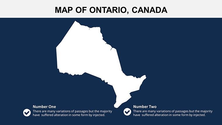
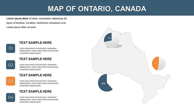
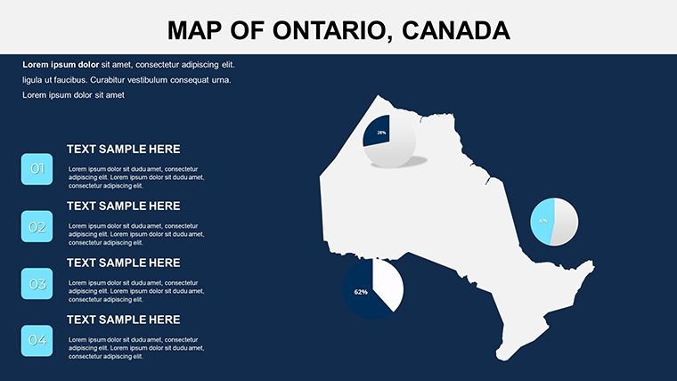
- Detailed Divisions: Break down Ontario into key areas, ideal for regional analyses.
- Visual Customizations: Add highlights, symbols, and colors to match corporate styles.
- Easy Edits: Resize, recolor, or annotate without design expertise.
- Design Variety: Options from corporate minimalism to colorful infographics.
An educator mapping Indigenous territories could enhance slides with symbols from First Nations resources, creating inclusive lessons that engage students deeply. Versus generic maps, this offers enhanced engagement through tailored visuals, reducing audience fatigue in long sessions.
Practical Use Cases with Guided Steps
Apply this template across scenarios with ease. For a market research report: Select an overview slide, customize colors to brand standards, and add data layers for population growth.
- Open in Keynote and pick your base map.
- Edit elements like boundaries or labels.
- Integrate icons for points like Niagara Falls.
- Apply transitions for smooth reveals.
- Present with confidence, backed by accurate visuals.
Marketers might use it for campaign rollouts, highlighting distribution in Southwestern Ontario with real data from Statistics Canada. Expert advice: Layer sparingly to avoid overload, and align with accessibility standards for broader reach. This method solves visualization bottlenecks, fostering clearer communication akin to a well-mapped expedition.
Standout Benefits in Competitive Landscapes
What makes this template indispensable? Its versatility in professional realms, from economic forums to educational seminars. A planner could illustrate urban sprawl in the Greater Golden Horseshoe, using icons for transit lines – outcomes include informed decisions, as in Ontario's Greenbelt initiatives. Pair with tools like ArcGIS for advanced data, and infuse humor subtly, like noting Toronto's 'traffic jam capital' status in lighter pitches.
Ultimately, it empowers users to craft narratives that persuade and inspire. Ready to map your success? Grab this template and redefine your presentations.
Frequently Asked Questions
- How many design styles are available?
- Multiple, including minimalist and corporate, to fit various presentation tones.
- Can I add my own icons?
- Yes, easily incorporate and customize symbols for specific needs.
- Is it compatible with older Keynote versions?
- Works with recent versions; test for full feature support.
- What if I need more slides?
- Duplicate and edit existing ones for expansion.
- Are maps based on accurate data?
- Yes, drawn from reliable provincial sources for precision.
- How do I handle large audiences?
- Use high-res vectors for clear projections on big screens.