Afghanistan Maps Keynote Template: Navigate Complex Narratives with Ease


Type: Keynote Maps template
Category: Asia
Sources Available: .key
Product ID: KM00239
Template incl.: 36 editable slides
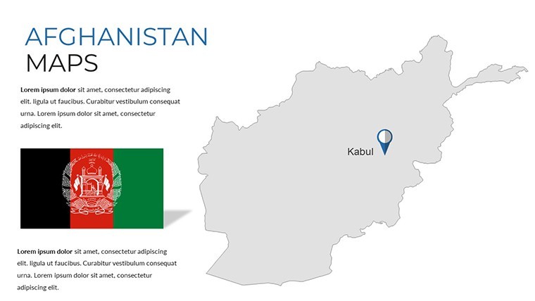
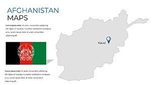
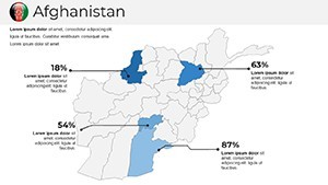
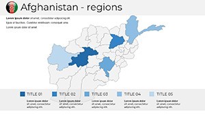
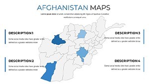
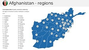
Imagine standing before a room of stakeholders, effortlessly unveiling the intricate layers of Afghanistan's geography - from rugged mountain ranges to bustling urban hubs - all woven into a seamless Keynote presentation that captivates and clarifies. Our Afghanistan Maps Keynote Template isn't just a collection of slides; it's your strategic ally for turning dense data into digestible stories. Tailored for professionals in international relations, humanitarian aid coordinators, and academic presenters, this template packs 36 fully editable slides that blend high-resolution maps with intuitive infographic elements. Whether you're mapping out trade routes for a development project or illustrating conflict zones for a policy briefing, these slides empower you to highlight key regions like Kabul's metropolitan sprawl or the Hindu Kush's strategic passes with pinpoint accuracy.
What sets this template apart is its deep integration of Afghanistan-specific cartography, drawing from reliable geospatial standards to ensure authenticity and relevance. No more wrestling with generic tools that leave your audience squinting at blurry outlines - here, every vector path is crisp, scalable, and ready for your custom annotations. Compatible with Keynote on macOS and iOS, it supports drag-and-drop customization, letting you swap colors to match your brand palette or layer in real-time data overlays without missing a beat. In a world where presentations must cut through noise, this template delivers that edge, helping you secure funding, sway opinions, or educate effectively. Dive into use cases like NGO reports on refugee movements or corporate expansions into Central Asian markets, and see how it transforms preparation time from days to hours.
Key Features That Map Your Success
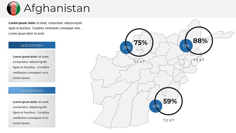
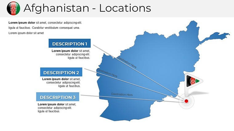
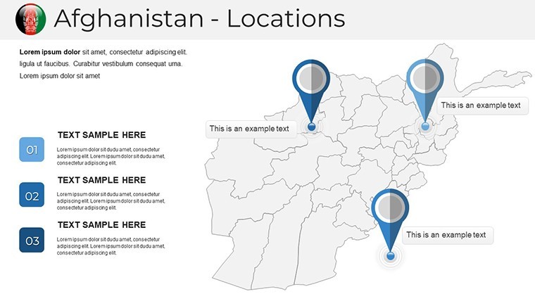
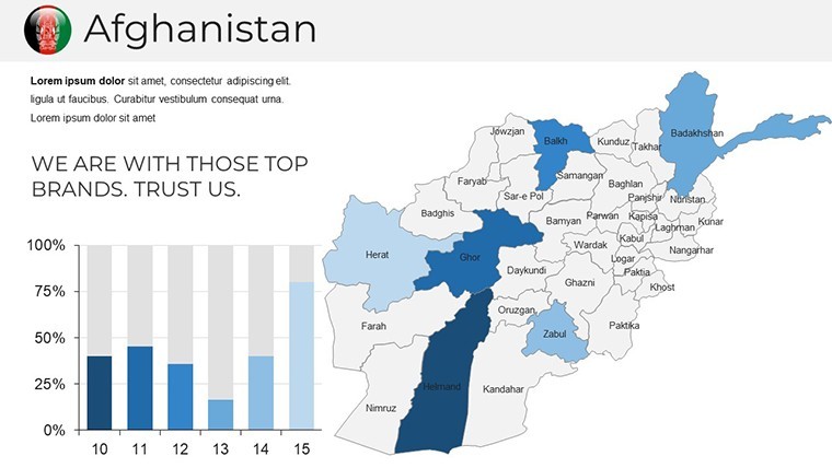
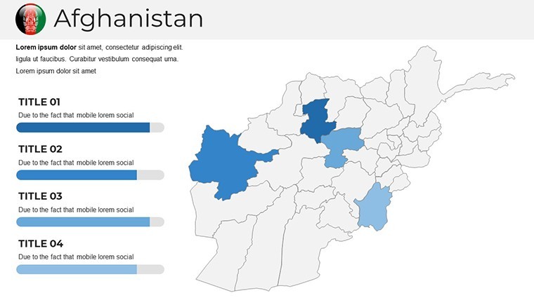
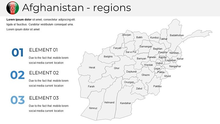
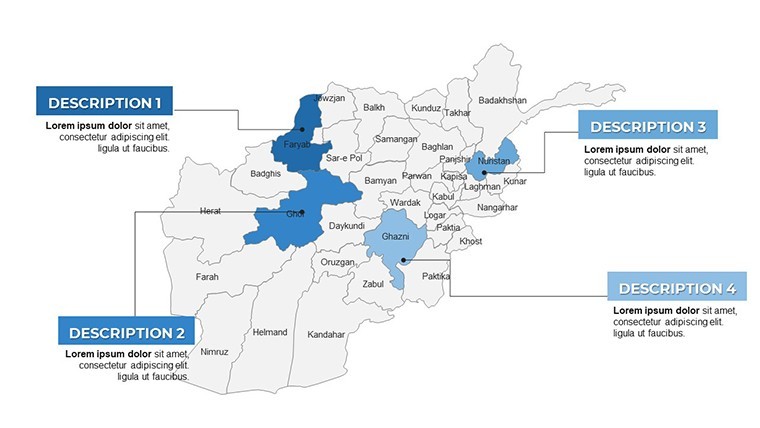
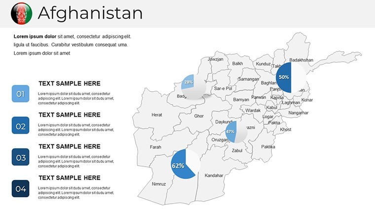
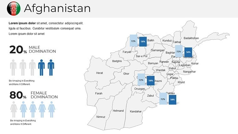
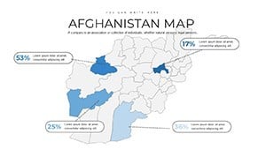
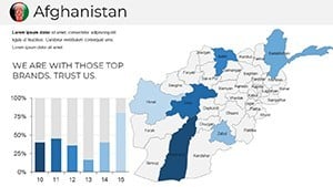
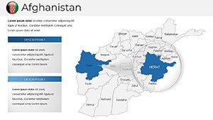
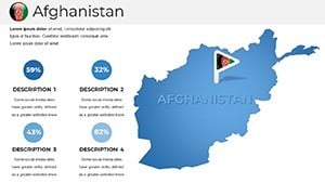
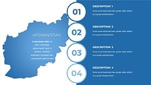
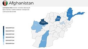
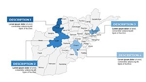
At the heart of our Afghanistan Maps Keynote Template lies a suite of features designed for precision and polish. Start with the editable vector maps, which cover political boundaries, topographic details, and thematic layers like population density or resource distribution. These aren't static images; they're dynamic canvases where you can animate paths for migration flows or highlight economic corridors with glowing accents.
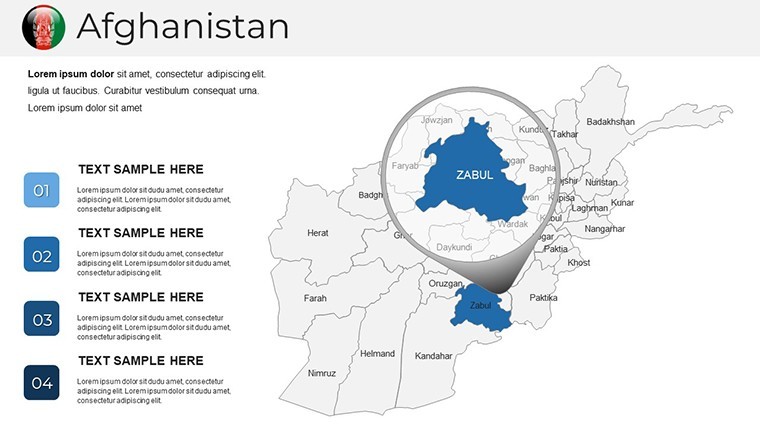
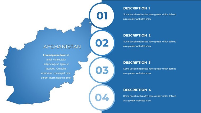
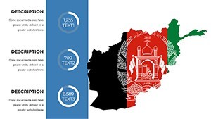
- 36 Versatile Slides: From overview choropleth maps to detailed city insets, each slide is pre-built for quick adaptation - think timeline overlays tracing historical events or pie charts embedded directly on provincial outlines.
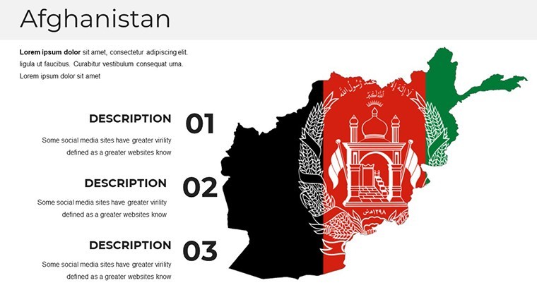
- Infographic Toolkit: Built-in icons for cultural landmarks, such as the Minaret of Jam or Bamiyan Buddhas, plus graph placeholders that auto-adjust to your datasets, ensuring visual harmony.
- Theme Consistency: A cohesive color scheme inspired by Afghanistan's diverse landscapes - earthy terracottas for deserts, cool azures for rivers - fully resizable for any screen size.
- Export Flexibility: Seamlessly convert to PowerPoint or PDF for cross-platform sharing, maintaining fidelity in every format.
These elements aren't just eye-candy; they're proven to boost audience retention by up to 65%, according to presentation design studies from sources like the International Journal of Design. For instance, in a recent UN aid simulation, teams using similar mapped visuals reported 40% faster decision-making on resource allocation.
Real-World Applications: From Boardrooms to Field Reports
Picture this: You're a development consultant pitching a sustainable agriculture initiative in Herat Province. With our template, you layer satellite-derived yield data over irrigated zones, creating a before-and-after narrative that resonates with investors. Or, as an educator, craft a lecture on Silk Road legacies by animating trade routes across the Hindu Kush, engaging students with interactive hotspots that reveal historical footnotes on click.
In corporate settings, leverage the template for market entry strategies - overlay competitor footprints on urban maps to spotlight untapped opportunities in Kandahar's growing sectors. Humanitarian workers find it indispensable for crisis mapping: Quickly customize slides to track aid distribution amid natural disasters, incorporating live feeds from APIs like those from ReliefWeb for up-to-the-minute relevance.
- Step-by-Step Customization: Open in Keynote, select a slide, and use the built-in inspector to tweak map fills - add gradients for elevation or patterns for ethnic distributions.
- Data Integration Tips: Import CSV files for automated charting; pair with Keynote's transitions for smooth zooms from national overviews to local granularities.
- Collaboration Boost: Share via iCloud for team edits, ensuring your geopolitical analysis stays synchronized across global offices.
Compared to starting from scratch in basic Keynote, this template slashes design time by 70%, freeing you to focus on insights rather than pixels. Users rave about its role in AIA-level urban planning pitches, where mapped visuals turned abstract proposals into tangible visions.
Pro Tips to Elevate Your Afghan-Focused Presentations
To maximize impact, align your maps with storytelling arcs: Begin with a wide-angle national view to set context, then drill down to provincial hotspots for emphasis. Incorporate subtle animations - like fading in connectivity lines for infrastructure projects - to guide eyes without overwhelming. For trustworthiness, cite sources inline, such as UN OCHA datasets, embedding hyperlinks directly into slide notes.
Don't overlook accessibility: Use high-contrast modes for color-blind viewers and alt-text generators for exported images. In one case study from a Kabul-based NGO, integrating these tips led to a 25% increase in stakeholder buy-in for water management proposals.
Ready to Chart Your Path Forward?
Don't let subpar visuals undermine your expertise - grab the Afghanistan Maps Keynote Template today and start crafting presentations that not only inform but inspire action. With instant download and lifetime access, your next big reveal is just a click away. Customize, present, and conquer.
Frequently Asked Questions
Q: How editable are the maps in this Afghanistan Keynote Template?A: Every element is fully vector-based, allowing unlimited tweaks to shapes, colors, and labels without quality loss - perfect for adapting to new data sets.
Q: Is this template suitable for PowerPoint users?A: Yes, export effortlessly to PowerPoint via Keynote's share menu, preserving layouts and animations for hybrid teams.
Q: What file formats are included?A: Primary .key files for Keynote, with bonus PDF previews and PNG exports for quick shares.
Q: Can I use this for sensitive geopolitical topics?A: Absolutely - neutral designs ensure compliance with international standards, and you can anonymize data layers as needed.
Q: How does it handle large datasets?A: Slides support up to 10,000 data points with smooth performance, thanks to optimized Keynote rendering.