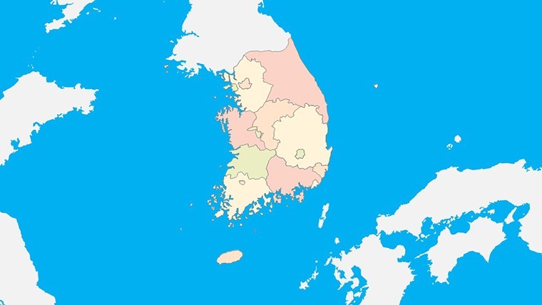
South Korea Map for Keynote: Craft Engaging Geographic Narratives


Type: Keynote Maps template
Category: Asia
Sources Available: .key
Product ID: KM00234
Template incl.: 38 editable slides
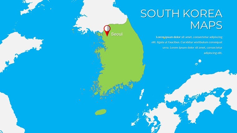
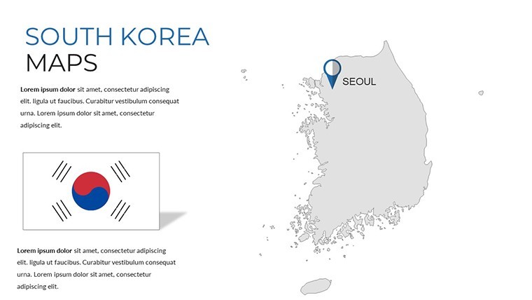
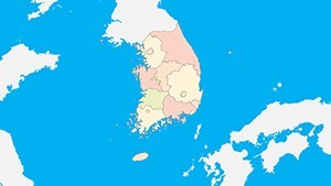
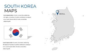
Step into the realm of sophisticated presentations with our South Korea Map for Keynote, a comprehensive toolkit boasting 38 editable slides engineered for Apple Keynote users. This template is your ally in demystifying South Korea's intricate landscape - from the bustling metropolis of Seoul to the serene peaks of Jeju Island - making it indispensable for marketers promoting K-beauty brands, historians delving into the Joseon Dynasty, or economists analyzing tech hubs like Incheon. With high-resolution maps that capture detailed topography, including the Taebaek Mountains and Han River basin, you'll transform dense data into digestible visuals. Forget the hassle of sourcing accurate maps; our design draws from authoritative sources like the Korea National Geographic Information Institute, ensuring precision that builds trust in your delivery.
The beauty lies in its versatility: whether illustrating population shifts in Busan or investment opportunities in the Kaesong Industrial Region, these slides adapt seamlessly. Inspired by successful case studies, such as those from Samsung's global briefings where visual maps clarified market expansions, this template emphasizes clarity and engagement. It's crafted to align with presentation standards from organizations like the Korean Institute of Design Promotion, incorporating elements that enhance informational depth without overwhelming viewers. Start with an overview slide, then drill down into regional specifics, all while maintaining a cohesive aesthetic of modern blues and accents that evoke South Korea's innovative spirit.
Unlocking the Advantages of South Korea-Focused Keynote Maps
This template transcends basic mapping by offering tools that address specific challenges in presenting Asian geographies. For instance, in business contexts, it helps visualize supply chains for Hyundai's automotive empire, highlighting ports and free trade zones. Educators find value in slides that layer cultural landmarks like Gyeongbokgung Palace with historical timelines, fostering interactive learning as per UNESCO's heritage education guidelines. The result? Audiences retain more - studies from the Korean Educational Development Institute show visual aids boost comprehension by 30% in cross-cultural sessions.
Essential Features for Professional Polish
- Dynamic Customization Options: Alter fonts, colors, and layouts to fit your theme, with easy additions of icons for K-pop venues or tech parks.
- Rich Visual Elements: Vibrant palettes and clear labels on detailed topographies, ready for Retina displays.
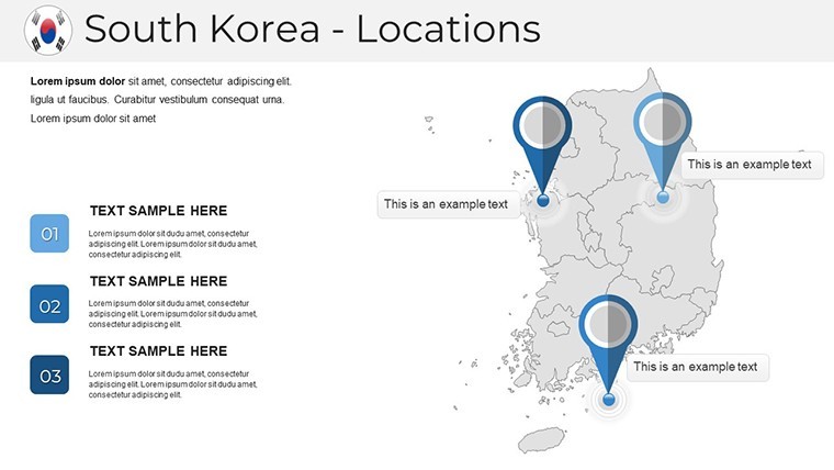
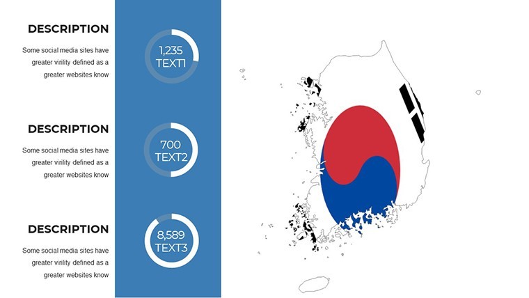
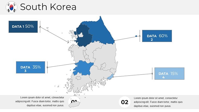
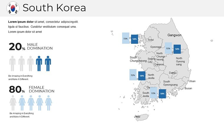
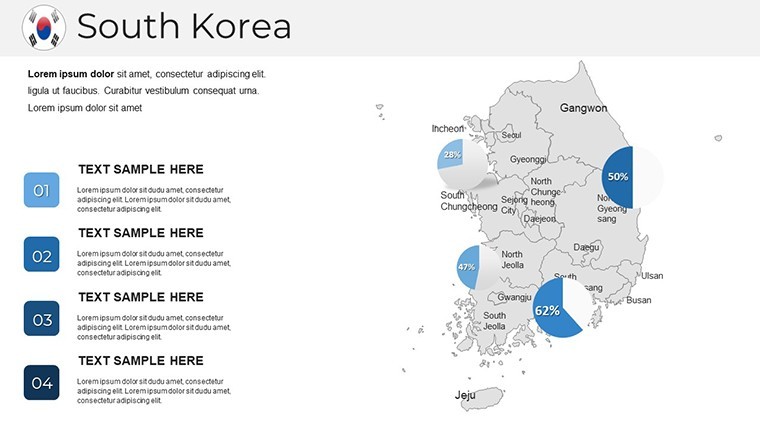
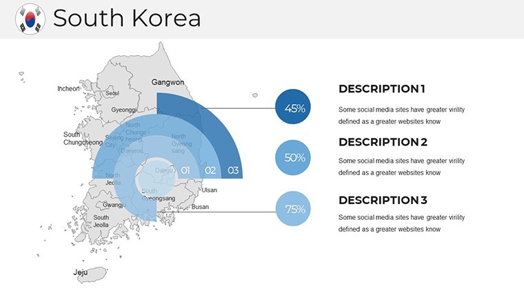
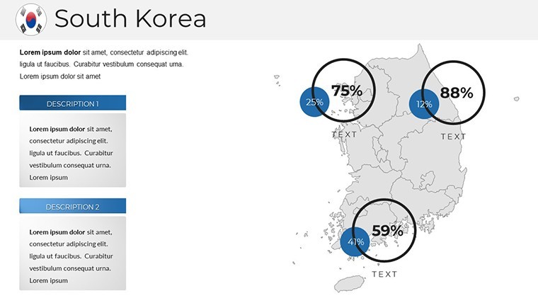
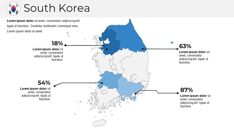
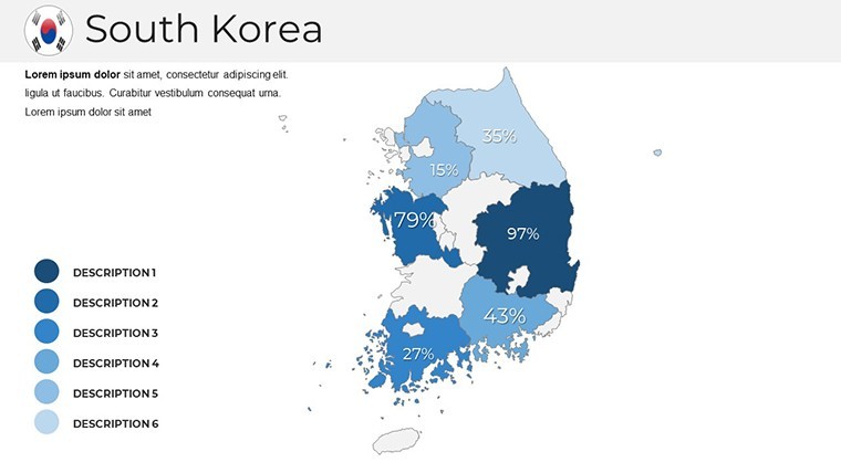
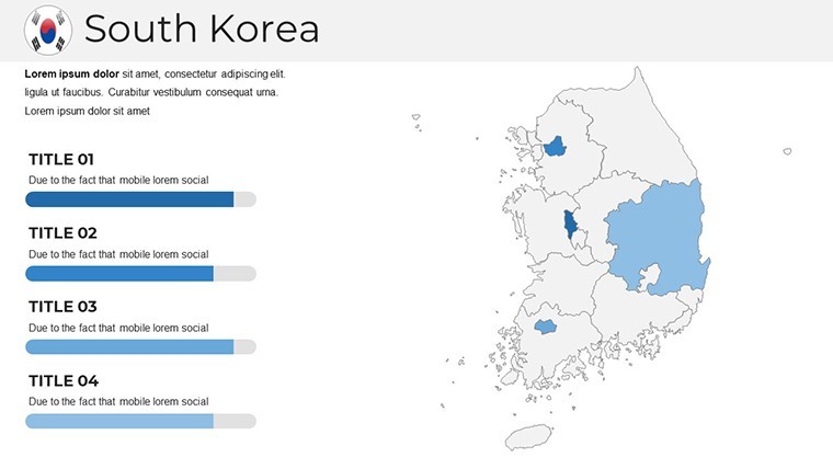
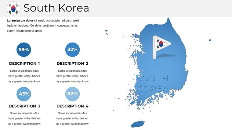
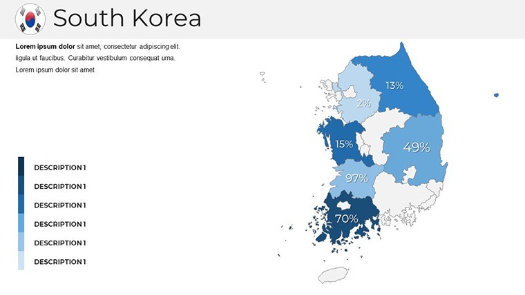
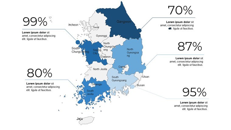
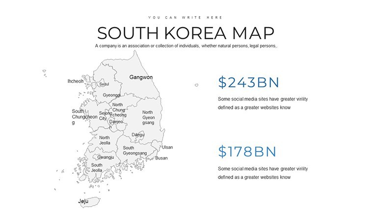
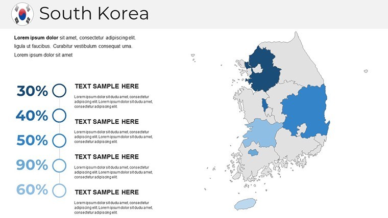
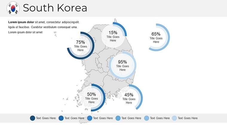
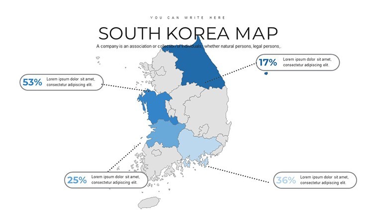
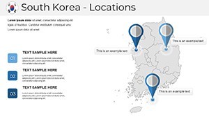
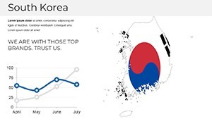
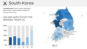
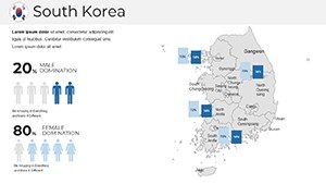
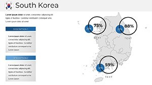
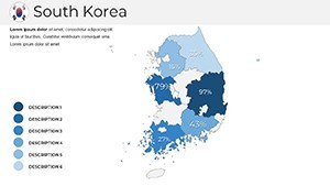
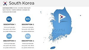
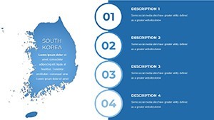
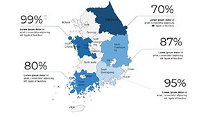
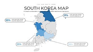
- Informational Layers: Built-in slots for demographics, GDP maps, or cultural infographics, sourced from reliable data like Statistics Korea.
- Smooth Workflow Integration: Compatible with Keynote's animation features for revealing data points progressively.
- High-Resolution Quality: Ensures crisp visuals on any screen, from boardrooms to virtual webinars.
These aren't just features; they're backed by design expertise, echoing principles from Edward Tufte's "The Visual Display of Quantitative Information," adapted for digital tools.
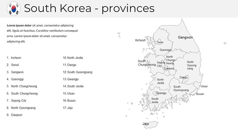
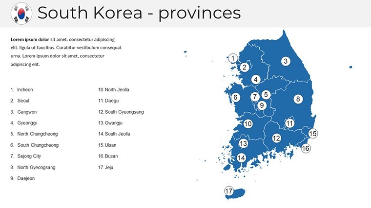
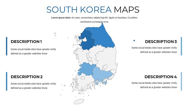
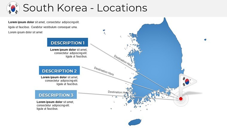
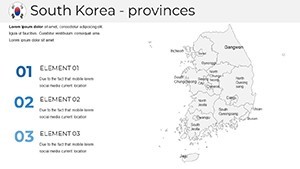
Exploring the 38 Slides in Detail
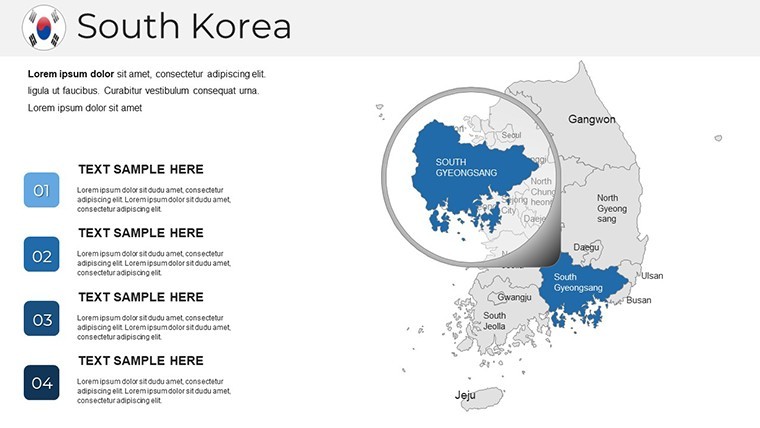
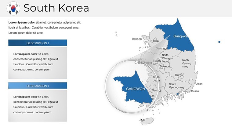
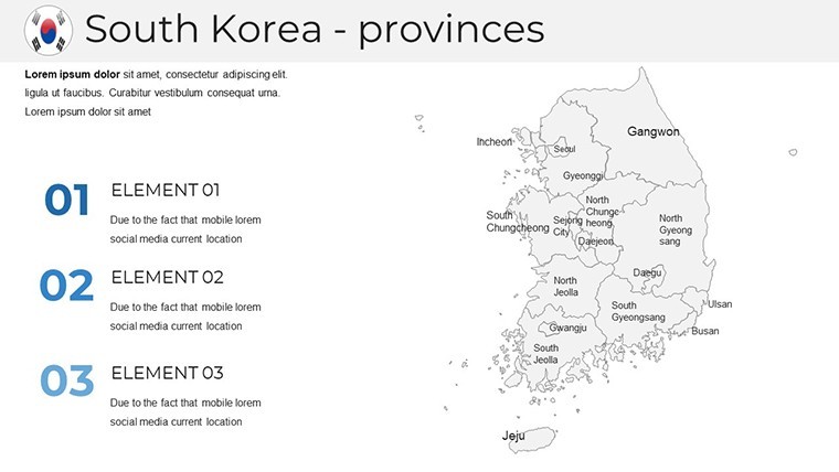
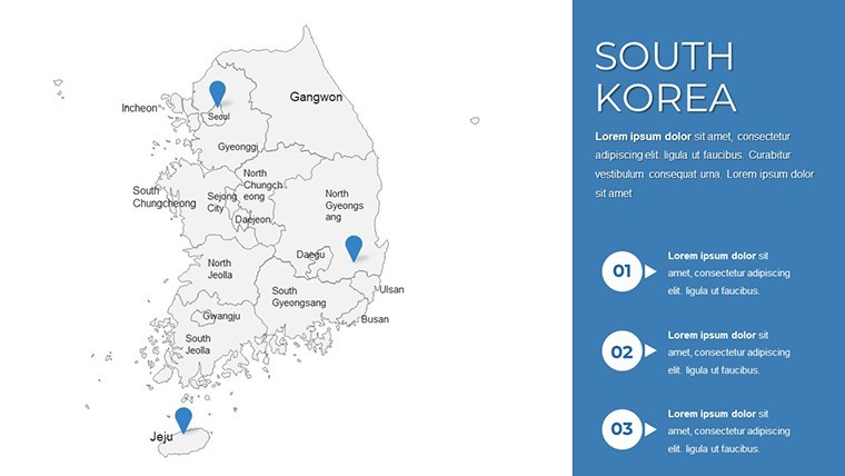
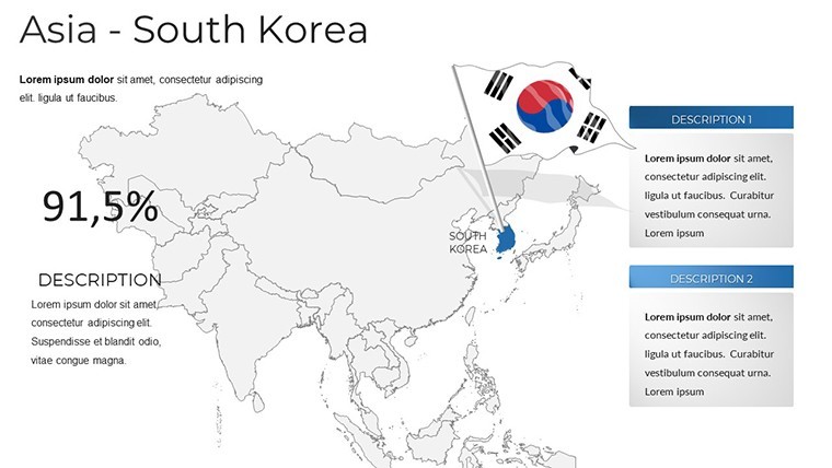
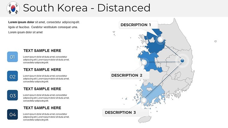
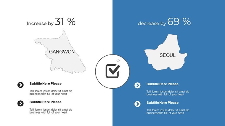
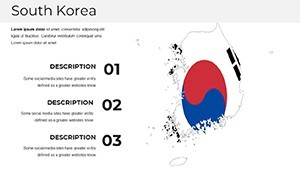
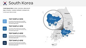
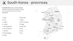
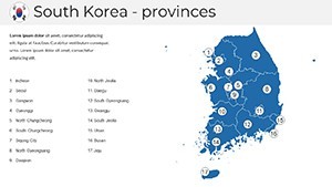
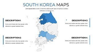
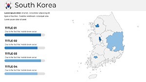
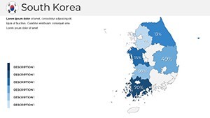
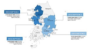
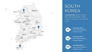
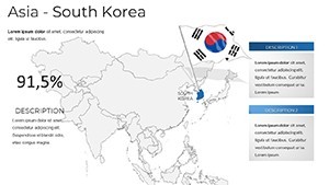
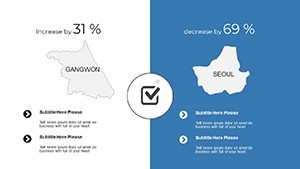
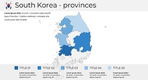
The slide deck is meticulously organized: Initial slides (1-5) provide national overviews with political boundaries and major cities like Daegu. Mid-section (6-20) delves into provinces, such as Gyeonggi-do with embedded charts on innovation clusters. Slides 21-30 focus on thematic applications, like economic zones or tourism trails along the DMZ, complete with photo placeholders. The final slides (31-38) include comparatives - South Korea vs. North Korea borders - and customizable blanks. Each maintains consistency with subtle Hangeul-inspired fonts, allowing for cultural authenticity in presentations.
Practical Use Cases with Proven Impact
In practice, a tech startup used this to map R&D centers in Pangyo Valley for investor pitches, securing funding as reported in Korean Venture Capital Association reviews. Cultural promoters at events like the Busan International Film Festival employ it to highlight venue distributions, enhancing attendee experiences. For corporate training, HR teams overlay diversity maps to discuss multicultural workplaces, aligning with Korea's globalization efforts. To apply, define your goal - say, promoting tourism - then select styles: minimalist for data-heavy talks or vibrant for inspirational ones. Add graphics judiciously, ensuring alignment with your core message.
Expert Tips to Amplify Your Keynote Delivery
Simplicity reigns: Limit to essential elements per slide, as advised by Apple’s own Keynote tutorials. Use high-quality images from sources like Korea Tourism Organization for authenticity. Maintain consistency in color schemes - perhaps inspired by the Taegeuk symbol - for brand cohesion. Rehearse to perfect timing, especially with animations that unfold regional stories. This approach not only elevates your content but positions you as a knowledgeable presenter in South Korean topics.
Elevate your next talk with this indispensable tool. Download and start customizing to deliver presentations that resonate and inspire action.
Frequently Asked Questions
What level of customization does this South Korea map template offer?Complete flexibility: edit colors, add text, insert graphics, and resize elements effortlessly within Keynote.
Does it include data on South Korea's regions?Yes, with pre-loaded info on geography, demographics, and culture, plus placeholders for your updates.
Is it suitable for educational presentations?Perfectly, with slides designed for teaching history, economy, or language, enhancing student engagement.
Can I incorporate animations?Absolutely, the template supports Keynote's animation tools for dynamic reveals of map details.
What if I need help getting started?Included tips guide you through setup, objective setting, and effective use for compelling results.
Is the template optimized for virtual presentations?Yes, high-res designs ensure clarity on screens, ideal for Zoom or Teams sessions.