Antarctica Keynote Map Template - Instant Download


Type: Keynote Maps template
Category: World
Sources Available: .key
Product ID: KM00226
Template incl.: 10 editable slides
What is a Keynote map template? A Keynote map template is a pre-built .key file with editable geographic shapes, placeholder text, and infographic elements that open directly in Apple Keynote - no design software or geographic data conversion required.
Files and Formats Included
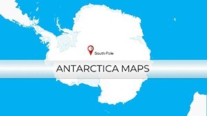
10 editable slides covering Antarctica's continental outline, major ice shelf regions, research station locations, and surrounding ocean zones. The entire download is a single .key file at standard 16:9 widescreen dimensions. Vector-based geographic shapes maintain clean edges at any zoom level - critical for polar maps where the visual complexity of coastline detail can degrade badly in rasterized formats.
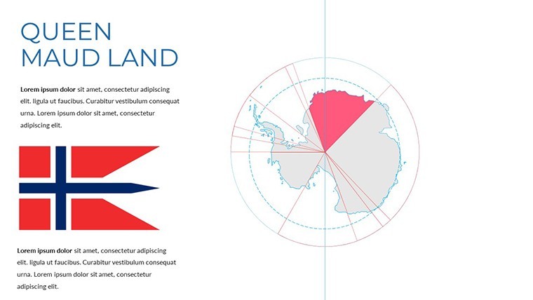
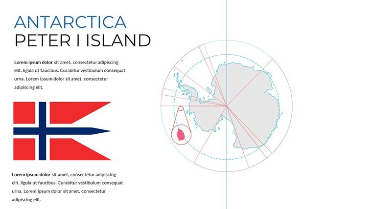
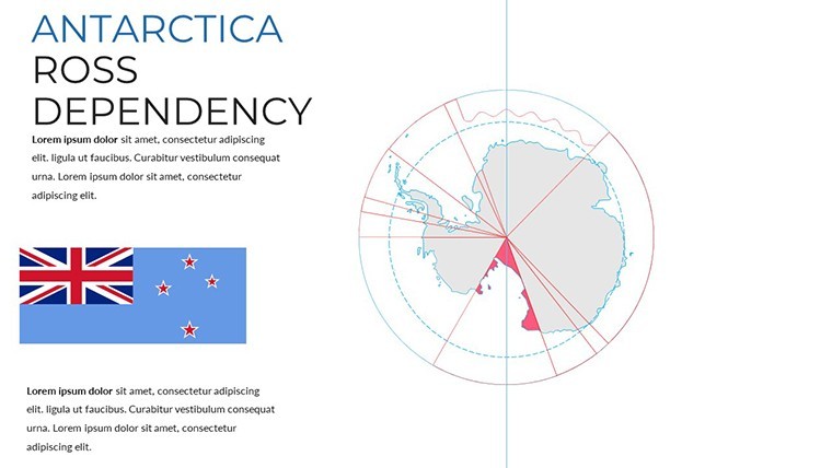
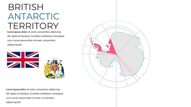
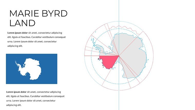
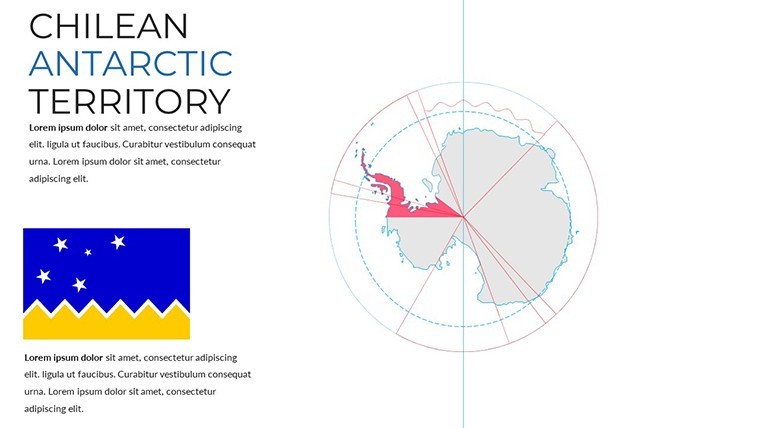
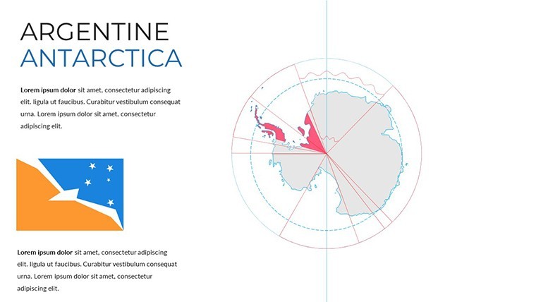
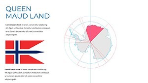
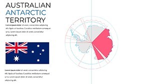
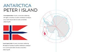
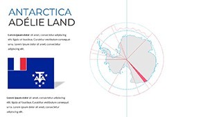
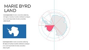
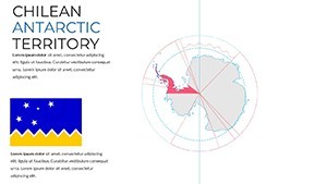
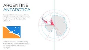
Slide coverage spans full-continent overviews showing the Antarctic Circle boundary, sectoral map views dividing the continent into territorial claim zones, and thematic overlays with icon anchor points for marking research bases, ice core sites, or wildlife observation zones. The compact 10-slide count reflects the focused geography: Antarctica has no administrative subdivisions equivalent to countries or provinces, so the value here lies in coverage clarity and overlay flexibility rather than sheer slide volume.
Compared with multi-continent atlas sets that include Antarctica as a single reference slide among dozens, this file gives the continent dedicated treatment - the resolution and labeling detail are designed for an audience that specifically needs Antarctic geography at the center of the presentation, not as a footnote to a world overview.
Format and Compatibility Details
| Feature | Details |
|---|---|
| File format | .key - native Apple Keynote format |
| Keynote compatibility | Keynote 12 and later (macOS Monterey or newer recommended) |
| Slides included | 10 editable map slides |
| Geographic shape type | Vector outlines - scale without pixelation |
| Region coverage | Continental outline, ice shelf zones, territorial sectors, research base markers |
| Text placeholders | Location labels and callout boxes editable directly without ungrouping |
| Export options | .key for editing; PDF or image export for reports and distribution |
Who Reaches for This Template
A climate research communications officer preparing a funding proposal for a polar science institute used the sectoral map slides to show the geographic scope of a proposed ice-core drilling program. Marking target sites with editable icon placeholders and adding data callouts to the surrounding ocean zones cut the visual preparation phase from half a day to under two hours - and the same base file was adapted for three separate funder briefings by changing only the overlay content.
Science educators running university modules on physical geography and climate systems rely on the continental overview slides for lecture decks. One instructor adapted the thematic overlay slides to illustrate the progression of ice shelf retreat over decades, using Keynote's duplicate-slide function to create a before/after sequence without rebuilding the map base each time.
Download and start editing immediately.
How to Make It Yours in Under 20 Minutes
Editing difficulty: Beginner. The geographic shapes behave like any other Keynote object - click to select, use the Format panel to recolor, and drag to reposition.
- Step 1 - Open the .key file in Keynote 12 or later (1 minute)
- Step 2 - Select the map slide that matches your coverage focus: full continent, sectoral view, or thematic overlay (1 minute)
- Step 3 - Apply brand or theme colors via the master slide palette; all region fills update accordingly (3 minutes)
- Step 4 - Replace placeholder labels with location names, research site identifiers, or data annotations (5 minutes)
- Step 5 - Add any icon markers to the geographic overlay layer using Keynote's built-in shape library (3 minutes)
- Step 6 - Export as .key for a collaborative file or PDF for a formatted report (1 minute)
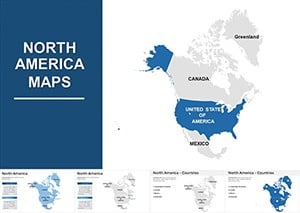
For broader geographic context - pairing an Antarctic coverage slide with a world map overview, for example - the World Keynote Maps category contains complementary regional sets that share the same file format and editing conventions. One practical pairing is a North America Keynote Maps set for presentations that need to contrast polar and mid-latitude geography in a single deck.
Building From Scratch vs. Starting Here
Constructing an accurate Antarctica map in Keynote from raw materials involves sourcing a vector outline from a geographic data provider, importing it into Keynote as an SVG or converting it through a design application, then manually adding text layers, callout frames, and any thematic overlay structure. That workflow requires familiarity with vector file handling and typically takes an experienced user between 90 minutes and three hours - before any actual presentation content has been added.
A less obvious problem with scratch-built polar maps: the Antarctic continent's shape is frequently distorted in standard Mercator projections. The version used in this file presents the continent in a polar azimuthal projection centered on the South Pole, which is the cartographically correct choice for a continent-focused map. Using a Mercator-derived outline stretches the landmass shape in ways that are immediately recognizable to any geographer or scientist in the audience - a credibility problem that is easy to avoid by starting with a correctly projected base.
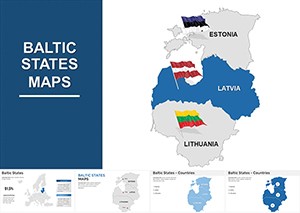
Presentations covering polar themes can also draw on the Baltic States Keynote Maps set if the deck requires contrasting high-latitude inhabited regions with the uninhabited polar continent - a common structure in climate or geopolitical briefings. The file formats are identical, so combining slides from both downloads into a single deck requires no reformatting.
Download and start editing immediately.
Which Keynote version is required to open the file?
The .key file opens in Keynote 12 and all later versions. Keynote 12 ships with macOS Monterey (2021); any Mac running Monterey, Ventura, or Sonoma supports it fully. iPadOS users need Keynote 12 for iPad, available through the App Store. Earlier Keynote versions may render vector shape outlines with minor formatting differences, so updating before opening is the safest approach. iCloud Keynote in a browser can display the file but does not support the same level of shape-layer editing as the desktop application.
How do I add research station or site markers to the map?
Open the slide containing the continental map shape. In Keynote, use Insert > Shape to add a circle, pin, or custom icon at the desired location on the map - then drag it into position over the geographic coordinates you want to mark. Resize the marker using the corner handles while holding Shift to maintain proportions. Add a text callout by inserting a text box and positioning it adjacent to the marker with a connecting line drawn using the Line tool. Grouping the marker, callout, and line together (Format > Group) keeps all three elements aligned when you move or resize the map area later.
Is the license suitable for academic or grant proposal use?
The standard license covers personal use and internal organizational presentations, which includes academic lectures and internal grant proposal documents. If the file's slides will appear in a publicly submitted document - a published journal article, a publicly distributed report, or a conference proceeding with a formal ISBN or DOI - the terms of use should be reviewed against ImagineLayout's licensing documentation to confirm that public-facing distribution is covered. Sublicensing or reselling the template file itself is not permitted. For any ambiguous use case, contacting ImagineLayout support with a description of the intended use will provide a definitive answer.
Can I export slides as images for use in reports or papers?
Keynote supports exporting individual slides as PNG or JPEG images via File > Export To > Images. PNG export preserves the sharpest edges for vector-heavy map slides and is the recommended format for any document that will be printed or displayed at high resolution. JPEG is suitable for web use where file size is a concern. The export dialog lets you select specific slides rather than the full set, so extracting one or two map slides for a report without exporting all 10 is straightforward. Resolution options in the export dialog go up to 300 DPI for print-quality output.
What is the refund policy for this download?
ImagineLayout processes refund requests when the delivered file is technically non-functional on a supported Keynote version or does not match the described contents - specifically, 10 editable Antarctic map slides in .key format. Digital downloads are not eligible for refunds based on preference after purchase, as the file is accessible immediately upon payment. If a technical issue prevents the file from opening in Keynote 12 or later, submitting a support request with the order number and a description of the error is the appropriate first step. The complete refund policy is at imaginelayout.com/refund-policy.