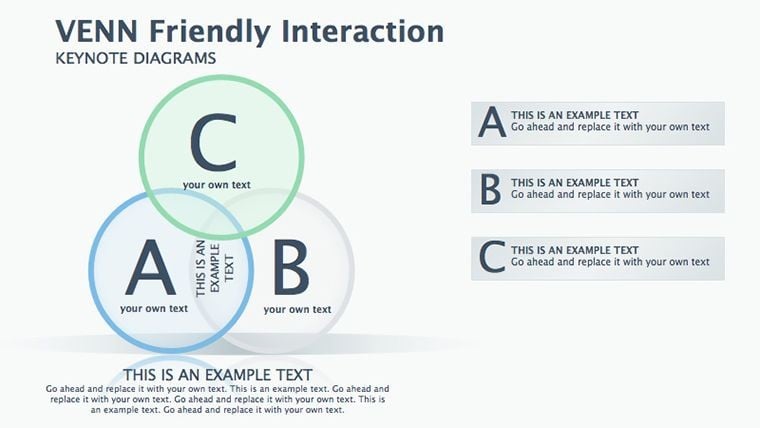
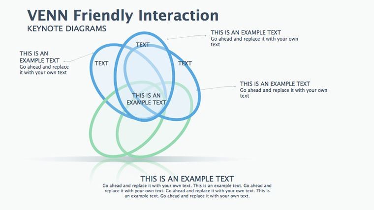
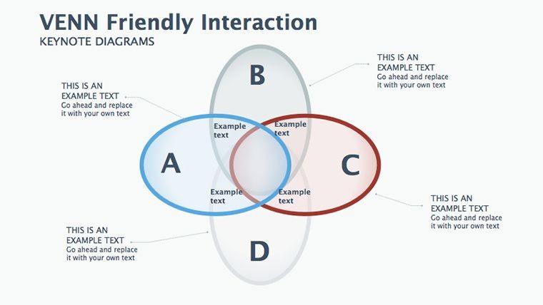
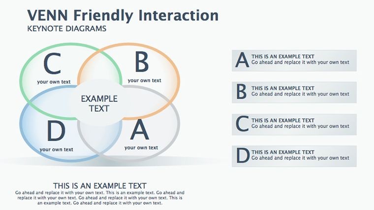
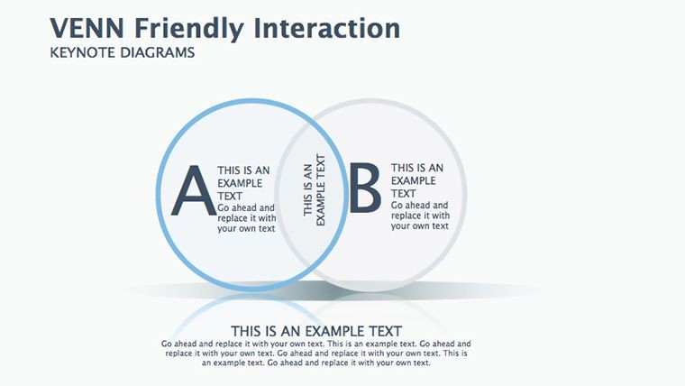
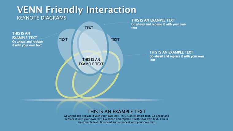
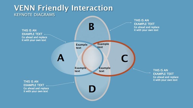
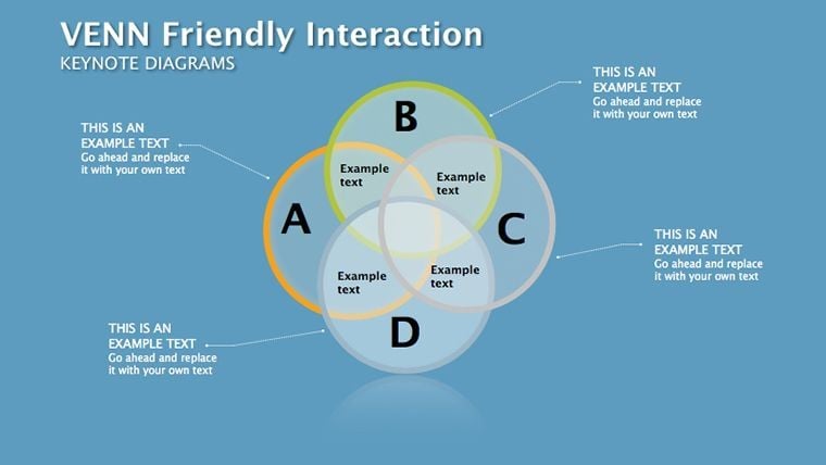
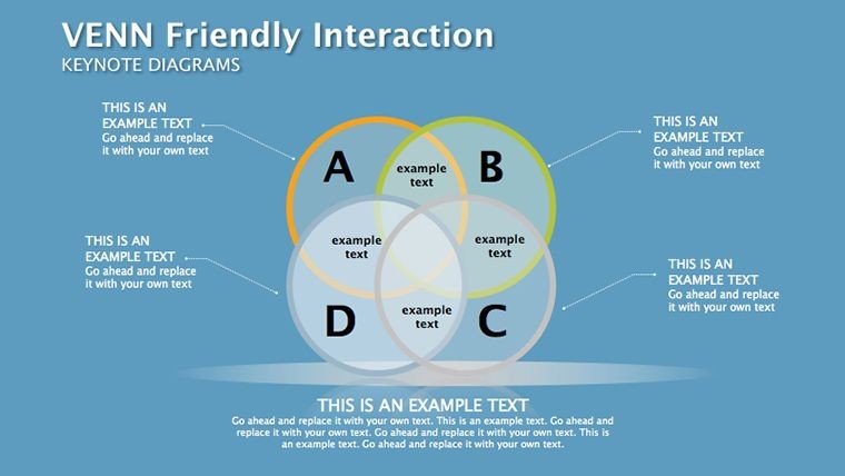
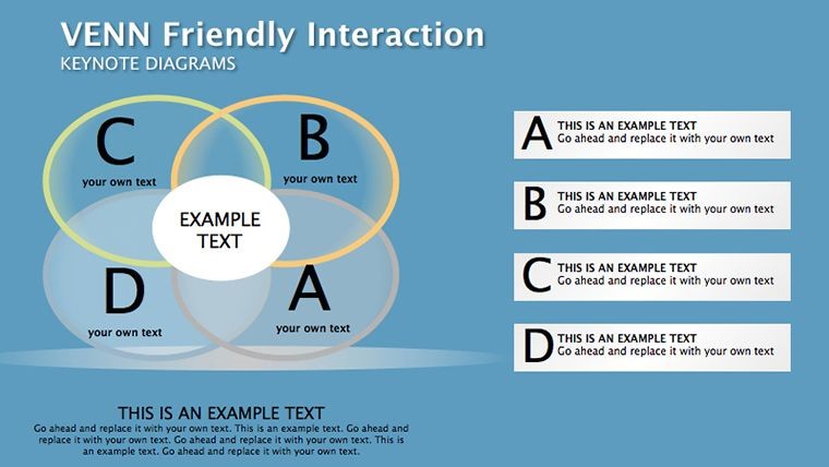
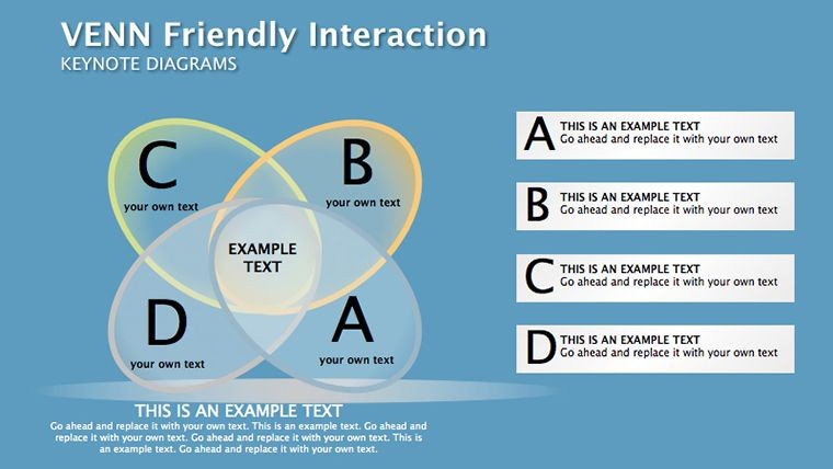
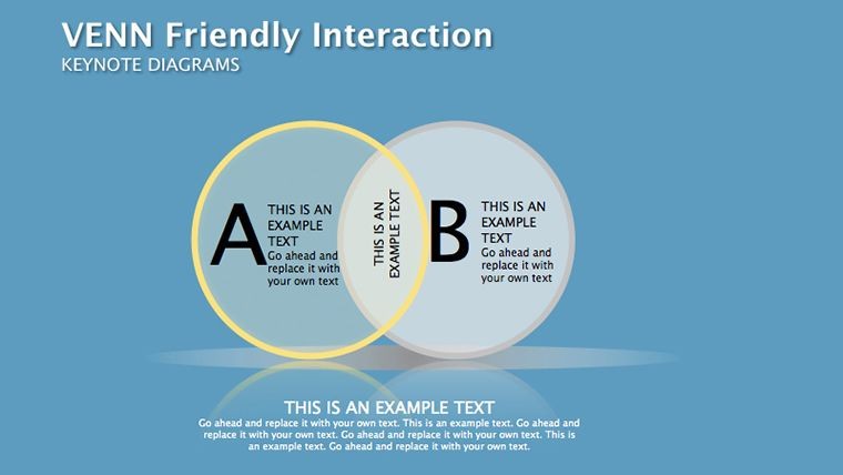
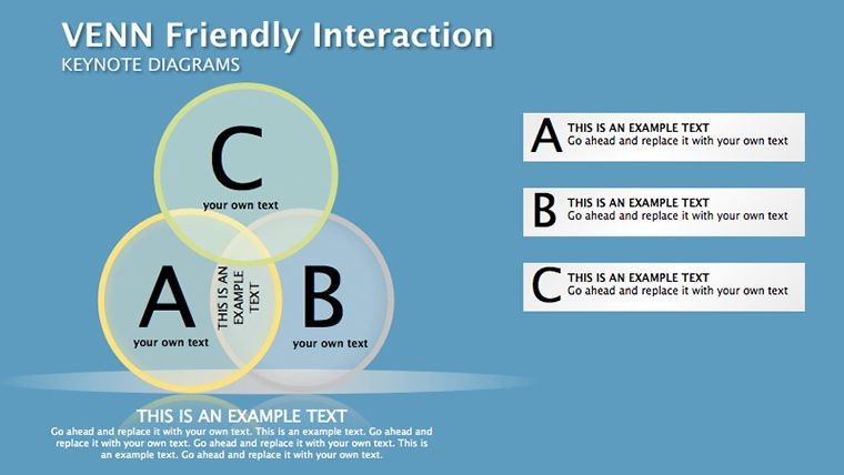
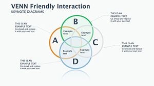
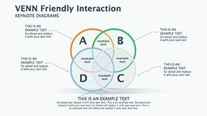
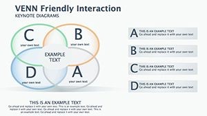
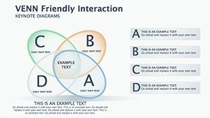
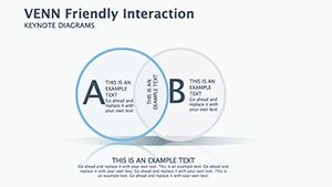
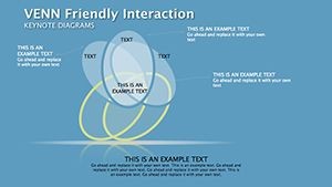
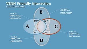
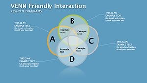
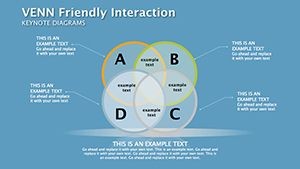
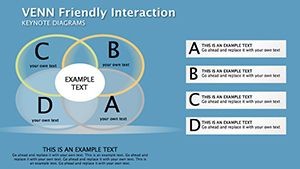
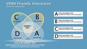
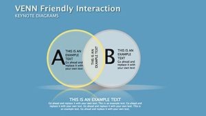
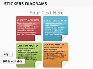
Venn Friendly Interaction Keynote Diagrams for Presentation
Type: Keynote Diagrams template
Category: Venn
Sources Available: .key
Product ID: KD00199
Template incl.: 16 editable slides
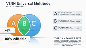
Venn diagrams are a powerful way to convey complex ideas and relationships in a clear, concise manner. Whether you're giving a keynote presentation at a conference or leading a training session for your team, Venn diagrams can help you make your point with maximum impact.
But not all Venn diagrams are created equal. Some can be confusing or hard to read, while others may not capture the full complexity of your message. That's why it's important to use Venn-friendly interaction keynote diagrams that are specifically designed for presentations.
Here are some tips for creating effective Venn diagrams for your next presentation:
- Keep it simple
The most effective Venn diagrams are those that are simple and straightforward. Don't try to cram too much information into a single diagram, or your audience may become overwhelmed. Instead, focus on the key points you want to convey and use only as many circles as necessary to get your message across. - Use color strategically
Color can be a powerful tool for highlighting key elements of your diagram and making it more visually appealing. However, be sure to use color strategically, rather than randomly. Stick to a limited color palette that complements your brand and ensures that your diagram is easy to read. - Label each circle clearly
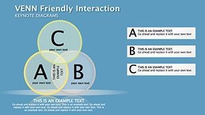
Each circle in your Venn diagram should be clearly labeled with a descriptive title. This will help your audience understand the purpose of each circle and how they relate to one another. Be sure to use concise, easy-to-understand language and avoid jargon or technical terms. - Use overlap areas wisely
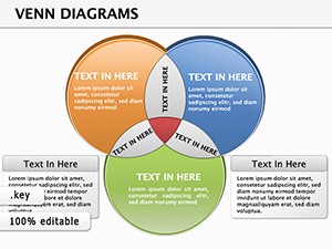
The overlap areas between circles are where the real magic happens in a Venn diagram. This is where you can show how different elements intersect and interact with each other. Use the overlap areas to highlight the most important connections between your key points, and consider using color or shading to make them stand out. - Make it interactive
Finally, consider making your Venn diagram interactive. This could involve using animation to reveal each circle or overlap area one at a time, or allowing your audience to click on different parts of the diagram to reveal more information. This will make your presentation more engaging and help your audience better understand the relationships between different elements.
By following these tips, you can create powerful, effective Venn diagrams that will enhance your next keynote presentation. Whether you're presenting to a large audience or a small group, Venn-friendly interaction keynote diagrams can help you communicate your ideas with clarity and impact.

