Social Issues Keynote Diagrams: Illuminating Societal Challenges


Type: Keynote Diagrams template
Category: Data, Relationship, Illustrations
Sources Available: .key
Product ID: KD00196
Template incl.: 14 editable slides
Navigating the complex web of social issues demands more than words; it requires visuals that reveal connections and inspire action. Our Social Issues Keynote Diagrams template provides exactly that - 14 editable slides blending data, relationships, and illustrations to help you dissect problems, their interdependencies, and potential solutions. Tailored for activists, policymakers, educators, and researchers, this tool draws from real-world frameworks like those from the United Nations Sustainable Development Goals (SDGs), enabling you to present with depth and authority.
Envision turning a discussion on inequality into a vivid diagram showing economic, educational, and health linkages. This template empowers you to do just that, fostering understanding and urgency. As evidenced by case studies from organizations like Amnesty International, such visuals have enhanced campaign effectiveness by clarifying issue overlaps, making your presentations a catalyst for change.
Core Features Enhancing Your Narrative
Built for ease and impact, the template's features support seamless customization in Keynote. From adjustable illustrations to data-driven charts, everything is designed to amplify your message.
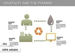
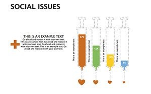
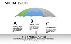
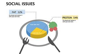
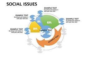
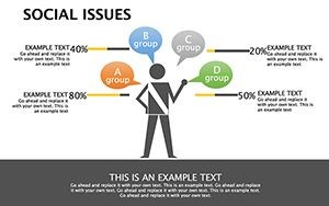
- Versatile Diagrams: Mix relationship maps with data bars, ideal for showing issue correlations like poverty and education gaps.
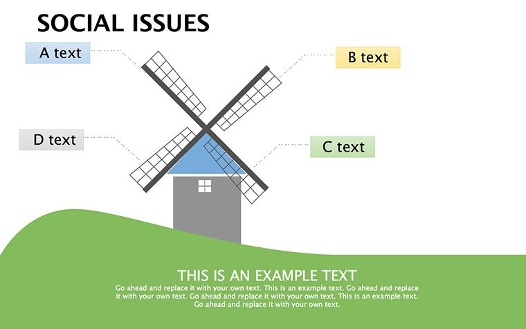
- Illustrative Elements: Hand-drawn style icons for human touch, customizable to represent diverse populations.
- Color Coding: Intuitive schemes - reds for urgent issues, greens for solutions - to guide viewer emotions.
- Export Flexibility: Compatible with Keynote's export to video or PDF, perfect for social media sharing.
These align with expert guidelines from visualization gurus like Hans Rosling, ensuring your slides are trustworthy and engaging.
Slide-by-Slide Exploration
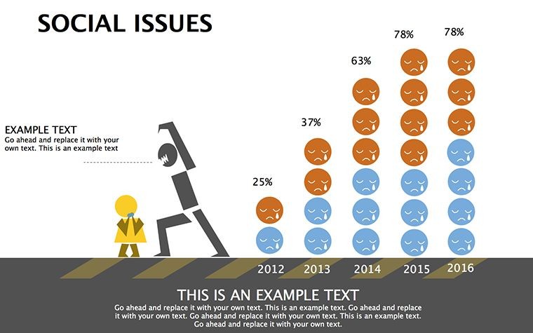
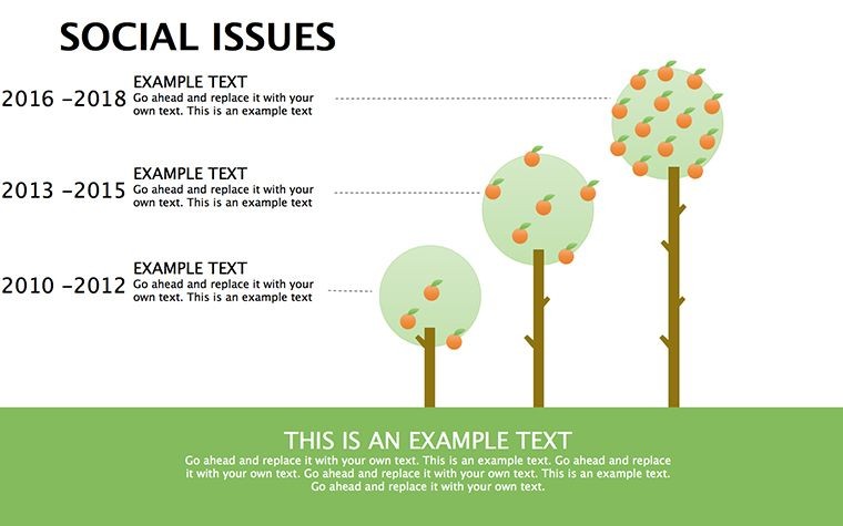
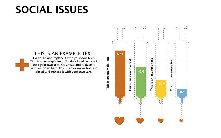
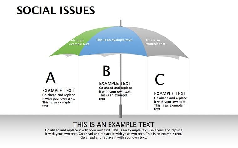
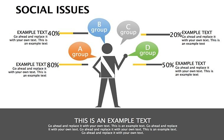
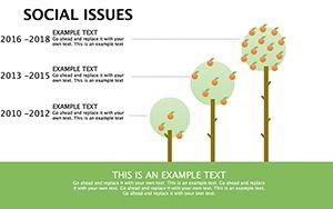
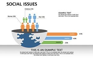
The 14 slides are structured for logical flow. Early slides (1-4) use basic illustrations to introduce issues, such as Slide 3's icon-based overview of global hunger, editable for local contexts.
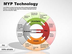
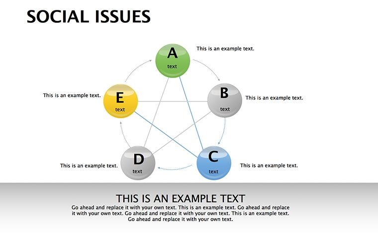
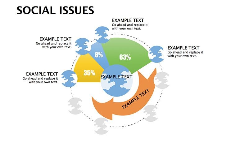
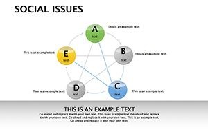
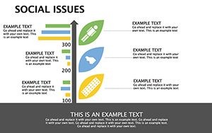
Mid-section (5-9) employs relationship diagrams to map interdependencies, like Slide 7 linking climate change to migration with editable arrows and nodes.
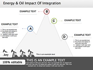
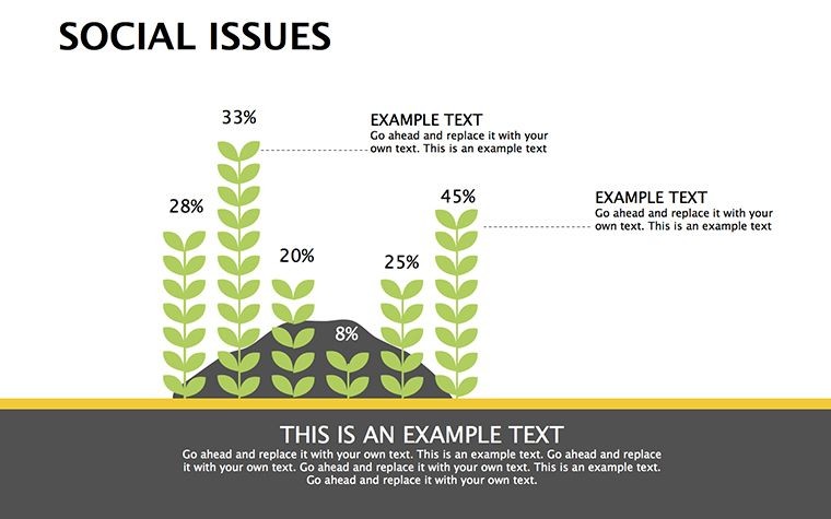
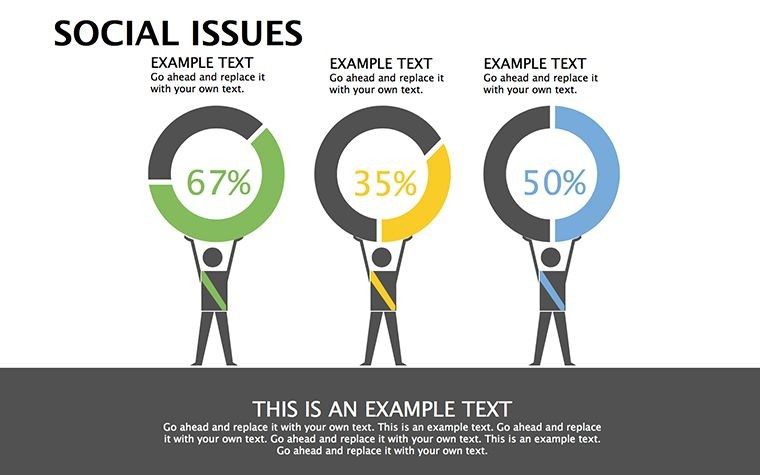
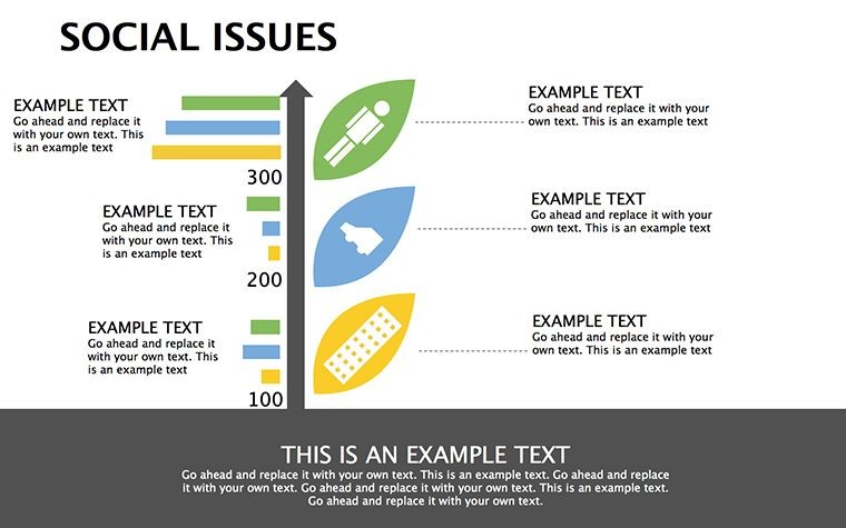
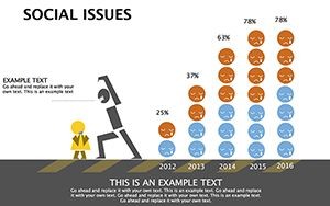
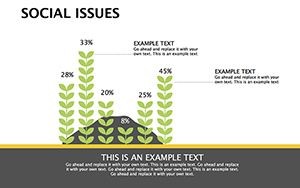
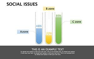
Later slides (10-14) incorporate data visuals, e.g., Slide 12's bar charts for study findings, backed by sources like World Bank reports.
Practical Applications in Advocacy
Apply this template in diverse scenarios. Nonprofits use it for donor reports, as in Oxfam's inequality campaigns where diagrams boosted funding.
Educators integrate it into lessons on civics, aligning with Common Core standards. Policymakers visualize policy impacts, drawing from Brookings Institution analyses.
- Community Workshops: Facilitate discussions on local issues like housing.
- Research Symposia: Present findings with clear interdependency maps.
- Corporate CSR: Highlight company efforts in social equity.
Start by selecting a slide, input data, and refine - simple steps for profound impact.
Insights for Effective Use
Keep it human: Pair diagrams with stories, like real anecdotes from Human Rights Watch. Vary pacing with animations to build tension around issues.
For a touch of inspiration: "Social issues aren't isolated; they're interconnected puzzles - solve them visually!"
Amplify Impact with These Diagrams
Step up your advocacy - customize now and drive meaningful dialogue.
Frequently Asked Questions
- How flexible are the social issue diagrams?
- Completely editable, including shapes, data, and illustrations.
- Compatible with other software?
- Optimized for Keynote; exportable to PowerPoint with minor tweaks.
- Suitable for which audiences?
- Activists, educators, policymakers - anyone addressing social challenges.
- Can I incorporate external data?
- Yes, easily add charts from sources like Excel.
- Any design tips included?
- Template guides suggest best practices for clarity.