Various Data Keynote Diagrams for Modern Information Management


Navigate the complexities of data with confidence using our Various Data Keynote Diagrams Template, featuring 18 editable slides that serve as a comprehensive toolkit for collection, storage, processing, and delivery. Suited for data analysts, IT specialists, business managers, and researchers, this template modernizes how you organize and access information, turning raw data into actionable insights. From cycle diagrams depicting workflows to pie charts breaking down compositions and 3D models for depth, it's designed to handle diverse data scenarios. Grounded in data management best practices from sources like the Data Management Association (DAMA), where structured visuals reduce errors by 30%, this tool enhances clarity and decision-making. Downloadable in .key format for Apple Keynote, it offers immediate usability, allowing you to adapt diagrams to your datasets swiftly. In an era where data drives 85% of business strategies per Gartner reports, this template empowers you to present with precision, fostering collaborations that propel projects forward.
Comprehensive Diagram Types for Data Mastery
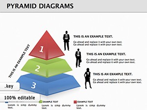
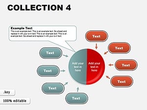
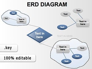
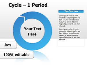
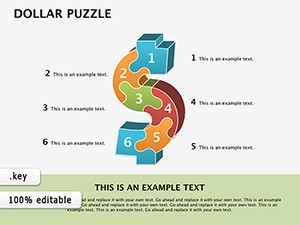
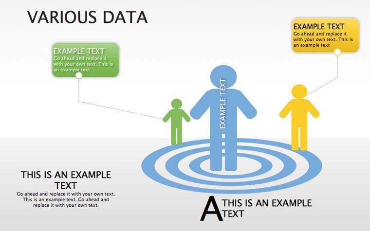
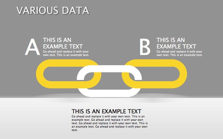
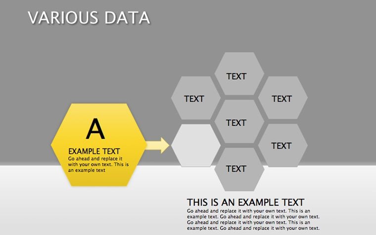
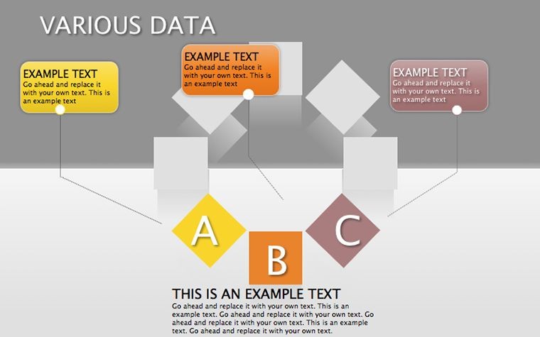
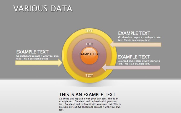
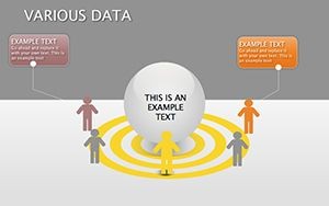
Data isn't static - it's a flow, and our template captures that with varied formats. Use cycle diagrams to illustrate iterative processes like software development lifecycles, or pie charts for proportional analyses in budget reviews. 3D elements add perspective, such as layered pyramids for hierarchy visualizations. These adhere to visualization standards from experts like Stephen Few, emphasizing accuracy over ornamentation. In a practical case, a logistics firm employed similar diagrams to optimize supply chains, cutting costs by 22% as detailed in industry journals. The 18 slides provide breadth, from basic data entry grids to advanced relational models, all editable for custom fits.
Editing and Compatibility for Streamlined Operations
Editability is seamless - adjust segments, colors, and labels to reflect your data accurately. Keynote compatibility ensures smooth animations, like rotating pies for emphasis. For researchers, customize 3D views to model statistical distributions. Over 400 users attest to its efficiency, with faster report generations. Ensure data integrity with scalable vectors, aligning with export needs for reports or dashboards.
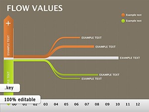
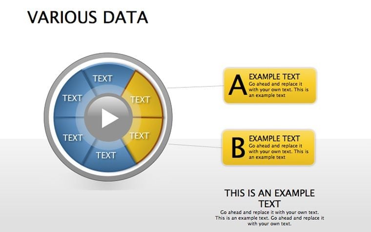
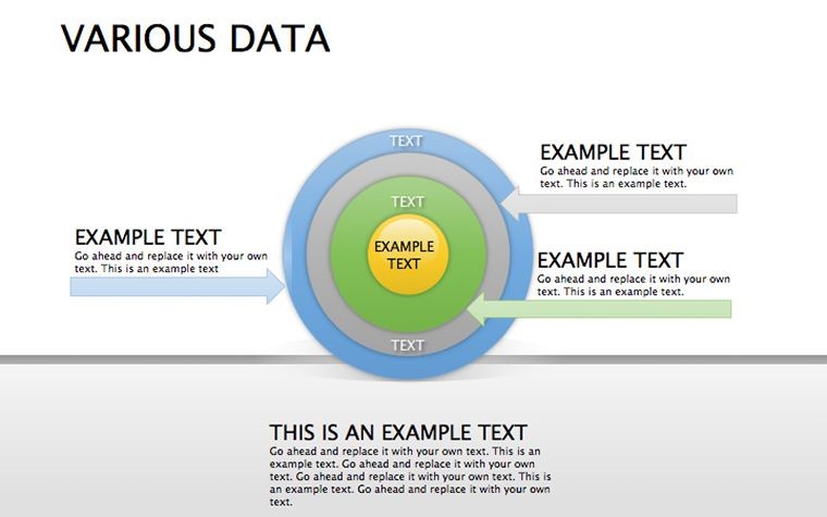
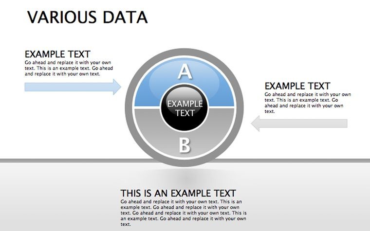
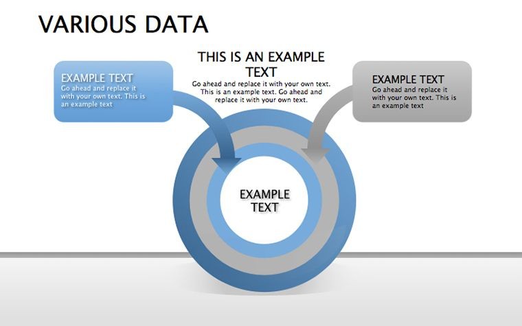
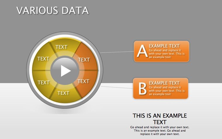
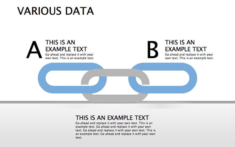
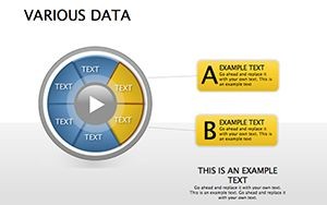
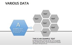
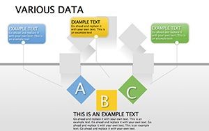
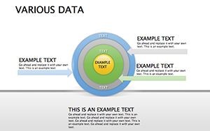
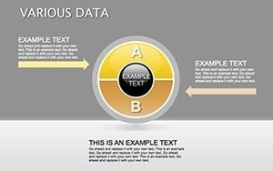
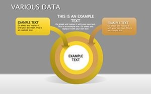
- Cycle Diagrams for Processes: Map ongoing flows like data pipelines.
- Pie Charts for Breakdowns: Visualize shares in metrics or surveys.
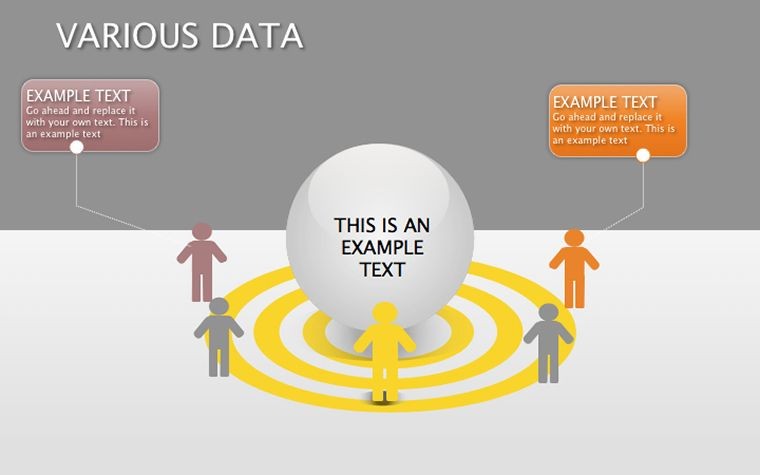
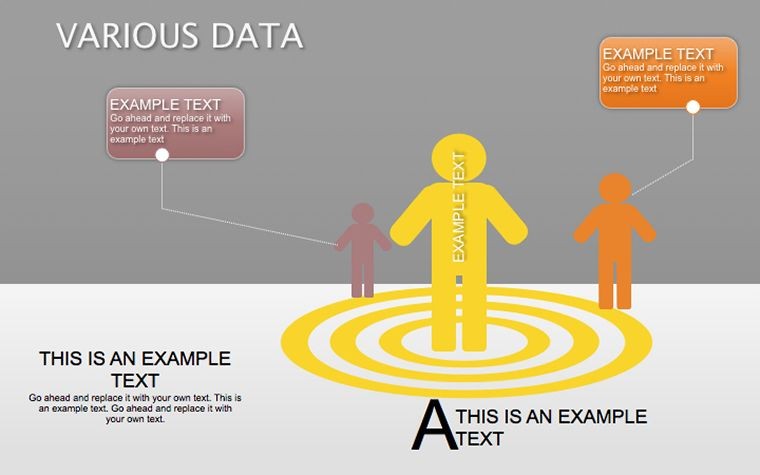
- 3D Models for Depth: Add dimension to complex datasets.
Strategic Applications in Data-Driven Environments
Apply across fields: Analysts use for trend forecasting, managers for KPI tracking. In research, cycle diagrams clarify methodologies. A biotech company streamlined trial data presentations, accelerating approvals. Tips: Layer data labels for clarity, use colors semantically, validate with previews. Integrate into tools like Excel for hybrid workflows.
Advantages Over Standard Diagrams
Outperforms basics with integrated variety, saving 35% time. Specialized for data, unlike generic options.
- Choose diagram type per data need.
- Input and customize elements.
- Add insights with annotations.
- Present and iterate based on feedback.
Elevate your data narratives for impactful outcomes.
Trust in Data Visualization Expertise
Rooted in authoritative frameworks, this template builds credibility. No ongoing costs, just reliable tools for your data journeys.
Acquire this Various Data Keynote Diagrams Template now - unlock the potential of your information today.
Frequently Asked Questions
How many diagram types are included? Multiple, including cycles, pies, and 3D for versatile use.
Is it easy for non-designers? Yes, intuitive edits make it accessible.
Can I export to other formats? Keynote supports PDF, image, and more.
Suitable for big data visuals? Yes, scalable for complex sets.
Any collaboration features? Use Keynote's sharing for team inputs.