Versatile Overlay Ring Pie Keynote Diagrams Template

Type: Keynote Diagrams template
Category: Pie
Sources Available: .key
Product ID: KD00125
Template incl.: 10 editable slides
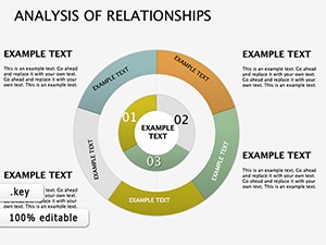
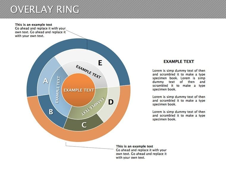
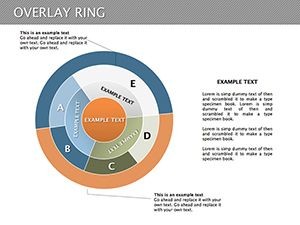
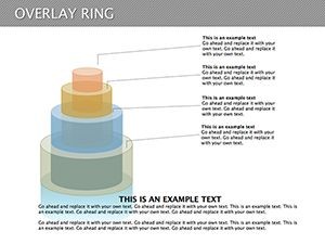
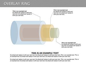
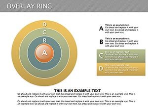
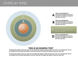
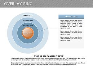
Data visualization is an art, and our Overlay Ring Pie Keynote Diagrams master it with elegance. This template offers 10 editable slides centered on pie structures with overlay rings, perfect for breaking down complex analyses into digestible sectors. Aimed at data analysts, marketers, and educators, it transforms raw numbers into narrative-driven graphics. Think of overlay rings as concentric circles adding layers of context - like market shares within broader industry pies. With editable sectors, you can fine-tune every slice, making your Keynote presentations not just informative but memorable. This tool bridges the gap between data overload and clear insights, helping you communicate effectively in high-stakes environments.
Exploring the Overlay Ring Design
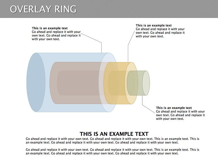
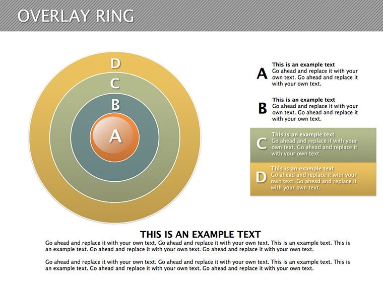
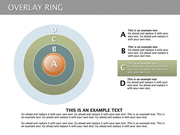
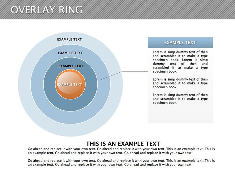
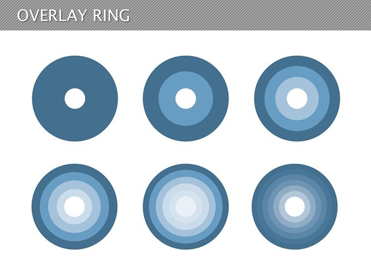
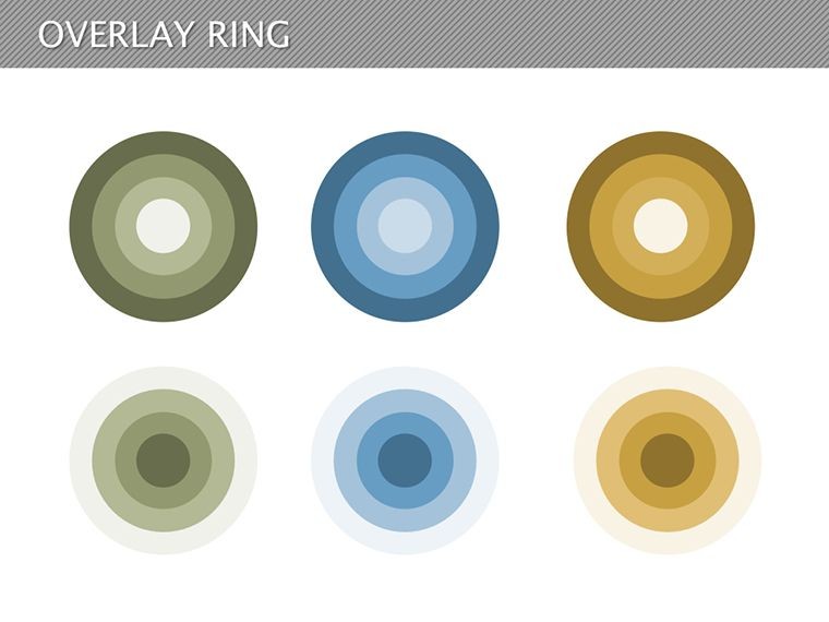
The overlay ring pie combines traditional pie charts with ring overlays for depth, allowing simultaneous display of multiple datasets. For example, the inner pie might show product sales, while outer rings detail regional breakdowns. This multi-dimensional approach, inspired by infographic pioneers like Florence Nightingale, enhances comprehension. In Keynote, editing is straightforward - resize sectors, swap colors, and add labels without hassle.
Essential Features for Data Mastery
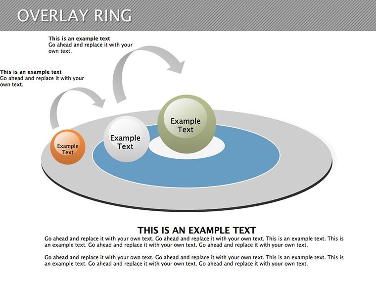
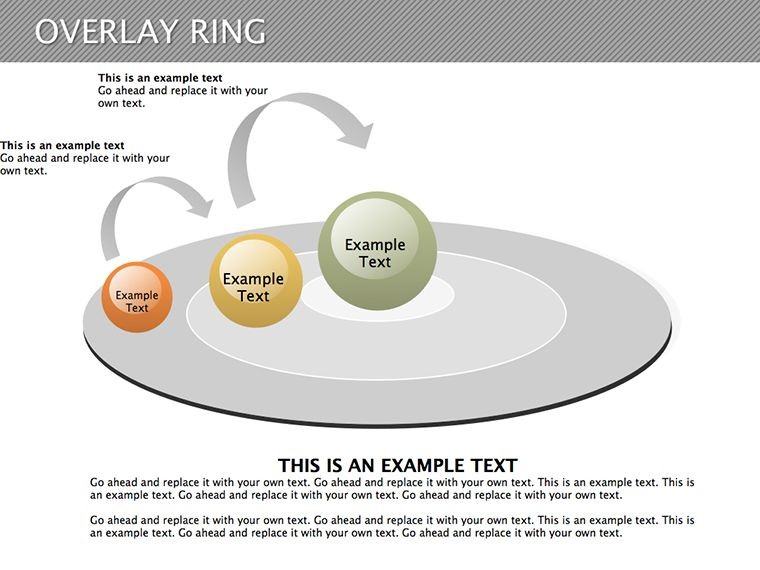
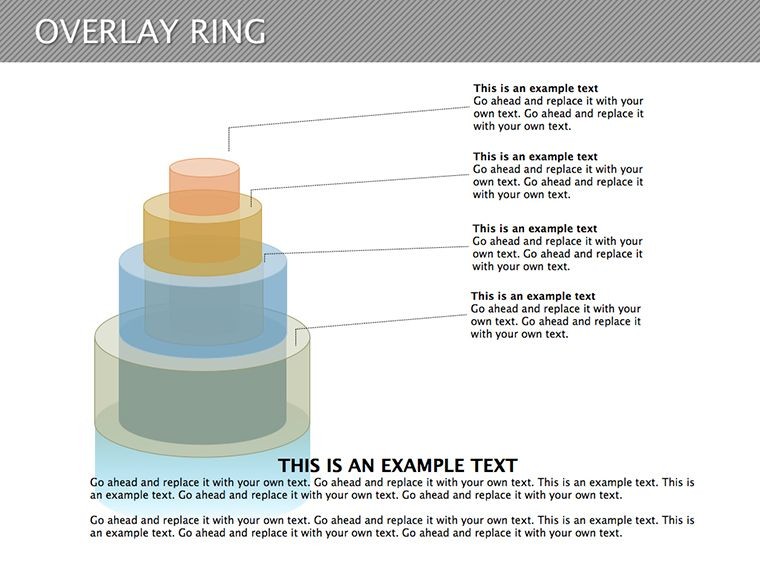
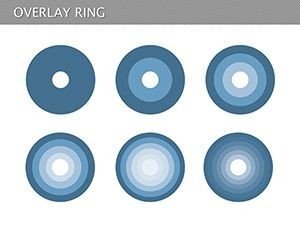
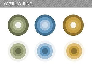
- 10 Specialized Slides: Variations from basic pies to multi-ring overlays.
- Editable Sectors: Adjust sizes and content dynamically for accurate representations.
- Color Customization: Match palettes to themes or data categories.
- High-Fidelity Vectors: Scalable without loss of quality.
- Text and Icon Support: Embed explanations directly on diagrams.
These tackle issues like static charts, providing dynamic alternatives for engaging storytelling.
Use Cases That Bring Data to Life
In marketing reports, use overlay rings to layer customer demographics over purchase data, revealing patterns per Nielsen insights. Educators teach statistics by overlaying historical data rings on current trends, aligning with Common Core standards. A finance firm case: Implemented ring pies for portfolio analysis, improving client understanding and retention by 20%. Non-profits visualize budget allocations with inner pies for expenses and outer for impacts, per IRS guidelines.
Customizing Step by Step
- Pick a Slide Layout: Start with single or multi-ring based on data layers.
- Enter Your Data: Use Keynote tables to populate sectors automatically.
- Refine Visuals: Apply fills, borders, and shadows for polish.
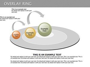
- Add Interactivity: Hyperlink sectors to detailed slides.
- Validate: Ensure percentages sum correctly and visuals align.
Integrates with Excel or Numbers for data flow, surpassing basic pie tools by offering layered complexity.
Tips from Data Visualization Experts
Follow guidelines from "Storytelling with Data" by Cole Nussbaumer Knaflic: Avoid over-segmenting - limit to 5-7 sectors per ring for clarity. Use contrasting colors for overlays, per ADA accessibility standards. In business, overlay competitive shares on your pie for SWOT visuals. A tech startup reported faster decision-making after adopting layered pies, cutting meeting times by 15%.
Apply to surveys: Inner ring for responses, outer for demographics. In healthcare, pie patient outcomes with overlays for treatments, per HIPAA-compliant reporting. This versatility outshines flat pies, enabling richer analyses.
Edges Over Conventional Charts
Standard pies lack overlays, restricting to single views. This template's 10 slides provide pre-set options, easing creation. Users note: "Simplified my analytics decks," from a data scientist. Sync with Tableau exports for advanced integrations.
Tailored for Various Sectors
In e-commerce, overlay sales by category and channel. Education: Ring student performance by subject and year. Even in journalism, visualize poll data with contextual rings, enhancing stories per AP style. Studies show layered visuals improve recall by 25%.
Dive into data with confidence - download and start layering insights.
Layer Your Insights � Get Started Today
Unleash the potential of Overlay Ring Pie Diagrams in your Keynote arsenal. Customize sectors for precision and persuasion � claim your template now.
Frequently Asked Questions
How editable are the pie sectors?
Fully adjustable in size, color, and content directly within Keynote.
Ideal for what type of analysis?
Perfect for multi-layered data like market shares or budget breakdowns.
Can I overlay multiple datasets?
Yes, rings allow for concentric data representations.
Supports accessibility features?
Yes, with color contrasts and alt text options in Keynote.
What's the file type?
Provided as .key for native Keynote compatibility.