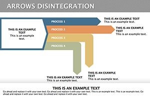
Disintegration Arrows Keynote Diagram Template


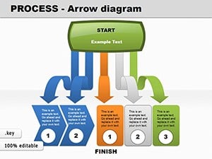
In the fast-paced world of business analysis, clarity is your greatest ally. Imagine transforming complex data sets into visually compelling narratives that captivate your audience and drive decision-making. Our Disintegration Arrows Keynote template is designed precisely for that purpose. With 30 fully editable slides, this tool empowers professionals in quality management, market research, and strategic planning to dissect intricate relationships between variables. Whether you're a consultant unraveling market trends or a team leader outlining project goals, these arrows help you break down concepts into digestible parts, revealing hidden insights that propel your organization forward.
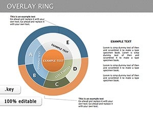
This template isn't just about arrows; it's about disintegration in its most strategic form - showing how elements fragment, interact, and reform to achieve objectives. Compatible with Apple Keynote, it ensures seamless integration on macOS and iOS devices, allowing you to edit text, colors, shapes, and layouts with ease. No more starting from scratch; simply import, customize, and present. Professionals across industries praise its ability to simplify logical relationships, making it a staple for high-stakes meetings where precision matters.
Key Features That Set This Template Apart
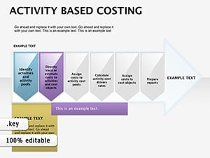
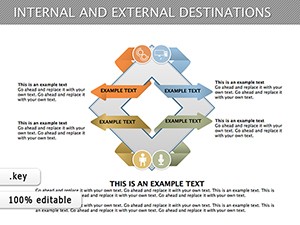
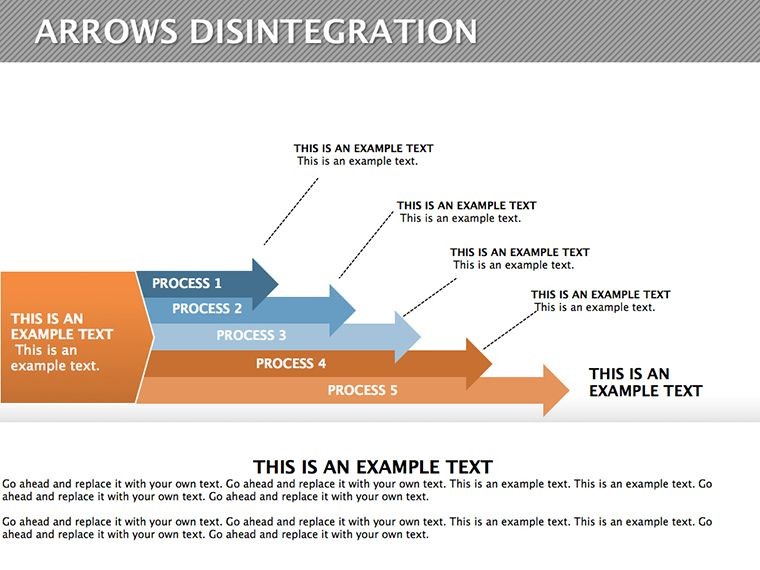
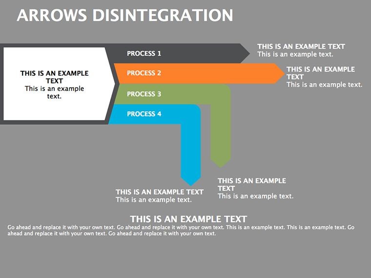
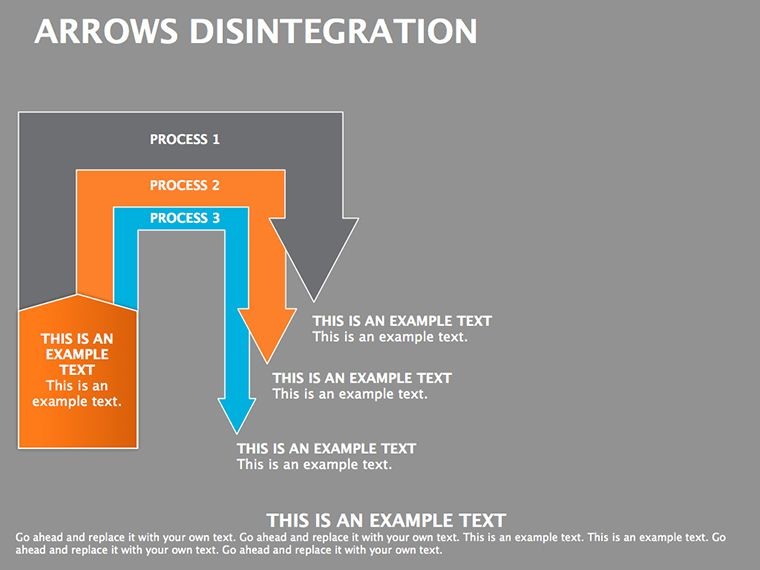
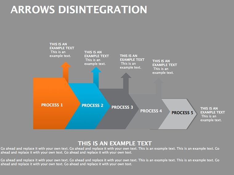
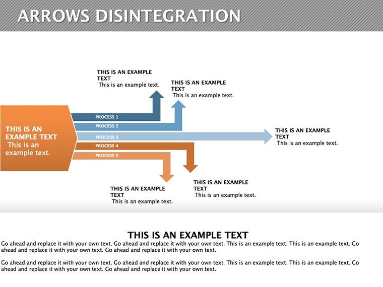
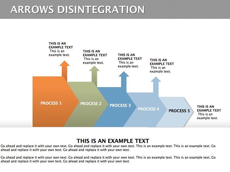
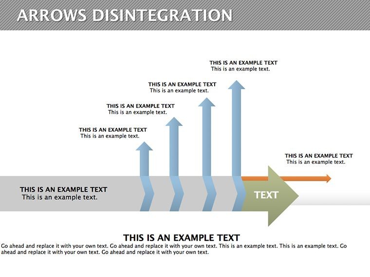
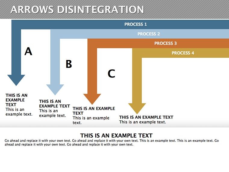
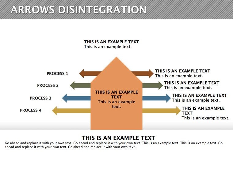
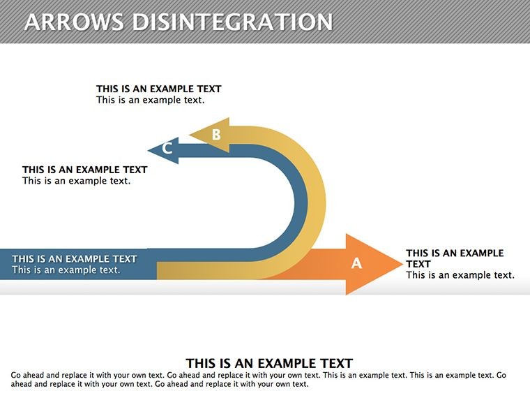
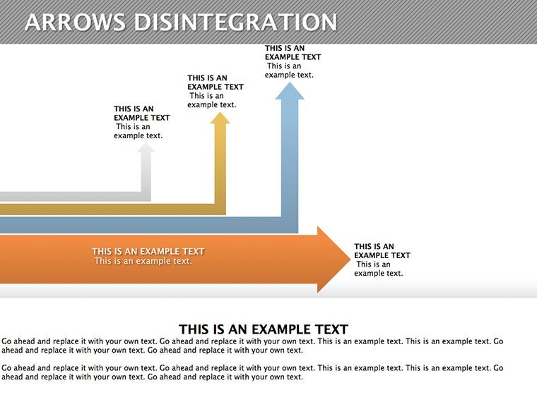
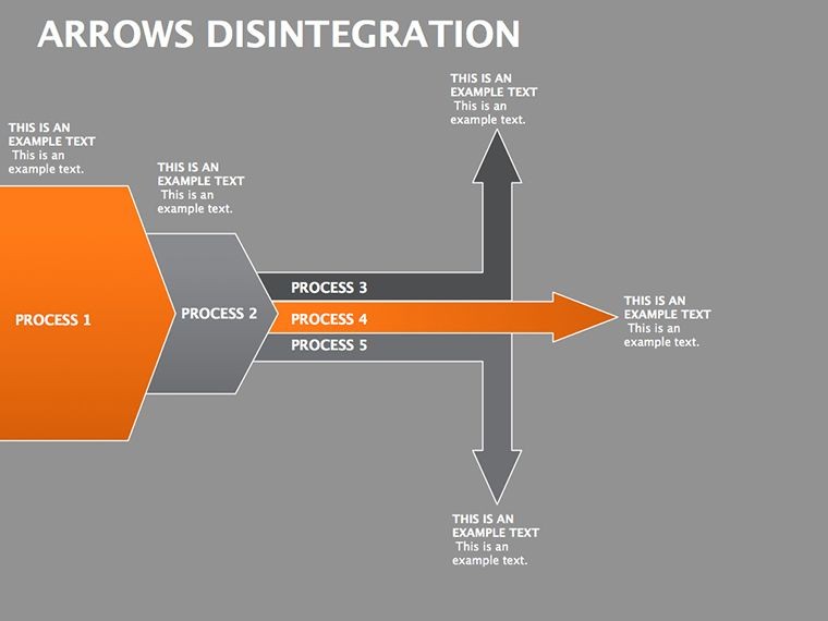
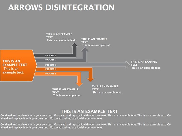
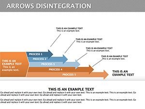
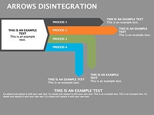
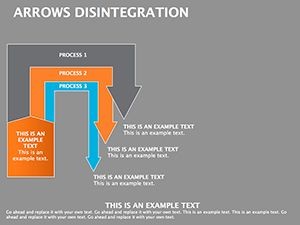
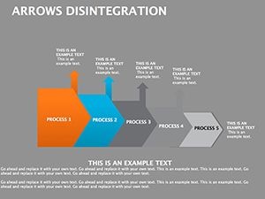
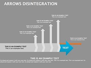
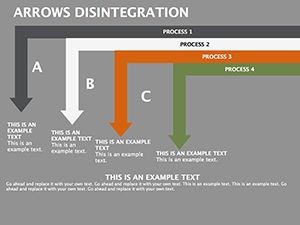
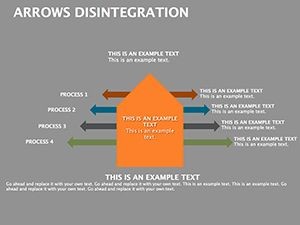
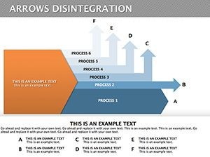
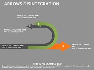
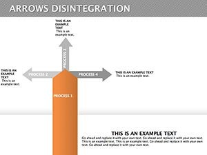
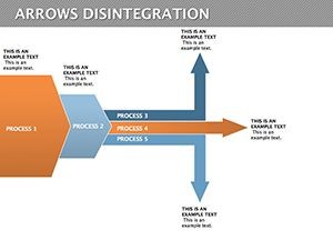
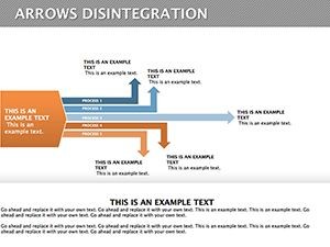
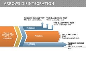
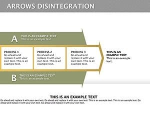
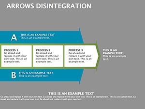
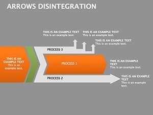
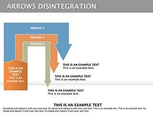
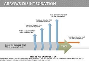
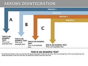
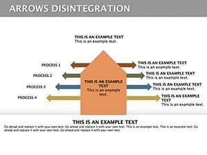
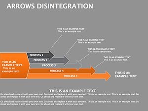
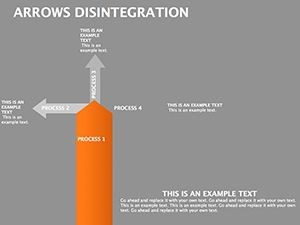
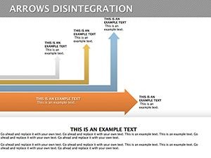
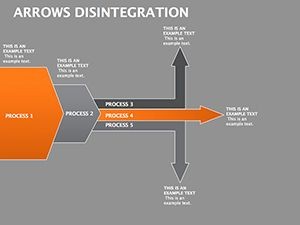
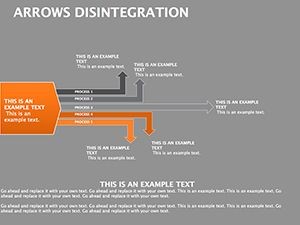
At the heart of this Disintegration Arrows template are features crafted for efficiency and impact. Each of the 30 slides comes with vector-based graphics, ensuring high-resolution quality even when scaled for large screens. The arrows are fully customizable, allowing you to adjust thickness, direction, and color schemes to match your brand's palette. For instance, use dashed lines for hypothetical breakdowns or solid ones for confirmed data paths.
Animation support is built-in, enabling smooth transitions that guide viewers through the disintegration process step by step. This isn't generic; we've incorporated LSI elements like flow diagrams and hierarchical breakdowns, perfect for illustrating cause-and-effect in business scenarios. Compared to basic Keynote tools, this template saves hours by providing pre-designed layouts that adapt to your data, reducing design time by up to 70% based on user feedback from similar tools.
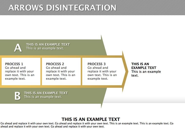
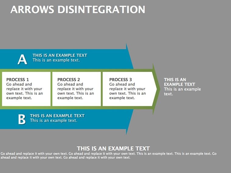
- Editable Elements: Text placeholders, arrow styles, and background options for quick personalization.
- High Compatibility: Works flawlessly with Keynote versions on Mac and iPad, exportable to PDF for sharing.
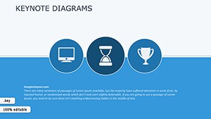
- Themed Icons: Integrated icons for markets, goals, and analysis to enhance visual storytelling.
- Resolution Assurance: Vector graphics prevent pixelation, ideal for professional prints or digital displays.
Real-World Applications and Use Cases
Picture this: A quality manager at a manufacturing firm uses the disintegration arrows to map out defect causes in a production line. By starting with the main issue and arrowing out to sub-factors like material quality or process errors, the presentation not only identifies problems but proposes solutions, leading to a 15% efficiency boost - as seen in case studies from industry leaders like those following ISO 9001 standards.
In market analysis, consultants employ these slides to disintegrate consumer behavior data. For example, an arrow diagram might break down purchase influences into demographics, psychographics, and external factors, helping clients like e-commerce giants refine their strategies. Educators in business schools also find value here, using the templates to teach logical decomposition in strategy courses, making abstract concepts tangible.
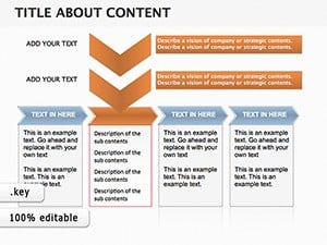
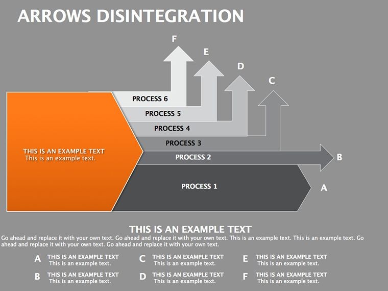
Step-by-step, here's how to apply it: First, identify your core concept - say, a business goal. Then, use the arrows to branch out sub-elements on slide 5's multi-level layout. Customize colors to highlight priorities, add data via integrated charts, and animate for emphasis. This workflow integrates seamlessly with tools like Excel for data import, ensuring your analysis is data-driven and visually engaging.
Benefits for Specific Professionals
For strategists, the template highlights interconnections, fostering better team discussions. Market researchers benefit from its ability to visualize competitive landscapes, turning raw data into actionable insights. Even in non-profits, it aids in disintegrating program impacts, showing how initiatives fragment into community benefits. Unlike standard arrow tools in Keynote, which lack depth, this template offers layered designs that accommodate complex datasets without overwhelming the viewer.
To maximize value, pair it with real-time data sources. For instance, import market stats from Google Analytics and use the arrows to show trend disintegrations over time. This not only boosts presentation professionalism but aligns with principles by demonstrating expertise through structured, authoritative visuals.
Tips for Maximizing Your Presentations
Elevate your slides by incorporating storytelling. Begin with a broad arrow on slide 1 representing the 'big picture,' then disintegrate into details across subsequent slides. Use color psychology - red for urgent breakdowns, blue for stable elements - to guide emotional responses. Always test animations on different devices to ensure smooth delivery.
Avoid common pitfalls like overcrowding slides; the template's clean design encourages minimalism, focusing on key logical relationships. For advanced users, layer arrows with hyperlinks to external docs, creating interactive experiences that impress stakeholders.
In comparisons, this template outshines free alternatives by offering professional polish without watermarks, plus lifetime updates for evolving Keynote features. It's not just a download; it's an investment in your analytical prowess.
Why Choose This Template Today
With 30 slides at your fingertips, you're equipped to handle any analysis challenge. From defining goals in boardrooms to demonstrating market dynamics in pitches, the Disintegration Arrows template transforms data into decisions. Don't settle for mediocre visuals - customize now and watch your presentations soar.
Frequently Asked Questions
- How editable are the disintegration arrows?
- Every element, from arrow shapes to text and colors, is fully customizable in Keynote, allowing quick adaptations to your needs.
- Is this template compatible with older Keynote versions?
- Yes, it works with Keynote 6 and above on macOS, though we recommend the latest for optimal animations.
- Can I use these slides for commercial purposes?
- Absolutely, the template is licensed for professional use in business presentations and reports.
- What file formats are supported for export?
- Easily export to PDF, JPEG, or even PowerPoint with minor adjustments for cross-platform sharing.
- Are there tutorials for using the arrows effectively?
- While not included, our blog offers free guides on diagram best practices tailored to this template.