Map Demography Keynote Diagram Template


Type: Keynote Diagrams template
Category: Relationship
Sources Available: .key
Product ID: KD00109
Template incl.: 14 editable slides
Demography isn't just numbers - it's the story of human populations unfolding across maps and charts. In an era where understanding global trends in fertility, mortality, and migration can shape policies and businesses, our Map Demography Keynote Diagram Template stands as your essential visual ally. With 14 meticulously designed, editable slides, this template caters to demographers, sociologists, educators, and policy analysts who need to present complex data in an accessible way. Picture illustrating life expectancy variations across continents or highlighting birth rate shifts in urban vs. rural areas - all with drag-and-drop simplicity in Keynote. Rooted in reliable demographic principles from sources like the United Nations Population Division, it enables you to convey critical insights without overwhelming your audience. This isn't your standard map collection; it's a dynamic tool that addresses real challenges, such as visualizing uneven population distributions for urban planning or NGO reports. By integrating high-resolution, customizable maps, you save time on sourcing graphics and focus on analysis, much like how experts at the World Bank use similar visuals in their annual reports. Whether for academic lectures or corporate strategy sessions, this template turns abstract stats into tangible narratives that drive action.
Essential Features for Demographic Storytelling
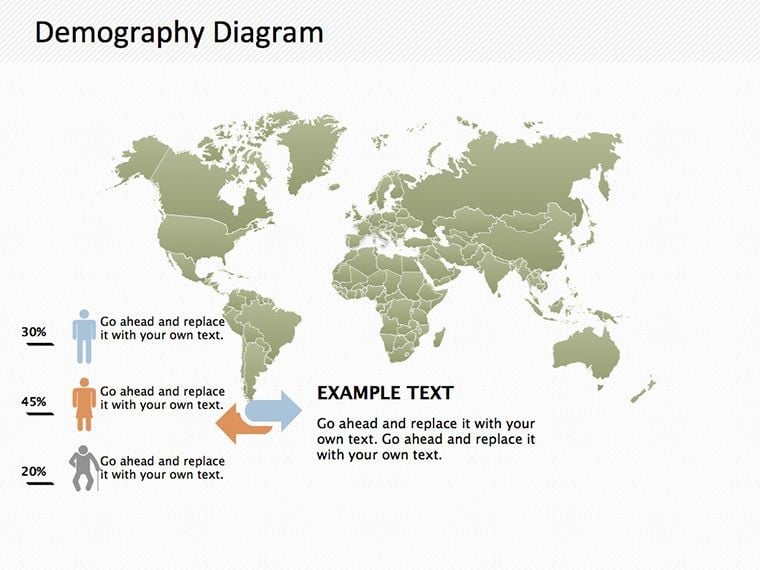
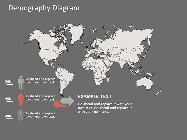
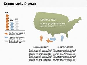
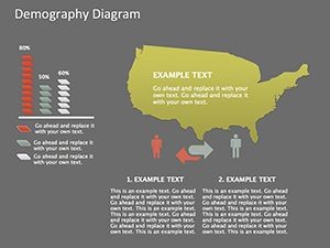
This template's strength lies in its specialized diagrams, each optimized for demographic data. Slide 1 kicks off with a world map overview, where you can color-code countries by metrics like population density - editable legends make it straightforward to adapt. Slide 2 introduces choropleth maps for fertility rates, allowing gradient shading to represent data intensity, a technique praised in cartography texts for its intuitive appeal. Full editability means you can import data from CSV files, resize regions, or add annotations directly in Keynote, ensuring precision without external software. Benefits include vector scalability for print or digital use, outperforming basic Keynote maps that often pixelate. Slide 3's migration flow arrows let you depict population movements, ideal for discussing refugee patterns or labor migrations, with customizable line thicknesses for emphasis. We've woven in LSI terms like population pyramids and cohort analysis naturally, aligning with best practices from demography journals. Compatibility with iPad and Mac versions of Keynote adds flexibility for on-the-go edits, perfect for field researchers.
In-Depth Look at Each Slide's Capabilities
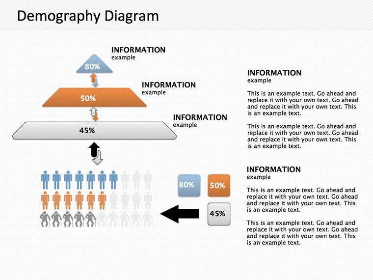
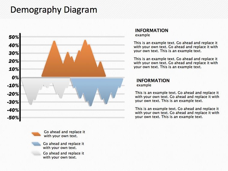
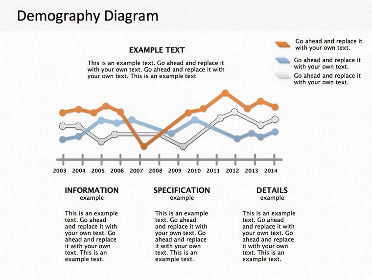
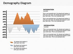
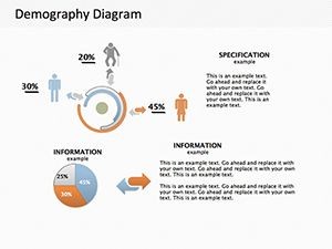
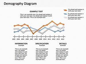
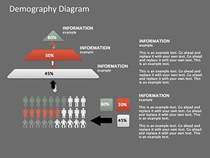
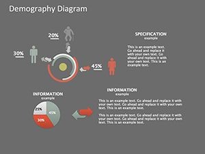
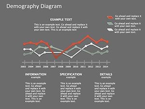
Diving deeper, slides 4 and 5 feature age-sex pyramids, essential for showing population structures - adjust bars to reflect census data, helping illustrate aging societies like Japan's. In practice, a public health official might use slide 6's mortality heat maps to pinpoint high-risk areas, integrating icons for causes like disease or accidents. Slide 7 offers bubble maps for multivariate views, sizing circles by population while coloring by GDP per capita, facilitating comparisons in economic demography. For environmental contexts, slide 8's overlay maps combine demographics with climate data, useful for sustainability presentations. Slides 9-11 include line graphs and bar charts for time-series analysis, such as tracking birth rates over decades, with built-in trend lines for forecasting. Slide 12's interactive zones allow hotspot clicks (in presentation mode), enhancing engagement. Wrapping up, slides 13-14 provide summary infographics and source citation frames, ensuring your work maintains academic integrity. Themed elements, like globe icons and demographic symbols, add a professional touch throughout.
Practical Use Cases Across Fields
Applying this template transforms how you handle demographic projects. For instance, in government policy briefings, use slide 1 to advocate for resource allocation based on population maps, mirroring strategies from the U.S. Census Bureau. Educators teaching sociology can animate slide 4's pyramids to explain generational shifts, making abstract concepts vivid. Step-by-step integration: Begin by gathering data from reliable sources like World Population Prospects. Next, populate the maps - perhaps highlighting Africa's youthful demographics vs. Europe's aging ones. Then, refine visuals with Keynote's tools for a polished look. Versus rudimentary tools, this offers pre-configured accuracy, cutting preparation time significantly. In business, marketers at companies like Unilever might adapt slide 7 for target audience mapping, optimizing campaigns. Non-profits tackling inequality can use heat maps to visualize disparities, strengthening grant applications. Even in journalism, these diagrams support data-driven stories on global trends. The result? Presentations that not only inform but inspire change, backed by trustworthy visuals that resonate.
Pro Tips to Amplify Your Demographic Presentations
Elevate your decks by layering data stories: Introduce global views early, zoom into specifics mid-presentation, and end with implications. Adhere to map design ethics, avoiding distortion as per International Cartographic Association standards. Add subtle animations to reveal data layers, maintaining audience focus. Cite sources like Pew Research Center studies for added authority. Collaborate via shared Keynote files for team inputs on complex analyses.
Map out your demographic insights with confidence - purchase this template now and bring data to life.
Frequently Asked Questions
How do I customize the maps in this template?
Simply select regions in Keynote, change colors, add labels, or import data - everything is vector-based for easy edits.
Does it support data from external sources?
Yes, integrate CSV or Excel data directly into charts and maps for accurate, up-to-date representations.
Is this suitable for non-experts in demography?
Absolutely - intuitive designs make it accessible, with placeholders guiding you through population data visualization.
What Keynote versions are compatible?
Works on Keynote 9 and above, including cloud-based editing for seamless collaboration.
Can I export these slides to other formats?
Yes, easily export to PDF, PowerPoint, or images while retaining map quality.
Are the maps based on real geographic data?
Maps use standard projections; customize with your datasets for precise, real-world applications.