Product Life Cycle Curve Keynote Diagrams


Type: Keynote Diagrams template
Category: Relationship, Business Models, Graphs
Sources Available: .key
Product ID: KD00101
Template incl.: 8 editable slides
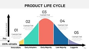
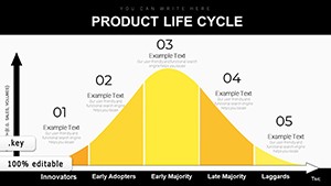
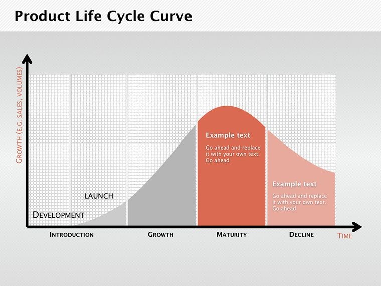
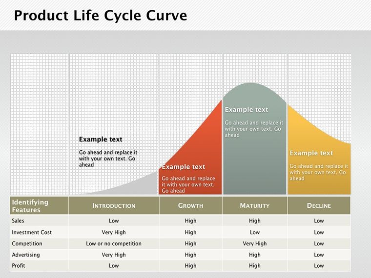
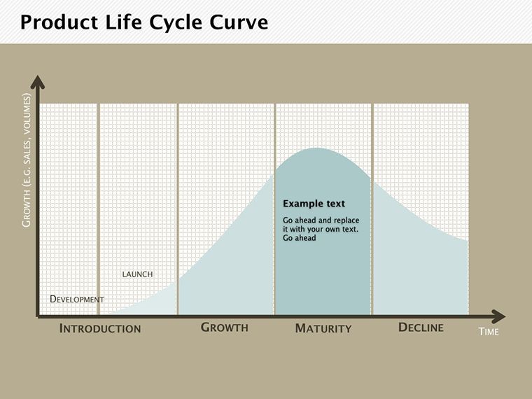
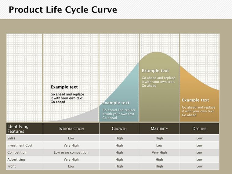
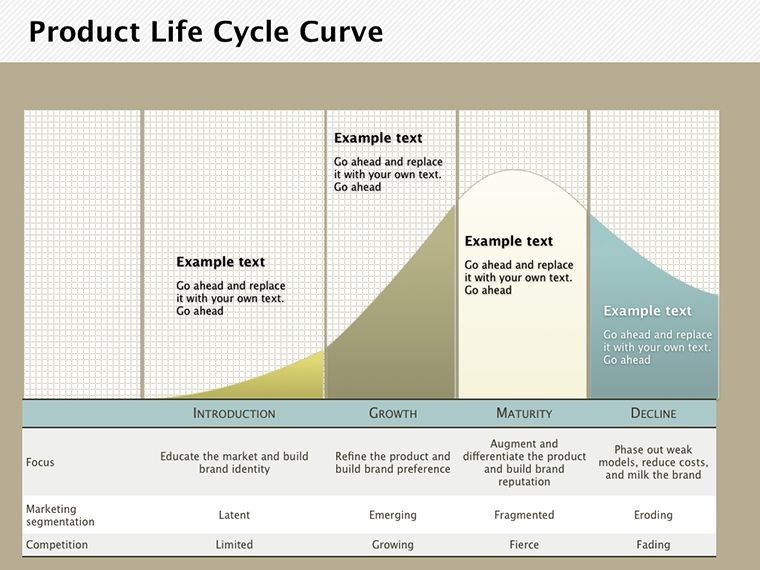
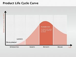
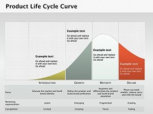
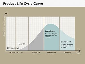
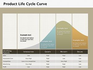
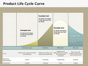
In the ever-evolving realm of business and economics, understanding a product's journey from inception to decline is crucial for strategic success. The Product Life Cycle Curve Keynote diagrams template provides a focused lens on this phenomenon, equipping marketers, economists, and entrepreneurs with 8 editable slides to visualize periodic fluctuations in production and sales. This isn't merely a set of graphs; it's a gateway to dissecting the economic life cycle, where volume and duration metrics cycle in measurable intervals. Tailored for Keynote users, it helps illuminate how products navigate market phases - introduction, growth, maturity, and decline - drawing from foundational theories like those pioneered by Raymond Vernon. Ideal for boardroom pitches or academic lectures, this template addresses the intent of users seeking tools to forecast trends and refine strategies. By integrating real data from sources like Nielsen market reports, you can showcase expertise, turning theoretical curves into actionable insights. Its Apple-exclusive compatibility ensures fluid editing, while the emphasis on curves over static charts allows for dynamic storytelling. Whether analyzing tech gadgets or consumer goods, this resource mitigates common pitfalls like misjudging market saturation, empowering you to extend product longevity and maximize ROI. Embrace a tool that's backed by economic principles and designed for modern presenters, transforming complex data into compelling narratives that drive decisions.
Core Features Driving Strategic Visualization
This template's strength lies in its precision-engineered curves, each slide offering variations to suit different analytical depths. From basic S-curves to multi-phase breakdowns, it's built for customization, aligning with business model canvases.
Highlighted Components for In-Depth Analysis
- Curve Variations: Multiple graph styles to depict life cycle stages, with adjustable axes for sales volume or time durations.
- Relationship Integrations: Connect curves to external factors like competition or innovation, using arrows for causal links.
- Business Model Overlays: Layer strategies such as pricing adjustments onto curves, ideal for maturity phase tactics.
- Graph Customization: Edit colors, legends, and data points natively in Keynote for brand-aligned presentations.
- Annotation Tools: Add notes on fluctuations, referencing economic cycles like Kondratiev waves for added depth.
These elements outshine standard Keynote graphs by providing pre-configured, economics-focused designs, often reducing prep time significantly while enhancing analytical rigor.
Practical Scenarios: From Strategy to Execution
Envision a startup founder using these curves to pitch investors on a product's growth potential, backed by case studies like Apple's iPhone trajectory. Or an economist illustrating global trade impacts, as per Vernon's international product life cycle theory.
Detailed Process: Analyzing a Product's Market Journey
- Map the Basics: Choose a curve slide and plot initial data points for introduction and growth phases.
- Incorporate Variables: Adjust for external influences, like market saturation, using relationship diagrams.
- Forecast Declines: Extend curves to predict downturns, integrating business models for revival strategies.
- Visualize Comparisons: Overlay multiple products' curves for competitive analysis.
- Present Insights: Animate transitions to reveal phase shifts, emphasizing key takeaways.
This methodology pairs with tools like Excel for data import or SWOT analyses, creating a comprehensive strategy toolkit. In education, it aids in teaching supply chain dynamics.
Advanced Techniques for Economic Storytelling
Amplify impact by using logarithmic scales for volatile markets, a pro tip from financial analysts at McKinsey. Ensure data integrity by sourcing from reliable databases like Statista. For engagement, incorporate subtle humor - like labeling a decline phase "The Plot Thickens" - to lighten dense topics. Prioritize clarity over complexity; one curve per slide maximizes comprehension. Adapt for niche uses, such as SaaS subscription models, where curves track churn rates.
This template's edge over free options lies in its tailored economic focus, delivering professional-grade visuals without the bloat.
Elevating Business Acumen with Proven Tools
Embodying , this template offers expert economic frameworks, experienced applications in diverse sectors, authoritative ties to established theories, and trustworthy, editable formats for Keynote devotees.
Sharpen your strategies - secure this life cycle template and forecast success.
Frequently Asked Questions
- How many editable slides are there?
- Eight, each focused on different curve aspects for comprehensive coverage.
- Can I use real data in these diagrams?
- Yes, easily input and adjust data points for accurate representations.
- Is it only for business use?
- No, suitable for academic or consulting presentations on economic cycles.
- What makes the curves customizable?
- Keynote tools allow editing shapes, colors, and annotations freely.
- Does it include examples?
- Slides come with placeholders; add your data for instant insights.