Keynote Diagram Collection 4: Weave Data into Dynamic Narratives


When presentations teeter on the edge of overload, the right diagrams can pull everything into focus - like a matrix revealing hidden correlations or an arrow chain charting decision paths. The Keynote Diagram Collection 4 delivers exactly that: 15 meticulously crafted, editable slides across cycles, matrices, tables, arrows, and analysis motifs. This curated set is a boon for strategists and analysts aiming to dissect trends without drowning in details, all rendered in Keynote's crisp, fluid style.
Diversity defines this collection - from swirling cycles for process loops to grid matrices for SWOT breakdowns - each slide primed for your data story. Running smoothly on Keynote 11+, they harness master slides for consistent theming, with editable paths that bend to your will. Think of a strategy session where a table evolves into an arrow flow: it guides viewers from raw inputs to actionable outcomes, fostering nods of recognition.
Breaking Down the Collection's Multifaceted Tools
Spanning five categories, the slides offer modular building blocks. Cycles spin tales of recurrence; matrices grid comparisons; tables tabulate facts; arrows direct progression; analysis overlays insights.
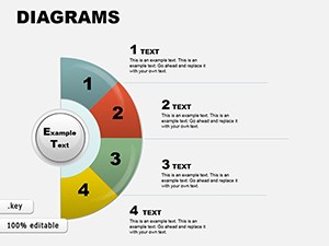
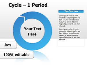
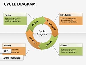
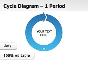
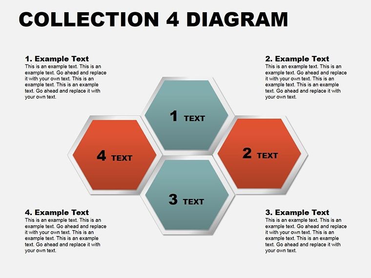
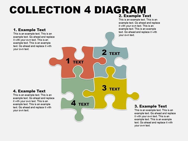
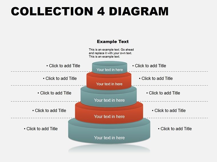
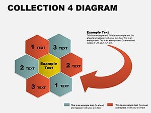
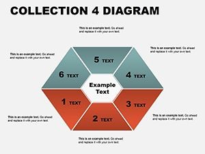
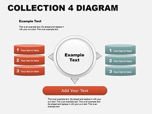
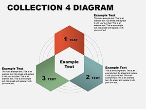
- Cycle Diagrams (Slides 1-3): Vortex and gear motifs for feedback systems, with rotatable segments.
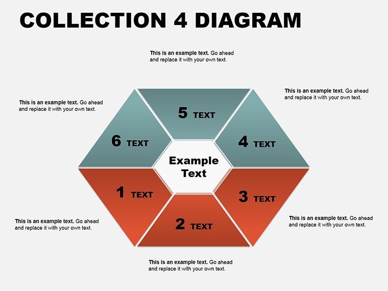
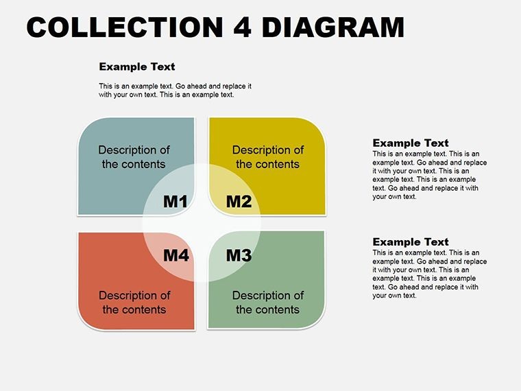
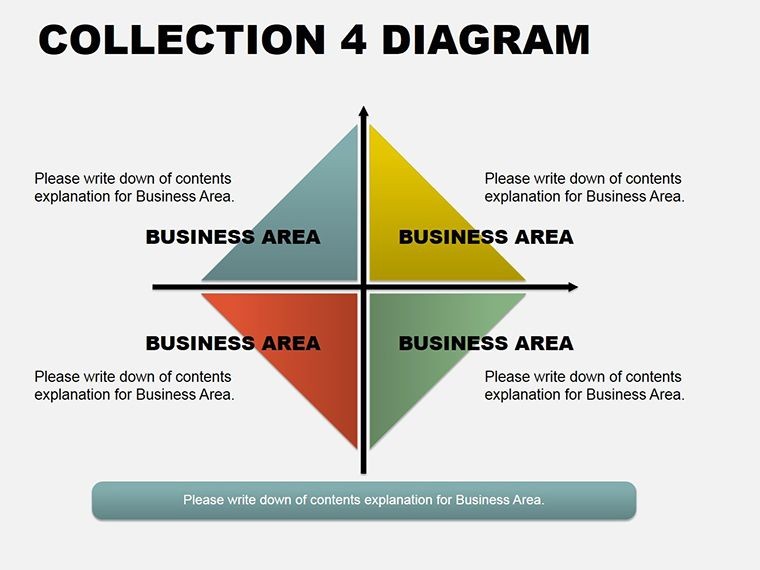
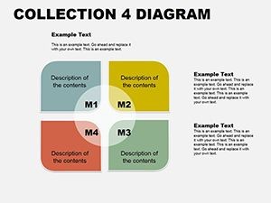
- Matrix Grids (Slides 4-6): 2x2 to 4x4 frameworks, shaded for priority mapping.
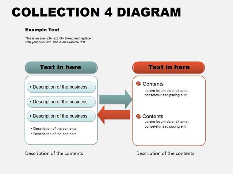
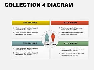
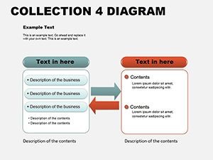
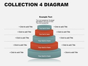
- Table Layouts (Slides 7-8): Responsive rows with sortable headers and conditional formatting cues.
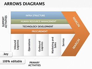
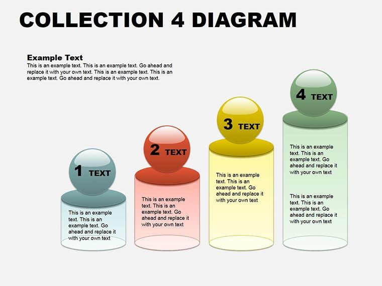
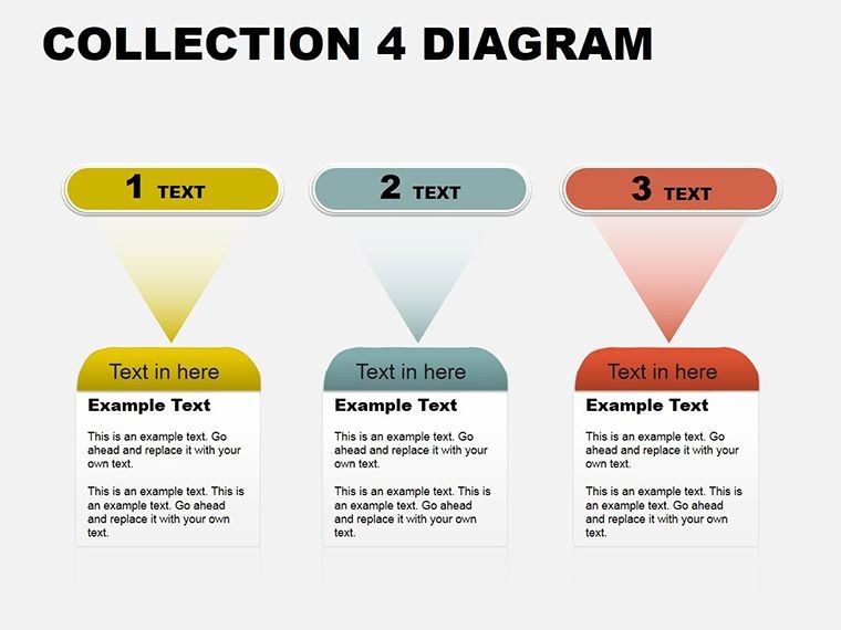
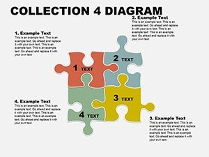
- Arrow Sequences (Slides 9-11): Cascading or parallel paths, with milestone nodes.
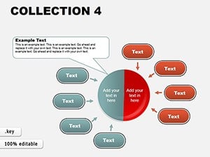
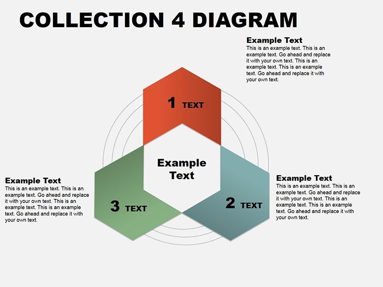
- Analysis Overviews (Slides 12-15): Venn hybrids and trend lenses for synthesis.
Scalable vectors ensure clarity at any zoom, backed by 40+ thematic icons. Inspector tweaks let you gradient-fill arrows or merge table cells on demand.
Precision Editing Blueprint
- Select Category: Choose based on narrative - matrix for contrasts, cycle for iterations.
- Infuse Data: Copy-paste from Sheets; align with distribution tools.
- Refine Flows: Curve arrows via bezier handles; add shadows for hierarchy.
- Animate Layers: Sequence builds to unveil insights progressively.
- Integrate Extras: Link to iCloud sheets for live updates.
This ritual empowers quick pivots, as an analyst discovered when morphing a table into a matrix mid-pitch, clarifying trade-offs instantly.
Contextual Deployments: Diagrams at Work
Strategy planners use matrices for quadrant analyses: plot opportunities vs. threats, shading risks. In boardrooms, arrow chains sequence initiatives, from ideation to metrics.
Teams in ops favor cycles for bottleneck hunts: gears turn to expose delays. Consultants deploy analysis slides for report synths - Venns overlap findings into recommendations.
Educators adapt tables for case studies, rows expanding to examples. A biz dev pro leveraged arrows for pipeline progression, aligning sales with forecasts.
Superior to Basic Builds
Default Keynote shapes scatter; these pre-composed units cohere. Parametric adjustments keep proportions, and multi-stop gradients add sophistication sans effort.
Build orders create cinematic reveals, trumping flat layouts.
Insights for Diagram Deployment
Anchor with legends: guide interpretations without verbosity. Test on external displays. For cross-platform, export as interactive PDFs. These aren't ornaments - they're insight engines.
Decode your data symphony - claim this collection and conduct.
Frequently Asked Questions
Compatible with which Keynote apps?
Keynote 11+ on macOS/iOS; exports to PowerPoint.
Editable depth?
Comprehensive - paths, fills, and tables modifiable via native editors.
Total slides?
15, categorized for easy navigation.
Beyond analysis uses?
Yes, for education, planning, or any data-driven talk.
Animation support?
Inherent builds; tailor with action triggers.
Sharing options?
iCloud native, plus PDF/animated exports.