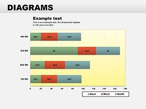
Collection Data Pie Keynote Diagrams


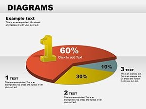


Imagine slicing through layers of numbers to reveal stories that stick - that's the power of well-crafted pie charts in your Keynote presentations. Whether you're a marketing analyst breaking down market shares or a project lead illustrating budget allocations, this Collection Data Pie Keynote Diagrams template turns raw data into digestible, eye-catching visuals. With 22 fully editable slides, you'll find everything from classic segmented pies to layered designs that highlight nuances in your datasets. Designed for professionals who need to communicate insights without overwhelming their audience, this template streamlines your workflow, letting you focus on the narrative rather than fiddling with shapes and colors.
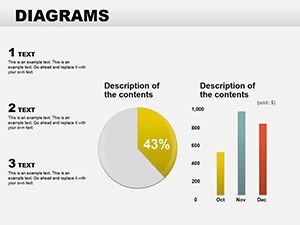
At its core, a pie chart isn't just a circle divided into slices; it's a tool for emphasis. Think of how a single glance at a well-proportioned pie can convey market dominance or resource distribution far better than a dense spreadsheet. This template builds on that principle, offering variations that adapt to your story - be it a simple two-slice comparison for quick decisions or a multi-segment explosion for detailed breakdowns. Compatible with Keynote on macOS and iOS, these slides integrate seamlessly into your existing decks, ensuring your presentations feel cohesive and professional.
Unlocking the Versatility of Pie Chart Designs
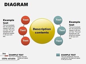
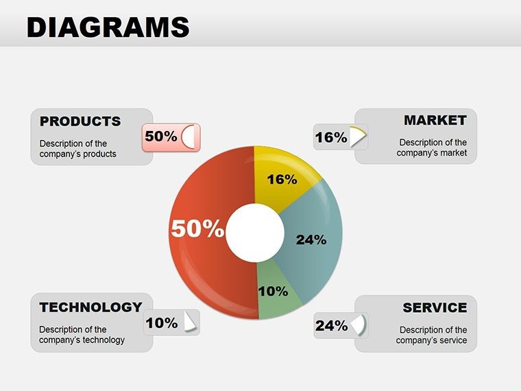
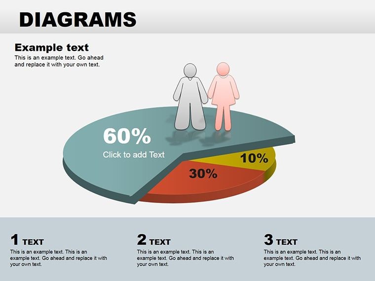
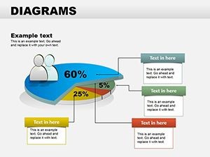
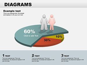
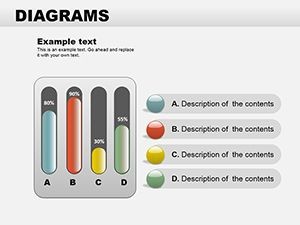
Start with the basics: our template includes straightforward pie charts that load your data with minimal effort. Drag and drop your figures into the placeholders, and watch as the segments resize automatically. But don't stop there - explore the donut-style variations, which add a modern twist by revealing a central message or icon in the empty core. Ideal for emphasizing a key takeaway, like "80% customer retention" with a bold stat in the middle.
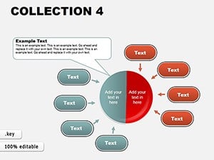
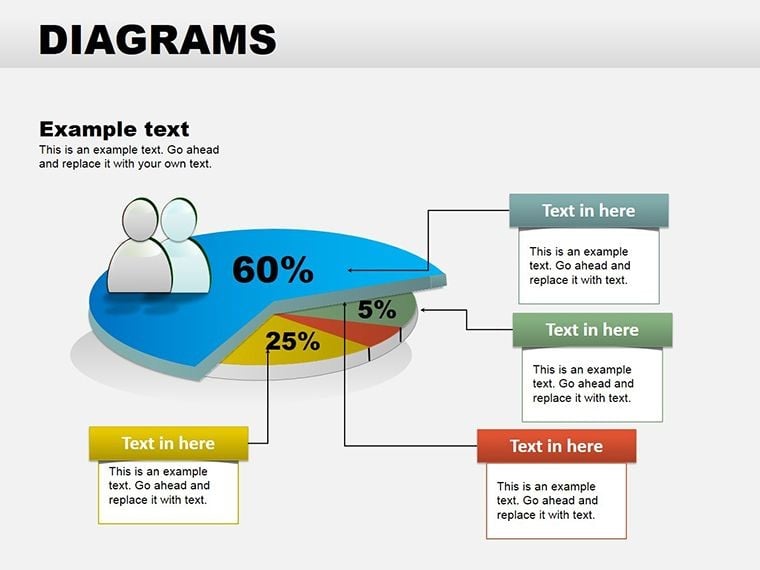
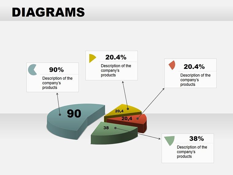
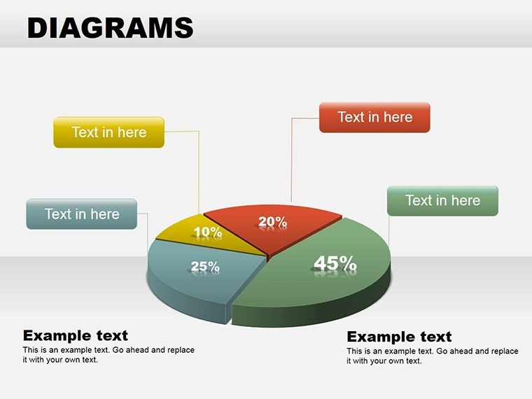
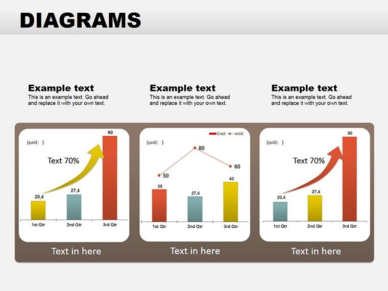
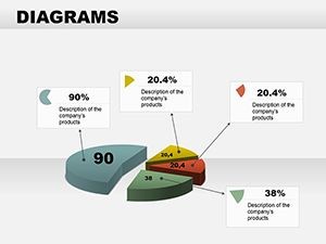
For more dynamic storytelling, dive into the 3D pie charts. These add subtle depth without the distortion pitfalls of overdone effects, making your data feel tangible. Use them in sales pitches to show revenue streams, where the protruding slices draw the eye to top performers. And for those intricate reports, the exploded pie sections let you pull out specific categories for closer inspection, perfect for investor updates where every detail counts.
- Customization at Your Fingertips: Swap colors to match your brand palette - vibrant blues for growth metrics or earthy tones for sustainability reports.
- Animation-Ready: Built-in transitions make slices build sequentially, guiding your audience through the data flow like a guided tour.
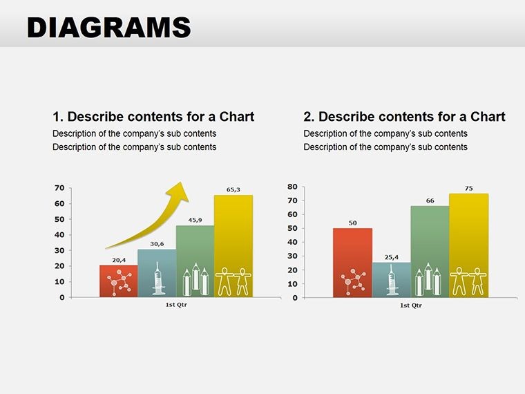
- Icon Integration: Pair slices with thematic icons, turning a financial pie into a visual roadmap of expenses.
Step-by-Step: Building Your First Pie Chart Slide
- Select Your Data: Gather your categories and percentages - keep it to 5-7 slices max for clarity.
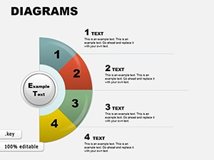
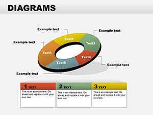
- Choose a Layout: Pick from the template's gallery; opt for a radial pie if your data radiates from a central theme.
- Input and Adjust: Enter values in the linked table; Keynote auto-updates the chart while you tweak fonts for readability.
- Add Context: Overlay a subtle shadow or gradient to enhance depth, then test the slide in presenter view.
- Animate for Impact: Set a spin-in effect for the whole pie, followed by sequential slice reveals to build suspense.
This process, honed from real-world decks like those used in quarterly board meetings, ensures your visuals support rather than distract from your message.
Real-World Applications That Drive Decisions
In the fast-paced world of business analytics, time is your scarcest resource. This template shines in scenarios where clarity trumps complexity. Take a product manager unveiling launch metrics: a pie chart slice for user acquisition channels instantly shows where marketing dollars yield the best ROI, sparking targeted discussions. Or consider educators mapping curriculum overlaps - a Venn-inspired pie hybrid (adaptable from our base designs) clarifies interdisciplinary connections, making lesson plans more intuitive.
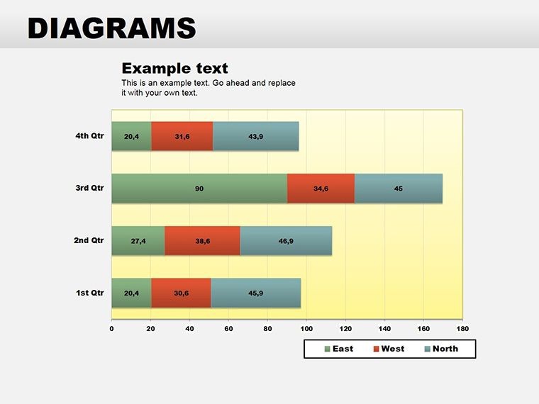
Shift to non-profits, where donor breakdowns demand transparency. Use the template's gradient pies to color-code contribution types, fostering trust with stakeholders. Even in healthcare, visualize patient demographics with soft, approachable hues, ensuring reports resonate on a human level. Each application leverages the template's editable nature, allowing you to iterate based on feedback without starting from scratch.
Compared to default Keynote charts, which often feel flat and uniform, these designs inject personality. No more wrestling with alignment tools; everything snaps into place, saving you hours per deck. And for teams collaborating remotely, the shared Keynote format means seamless handoffs, with changes reflected in real-time.
Tailoring for Your Industry
Marketing Teams: Highlight campaign performance with explosive pies that pop key wins.
Finance Pros: Opt for minimalist lines to maintain a clean, authoritative look in audits.
Design Consultants: Layer textures for creative pitches, echoing trends from firms like Pentagram.
These tweaks ensure your slides not only inform but inspire action, turning passive viewers into engaged partners.
Enhancing Engagement with Pro Tips
To maximize impact, pair your pies with complementary elements. Start with a strong title slide that teases the data story, then flow into your charts with smooth transitions. Limit text overlays to 3-5 words per slice - let the visuals do the heavy lifting. For accessibility, ensure high contrast ratios; the template's defaults pass WCAG guidelines, but always double-check with Keynote's built-in tools.
Workflow integration is key: import this template into your master deck for consistency across projects. Use it alongside timelines for a holistic view - imagine a pie feeding into a Gantt chart, showing how budget slices align with milestones. This interconnected approach, reminiscent of how strategists at McKinsey structure reports, elevates your entire presentation.
Download this template today and transform how you handle data. At just $24, it's an investment in clearer communication that pays dividends in every meeting.
Frequently Asked Questions
What makes these pie charts different from Keynote's built-in options?
Our designs offer pre-styled variations with advanced animations and icon sets, saving setup time while adding professional polish.
Can I use this template on iPad?
Yes, it's fully compatible with Keynote on iOS devices, allowing edits on the go.
How do I update the data in the charts?
Simply edit the linked data table on a hidden slide; changes propagate instantly to all visuals.
Are there animation presets included?
Absolutely - choose from build-in, fade, or rotate effects tailored for data reveals.
Does it work with older Keynote versions?
Optimized for Keynote 2016 and later; for earlier, some animations may need manual tweaks.
Can I resell presentations made with this template?
Yes, for commercial use, as long as the template itself isn't redistributed.