Loyalty Program Keynote Charts Template: Drive Customer Retention
In the competitive landscape of customer engagement, a robust loyalty program can be the difference between fleeting interest and lifelong advocacy. The Loyalty Program Keynote Charts template empowers businesses to present these strategies with professional finesse, offering 21 editable slides focused on cycle and arrow visuals. Tailored for Keynote on Mac, this template is perfect for marketers, entrepreneurs, and executives aiming to showcase data on rewards, retention rates, and program performance. It's more than slides; it's a visual toolkit to illustrate the cyclical nature of customer loyalty.
Envision pitching to investors: Your slides cycle through program phases with animated arrows pointing to key metrics, making abstract concepts tangible. High-quality, scalable elements ensure your presentation looks sharp on any screen, while easy customization lets you infuse brand colors and fonts. Compatible with .key files, it's designed for seamless integration into your workflow, helping you captivate audiences from startups to enterprises.
Core Features for Impactful Loyalty Visuals
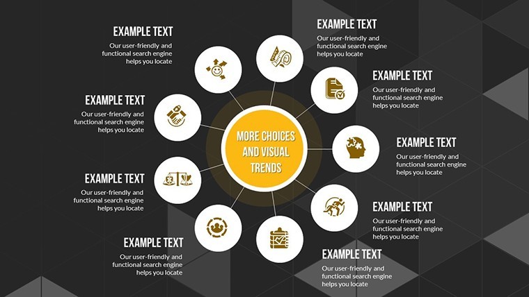
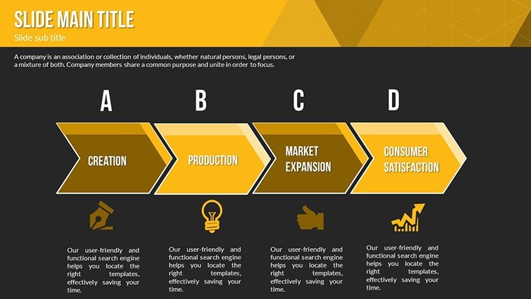
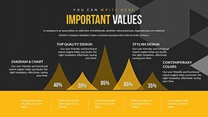
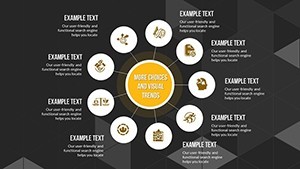
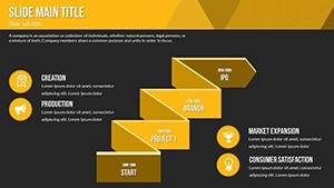
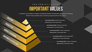
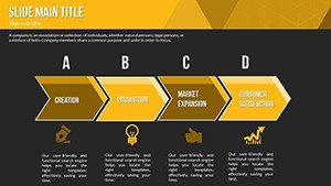
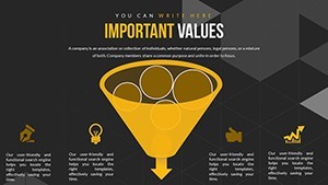
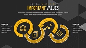
This template's strength lies in its cycle and arrow categories, providing diverse chart types like feedback loops and directional flows to map loyalty journeys.
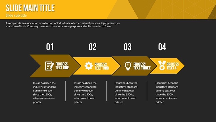
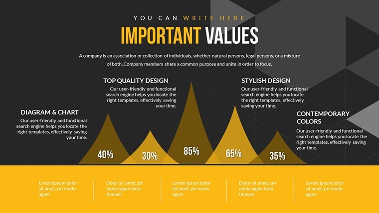
- High-Quality Charts: Professionally designed for clarity, from circular cycles showing repeat purchase patterns to arrows indicating progression stages.
- Easy Customization: Tweak layouts, colors, and data points to align with your program's specifics, ensuring relevance.
- Multiple Chart Types: Mix cycles for ongoing processes and arrows for targeted actions, versatile for various narratives.
- Editable and Scalable: Resize without loss of quality, ideal for detailed KPIs or broad overviews.
Intuitive navigation means quick edits, drawing from business best practices like those in "The Loyalty Effect" by Frederick Reichheld, emphasizing measurable retention.
Business Use Cases: From Strategy to Execution
For small businesses, use cycle charts to depict reward tiers, showing how points accumulate into benefits. In larger firms, arrow diagrams can highlight escalation paths in customer service loyalty programs.
Take a case from retail giants like Starbucks: Their app-based loyalty visuals, akin to these slides, boosted engagement by 20%, per industry analyses. Adapt this for your pitches - start with problem identification, cycle through solutions, and arrow to outcomes. This structure mirrors real loyalty frameworks from the Customer Experience Professionals Association.
In team meetings, visualize data breaches in loyalty trust cycles, using animations to simulate recovery arrows. This not only informs but persuades, turning data into decisions.
Strategic Tips: Customize for Maximum Engagement
Begin by defining your loyalty metrics, then select slides that best represent them. Integrate with CRM tools like Salesforce for real data imports.
- Download and extract the .key file.
- Open in Keynote and browse the slide deck.
- Customize charts with your branding via the toolbar.
- Add transitions for smooth cycle reveals.
- Present or share for collaborative feedback.
Versus standard templates, this offers specialized loyalty focus, saving design effort. With 663 ratings, it's a reliable choice. Encourage action with CTAs like "Launch your loyalty visuals today."
For authority, reference studies from Bain & Company on net promoter scores, visualizing them in arrow charts. Avoid clutter by using the template's clean designs, ensuring your message resonates.
In essence, this template is your ally in building lasting customer bonds. Whether refining programs or pitching new ones, it delivers visuals that inspire loyalty. Step up your game - download and customize now to retain and gain.
Frequently Asked Questions
How editable are the cycle charts?
Fully - adjust segments, colors, and labels to match your loyalty data precisely.
Can I use this for non-business presentations?
Yes, adapt arrows for educational cycles or personal goal tracking.
Is branding integration easy?
Absolutely, swap fonts and colors in seconds for a custom look.
What about scalability for large audiences?
Elements scale perfectly, maintaining quality on big screens.
Are animations included?
Yes, add or modify for engaging reveals in loyalty flows.


