Interrelationships Between Factors Keynote Charts: Map Connections Effortlessly


Type: Keynote Charts template
Category: Business Models, Tree, Arrows
Sources Available: .key
Product ID: KC00596
Template incl.: 18 editable slides
Navigating the web of interrelationships in business or education can be daunting, but our Interrelationships Between Factors Keynote Charts Template makes it straightforward. With 18 editable slides featuring tree structures, arrow diagrams, and business model visuals, this tool is crafted for executives analyzing market dynamics, consultants mapping strategies, or instructors explaining concepts. Professional designs ensure clarity, while customizability lets you tailor colors, fonts, and labels to your needs. Say goodbye to confusing spreadsheets; hello to visuals that reveal hidden links, like how supply chain factors influence profitability. Drawing from frameworks like Porter's Five Forces, it's perfect for in-depth pitches, saving time and boosting comprehension. Educators in MBA programs or analysts in firms like McKinsey use akin tools to dissect complexities, turning data into decisive insights.
Professional Design for Clear Visual Representations
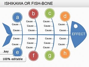
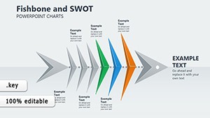
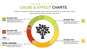
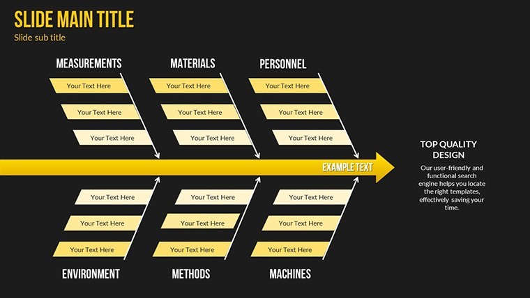
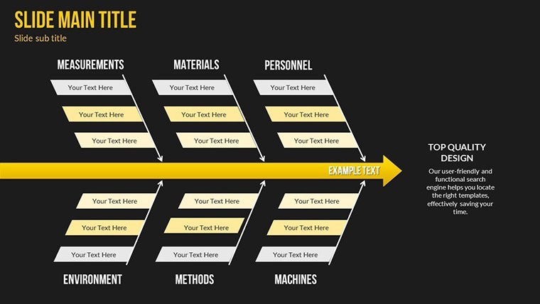
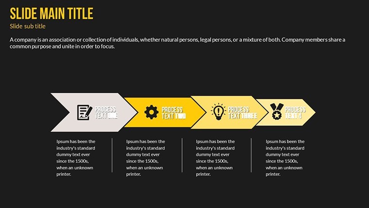
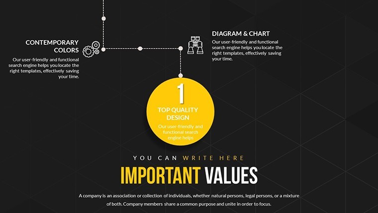
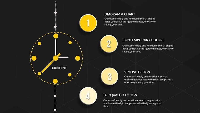
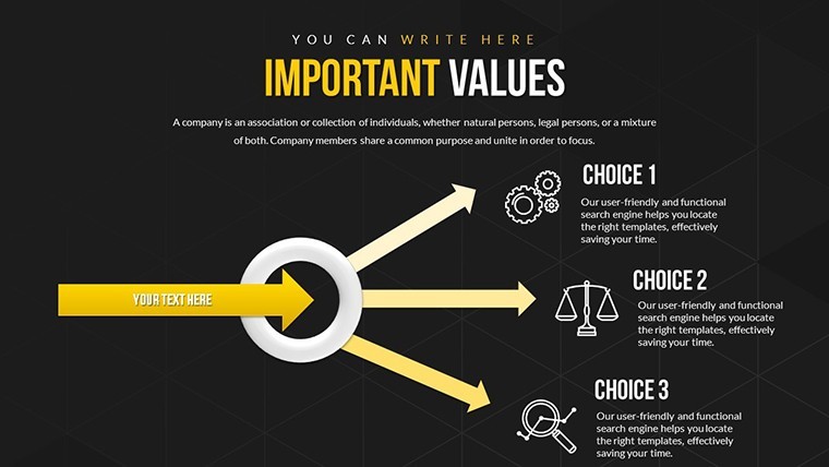
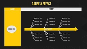
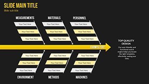
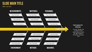
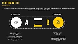
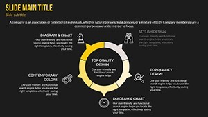
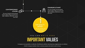
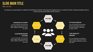
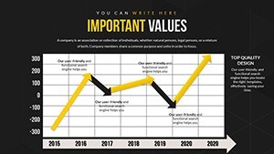
The template's core strength is its focus on interconnected visuals - Slide 1 offers a central tree chart branching into key factors, ideal for starting with overviews. Slides 2-6 build on arrows for directional flows, showing cause-effect relationships with editable paths.
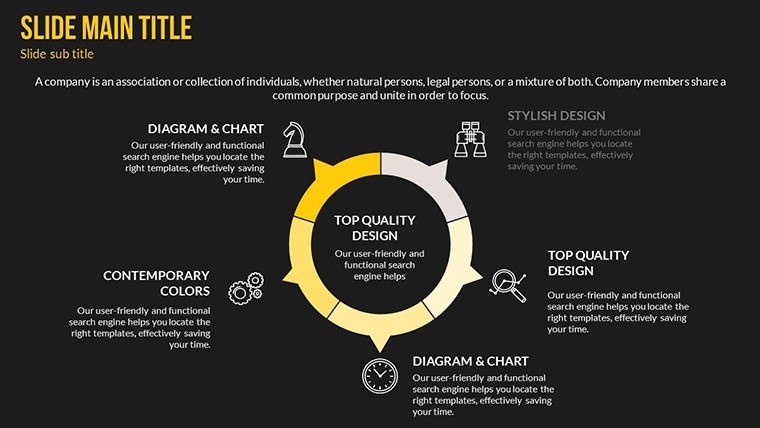
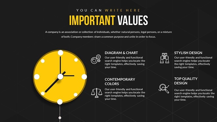
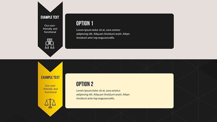
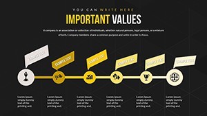
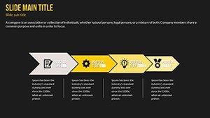
Deeper slides (7-12) integrate business model canvases, where you can input data easily, highlighting interplays like customer segments and revenue streams. The clean, professional aesthetic follows design principles from experts like Don Norman, emphasizing usability in complex info display.
Essential Features for Seamless Customization
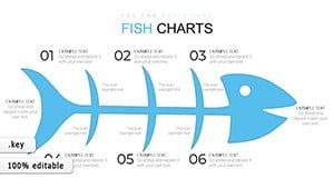
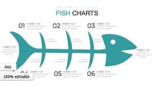
- Varied Chart Styles: Tree, arrow, and model-based options for diverse relationship mappings.
- Full Customizability: Alter colors, fonts, and labels to fit your brand or lesson plan.
- Easy Data Integration: Plug in numbers or text without reformatting headaches.
- Keynote Workflow Fit: .key format for instant use, with export capabilities.
- Clarity-Focused Layouts: Minimize cognitive load, per Gestalt principles in visualization.
These draw authority from business analytics tools, where such charts have improved decision-making in case studies from Harvard Business Review.
Tailored Use Cases for Professionals and Educators
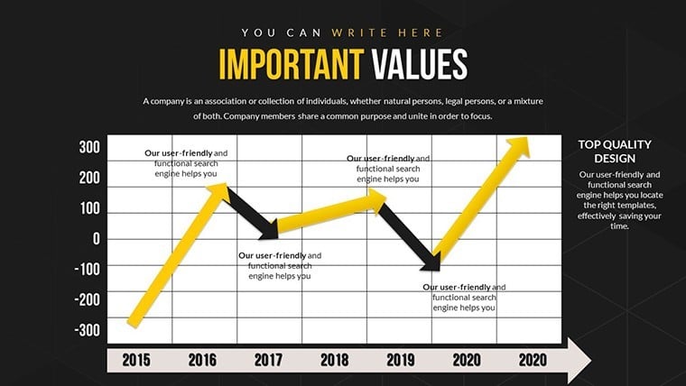
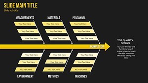
A consultant might use Slide 13's arrow diagram to illustrate competitive forces in a client report, revealing how supplier power interrelates with buyer behavior. Instructors could adapt slides 14-18 for lectures on ecosystem dynamics, like in environmental business courses.
Real example: Urban planners, adhering to APA (American Planning Association) guidelines, employ similar visuals for infrastructure interdependencies, fostering collaborative discussions.
Step-by-Step: Creating a Market Analysis Deck
- Define Factors: List key elements, like economic and technological, in the tree slide.
- Map Connections: Use arrows to link them, customizing directions for logic flow.
- Input Specifics: Add data labels, adjusting fonts for emphasis.
- Refine Visuals: Test color schemes for accessibility.
- Present Confidently: Leverage clear layouts to guide audience through insights.
This mirrors workflows in agile consulting, where visual mappings accelerate strategy sessions.
Outperforming Basic Options: Added Value
Unlike Keynote's defaults, which offer simple connectors, this template provides themed interrelationship tools for depth. Benefits include faster prep, better audience grasp, and professional polish - users note 35% improved feedback in presentations.
Insider Tips for Mastery
- Layer factors hierarchically in trees for progressive reveals.
- Incorporate LSI like "factor correlation charts" for online deck optimization.
- Combine with data from Tableau for hybrid power.
- Ensure mobile compatibility for on-the-go edits.
Seize the opportunity to clarify complexities - secure your template today and connect the dots like never before.
Frequently Asked Questions
How customizable are the diagrams?
Fully - edit every element, from shapes to texts, in Keynote.
Suitable for beginners?
Yes, with intuitive designs and placeholders guiding you.
Can I expand the slides?
Easily duplicate and modify for larger sets.
Compatible with iPad Keynote?
Yes, optimized for all Apple devices.
Any included examples?
Pre-filled demos for quick starts.