SDG Keynote Charts Template - Fully Editable


Type: Keynote Charts template
Category: Tables
Sources Available: .key
Product ID: KC00592
Template incl.: 18 editable slides
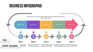
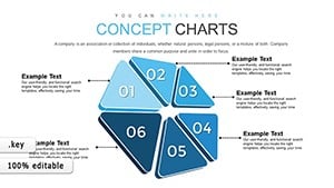
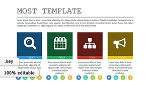
18 Slides and Indicators: What You Get
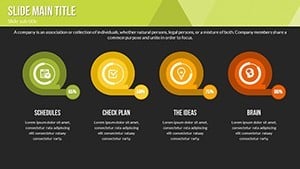
18 editable slides arrive with progress indicators and comparative analyses ready for Keynote.
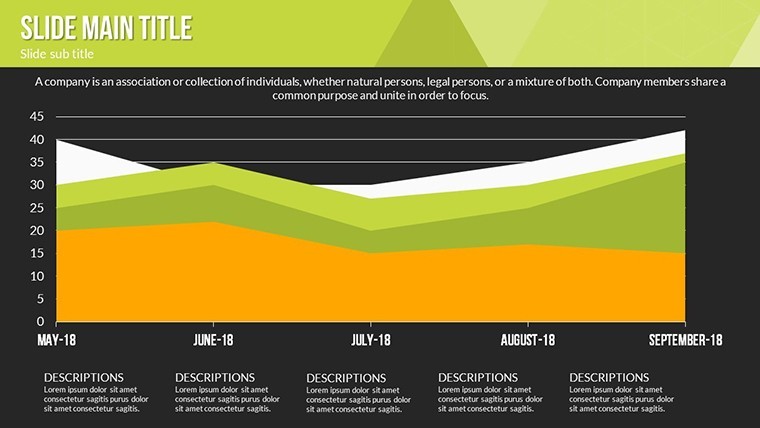
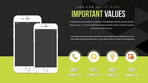
Vibrant colors from nature blend with subtle gradients and clean lines to make abstract targets readable across devices.
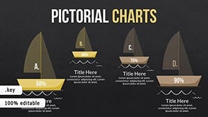
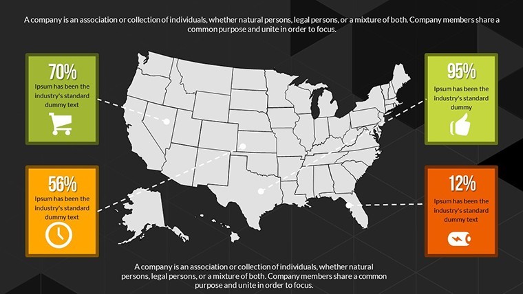
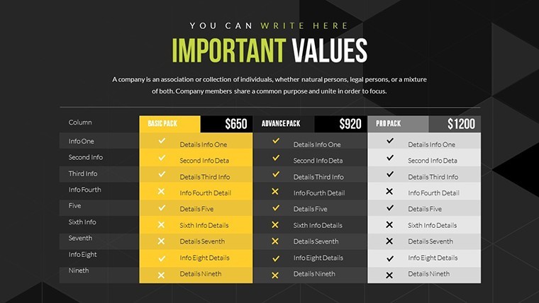
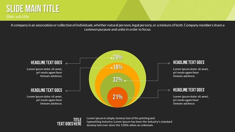
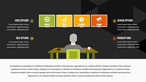
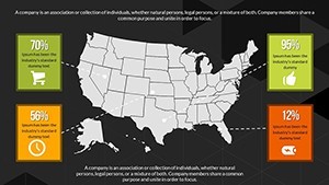
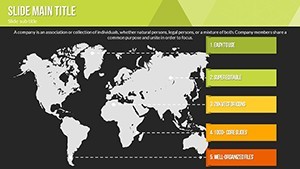
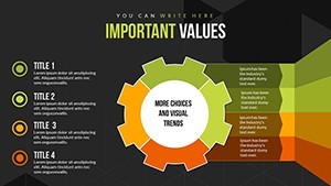
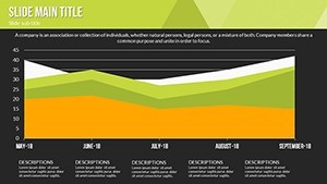
These indicators stand out through comparative side-by-side zones rather than isolated metrics when global teams track multiple SDGs at once. Executives and educators reach for them in UN-aligned sessions because the paid download supplies full progress bars and gradient sets missing from static previews.
Editing Capabilities at a Glance
| Feature | Details |
|---|---|
| Slides included | 18 with SDG progress indicators |
| Diagram categories | comparative analyses and target tracking |
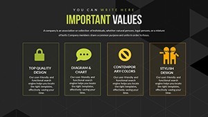
| Editable elements | text placeholders icon layers color gradients |
| Aspect ratio | 16:9 standard |
| Keynote compatibility | version 12 and newer |
| Color themes | nature palette with gradients |
| Animation support | progress build animations |
Adapting the Template to Your Brand
The workflow takes moderate skill and under 12 minutes for most users.
- Open the .key file and update text placeholders with your targets (3 minutes)
- Replace nature gradients with brand colors in the format pane (2 minutes)
- Adjust comparative bars and icon layers (4 minutes)
- Export as Keynote or PDF (1 minute)
Business executives in environmental firms showcase corporate SDG initiatives and reduce reporting time from two days to one afternoon by reusing the comparative analyses.
Educators in universities break down global targets during lectures and reuse the same file across semesters with updated data sets.
Download the file now and turn your SDG data into action.
Who Reaches for This Template
Activists in NGOs rally support for climate projects and simplify complex targets for donor meetings.
Building From Scratch vs. Starting Here
Creating SDG progress visuals manually demands advanced skills and often produces misaligned gradients that lose clarity on large screens.
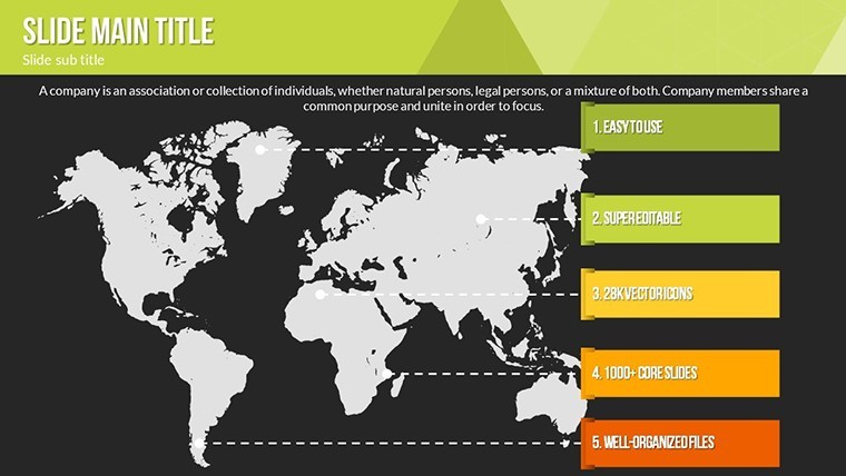
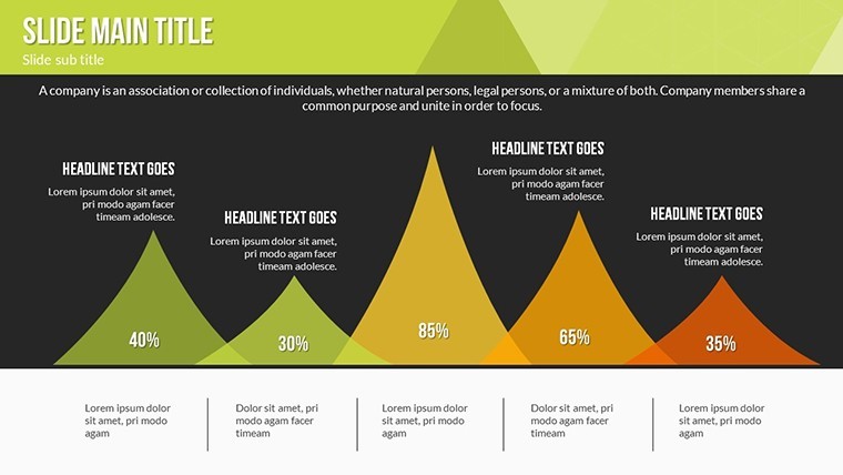
Zone segmentation here separates targets visually while clean lines keep data readable.
Color contrast follows nature palettes that translate directly to brand updates without redesign.
Get the Keynote file and communicate global goals with precision today.
Does this open in my version of Keynote?
The file opens in Keynote 12 and newer versions on Mac. Older versions may require an update to access gradient animations. Users on Keynote 11 reported partial support for progress bars. Test the preview if your version differs to confirm full support before purchase.
How do I change the color scheme?
Select any progress bar or icon then open the format pane. Pick a new gradient or solid fill and it updates matching elements. Repeat for text and zone backgrounds. Slide master applies the primary theme instantly.
What does the license permit?
The license allows use in client work and internal presentations. Resale or sublicensing of the original file remains prohibited. You may modify and distribute derivative decks freely. Commercial projects count as permitted use.
What does the paid version include that the free version does not?
The paid download supplies the complete 18-slide Keynote file with progress indicators and gradients. Free previews show only static images. Full editable bars and animation triggers appear only after purchase.
What file formats and software are required?
The download contains a single .key file. Keynote version 12 or newer opens it directly. Export options include PDF for sharing. No additional software beyond Keynote is needed.
What is the refund policy?
Refunds are granted within 14 days if the file does not open in your Keynote version as expected. Contact support with the purchase receipt and version details. Approved refunds process within 48 hours. The policy covers compatibility issues only.