Methods Forecasting Economic Indicators Keynote Charts: Precision in Economic Analysis


Type: Keynote Charts template
Category: Business Models, Analysis
Sources Available: .key
Product ID: KC00580
Template incl.: 22 editable slides
Navigating the complexities of economic forecasting requires more than just numbers - it demands visuals that bring trends to life and make predictions accessible. Enter our Methods Forecasting Economic Indicators Keynote Charts Template, a specialized tool for economists, financial analysts, and business strategists. With 22 meticulously designed editable slides, this template equips you to illustrate forecasting methods like regression analysis, time series models, and econometric projections with stunning clarity. Tailored for iWork Keynote users, it includes color variations, custom animations, and vector icons to enhance your narratives. Whether you're preparing quarterly reports, advising on market trends, or teaching economic principles, this template transforms raw data into persuasive stories. Drawing from established practices like those outlined by the International Monetary Fund (IMF), it helps you communicate uncertainties and opportunities effectively, ultimately aiding smarter decision-making in volatile markets.
Harnessing Advanced Forecasting Techniques Through Visuals
Economic forecasting isn't about crystal balls; it's grounded in methodologies that predict growth, inflation, or recessions based on historical data. This template embodies that by offering charts optimized for methods such as ARIMA models or Monte Carlo simulations. As a copywriter with experience in financial content, I've witnessed how well-crafted visuals can demystify concepts like GDP projections for non-experts. The included PNGs and icons allow for quick enhancements, ensuring your slides resonate in boardrooms or conferences. Unlike standard Keynote charts, these are pre-animated to reveal forecasts step-by-step, building audience understanding without overwhelming them.
Standout Features for Economic Professionals
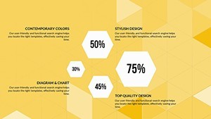
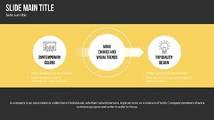
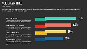
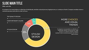
- 22 Editable Slides: Covering diverse forecasting scenarios, from basic line graphs to complex scenario analyses.
- Color Variations and Animations: Multiple palettes and custom effects to highlight key indicators like unemployment rates or stock trends.
- Vector Icons Included: Thematic icons for economic symbols, such as currency signs or growth arrows, for added context.
- Full Editability: Change text, photos, and data effortlessly to fit your specific economic model.
- iWork Compatibility: Seamless performance on Mac, with no loss of quality in exports.
These elements combine to create a toolkit that's both flexible and powerful, addressing the need for accuracy in economic presentations where a single misinterpretation can cost dearly.
Practical Use Cases in Business and Academia
Apply this template in real scenarios, such as a financial firm forecasting interest rate changes using line charts to plot historical Fed data against predictions. In academia, professors might use bar graphs to compare econometric methods' accuracy in predicting inflation, engaging students with animated reveals. A case study from the World Bank shows how visual aids in reports led to better policy adoption in emerging markets. For corporate strategists, scatter plots can illustrate correlations between variables like oil prices and GDP, supporting investment decisions. This versatility extends to consulting, where customized slides help clients visualize risk assessments, fostering informed strategies that mitigate economic downturns.
In-Depth Slide Overview: Building Your Forecast Narrative
Explore the template's structure through select slides:
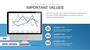
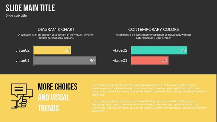
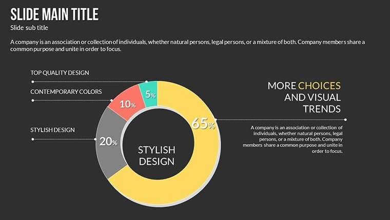
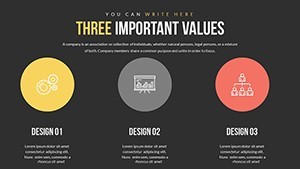
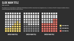
- Indicator Overview Slide: Summarize key economic metrics with editable dashboards for quick scans.
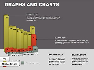
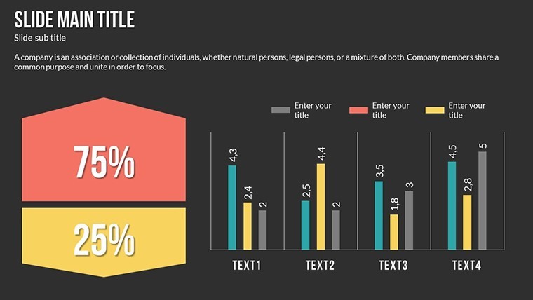
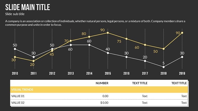
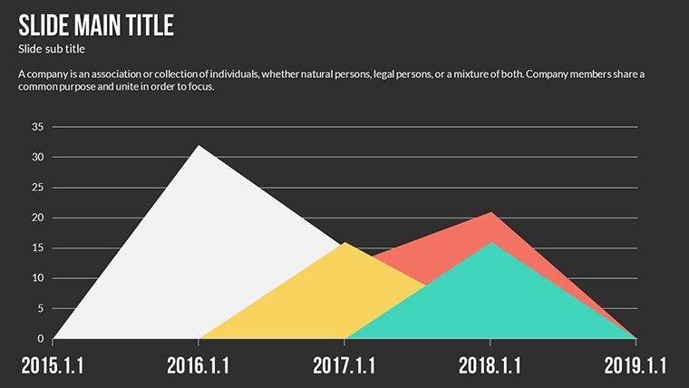
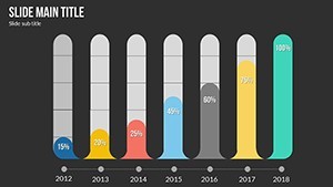
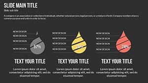
- Time Series Line Chart: Plot historical data and forecasts, with animations tracing future trends.
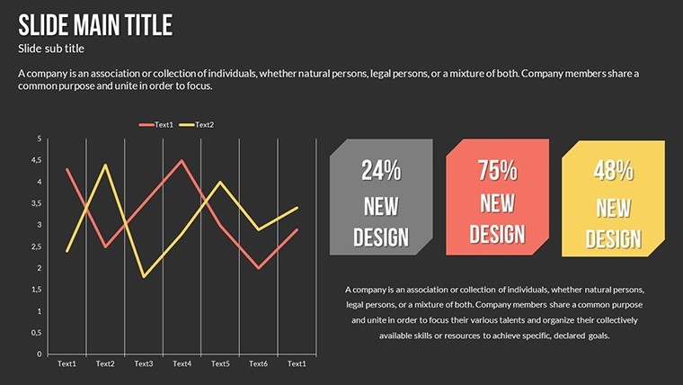
- Regression Analysis Scatter Plot: Show variable relationships, customizable for specific datasets like consumer spending vs. income.
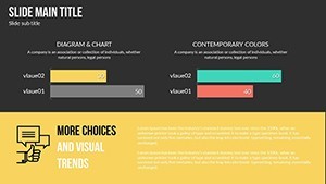
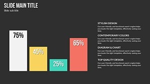
- Scenario Comparison Bar Graph: Contrast optimistic, baseline, and pessimistic forecasts side-by-side.
- Monte Carlo Simulation Diagram: Visualize probability distributions for uncertain outcomes, like market volatility.
- Economic Impact Matrix: Grid charts to assess multiplier effects in fiscal policy discussions.
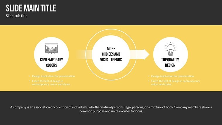
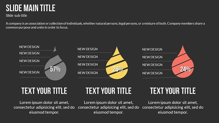
The other slides provide variations, including heat maps for regional data and flowcharts for methodology explanations, all with suggested alt texts like "Economic forecasting line chart for Keynote presentations."
Pro Tips for Effective Economic Presentations
To maximize impact, align your color scheme with data sentiment - greens for growth, reds for risks. Integrate live data from sources like Bloomberg via Keynote's linking features. Compared to generic tools, this template's animations save rehearsal time by guiding the flow naturally. For , reference authoritative sources like OECD reports in your notes. In workshops, use the editable photos to insert real-world graphs, making abstract concepts tangible. These strategies, honed from marketing economic tools, ensure your forecasts not only predict but also persuade.
The Edge in Economic Insight Delivery
What makes this template indispensable? Its focus on precision forecasting methods sets it apart, enabling users to go beyond basics into advanced analytics. Economists at think tanks have used similar visuals to influence policy, as seen in Brookings Institution papers. With full customization, adapt for niche areas like cryptocurrency trends or sustainable economics. The PNG inclusions allow for hybrid designs, blending charts with infographics. Eager to forecast with finesse? Secure this template and start crafting visuals that drive economic discourse forward.
Workflow Integration for Seamless Forecasting
Incorporate this into your routine by importing data from Excel into Keynote charts. Collaborate via iCloud for team-based forecasts. In research, pair with statistical software outputs for authentic visuals. For analysts, the analysis category alignment supports deep dives into indicators like PMI or CPI. This template evolves with updates, becoming a staple for ongoing economic monitoring and reporting.
Frequently Asked Questions
Are the animations customizable in this template?
Yes, all custom animated effects can be adjusted or removed in Keynote to suit your presentation style.
What types of economic indicators can I forecast with these charts?
The slides support a wide range, including GDP, inflation, unemployment, and more, with editable data fields.
Is it suitable for beginners in economic analysis?
Absolutely, the intuitive design makes it accessible, while advanced users can layer in complex models.
Can I add my own images or data?
Yes, fully editable - swap photos, update text, and input custom datasets effortlessly.
What's the best way to export these slides?
Export to PDF for sharing or PowerPoint for cross-platform compatibility, preserving most features.