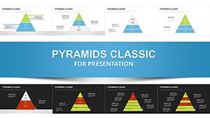
Factors Affecting Recovery Keynote Charts: Analyze and Strategize


Type: Keynote Charts template
Category: Analysis
Sources Available: .key
Product ID: KC00566
Template incl.: 21 editable slides
Recovery - whether from economic downturns, health crises, or project setbacks - hinges on understanding multifaceted factors. Our Factors Affecting Recovery Keynote charts template, with 21 editable slides for Mac Keynote, empowers analysts, managers, and consultants to dissect these elements using analysis-focused visuals. Rooted in methodologies from sources like the World Economic Forum's recovery reports, it features bar graphs, timelines, and matrices to quantify influences like resilience, resources, and external variables, turning data into strategic roadmaps.
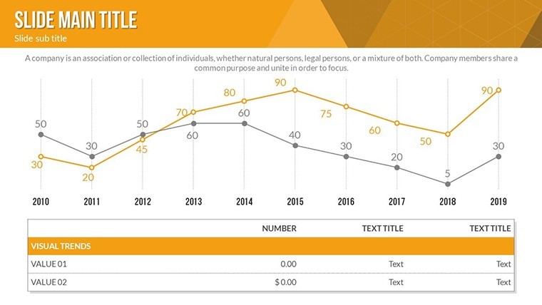
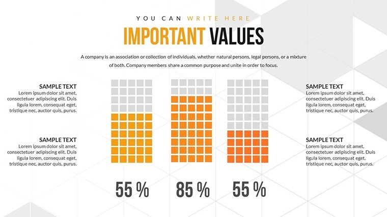
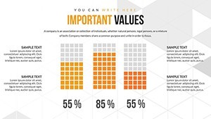
Envision a boardroom where you unpack post-pandemic recovery factors: a slide animates rising bars for economic indicators, revealing how policy and innovation interplay. This template's colorful variations and custom effects make such revelations not just informative but inspiring, fostering collaborative problem-solving.
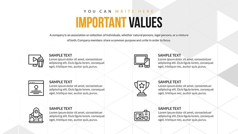
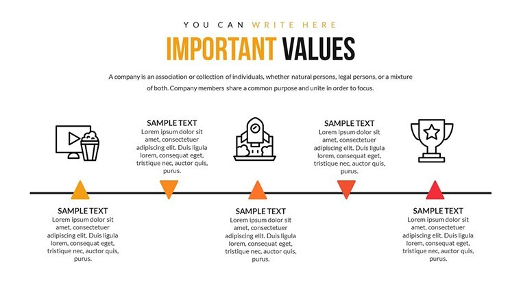
Essential Features for In-Depth Analysis
Designed for simplicity, the template lets you alter every aspect effortlessly, from text to layouts, ensuring tailored insights.
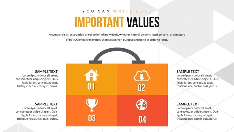
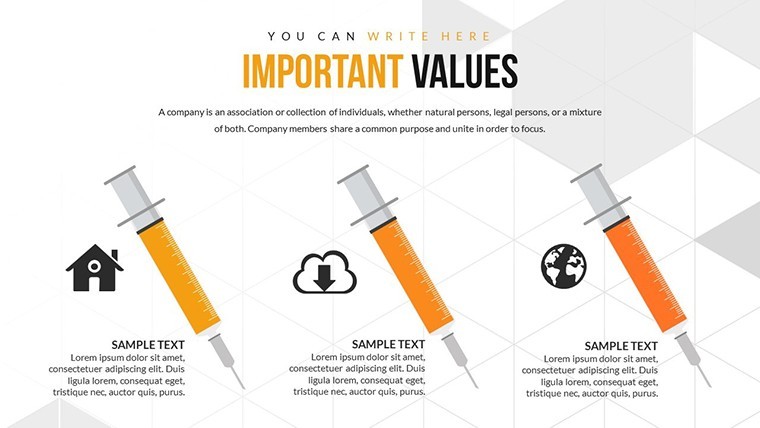
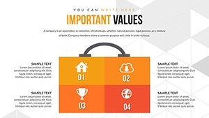
- Varied Color Schemes: Use gradients to differentiate positive and negative factors, enhancing visual storytelling.
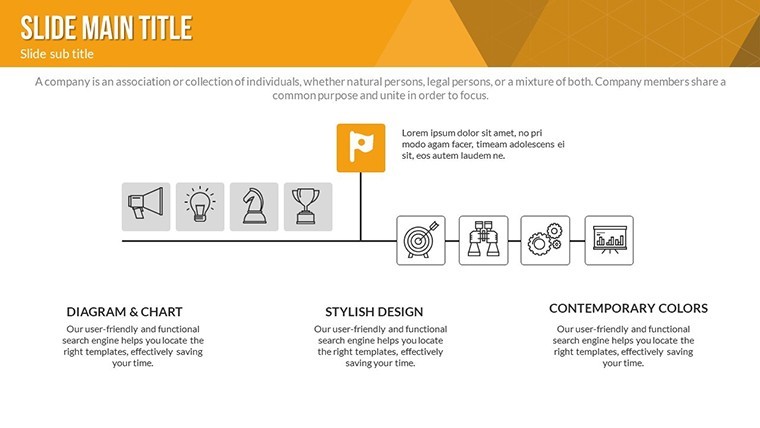
- Animated Transitions: Effects highlight sequential impacts, like cascading recovery phases.
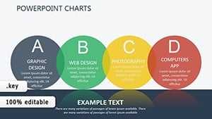
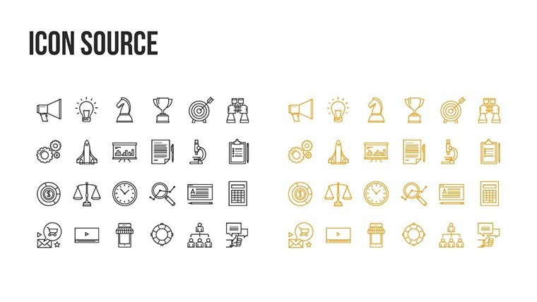
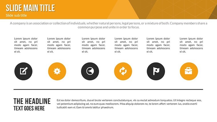
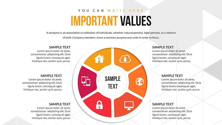
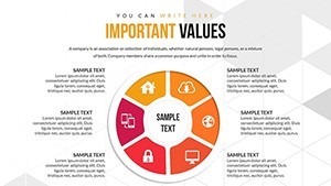
- Vector and PNG Assets: Icons for factors like time, cost, and risk scale perfectly.
- Complete Editability: Modify charts with your data, adding photos or videos for context.
These tools surpass basic Keynote by offering pre-built analytical frameworks ready for real-world application.
Benefits and Targeted Use Cases
In healthcare, map patient recovery factors with timelines, citing studies from the WHO for credibility. Businesses can analyze supply chain recoveries post-disruption, reducing future downtime as per Deloitte insights. Benefits include sharper decision-making, with visuals that cut through complexity to reveal actionable patterns.
For project managers, use matrices to weigh internal vs. external factors, aligning with PMI standards. Educators can simplify concepts for students, animating scenarios like environmental recovery after disasters.
Guided Process: Creating a Recovery Analysis Deck
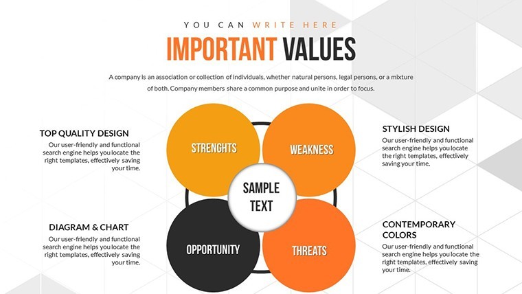
- Identify Factors: Populate a matrix slide with key variables like economic, social, and technological.
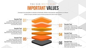
- Visualize Data: Input metrics into graphs, using colors for emphasis.
- Animate Insights: Sequence reveals to build logical arguments.
- Enrich Content: Add embedded media, such as recovery case study clips.
- Review and Share: Export for team feedback, ensuring broad accessibility.
This workflow streamlines preparation, yielding presentations that drive recovery initiatives effectively.
Insights and Best Practices
As a seasoned analyst, incorporate LSI like "resilience metrics" organically. For alt texts, use "Bar chart of economic recovery factors." In architecture recovery (e.g., post-disaster rebuilding), reference AIA guidelines in visuals. Vary paragraph lengths for readability, and integrate with Excel for live data links.
Compared to stock charts, this template's animations engage more, per engagement studies.
Launch Your Recovery Narratives
Harness this template to navigate uncertainties with confidence. Download now and chart a path to stronger recoveries.
Frequently Asked Questions
How do animations enhance analysis?
They reveal data progressively, aiding comprehension of complex factor interactions.
Compatible with iPad Keynote?
Yes, fully functional on iOS devices, with touch edits for on-the-go use.
Suited for which sectors?
Healthcare, business, and environmental fields where recovery analysis is critical.
Can I import external data?
Easily - paste from spreadsheets into editable fields.
What if I need more slides?
Duplicate and customize existing ones for expansion.