Master Data Management Keynote Charts Template: Empower Your Data Strategy

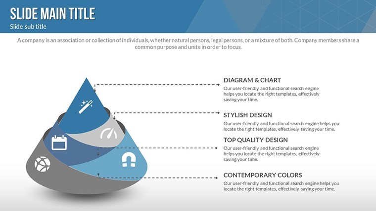
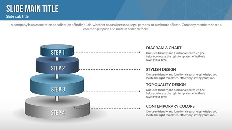


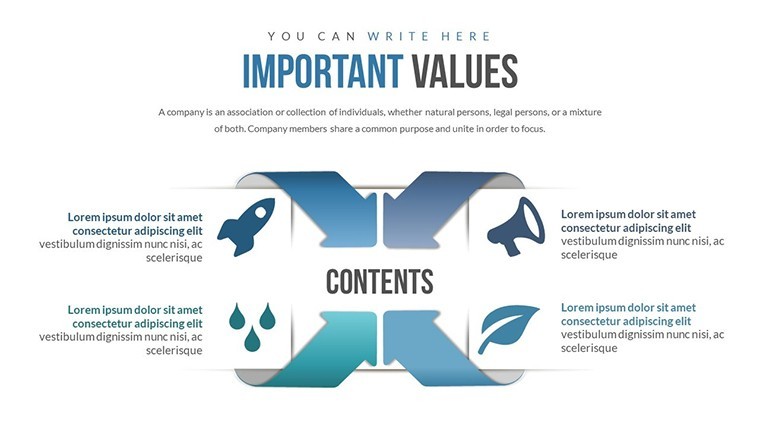

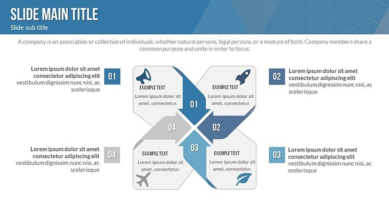
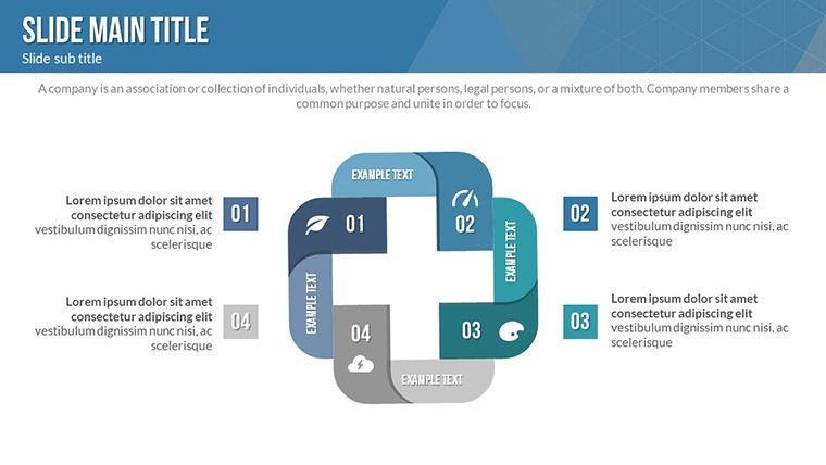


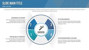
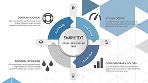

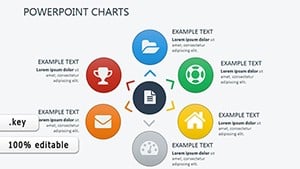
In today's data-driven business landscape, mastering your core information assets is crucial for operational efficiency and strategic success. Our Master Data Management (MDM) Keynote charts template is meticulously crafted to help professionals like you visualize and communicate these essential processes with clarity and impact. Whether you're a data analyst presenting to executives, an IT manager outlining governance frameworks, or a consultant advising on data integration, this template equips you with 27 fully editable slides tailored for Keynote on Mac. Drawing from established standards like those from the Data Management Association (DAMA), it incorporates hexagon processes and pyramid structures to break down MDM components - such as customer data, product hierarchies, and reference data - into digestible visuals that resonate with stakeholders.
Imagine transforming raw, scattered data into a cohesive narrative that highlights how MDM reduces redundancies, ensures compliance, and boosts agility. This template isn't just about charts; it's about storytelling. With widescreen formats optimized for modern displays, each slide features creative, modern designs that blend professionalism with visual appeal. Special animations bring elements to life, drawing attention to key points like data stewardship roles or integration workflows. And because every element is vector-based, you can scale, recolor, or reshape without losing quality, ensuring your presentation aligns perfectly with your brand's aesthetic.
Key Features That Set This Template Apart
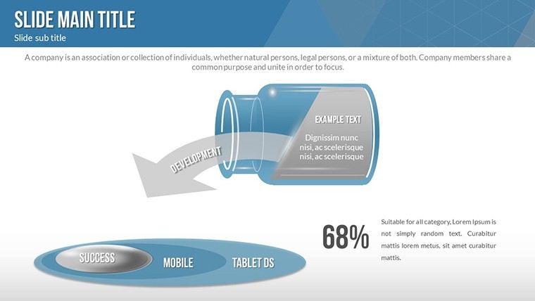
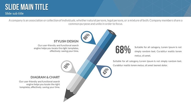
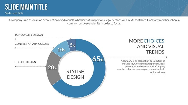
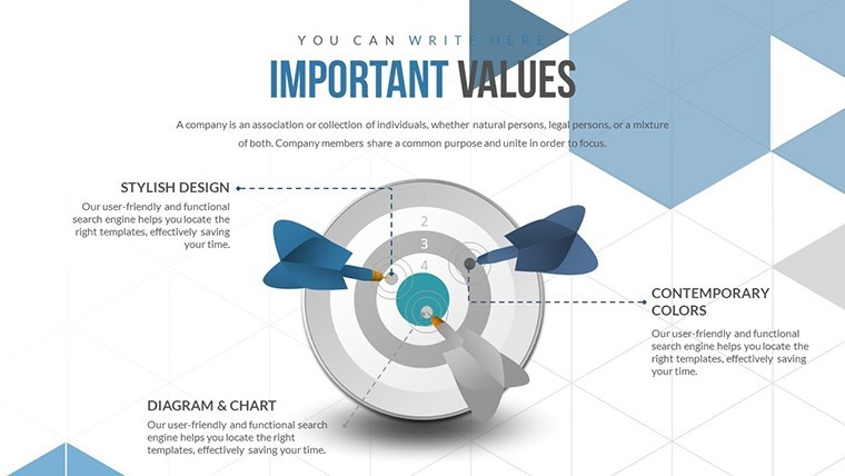
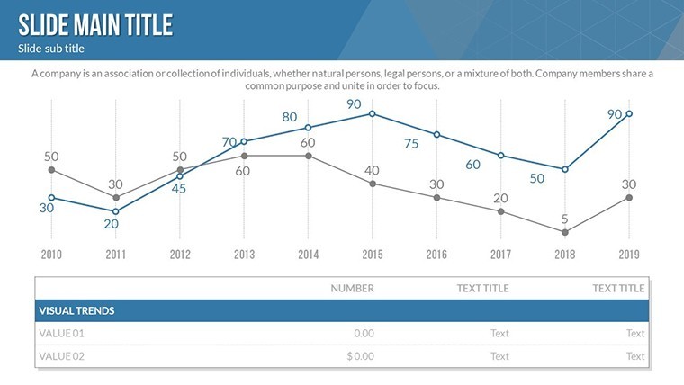
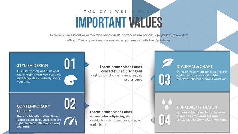
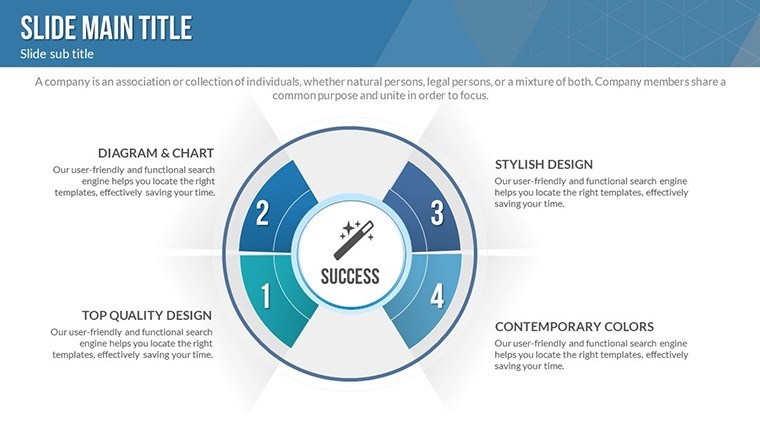
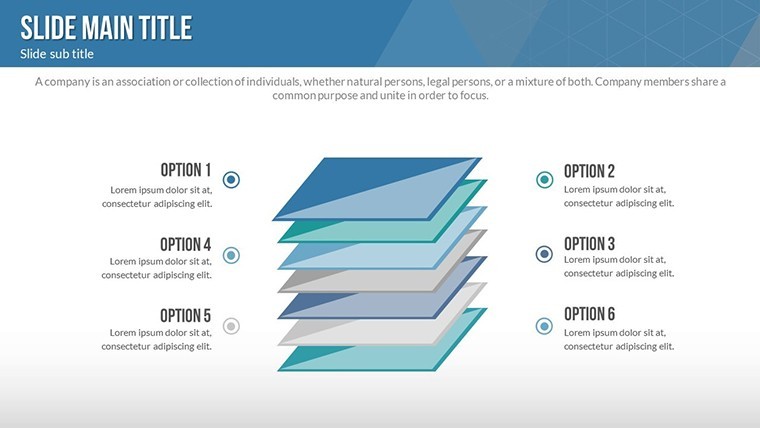
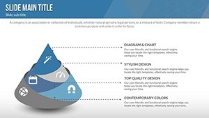
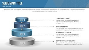
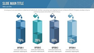
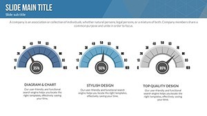
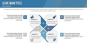
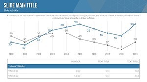
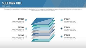
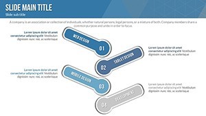
What makes this MDM Keynote template a game-changer? Let's dive into its standout attributes. First, the ease of editing stands out - drag-and-drop functionality allows even non-designers to customize charts in minutes. Integrate your own datasets into hexagon diagrams to illustrate multi-faceted MDM processes, or use pyramid charts to depict hierarchical data structures, such as organizational master data layers.
- Creative Animations and Effects: Each object animates individually, creating a dynamic flow that keeps audiences engaged. For instance, reveal data silos one by one in a process chart to emphasize the need for unification.
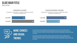
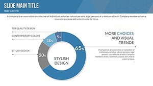
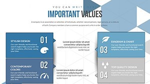
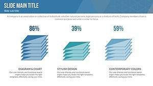
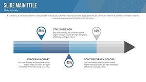
- Professional Design Elements: Incorporate themed icons for customers, products, and staff, all editable to fit your narrative. This aligns with best practices from industry leaders like Gartner, who stress visual simplicity in data presentations.
- Seamless Integration: Add tables for data mappings, embed videos of MDM tools in action (e.g., demos from Informatica or IBM), or insert photos of real-world implementations to add authenticity.
- Vector Scalability: Stretch diagrams across slides without pixelation, ideal for high-resolution exports or printing handouts.
Beyond these, the template supports advanced Keynote features like transitions that mimic data flows, enhancing the metaphorical representation of MDM as a "central nervous system" for business intelligence.
Real-World Applications and Benefits
Consider a retail company struggling with inconsistent product data across channels. Using this template, you could craft a presentation that maps out an MDM rollout: start with a pyramid slide showing data hierarchy from raw inputs to governed outputs, then transition to hexagon processes detailing steps like data cleansing and matching. The benefits? Reduced errors by up to 30% (as per DAMA case studies), faster time-to-market for new products, and improved customer experiences through accurate personalization.
For financial services, where compliance is paramount, leverage the charts to visualize regulatory alignments, such as GDPR or CCPA impacts on master data. Educators and trainers can adapt it for workshops, breaking down MDM concepts for students with interactive elements. Entrepreneurs pitching to investors might use it to demonstrate scalable data strategies, turning abstract ideas into tangible visuals that secure funding.
Step-by-Step Use Case: Building an MDM Pitch
- Assess Needs: Open the template in Keynote and select a hexagon slide to outline current data challenges, like silos in customer information.
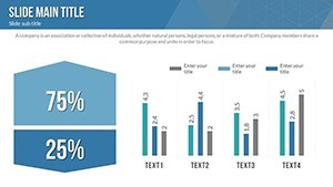
- Customize Data: Input your metrics - e.g., error rates or integration times - into editable fields, adjusting colors to match your corporate palette.
- Add Multimedia: Embed a short video clip showing before-and-after MDM scenarios, using the template's media placeholders.
- Animate for Impact: Apply entrance effects to reveal benefits sequentially, building suspense and emphasis.
- Rehearse and Refine: Use Keynote's presenter notes to add talking points, ensuring your delivery syncs with the visuals.
This approach not only saves hours compared to building from scratch in basic Keynote but also elevates your content's professionalism, making complex topics accessible and persuasive.
Expert Tips for Maximizing Your MDM Presentation
As an SEO and design expert with years in data visualization, I recommend aligning your charts with AIA (American Institute of Architects) principles if your MDM involves spatial data, like in urban planning firms. For instance, use pyramids to represent building information modeling (BIM) hierarchies. Always prioritize accessibility - ensure high contrast in colors for color-blind viewers, and include alt text for images like "Hexagon process chart illustrating MDM data flows."
Compare this to standard Keynote tools: while built-in charts are functional, they lack the pre-themed sophistication here, often requiring manual tweaks that eat into prep time. Our template's animations alone can increase audience retention by fostering a narrative arc, much like storytelling in TED Talks.
Incorporate LSI elements naturally: think data governance frameworks, master data hubs, or entity resolution techniques. For workflow integration, export slides to PDF for sharing or import into tools like Tableau for hybrid presentations.
Why Download This Template Today?
Don't settle for mediocre data depictions when you can command attention with polished, purpose-built visuals. This MDM Keynote template bridges the gap between technical depth and audience comprehension, empowering you to drive real change. Ready to revolutionize your presentations? Customize now and see the difference in engagement and outcomes.
Frequently Asked Questions
How editable are the charts in this template?
Every element is fully customizable - you can change colors, text, shapes, and even add or remove sections without any quality loss, thanks to vector graphics.
Is this compatible with other presentation software?
Primarily designed for Keynote on Mac, but you can export to PDF or images for use in PowerPoint or Google Slides, though animations may vary.
What industries benefit most from MDM charts?
Retail, finance, healthcare, and manufacturing see the greatest gains, where accurate master data directly impacts operations and compliance.
Can I add my own data sets?
Absolutely - simply replace placeholders with your Excel imports or manual entries for personalized insights.
Are there animation tutorials included?
While not bundled, Keynote's built-in help and our online resources guide you through applying effects seamlessly.