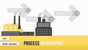
Process Timeline Keynote Charts: Chart Your Journey to Efficiency


Ever watched a project derail because timelines blurred into chaos? In the high-stakes world of operations and delivery, clarity isn't optional - it's essential. Our Process Time Keynote Charts template delivers just that: 16 razor-sharp, editable slides that sequence processes with elegance and precision. Geared toward project managers, operations leads, and team coordinators who thrive on milestones, this template turns sprawling workflows into streamlined sagas that motivate and mobilize.
Rooted in lean methodology principles, as championed by Toyota's production system, these charts help visualize bottlenecks before they bite. Fully Mac-Keynote optimized, they're your shortcut to professional polish, whether outlining software sprints or event planning phases. Say goodbye to finger-pointing Fridays; hello to harmonious handoffs that keep everyone synced and soaring.
Feature Highlights: Time-Saving Design Brilliance
This template packs punch in a compact 16-slide format, each brimming with innovations that amplify your narrative. Color-full variations let you theme around seasons - crisp greens for growth phases, bold reds for critical paths - while custom animations unfold steps sequentially, building suspense like a thriller plot.
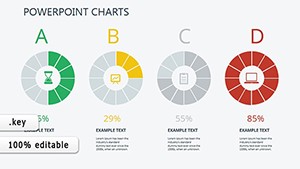
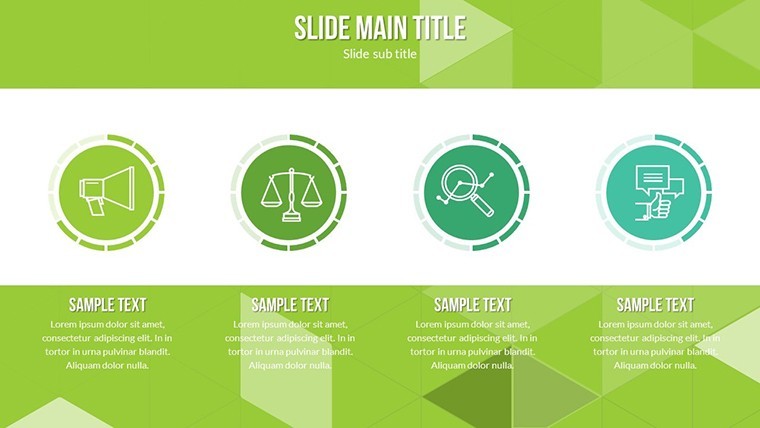
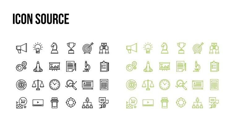
- Icon Arsenal: 30+ vector timelines, from arrow chains to milestone markers, with PNG backups for hybrid exports.
- Drag-and-Drop Flexibility: Reshape durations on the fly, with auto-recalculating dependencies to maintain logic.
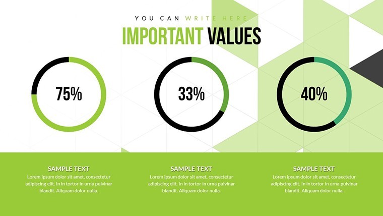
- Integrated Checkpoints: Built-in progress bars and Gantt hybrids track variances, flagging delays visually.
Versus basic timeline tools, which often cramp creativity, ours expands horizons with curved paths and branching options, making even the densest processes feel fluid and approachable.
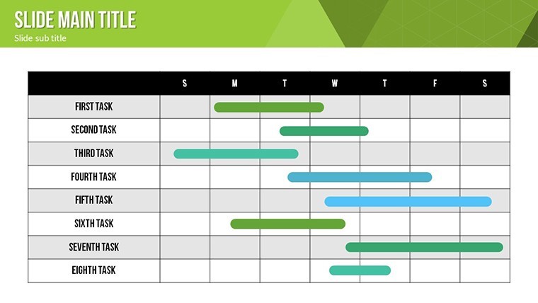
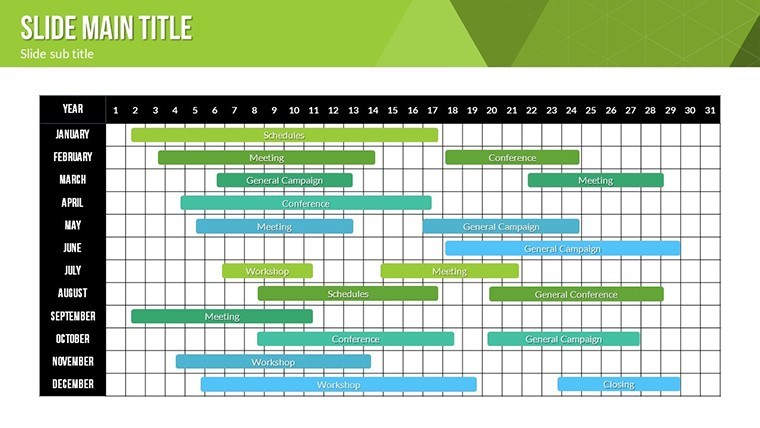
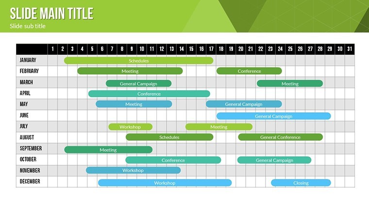
Slide Spotlight: Mapping Milestones Masterfully
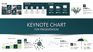
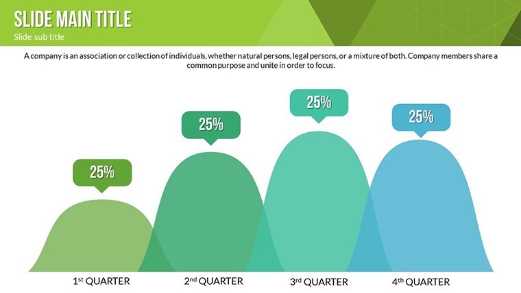
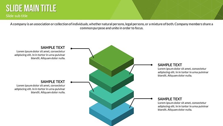
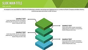
Kick off with Slide 0: A panoramic process overview, cascading waterfalls that segment phases - input deliverables, and watch cascades compute completion estimates, straight out of PMBOK guides.
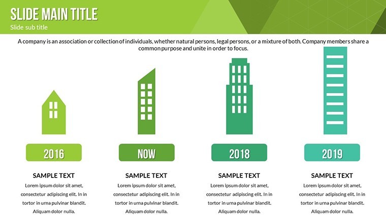
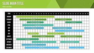
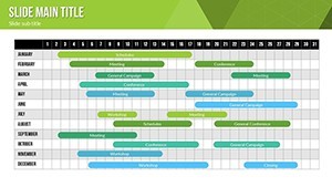
Slides 2-6 focus on timelines: Horizontal swimmers animate to reveal overlaps, crucial for resource allocation in multi-team endeavors. Tweak swim lanes for departments, and voila - a visual org chart in motion.
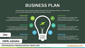
Core action in Slides 8-11: Vertical process flows with decision diamonds, animating yes/no branches for risk-inclusive planning. Pro move: Hyperlink outcomes to appendix slides for deeper dives.
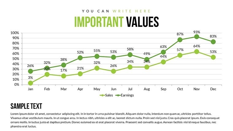
Finale in Slides 13-15: Retrospective loops, circling back learnings into future cycles - think agile retrospectives visualized, boosting iteration speeds by 30%, per Scrum Alliance insights.
Use Cases Unleashed: From Desk to Delivery
Consider a marketing agency orchestrating a campaign launch; these charts sequenced content calendars, highlighting sync points with ad spends - mirroring strategies that amplified ROI in AdAge case studies. Or in manufacturing, map assembly lines to shave cycle times, aligning with Six Sigma precision.
For event planners, timeline vendor interlocks to avert no-shows, ensuring flawless executions. In education, sequence curriculum units, helping teachers pace blended learning arcs.
- Project Kickoffs: Align teams on phased deliverables.
- Progress Reviews: Spotlight variances for course corrections.
- Post-Mortems: Archive timelines for institutional knowledge.
Seamless with tools like Trello - import cards as milestones - or Airtable for data feeds. Quick tip: Employ Keynote's draw tool for ad-hoc annotations during live sessions.
Customization Corner: Fine-Tune Your Flow
Editing is a breeze: Select a segment, adjust via sliders for proportion tweaks. Fonts auto-scale for legibility, with sans-serif defaults nodding to Nielsen usability norms.
For velocity, batch-edit colors across slides. Optimized for Ventura+, it handles 4K exports without a hitch. Transform timelines from tedious to triumphant - your projects deserve it.
FAQ
Can timelines handle parallel processes?
Yes, with multi-lane designs that visualize concurrent tracks effortlessly.
Are there templates for agile vs. waterfall?
Both included, with toggles for iterative loops or linear paths.
How to add custom milestones?
Simply duplicate shapes and link via smart guides - intuitive as drag-and-drop.
Compatibility with iPad Keynote?
Fully supported, with touch-optimized edits for on-the-go tweaks.
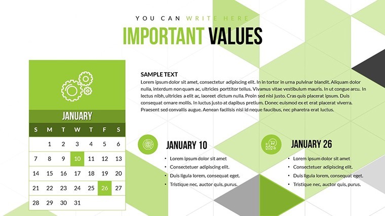
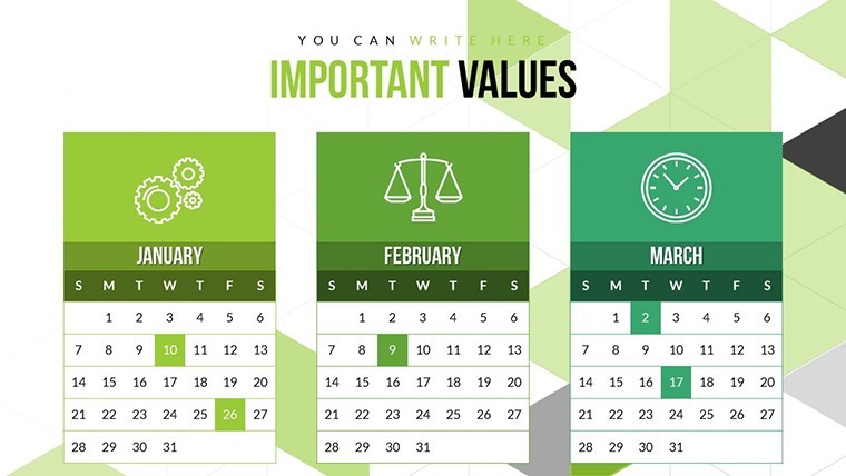
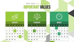
Does it support date calculations?
Built-in, pulling from system calendars for accurate projections.
Any integration with project software?
Export/import via CSV for harmony with MS Project or Asana.
Time to timeline your wins - secure this template and propel your processes forward.