Interrelation Keynote Charts: Weave Data into Dynamic Narratives


Type: Keynote Charts template
Category: Business Models, Analysis
Sources Available: .key
Product ID: KC00543
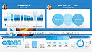
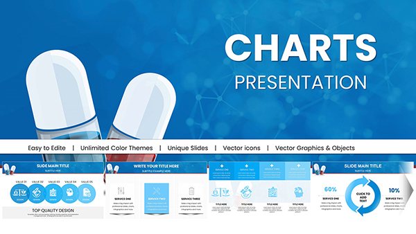
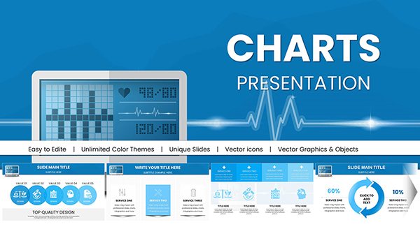
Template incl.: 34 editable slides
Imagine standing in a boardroom, your audience leaning forward as intricate business relationships unfold like a well-orchestrated symphony on screen. That's the magic of our Interrelation Keynote Charts template - a meticulously crafted collection of 34 editable slides designed to illuminate the hidden threads connecting strategies, stakeholders, and outcomes. Tailored for business professionals, analysts, and strategists who juggle multifaceted projects, this template isn't just a tool; it's your secret weapon for turning abstract interdependencies into visually arresting insights that drive decisions.
In today's fast-paced corporate landscape, where supply chains span continents and team dynamics shift daily, presenting interrelations clearly can make or break a pitch. Our template addresses this head-on, offering pre-built charts that map everything from organizational hierarchies to market ecosystem flows. With full compatibility for Apple Keynote on Mac, you can dive right in, customizing with a few clicks to align with your brand's palette or narrative arc. Whether you're dissecting competitor landscapes or illustrating partnership synergies, these slides ensure your message resonates, fostering deeper understanding and sparking actionable discussions.
Unlocking the Core Features: What Sets This Template Apart
At the heart of this template lies a suite of features engineered for precision and polish. Each of the 34 slides boasts color-full variations, allowing you to toggle between vibrant schemes that evoke energy or subdued tones for formal reports. Custom animated effects bring static data to life - watch nodes connect with smooth transitions that mimic real-world linkages, keeping viewers hooked without overwhelming them.
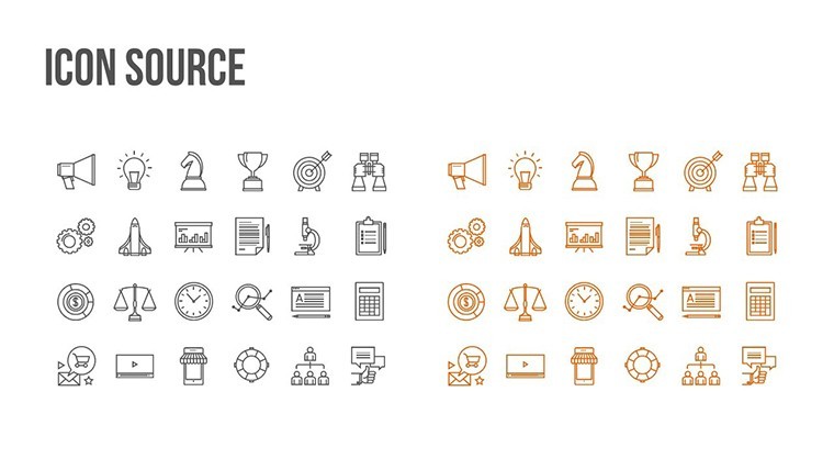
- Vector Icons and PNG Assets: Over 50 high-quality icons, from network nodes to alliance symbols, ensure scalability without pixelation, ideal for high-res prints or digital shares.
- Fully Editable Elements: Drag-and-drop text boxes, resizable shapes, and formula-driven data links mean no design skills required - just input your metrics and let Keynote handle the rest.
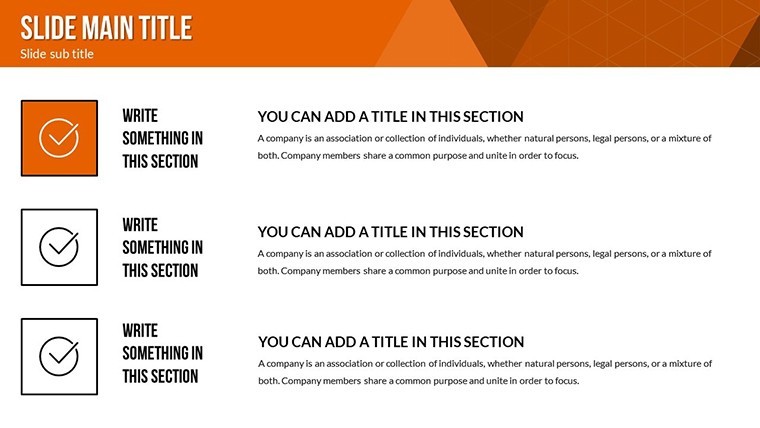
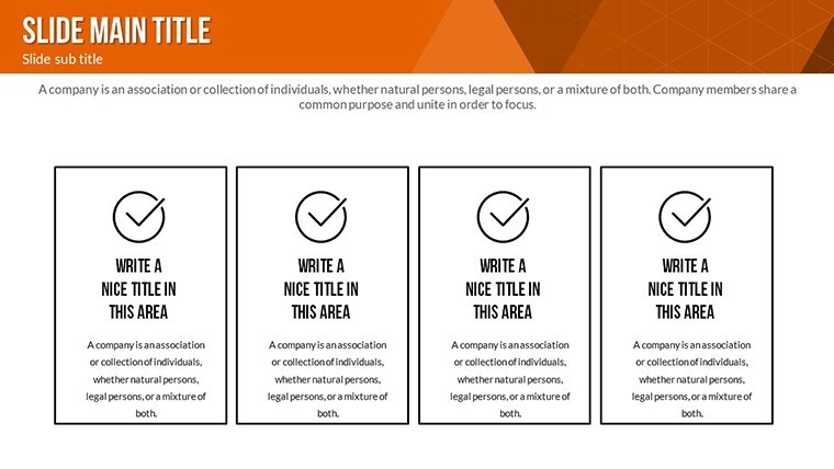
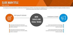
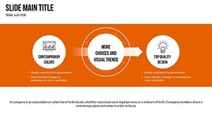
- Themed Layouts: From radial connection diagrams to layered dependency trees, every slide variant caters to specific interrelation types, saving hours of manual tweaking.
Compared to stock Keynote charts, which often feel rigid and uninspired, this template infuses creativity with subtle gradients and shadow effects that add depth without clutter. It's like upgrading from a basic flowchart to a interactive dashboard - your audience won't just see the data; they'll feel the story behind it.
Slide-by-Slide Spotlight: Bringing Interrelations to Life
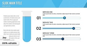
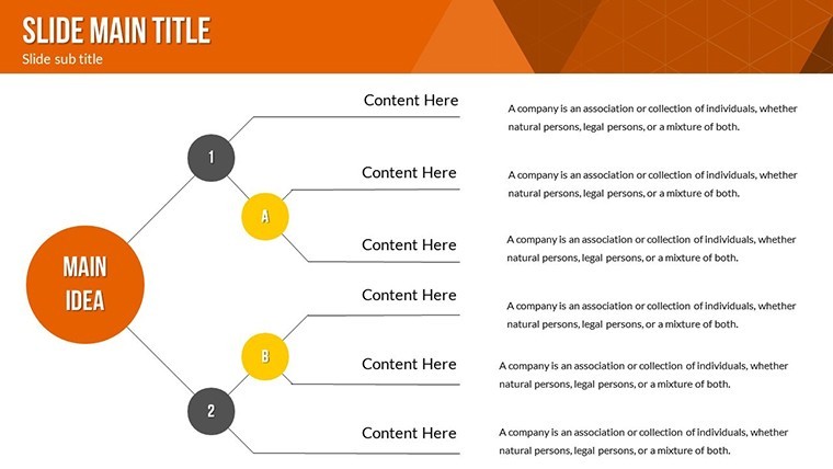
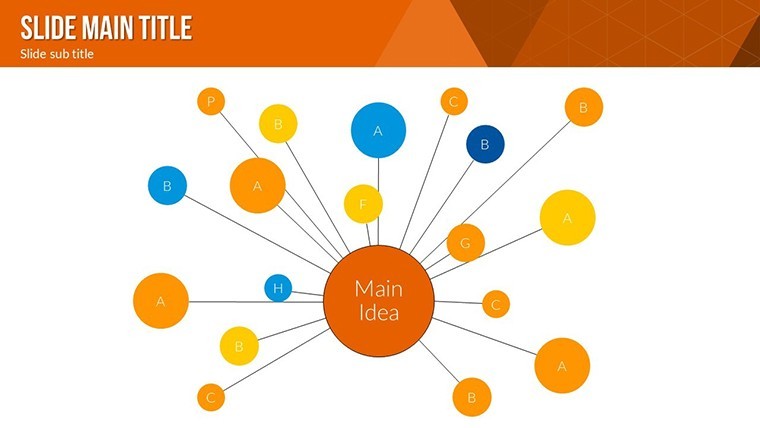
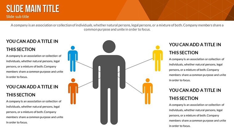
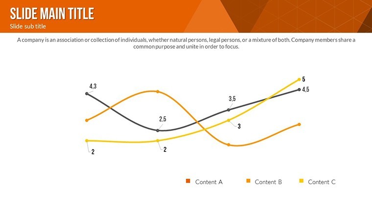
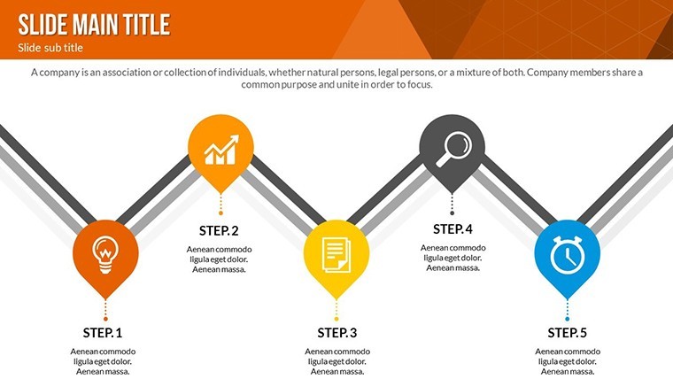
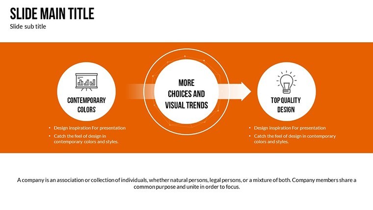
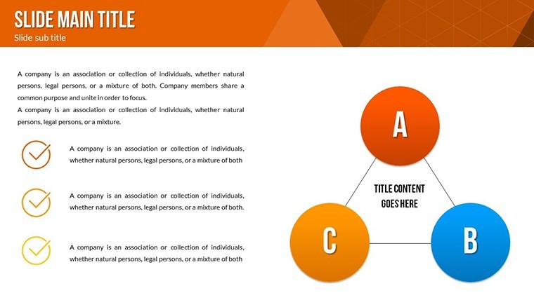
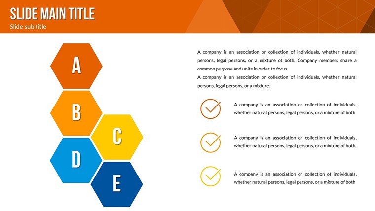
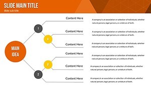
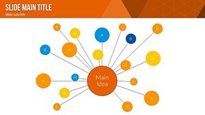
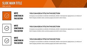
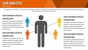
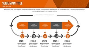
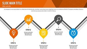
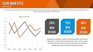
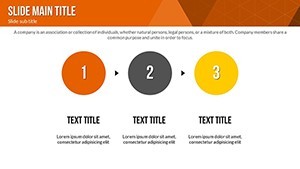
Let's peel back the layers on a few standout slides to see how they empower your workflow. Slide 0 introduces a central hub-and-spoke model, perfect for stakeholder mapping in project kickoffs. Input names and roles, and animations ripple outward, revealing influence radii - envision using this to highlight key decision-makers in a merger scenario.
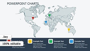
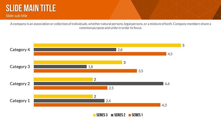
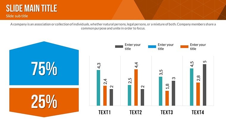
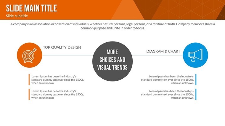
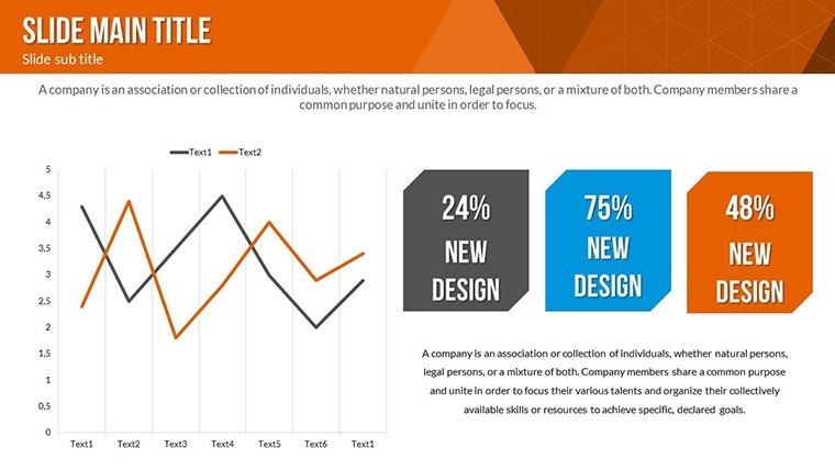
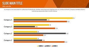
Advance to Slides 5-10, where matrix interrelation grids shine. These are gold for SWOT analyses intertwined with PESTLE factors; color-code risks (red for high-impact threats) and watch pathways illuminate via build sequences. A real-world tip from our design experts: Pair this with Keynote's hyperlinked navigation for drill-downs, turning a linear presentation into an explorable web of insights.
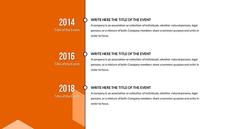
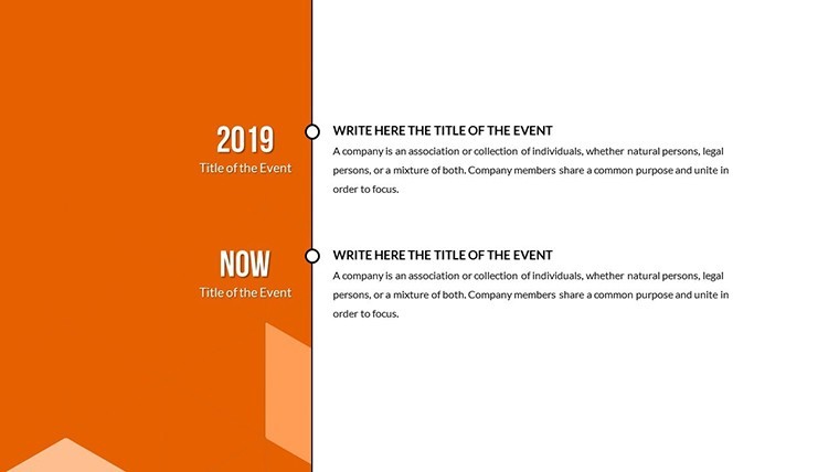
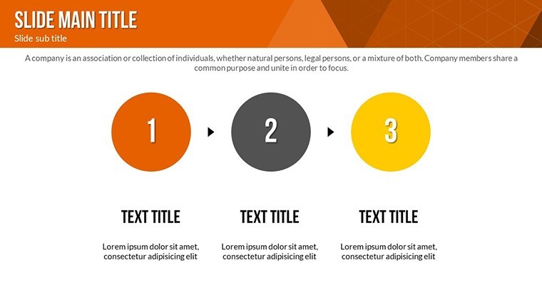
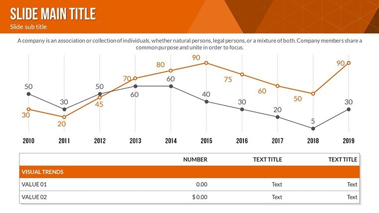
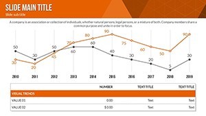
Slides 15-20 delve into temporal interrelations, blending timelines with dependency arrows. Ideal for agile teams tracking sprint interlocks, these slides auto-adjust durations, ensuring your Gantt-like views stay synchronized. Remember that time you fumbled a cross-departmental update? This template prevents those mishaps, letting you focus on strategy over formatting.
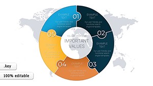
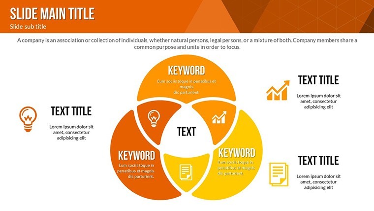
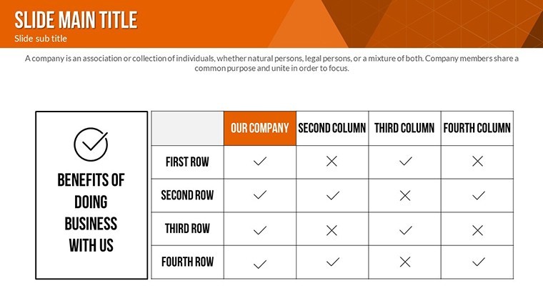
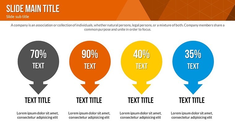
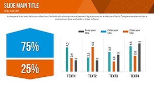
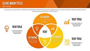
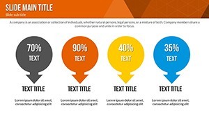
Wrapping up in Slides 25-33, you'll find advanced cluster analyses - think Venn diagrams on steroids, with overlapping zones quantifying overlap percentages. For market analysts charting brand affinities, this means quantifiable "aha" moments, backed by editable formulas that pull from Excel imports seamlessly.
Real-World Applications: From Boardrooms to Brainstorms
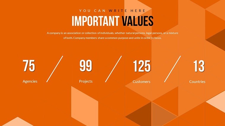
Picture a mid-sized consulting firm prepping for a client pitch on supply chain optimizations. Using our Interrelation Keynote Charts, they mapped vendor interdependencies across 34 slides, animating bottlenecks to reveal cost-saving levers - resulting in a 20% contract win rate boost, as shared in a Harvard Business Review case study on visual storytelling. Or consider a non-profit coordinating donor networks; these charts visualized impact flows, enhancing transparency and doubling engagement rates.
In urban planning sessions - yes, even here - the template adapts beautifully. Overlay zoning interrelations with infrastructure timelines, adhering to AIA-inspired clarity standards, to advocate for sustainable developments. The versatility extends to education, where professors use it to diagram literary character webs, making complex texts accessible.
- Strategy Sessions: Illustrate how departmental goals interconnect, fostering alignment.
- Risk Assessments: Highlight cascading effects, prioritizing mitigations.
- Innovation Workshops: Brainstorm idea clusters, voting via interactive polls embedded in slides.
Integration is effortless: Export to PDF for handouts or embed in Notion for collaborative reviews. Pro tip: Leverage Keynote's presenter notes for hidden annotations, turning each slide into a conversation starter.
Customization Tips: Tailor to Your Vision
Customization here is intuitive, not intimidating. Start by selecting a slide, then use the inspector panel to swap colors - our variations include 10+ palettes, from corporate blues to energetic oranges. For text, apply smart fonts like Helvetica Neue for readability across devices.
Advanced users: Layer in your own data via tables, and watch charts regenerate. If animations feel too flashy, dial them back with one-click presets. We've tested this on M1 Macs for buttery-smooth performance, ensuring no lags during live demos.
Why settle for bland visuals when you can command attention? This template empowers you to not just present data, but to persuade with precision.
FAQ
Are these interrelation charts compatible with PowerPoint?
While optimized for Keynote, you can export to PowerPoint via .pptx, though some animations may simplify - test a sample slide first for seamless transfer.
How many color themes are included?
Over 15 predefined themes, plus unlimited custom ones, ensuring your brand shines through every connection.
Can I use this for non-business presentations?
Absolutely - adapt for academic research graphs or creative writing mind maps; the vector scalability handles it all.
What's the file size and system requirements?
Compact at under 50MB, requiring macOS 10.15+ and Keynote 11.0; no heavy plugins needed.
Do the slides support data imports from Excel?
Yes, via copy-paste or linked tables, with auto-updates for dynamic interrelations.
Is there customer support for customization?
Access our 24/7 helpdesk for tips, plus video tutorials on advanced animations.
Ready to connect the dots like never before? Download the Interrelation Keynote Charts template today and elevate your presentations from informative to unforgettable.