Business Professional Keynote Charts Template


Type: Keynote Charts template
Category: Business Models
Sources Available: .key
Product ID: KC00519
Template incl.: 19 editable slides
In today's competitive business landscape, where first impressions can seal deals, the Business Professional Keynote Charts template emerges as your secret weapon. With 19 meticulously designed editable slides, this infographic powerhouse is crafted for executives, marketers, and consultants who need to convey complex data with clarity and style. Imagine transforming quarterly sales figures into eye-catching graphs that highlight trends at a glance, or mapping out strategic plans with diagrams that guide your team toward success. This template isn't just about visuals - it's about solving real pain points like audience disengagement during lengthy meetings. By incorporating professional designs aligned with best practices from organizations like the American Marketing Association, you can create presentations that not only inform but persuade, leading to better outcomes such as increased buy-in from stakeholders or higher conversion rates in pitches.
Essential Features for High-Impact Business Visuals
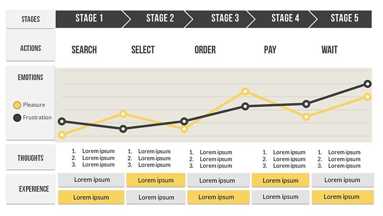
At the core of this template are features that prioritize usability and sophistication. The 19 slides encompass a range of chart types, including bar graphs for comparative analysis, pie charts for market share breakdowns, and line graphs for trend forecasting. Each is built with vector graphics for sharp resolution, even on 4K displays. Customization is seamless: alter color palettes to match your corporate branding - say, shifting from cool blues for tech firms to warm oranges for creative agencies. Add animations that reveal data points progressively, keeping your audience hooked without overwhelming them. Unlike standard Keynote options that demand extensive tweaking, these pre-optimized elements reduce preparation time, allowing you to focus on content strategy. Users in fields like finance appreciate how easily they can integrate Excel data, turning raw numbers into compelling stories that drive decisions.
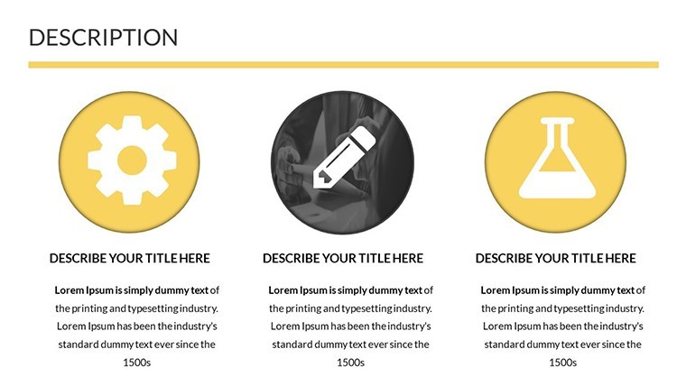
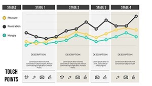
Infographic Elements That Simplify Complexity
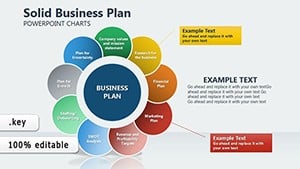
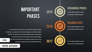
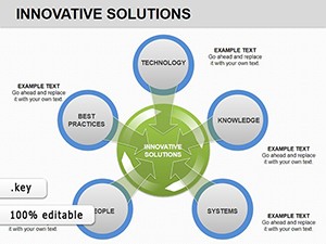
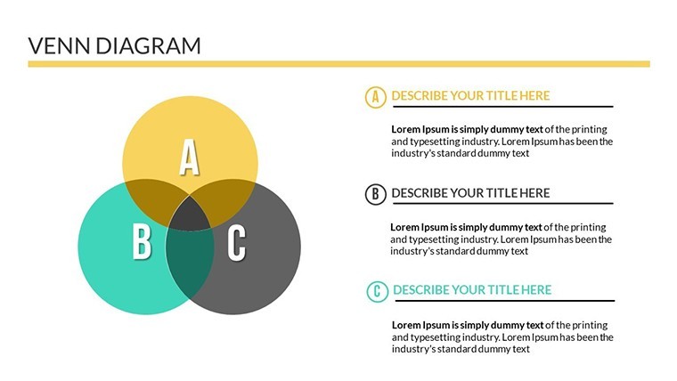
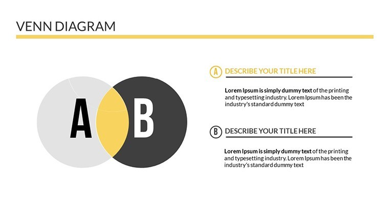
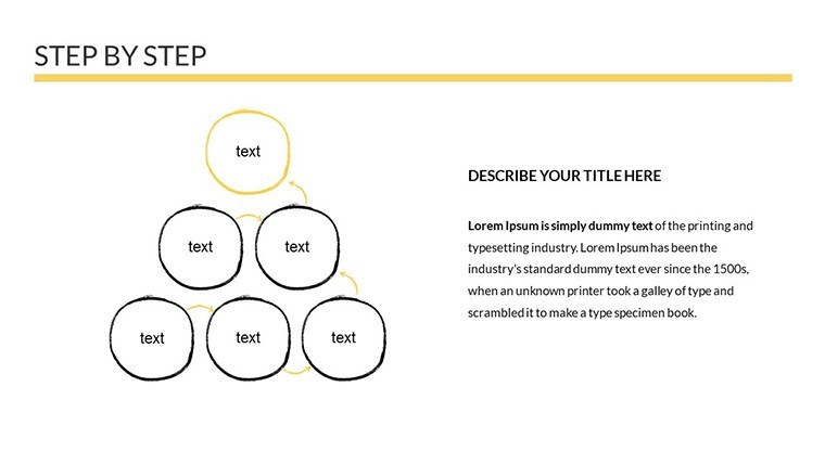
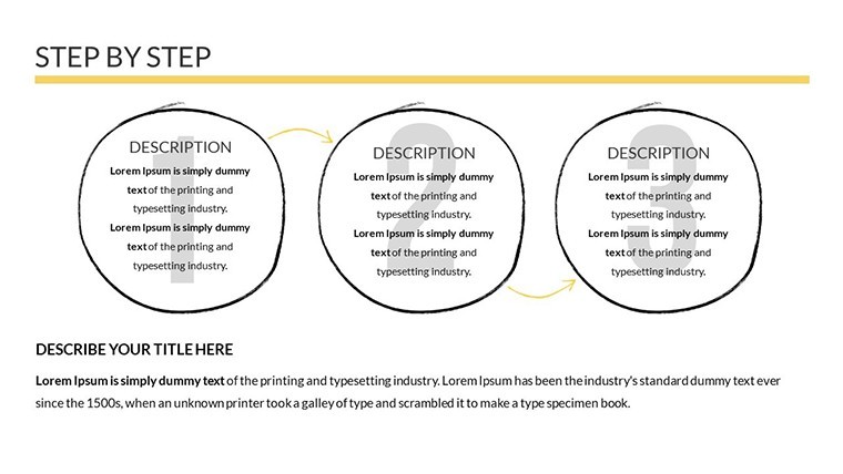
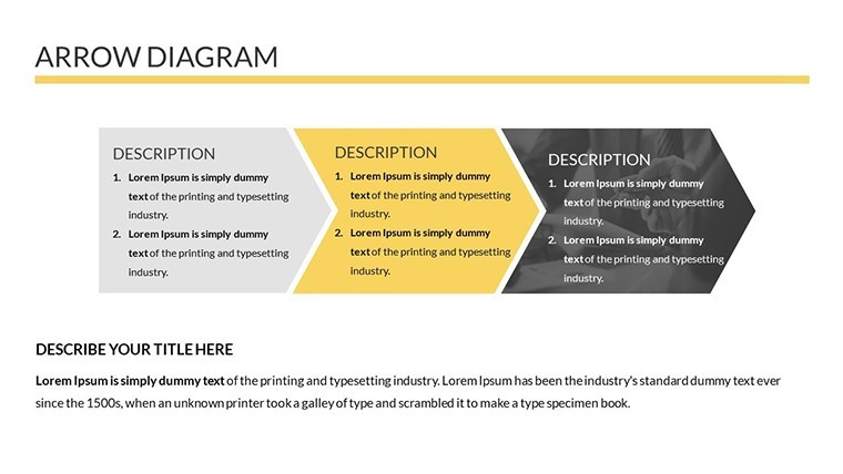
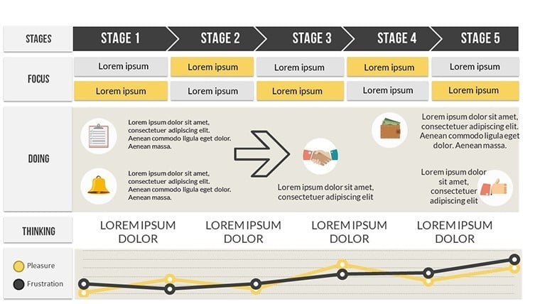
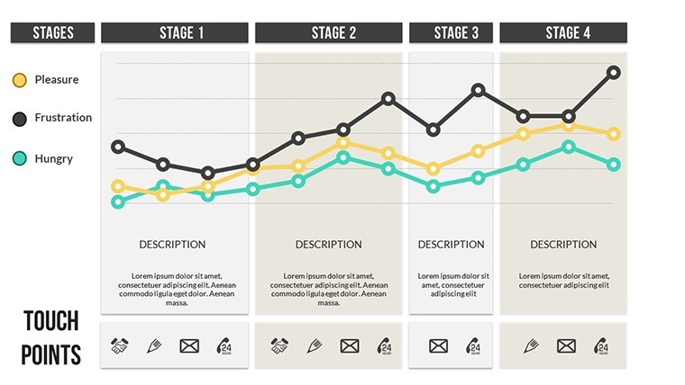
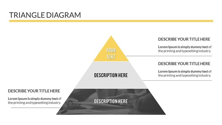
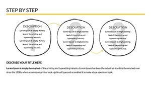
Delve into the infographic components, where icons and diagrams turn abstract concepts into tangible insights. For example, use a process flow diagram to outline a new marketing funnel, with customizable nodes for each stage from awareness to conversion. This approach draws from proven design principles, ensuring your slides adhere to accessibility standards like WCAG for color contrast. Benefits extend to audience retention; studies from sources like Harvard Business Review show that visual aids can improve information recall by 65%. Tailor these for specific scenarios, such as a SWOT analysis slide where strengths and weaknesses are visualized with balanced quadrants, fostering collaborative discussions in boardrooms.
Versatile Use Cases Across Industries
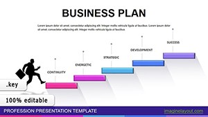
This template thrives in diverse applications, making it indispensable for professionals. In marketing, craft a campaign overview with infographics showing ROI projections, complete with icons for social media channels and growth arrows. Consultants might use it for client reports, embedding funnel charts to demonstrate lead generation efficiencies. Educators in business schools can adapt slides for case studies, like analyzing Apple's market strategies with timeline-infused graphs. Real-world success stories abound: a startup founder used similar visuals to secure funding by clearly depicting user acquisition metrics, turning skeptics into investors. By addressing common challenges - like data overload in reports - this tool ensures your presentations are concise yet comprehensive, aligning with agile methodologies for quick iterations.
Workflow Integration and Pro Tips
- Begin by importing your data sets directly into the charts for automatic updates.
- Experiment with layouts: rearrange elements via drag-and-drop for optimal flow.
- Incorporate brand assets, such as logos, to maintain consistency across slides.
- Preview in slideshow mode to fine-tune transitions and timings.
- Export to PDF for handouts, enhancing post-presentation engagement.
Integrate with tools like Google Analytics for real-time data pulls, or Canva for additional graphics, creating a hybrid workflow that's efficient and creative. Drawing from industry experts, such as those at Gartner, emphasize storytelling in your designs to make metrics memorable.
Elevating Your Professional Edge
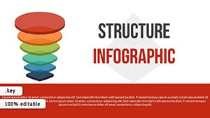
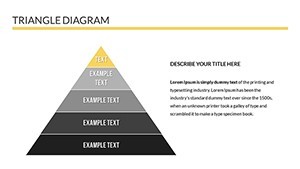
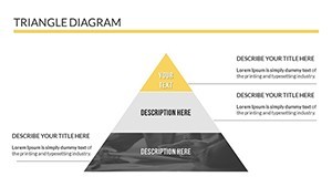
What truly differentiates this template is its blend of aesthetics and functionality. While basic tools offer rudimentary charts, these professional ones include layered infographics for depth, like nested circles for hierarchical structures in organizational charts. This sophistication builds trust, as polished visuals signal expertise. For competitive advantages, consider A/B testing slide variations in focus groups to refine impact. The end result? Presentations that not only meet business objectives but inspire action, whether closing sales or launching initiatives.
Don't settle for ordinary - download the Business Professional Keynote Charts template and redefine your presentation game today.
Frequently Asked Questions
What makes this template ideal for business professionals?
It offers 19 editable slides with infographics tailored for data-driven pitches, ensuring professional polish and audience engagement.
Can I customize the charts for my brand?
Yes, easily change colors, fonts, and layouts to align with your branding, all within Keynote's intuitive interface.
Is it suitable for team collaborations?
Absolutely; share the .key file via iCloud for real-time edits, perfect for group projects.
Does it include animation options?
Pre-built animations are included, with custom effects to highlight key data points dynamically.
How does it compare to free templates?
It provides premium infographics and versatility, saving time over basic free options with superior design quality.
Are updates available for this template?
Check our site for version updates; the core design is timeless but compatible with Keynote evolutions.