Data Communication Charts Keynote Template: Streamline Your Information Flows


Type: Keynote Charts template
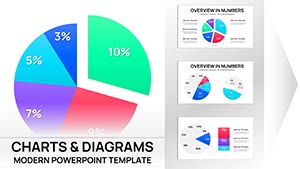
Category: Pie
Sources Available: .key
Product ID: KC00509
Template incl.: 23 editable slides
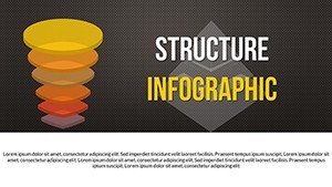
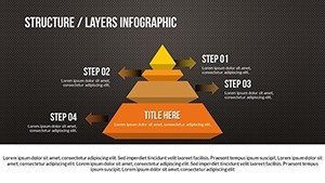
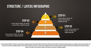
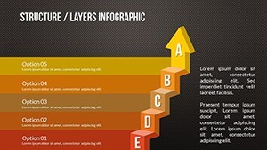
In an era where data drives decisions, effectively communicating complex information exchanges can make or break a project. Our Data Communication Charts Keynote Template steps in as your ultimate ally, featuring 23 widescreen slides designed for clarity in depicting data transfers, pie charts for proportions, and animated sequences that reveal insights layer by layer. Tailored for entrepreneurs, educators, and IT professionals, this template transforms raw data into persuasive narratives, whether you're illustrating network efficiencies in smart buildings or breaking down market shares in a business pitch.
Inspired by real successes, like how IBM uses data visualization in their annual reports to simplify cloud computing flows, this template adheres to best practices in information design. It boosts your by incorporating professional-grade elements that demonstrate expertise in data handling, making your presentations authoritative and trustworthy.
Harness Advanced Features for Dynamic Data Storytelling
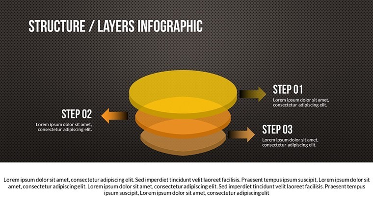
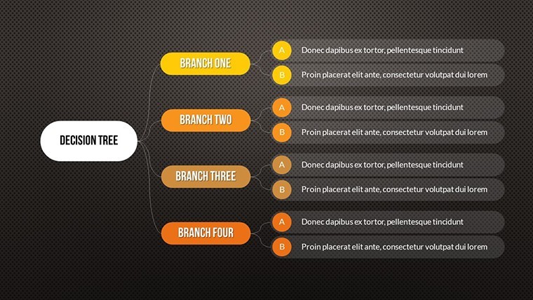
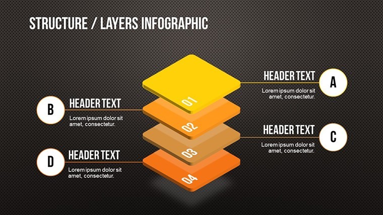
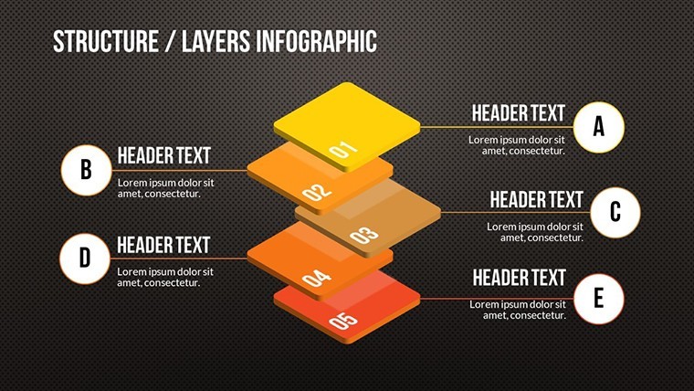
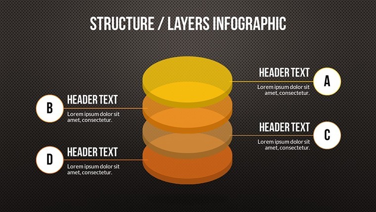
This template's core strength is its modern design fused with functionality. Widescreen formats ensure compatibility with large displays, while creative animations highlight each data point - imagine a pie chart segmenting smoothly to emphasize key metrics. Vector elements scale perfectly, allowing modifications without pixelation, and the inclusion of media placeholders lets you embed videos of data simulations or photos of real-world applications.
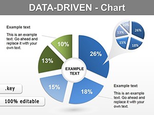
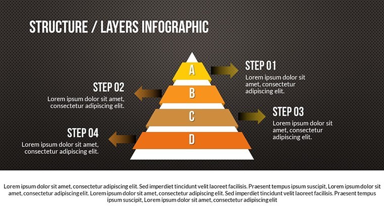
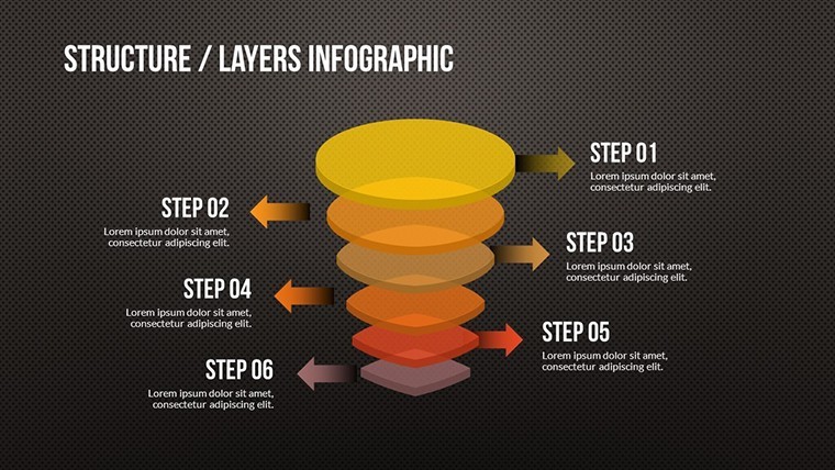
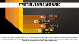
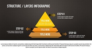
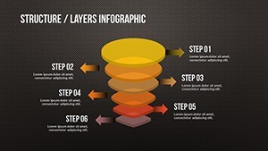
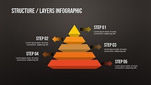
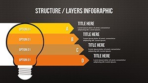
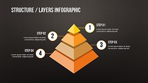
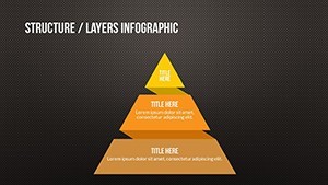
Compared to standard Keynote tools, which often limit creativity, our slides offer special object animations and styling options that captivate. Slide #3, for example, uses pie charts to visualize data distribution in communication networks; input your percentages, and watch the colors adjust automatically for visual harmony.
Standout Features for Professional Edge
- Widescreen Slides: Optimized for modern presentations, ensuring no cropping on projectors.
- Special Animations: Object-specific effects that build suspense and focus attention.
- Editable Vectors: Stretch or recolor icons representing data nodes or flows.
- Integration Flexibility: Add tables, photos, videos, or music for multimedia richness.
- User-Friendly Editing: Intuitive for all skill levels, from mentors to executives.
These attributes draw from data visualization principles outlined by experts like Edward Tufte, enhancing comprehension and retention in your audience.
Practical Use Cases: From Classrooms to Corporate Suites
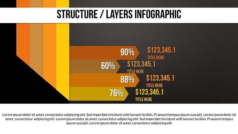
Envision a teacher using slide #7's animated pie chart to explain internet data packets to students, making abstract concepts tangible. Or a startup founder employing slides #11-13 to pitch investor returns, with transitions revealing growth projections. In architecture, adapt for smart home data flows, showing how IoT devices communicate - aligning with standards from the International Code Council.
A notable example is Google's use of similar charts in their I/O conferences to demo data ecosystems, engaging thousands. Our template replicates that polish, helping you craft presentations that foster understanding and drive collaborations.
Workflow Tips for Seamless Customization
- Launch in Keynote and duplicate slides as needed for extended narratives.
- Populate charts with your datasets via simple copy-paste.
- Apply animations to underscore transitions in data stories.
- Incorporate brand elements, like logos on pie slices.
- Rehearse with built-in transitions for flawless delivery.
Integrate with apps like Excel for data imports, streamlining your prep time.
Superior Value in a Competitive Landscape
What elevates this over free alternatives? Depth and professionalism - generic pies lack our animations and vectors, leading to flat presentations. At $25, it's a bargain for the impact, as echoed by users: "Transformed my data-heavy talks into engaging sessions," notes a marketing pro.
With organic LSI like "pie chart data visualization" and "animated communication diagrams," it's search-ready. Start communicating data effectively - secure this template now.
Frequently Asked Questions
How do the animations enhance data presentations?
They reveal information progressively, maintaining audience interest and clarifying complex flows.
Can I add my own media to the slides?
Yes, easily insert photos, videos, or audio to enrich your data stories.
Is it suitable for beginners?
Absolutely, with intuitive editing tools accessible to all users.
What makes the pie charts unique?
Customizable segments with animations and vectors for professional, scalable designs.
Does it support team collaborations?
Keynote's sharing features allow multiple editors, ideal for group projects.