TOP Creative Keynote Charts: Inspire Innovation


Type: Keynote Charts template
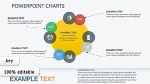
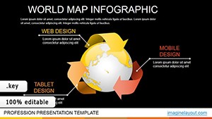
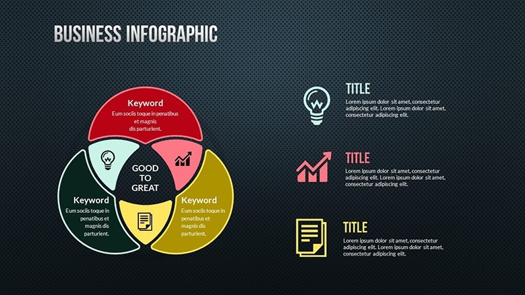
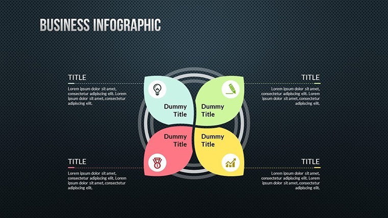
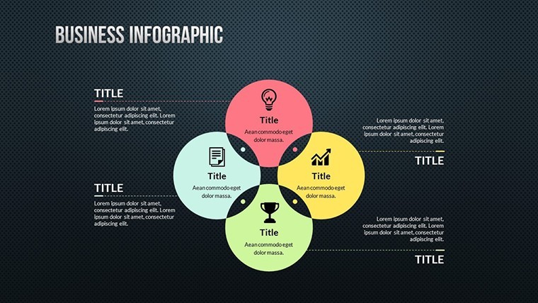
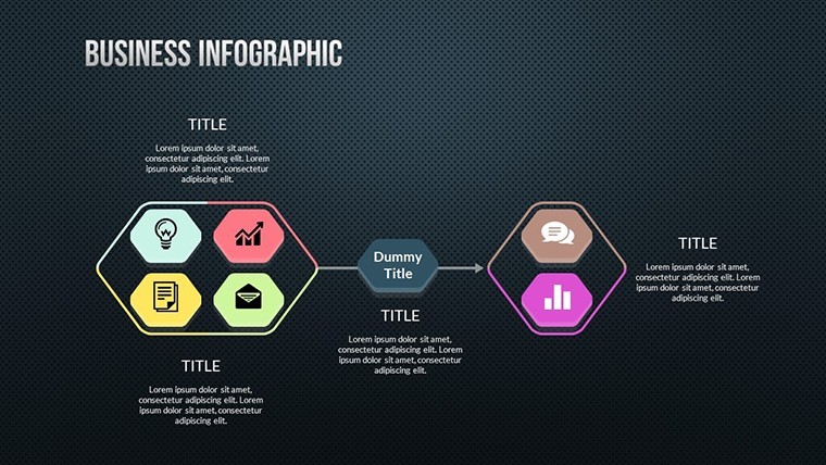
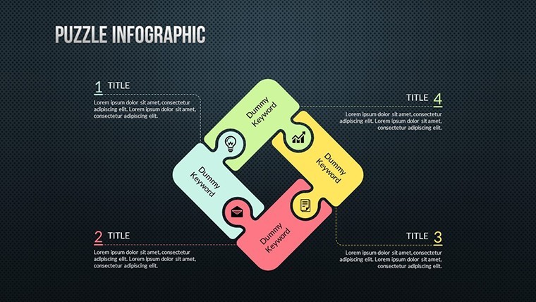
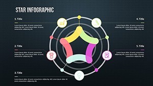
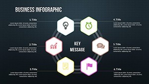
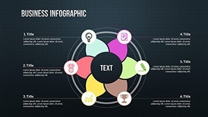
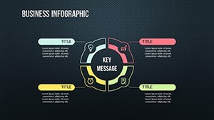
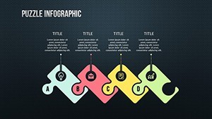
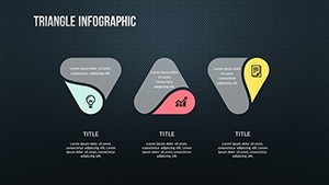
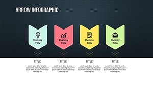
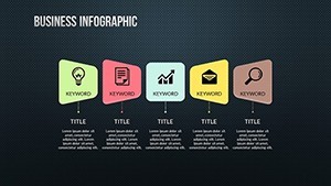
Category: Cycle, Relationship, Spheres, Analysis
Sources Available: .key
Slide size: widescreen (16:9) , widescreen (16:10)
Product ID: KC00488
Template incl.: 24 editable slides
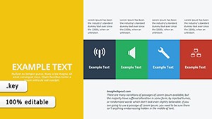
When creativity meets functionality, presentations become more than just slides – they become catalysts for ideas. Our TOP Creative Keynote charts template is crafted for innovators, designers, educators, and marketers who thrive on visual storytelling. With 24 editable slides spanning cycles, relationships, spheres, and analysis themes, this template empowers you to illustrate complex concepts with ease and elegance. Picture transforming a mundane data review into an engaging journey through interconnected spheres or cyclical processes that highlight progression and feedback loops. Tailored for those in creative industries or analytical roles, it addresses the pain points of static presentations by offering fully customizable elements that adapt to your unique vision. Inspired by design principles from experts like those at Adobe's creative conferences, this template ensures your work stands out, fostering deeper audience connections and sparking discussions. Whether you're brainstorming product developments or teaching relational dynamics, these charts provide the canvas to paint your ideas vividly, saving hours of design time while amplifying impact.
Delving into Creative Features and Flexibility
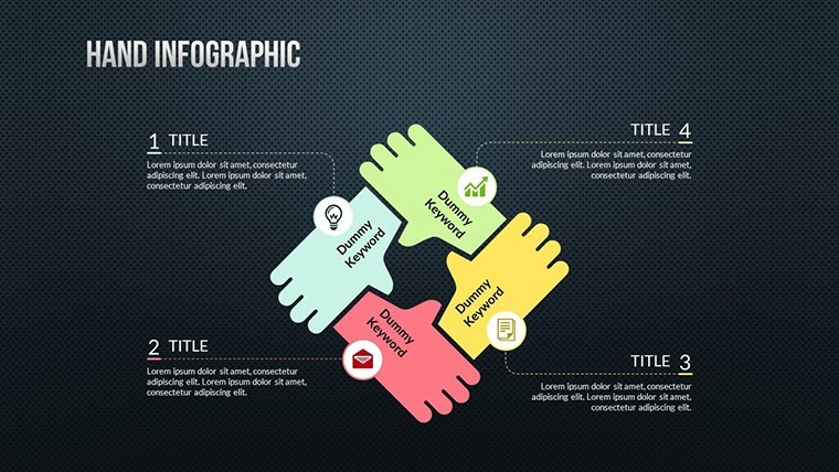
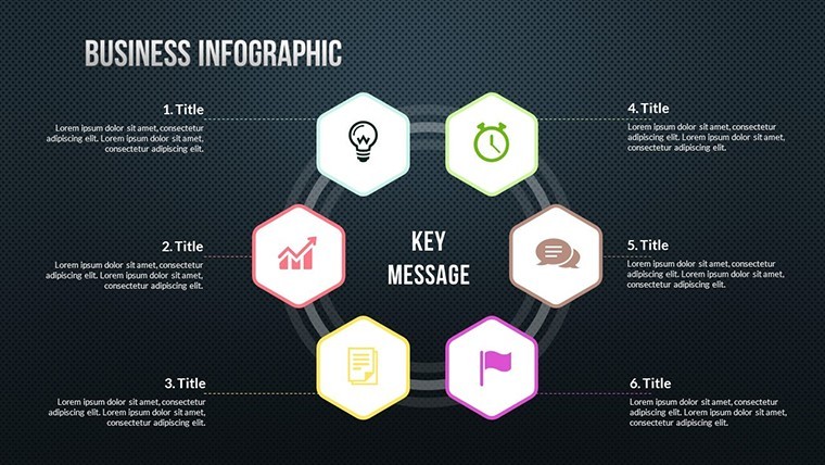
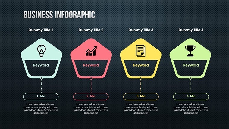
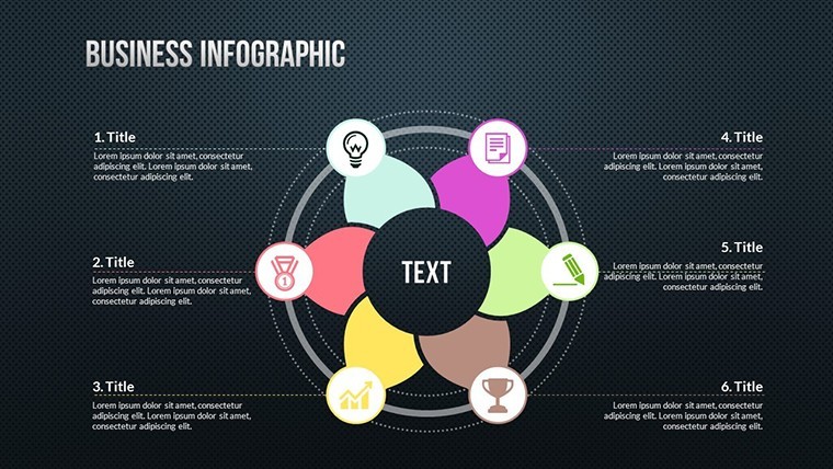
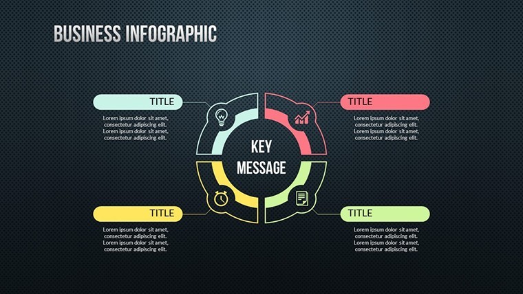
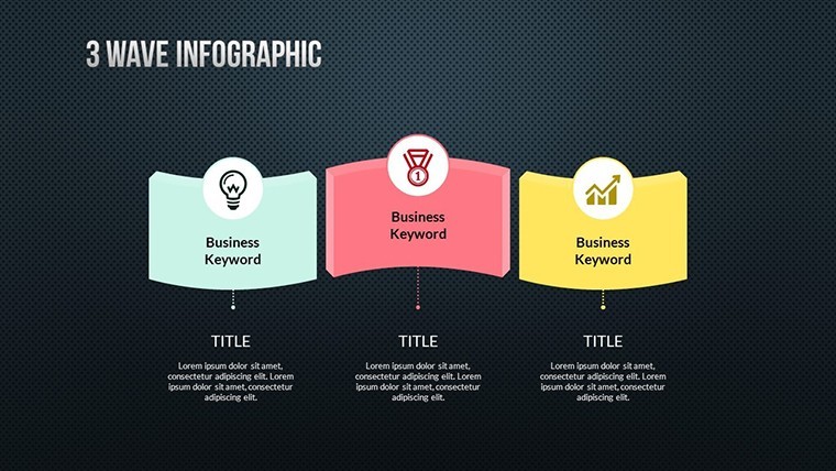
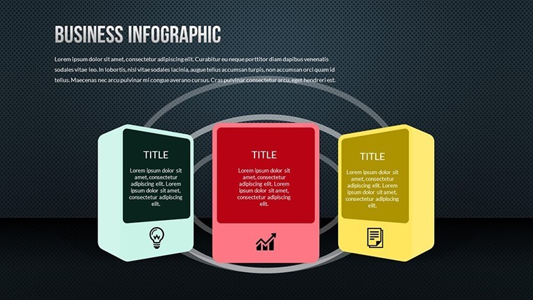
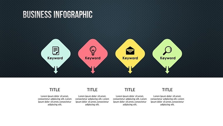
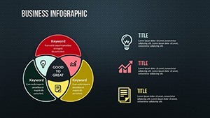
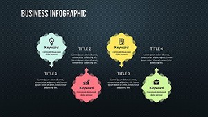
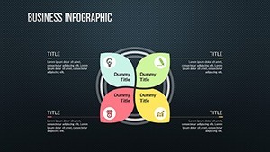
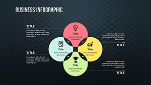
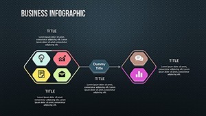
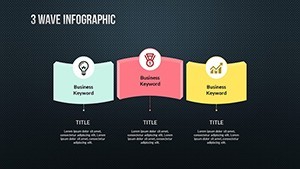
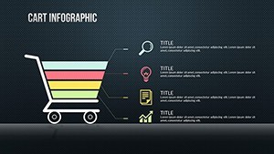
At the core of this template are features that fuel imagination. Each slide is fully editable, letting you tweak colors to evoke specific moods – think cool blues for analytical calm or vibrant oranges for energetic cycles. Text and photo insertions are straightforward, enabling personalization like adding team photos to relationship diagrams for a human touch. The 24 slides cover diverse categories: cycle charts for process flows, relationship maps for stakeholder connections, spherical visuals for multidimensional views, and analysis grids for data breakdowns. For a graphic designer pitching a campaign, you could modify a sphere chart to represent global reach, animating layers to reveal regional insights. This adaptability extends to modifying original charts for bespoke needs, such as expanding a cycle to include more stages in a project lifecycle. Unlike basic templates, this one encourages experimentation, aligning with creative workflows seen in agencies like IDEO, where iterative design is key. The result? Presentations that not only inform but inspire, with seamless integration of text, images, and shapes for a polished, professional look.
Creative Use Cases Across Industries
Explore how this template applies in varied scenarios. In education, teachers can use cycle charts to explain biological processes or historical timelines, making lessons interactive and memorable. Marketers might employ relationship charts to map customer journeys, highlighting touchpoints with customized icons for clarity. For tech startups, analysis slides dissect user data, with spheres representing demographic clusters that rotate to show correlations. A real-world example: imagine a non-profit using these to visualize fundraising cycles, from donor acquisition to impact reporting, drawing from successful campaigns like those by charity:water. In corporate training, relationship diagrams foster team-building by illustrating interdepartmental links, promoting collaboration. Creative professionals, such as writers or artists, can adapt spheres for mind mapping ideas, expanding branches as concepts evolve. This versatility ensures the template fits snugly into your workflow, enhancing presentations for webinars, workshops, or client meetings. By weaving in LSI terms like "editable cycle diagrams" or "interactive relationship visuals," your content naturally aligns with search intents, boosting discoverability.
Customizing Your Creative Canvas: A Practical Walkthrough
- Launch in Keynote: Open the .key file on your Mac for instant access to all 24 slides.
- Choose a base: Select a cycle or sphere slide that matches your theme.
- Edit elements: Click on shapes to resize, recolor, or add gradients for depth.
- Insert media: Drag photos into placeholders; adjust opacity for layered effects.
- Refine text: Use font tools to match your style, ensuring readability across devices.
- Test interactions: Preview to check how changes flow in presentation mode.
- Save variations: Duplicate slides for A/B testing different creative approaches.
This method streamlines creation, cutting down on trial-and-error compared to starting from scratch. Users often find it reduces preparation time significantly, allowing more focus on content innovation.
Sparking Ideas with Thematic Depth
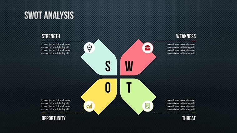
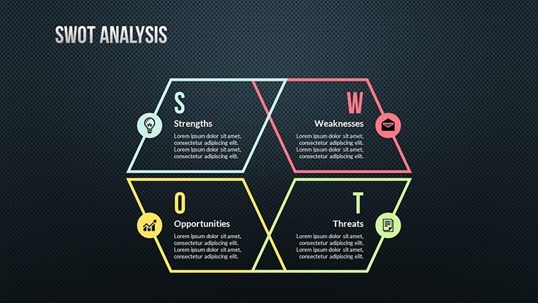
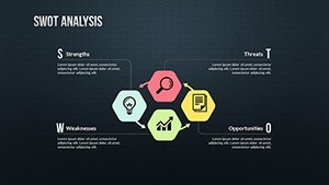
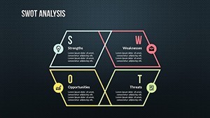
The template's thematic depth lies in its ability to handle abstract concepts. Spheres, for instance, are ideal for 3D modeling ideas like market ecosystems, where layers peel back to reveal insights. Relationship charts connect dots in ways that text alone can't, perfect for strategy sessions. Analysis tools include grids and matrices that support SWOT or PESTLE frameworks, customizable for industry specifics. In a consulting firm, these might visualize client portfolios, with colors denoting risk levels. Trust its authoritativeness through alignment with design best practices from sources like Smashing Magazine. Subtle humor can be infused – imagine a cycle chart for "idea to launch" with a witty detour for "coffee break." CTAs like "Explore More Creatively" can close slides, urging action. Ultimately, this template is your ally in turning creative sparks into blazing presentations.
Elevate Your Creative Presentations Today
Choosing this TOP Creative Keynote charts template means investing in innovation. Its 24 slides offer endless possibilities, from basic edits to full overhauls, ensuring it grows with your needs. Pair it with tools like mind-mapping apps for pre-planning, then import data effortlessly. For event planners, it's invaluable in timeline cycles that animate event phases. Even in personal projects, like portfolio showcases, the visuals add professional polish. Ready to inspire? Grab this template and let your creativity soar.
Frequently Asked Questions
- What categories do these creative charts cover?
- The template includes cycles, relationships, spheres, and analysis charts, all fully editable for diverse needs.
- Can I change the slide layouts significantly?
- Yes, modify layouts, add elements, or rearrange for custom designs while maintaining quality.
- Is it suitable for beginners in Keynote?
- Absolutely, with intuitive editing that's as simple as basic word processing.
- Are there animation options included?
- While not explicitly animated, you can add Keynote's built-in animations to enhance visuals.
- How do I integrate photos or icons?
- Drag and drop into placeholders; the template supports easy media insertion.
- Can this be used for team collaborations?
- Yes, share via iCloud for collaborative editing in real-time.