Financial Keynote Charts - Fully Editable | ImagineLayout


Type: Keynote Charts template
Category: Process
Sources Available: .key
Product ID: KC00472
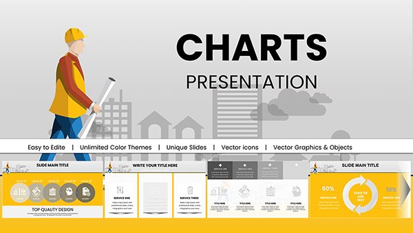
Template incl.: 14 editable slides
Files and Formats Included
14 editable slides come in a single .key file ready for immediate use in Keynote.
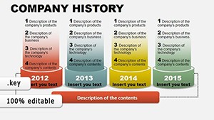
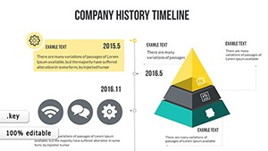
The slides connect loan portfolio breakdowns to investment strategy outlines covering end-to-end tasks in one investor deck.
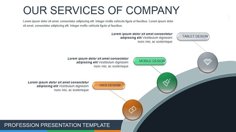
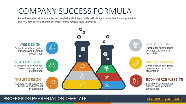
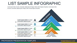
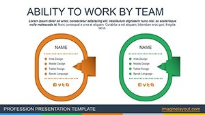
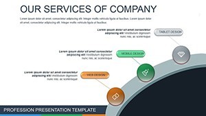
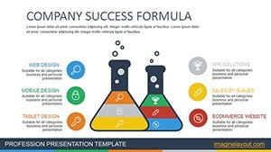
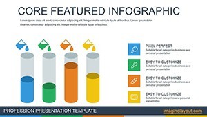
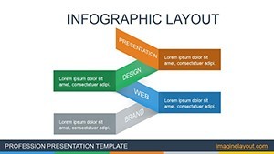
Unlike general process sets this layout emphasizes targeted financial diagram structure with zone segmentation that keeps visual hierarchy tight during board briefings.
Key Specifications
| Feature | Details |
|---|---|
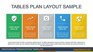
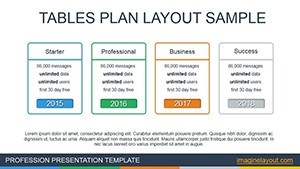
| Slides included | 14 editable slides focused on financial metrics |
| Editable shapes | diagram segments resize and recolor independently |
| Text labels | each label editable without unlocking grouped elements |
| Color themes | compatible with Keynote slide master color palette |
| Diagram connectors | arrows and lines adjustable in direction and weight |
| Export options | .key for editing PDF for distribution |
Typical Use Cases by Role
A banking analyst in corporate finance prepares loan portfolio reviews by adapting investment strategy slides reusing the file across three reports through color theme adjustments.
Corporate executives in investment firms outline strategies during a board briefing cutting deck preparation from three hours to 45 minutes.
Download the Financial Services Keynote Charts template now for your next investor deck.
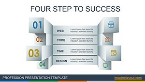
Customization in 4 Steps
Moderate difficulty. The process takes under 15 minutes in Keynote.
- Open the .key file and select the target slide one minute
- Replace placeholder text with your financial data three minutes
- Adjust brand colors via the slide master two minutes
- Fine-tune diagram connectors then export four minutes
Why This Template Not a Blank Slide
Creating equivalent financial diagrams manually demands four hours and advanced skills to prevent label overlap on projection screens.
This set delivers ready layout composition that maintains information spacing and flow direction.
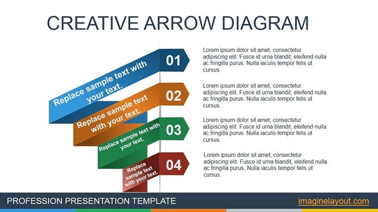
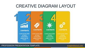
Many presentations place labels directly inside diagram shapes. That approach works on laptops but becomes harder to read on large projection screens. This layout keeps labels outside the shapes and connects them with thin lines improving clarity during live meetings without increasing editing complexity.
Get the template and streamline your financial presentations today.
Which Keynote versions does this template support?
The template opens correctly in Keynote 12 and newer versions including the latest 2025 release. Older versions before Keynote 12 may show layout shifts because of missing shape effects. Test the file immediately after download to confirm compatibility with your installed version. If issues appear simply update Keynote through the App Store for full editable shapes and color theme support.
How do I change the color scheme?
Select any slide then open the Format panel on the right. Click the color well next to the shape fill and pick your brand color. Repeat for all diagram connectors and text labels. The changes apply across the entire deck because of slide master compatibility. Save the file once finished to lock the new color contrast for your next sales report presentation.
What does the license allow for client work?
You may use the template in paid client projects including investor decks and board briefings. The license covers unlimited presentations for your own business or clients. Resale of the original file or sublicensing to third parties is not permitted. Modify the diagrams freely and export PDFs for distribution without additional fees.
What does the free version include versus the paid version?
The free version provides only a single static preview slide with locked elements. The paid version unlocks the complete 14 editable slides plus all diagram connectors and icon layers. Full text placeholders and color theme adjustments become available only after purchase. This difference lets you test the layout composition before committing to the full financial set.
What software is required to open the files?
Apple Keynote is required on macOS or iOS devices. The .key format does not open in PowerPoint or Google Slides. Download the free Keynote app if you do not already have it. No additional plugins or fonts are needed because all elements use standard system resources.
What is the refund policy?
Refunds are available within 14 days of purchase if the file fails to open in your Keynote version. Send the order number and a screenshot of the error to support. Refunds are not granted after successful download and editing because the product is digital. All sales are final once the template has been customized.