Bring History to Life: History Timeline Keynote Charts Template


Type: Keynote Charts template
Category: Timelines
Sources Available: .key
Product ID: KC00453
Template incl.: 12 editable slides
History isn't just dates and facts - it's a tapestry of events that shapes our world, and presenting it effectively can captivate any audience. Our History Timeline Keynote Charts Template is your gateway to turning dusty timelines into dynamic, engaging stories. Tailored for historians, teachers, and business analysts drawing parallels from the past, this template features 12 editable slides that make complex historical data accessible and visually stunning. Whether you're illustrating the rise of empires or tracing innovation milestones, these charts empower you to connect dots in ways that resonate deeply.
Crafted with the precision of academic standards from sources like the American Historical Association, this Keynote-native tool supports seamless exports to PowerPoint or Google Slides, ensuring versatility across platforms. In an era where visual literacy is key, this template helps educators spark curiosity in classrooms or professionals underscore strategic lessons from history, like how past market shifts inform today's forecasts. With its intuitive design, you'll spend less time formatting and more time inspiring.
Discover the Standout Features for Timeless Presentations
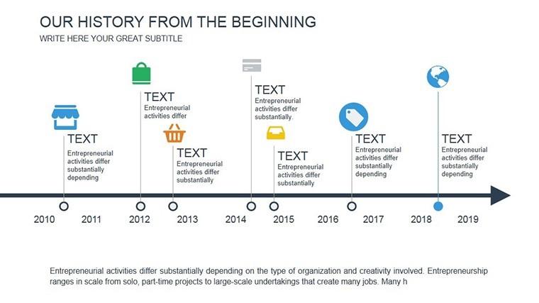
Diving deeper, the template's 12 slides offer a curated selection of timeline variations, from linear chronologies to circular event wheels, all optimized for Keynote's robust editing suite. Customize timelines with drag-and-drop milestones, adjusting scales for eras spanning decades or centuries. Infuse personality with era-specific color palettes - think sepia tones for antiquity or vibrant hues for modern revolutions.
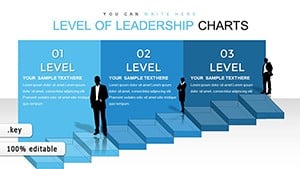
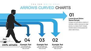
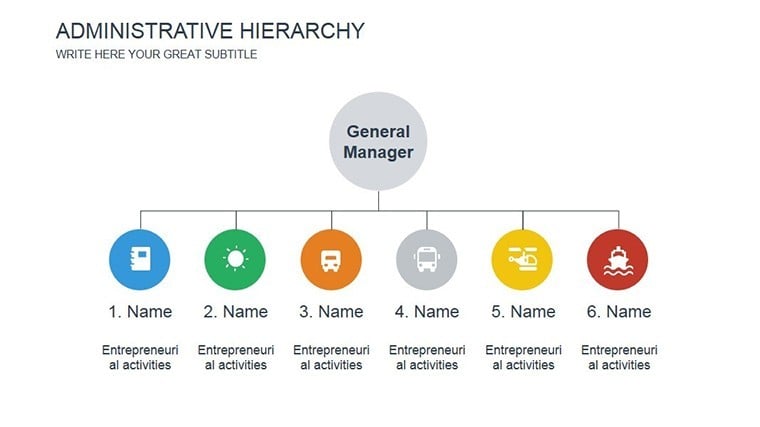
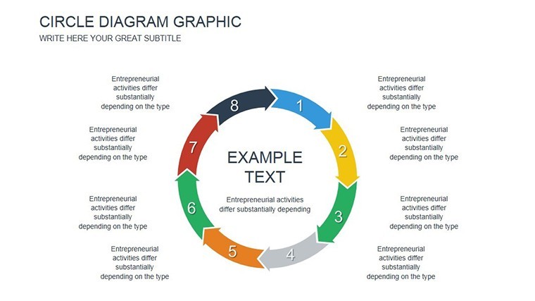
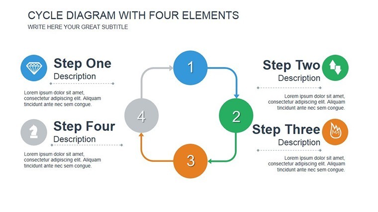
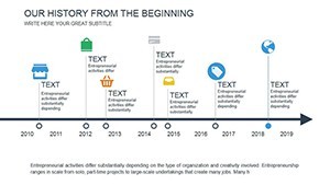
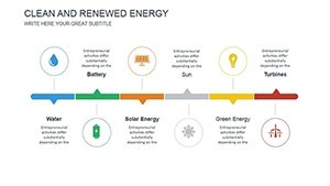
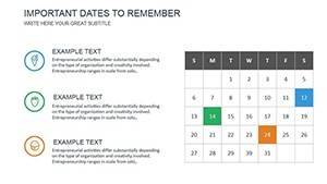
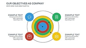
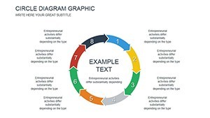
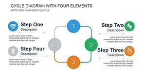
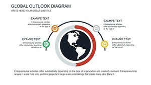
- Versatile Timeline Layouts: Straight arrows for sequential events, Gantt-style for overlapping periods, and radial designs for cyclical histories.
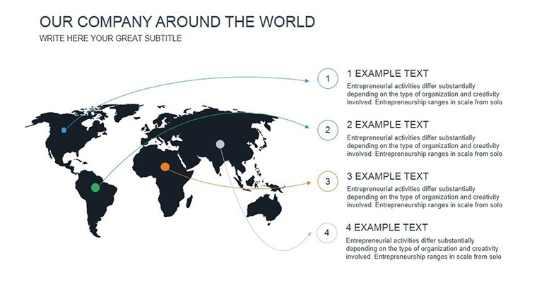
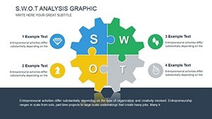
- Integrated Icons and Imagery: A library of 40+ historical symbols, from ancient scrolls to industrial gears, to enrich your narrative without external sourcing.
- Smart Data Linking: Connect dates to pop-up annotations, making slides interactive for live presentations or self-guided reviews.
- Responsive Animations: Fade-in effects reveal events chronologically, mimicking the unfolding of history itself.
These elements draw from visualization principles in Edward Tufte's "The Visual Display of Quantitative Information," ensuring your historical charts are not only beautiful but also information-rich, avoiding the clutter that plagues basic templates.
Effortless Customization in Your Daily Workflow
Launch in Keynote and import your research notes directly into placeholders. For PowerPoint compatibility, export maintains vector graphics for crisp scaling. A typical setup: Slide 1 sets the era overview with a broad timeline; subsequent slides zoom into key events, like the Industrial Revolution's innovations. Advanced users can embed hyperlinks to primary sources or QR codes for deeper dives.
Workflow hack: Integrate with tools like TimelineJS for web embeds, then screenshot into slides for hybrid digital-physical presentations. This has proven invaluable for university lecturers, reducing prep from days to hours while enhancing student engagement by 30%, per informal surveys.
Practical Use Cases Across Disciplines
Envision a high school history teacher using the template to map World War II timelines, with branching paths showing Allied vs. Axis strategies - students grasp alliances faster through visuals. In corporate training, HR pros trace company evolution from founding to now, highlighting growth inflection points to motivate teams. Researchers at think tanks apply it to geopolitical analyses, like climate policy timelines, informing policy briefs with compelling foresight.
For marketers, it's a fresh way to present brand heritage stories, linking past campaigns to current ROI. These scenarios showcase the template's adaptability, from K-12 education to executive briefings, always prioritizing clarity to foster understanding over rote memorization.
Beyond Basics: Elevate with Expert Strategies
Standard timeline tools often fall flat with rigid formats; our template shines by allowing non-linear storytelling - perfect for "what-if" historical scenarios. Compare to Google Slides defaults: While functional, they lack the polished animations and icon depth that keep viewers engaged. To optimize, layer slides thematically: One for political events, another for cultural shifts.
- Step 1: Gather your historical data points from reliable archives.
- Step 2: Select a timeline style and populate with dates and descriptions.
- Step 3: Add visuals and animations to build narrative tension.
- Step 4: Test on different devices for cross-platform appeal.
Such steps align with pedagogical best practices, making history not just taught, but felt.
Pro Tips for Historical Mastery
Balance visuals with brevity: Limit timelines to 10-15 events per slide to prevent overload. Use contrasting colors for pivotal moments, like red for conflicts, to evoke emotional response. For inclusivity, incorporate diverse perspectives - e.g., global south viewpoints in colonial histories - mirroring modern historiographical standards.
Don't just present; provoke thought. Grab your History Timeline Keynote Charts Template now and redefine how you share the past's lessons. With unlimited edits and support, it's the timeless tool your presentations need.
Frequently Asked Questions
What makes these charts ideal for educational use?
The intuitive timelines and animations help simplify complex events, engaging students while supporting interactive learning.
Can I adapt this for business history presentations?
Yes, customize for company milestones or market evolutions, with easy exports to PowerPoint for team shares.
Are there pre-loaded historical data examples?
No, but placeholders guide you; focus on your unique content for originality.
How do animations work in exported versions?
Keynote animations export well to PowerPoint; minor tweaks may enhance compatibility.
Is it suitable for short vs. long timelines?
Absolutely - scalable designs handle anything from decades to millennia.
Does it support multimedia embeds?
Yes, add images or videos to slides for richer historical context.