Animated Keynote Charts - Instant Download | ImagineLayout


Type: Keynote Charts template
Category: Process
Sources Available: .key
Product ID: KC00443
Template incl.: 16 editable slides
What's Inside the Download
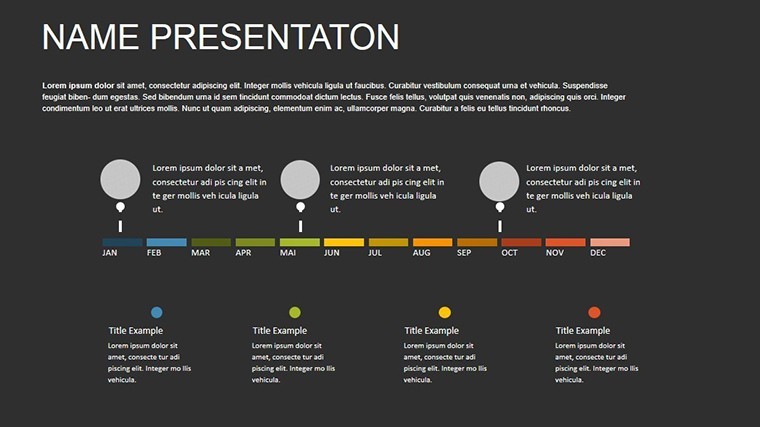
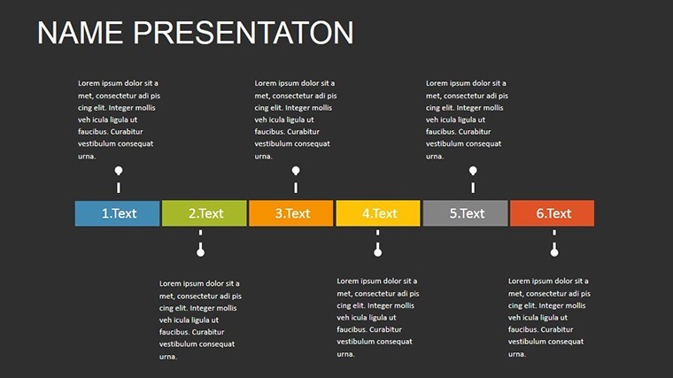
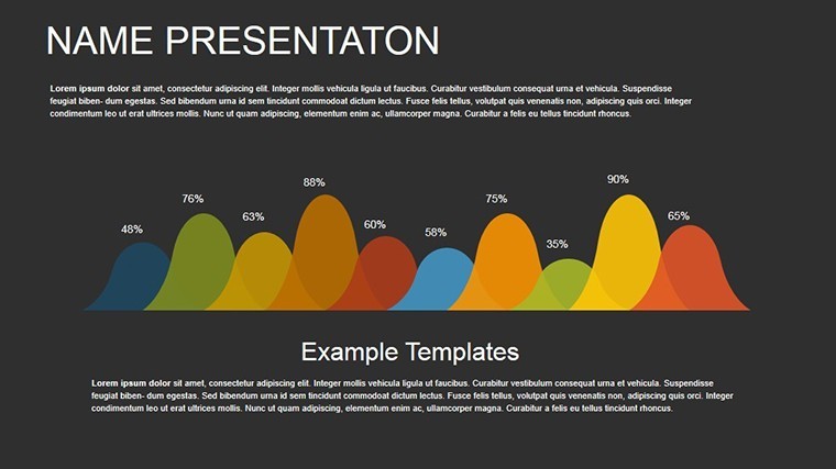
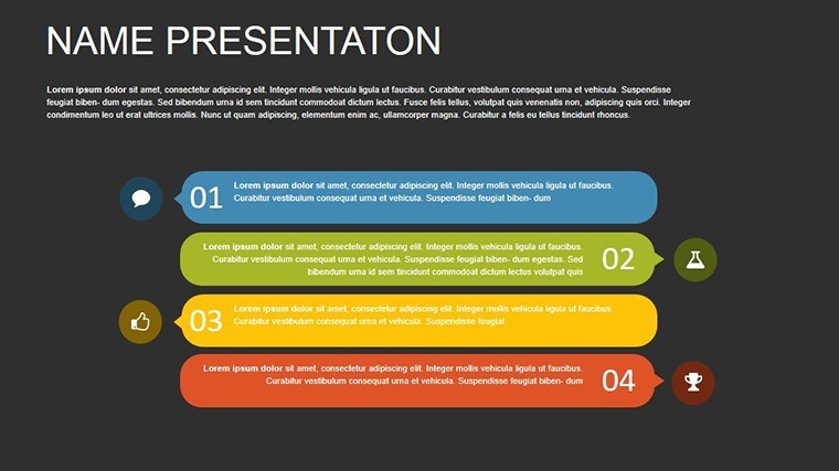
16 slides feature animated chart elements for timelines and budgets.
The .key file arrives ready for direct Keynote editing.
All animations and layout composition stay fully accessible.
Editing Capabilities at a Glance
| Feature | Details |
|---|---|
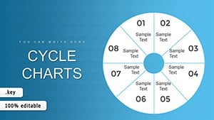
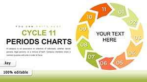
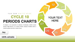
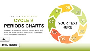
| Slides included | 16 animated charts |
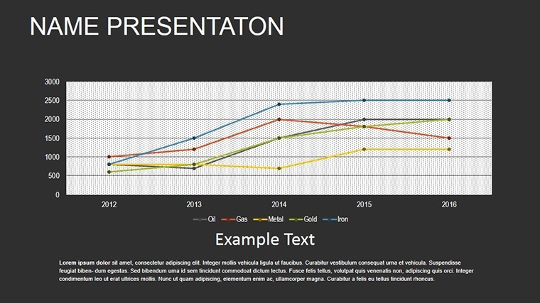
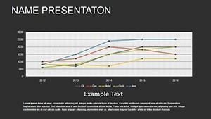
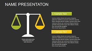
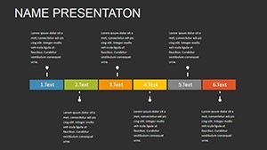
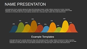
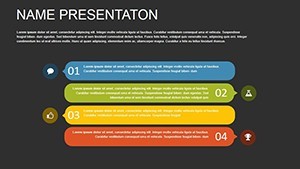
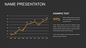
| Diagram categories | timeline and growth trajectories |
| Editable elements | text placeholders and icon layers replaceable without affecting layout |
| Aspect ratio | standard 16:9 |
| PowerPoint compatibility | Keynote only |
| Color themes | compatible with Keynote slide master color palette |
| Animation support | built-in effects on data elements |
| Diagram connectors | arrows and lines adjustable independently |
From Download to Final Deck
1. Open the .key file in Keynote (1 minute).
2. Replace placeholder text and numbers (3 minutes).
3. Adjust color theme adjustments for brand match (2 minutes).
4. Fine-tune animation timing if required (4 minutes).
Export as PDF for the meeting (1 minute). Editing difficulty stays moderate.
How Consultants Use This in Client Work
An engineer in construction industry pitches sustainable high-rise designs to investors.
Animated timelines and pulsing budget growth cut preparation from 3 hours to 40 minutes.
A project manager in urban planning breaks down site phases for city council.
The file gets reused across multiple proposals after quick color updates.
Download the Animated Keynote Charts and make data move with your story.
The Cost of Not Using a Template
Manual animation setup risks inconsistent flow direction across slides.
This version already applies zone segmentation and external labels for projection clarity.
You avoid hours lost to alignment errors common in blank Keynote files.
Visual hierarchy and information spacing remain professional from the first use.
Get the Animated Keynote Charts and boost impact in your next presentation.
Which Keynote versions does this template support?
This template opens exclusively in Keynote versions 10 and above on macOS or iOS. Earlier versions may not support the animation features fully. You cannot open it in PowerPoint or Google Slides without conversion losses. Always test in your installed Keynote before finalizing edits.
How do I change the color scheme?
Open the file in Keynote and switch to slide master view. Select the color palette and update the theme colors directly. Apply the changes to all slides at once. Every diagram updates automatically without manual recoloring of each element.
What does the license permit?
The license permits use in your own presentations and for paid client work. You cannot resell the template file itself or distribute copies to others. Sublicensing is not allowed. Commercial use in client proposals is fully permitted as long as the end user does not receive the source file.
Is there a free version available?
No free version is available for this template. The paid download includes all slides, animations, and editable elements listed. A free version would typically limit slides or remove animations but is not offered here. Purchase grants immediate access to the complete package.
What file formats are included and what software is required?
The file is provided as a single .key archive. Keynote software is required to open and edit it. No PPTX or other formats are included. Export to PDF or images is possible from within Keynote for sharing.