Functional Keynote Charts - Ready to Present | ImagineLayout


Files and Formats Included
16 slides deliver functional chart layouts optimized for data display.
One .key file contains everything needed for immediate use.
Standard Keynote compatibility covers all modern versions.
Key Specifications
| Feature | Details |
|---|---|
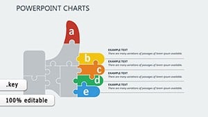
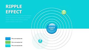
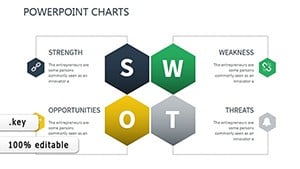
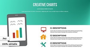
| Slides included | 16 functional charts |
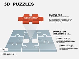
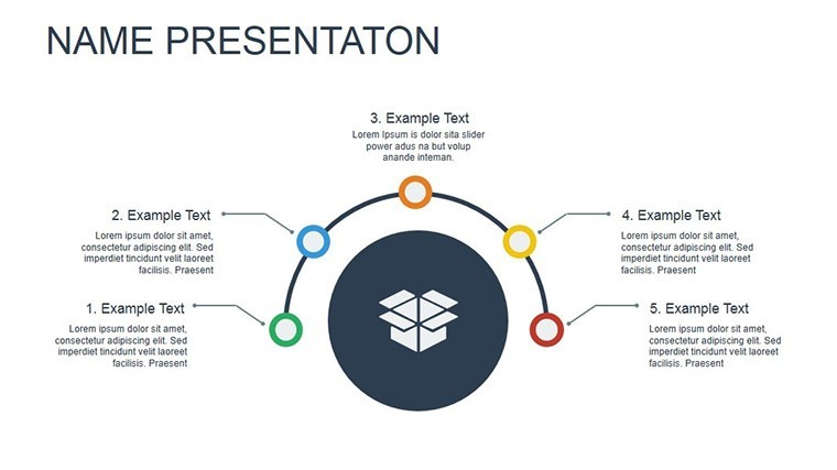
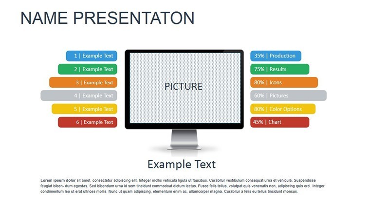
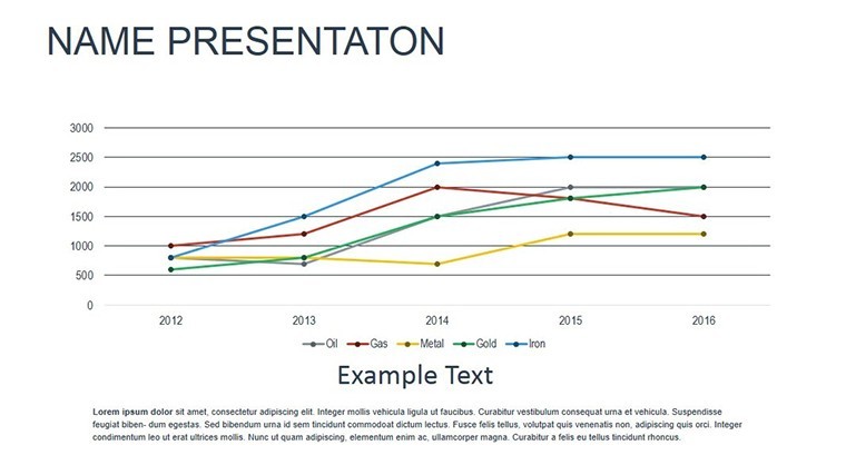
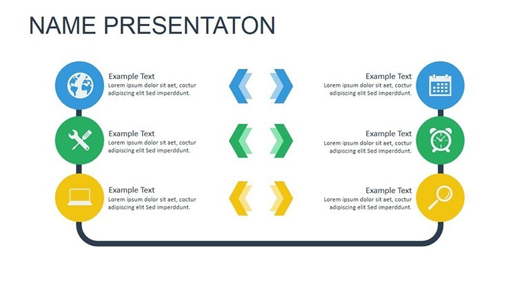
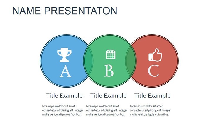
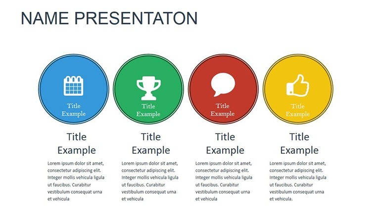
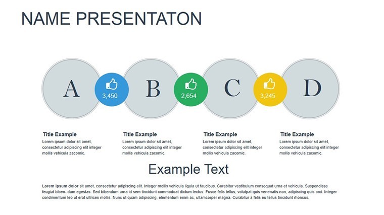
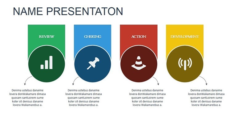
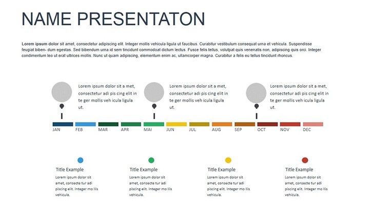
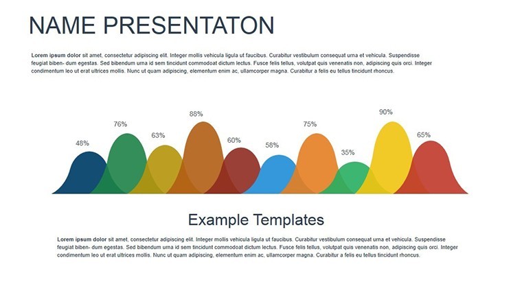
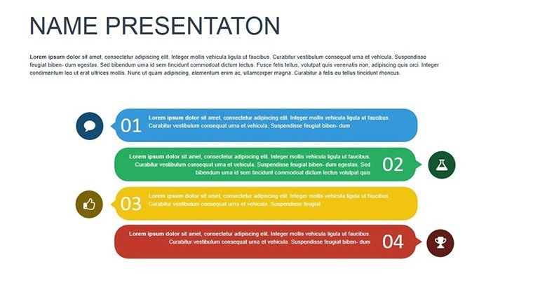
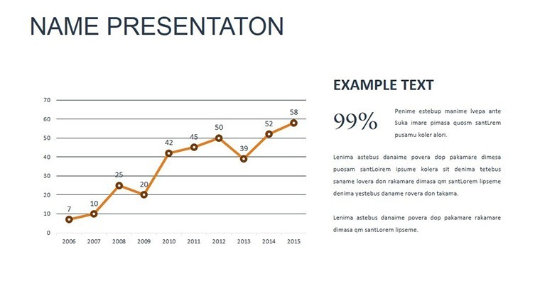
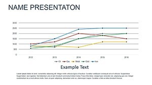
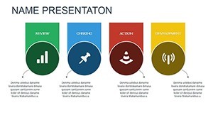
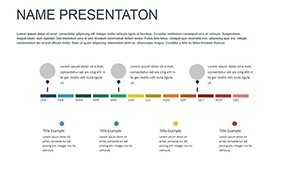
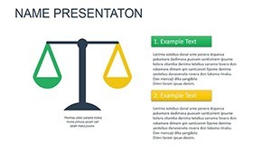
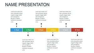
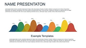
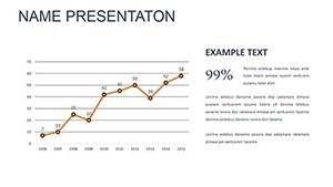
| Diagram categories | ROI and performance metrics |
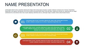
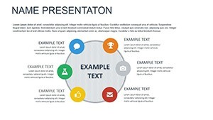
| Editable elements | text placeholders and icon layers replaceable without affecting layout |
| Aspect ratio | standard 16:9 |
| PowerPoint compatibility | Keynote only |
| Color themes | compatible with Keynote slide master color palette |
| Animation support | subtle transitions on data bars |
| Diagram connectors | arrows and lines adjustable independently |
Three Situations Where This Pays Off
A corporate executive in finance presents quarterly results in board meetings.
Swapping data labels and color contrast cut preparation from 3 hours to 40 minutes.
A marketing team in tech industry dissects campaign ROI during internal reporting.
The file gets reused across three decks with quick theme updates.
Download the Modern Functional Keynote Charts and drive decisions with clear data.
Edit, Brand, Present: The Workflow
1. Open the .key file in Keynote (1 minute).
2. Replace text labels in charts (3 minutes).
3. Apply brand colors via slide master (2 minutes).
4. Adjust diagram connectors if needed (3 minutes).
Export ready for the meeting (1 minute). Editing difficulty stays moderate.
What You'd Need to Replicate This Yourself
Manual chart creation demands precise alignment of every bar and label.
This template already solves information spacing and zone segmentation issues.
You skip hours of trial and error with flow direction already optimized.
Resulting visual hierarchy matches professional standards without design skill.
Get the Functional Keynote Charts and present data that actually drives action.
Which Keynote versions does this template support?
This template opens exclusively in Keynote versions 10 and above on macOS or iOS. Earlier versions may not support the animation features fully. You cannot open it in PowerPoint or Google Slides without conversion losses. Always test in your installed Keynote before finalizing edits.
How do I change the color scheme?
Open the file in Keynote and switch to slide master view. Select the color palette and update the theme colors directly. Apply the changes to all slides at once. Every diagram updates automatically without manual recoloring of each element.
What does the license permit?
The license permits use in your own presentations and for paid client work. You cannot resell the template file itself or distribute copies to others. Sublicensing is not allowed. Commercial use in client proposals is fully permitted as long as the end user does not receive the source file.
Is there a free version available?
No free version is available for this template. The paid download includes all slides, animations, and editable elements listed. A free version would typically limit slides or remove animations but is not offered here. Purchase grants immediate access to the complete package.
What file formats are included and what software is required?
The file is provided as a single .key archive. Keynote software is required to open and edit it. No PPTX or other formats are included. Export to PDF or images is possible from within Keynote for sharing.