Dynamic Infographics Keynote - Instant Download | ImagineLayout


Type: Keynote Charts template
Category: Relationship, Pyramids
Sources Available: .key
Product ID: KC00437
Template incl.: 12 editable slides
Package Contents
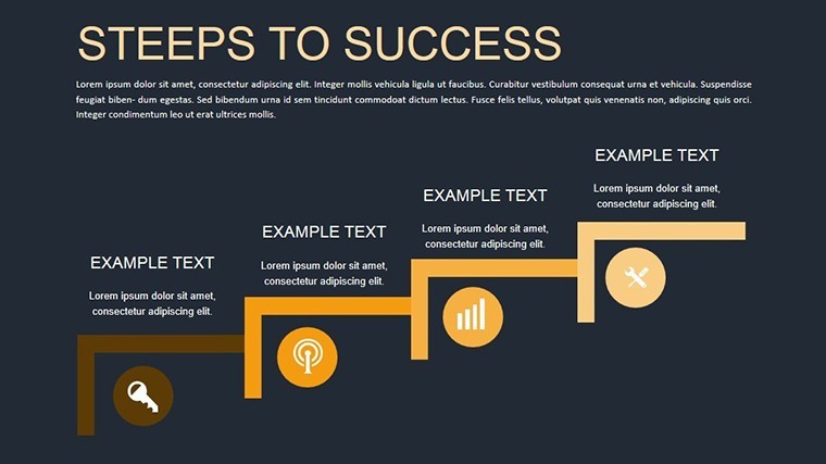
12 slides deliver infographic layouts focused on architectural data.
The download contains one .key file with all elements included.
No extra assets or fonts required beyond standard Keynote.
At a Glance
| Feature | Details |
|---|---|
| Slides included | 12 infographic slides |
| Diagram categories | site survey and budget flow |
| Editable elements | text placeholders and icon layers replaceable without affecting layout |
| Aspect ratio | standard 16:9 |
| PowerPoint compatibility | Keynote only |
| Color themes | compatible with Keynote slide master color palette |
| Animation support | dynamic transitions on data elements |
| Export options | PPTX not available but PDF from Keynote |
Adapting the Template to Your Brand
1. Open the .key file in Keynote (1 minute).
2. Update brand colors through the slide master (2 minutes).
3. Replace text placeholders in infographic zones (3 minutes).
4. Adjust diagram structure for specific site data (4 minutes).
Export as PDF for client review (1 minute). Editing difficulty remains moderate.
Typical Use Cases by Role
An architect in urban planning presents site survey results to city council.
Zone segmentation and contrast zones reduced revision rounds from four to one.
A project manager in construction industry prepares quarterly briefings for stakeholders.
The same file gets reused across three reports after swapping color schemes.
Get the Dynamic Infographics Keynote and clarify your next site data presentation.
Building From Scratch vs. Starting Here
Creating infographics manually requires hours aligning zones and flow direction.
This version provides ready layout composition with external labels for screen readability.
You avoid common errors like overcrowded information spacing that happens in blank slides.
Time saved reaches 90 percent while visual hierarchy stays consistent across slides.
Download the Dynamic Infographics for Architectural Keynote and start sculpting data clarity today.
Which Keynote versions does this template support?
This template opens exclusively in Keynote versions 10 and above on macOS or iOS. Earlier versions may not support the animation features fully. You cannot open it in PowerPoint or Google Slides without conversion losses. Always test in your installed Keynote before finalizing edits.
How do I change the color scheme?
Open the file in Keynote and switch to slide master view. Select the color palette and update the theme colors directly. Apply the changes to all slides at once. Every diagram updates automatically without manual recoloring of each element.
What does the license permit?
The license permits use in your own presentations and for paid client work. You cannot resell the template file itself or distribute copies to others. Sublicensing is not allowed. Commercial use in client proposals is fully permitted as long as the end user does not receive the source file.
Is there a free version available?
No free version is available for this template. The paid download includes all slides, animations, and editable elements listed. A free version would typically limit slides or remove animations but is not offered here. Purchase grants immediate access to the complete package.
What file formats are included and what software is required?
The file is provided as a single .key archive. Keynote software is required to open and edit it. No PPTX or other formats are included. Export to PDF or images is possible from within Keynote for sharing.