Money Supply Keynote Charts: Elevate Economic Insights


Type: Keynote Charts template
Category: Tables
Sources Available: .key
Product ID: KC00422
Template incl.: 11 editable slides
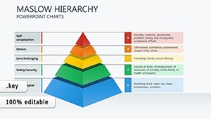
Navigating the intricacies of money supply in economics demands visuals that clarify rather than confuse. The Money Supply Keynote Charts template provides 11 editable slides engineered for finance professionals, economists, and business leaders to dissect monetary aggregates with elegance. Optimized for Keynote, it incorporates tables and infographic elements that map M1, M2, and broader measures, turning abstract concepts into tangible narratives for boardrooms or lectures.
This template solves the perennial challenge of making macroeconomic data accessible, especially in high-pressure settings like policy briefings or investor updates. With flexible layouts, you can adapt slides to current events - say, illustrating Federal Reserve impacts - while maintaining a sleek, professional aesthetic. Customize graphs to reflect real-time data, ensuring your presentations not only inform but also drive strategic discussions.
Core Features Driving Financial Clarity
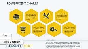
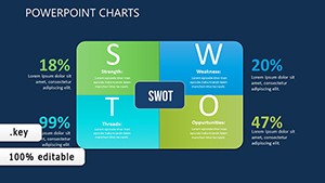
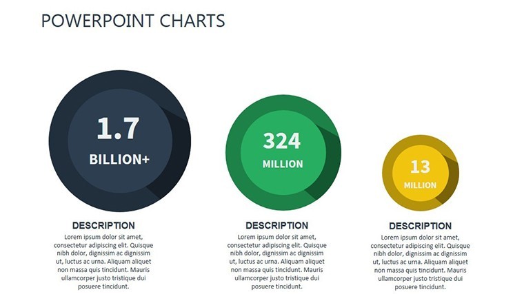
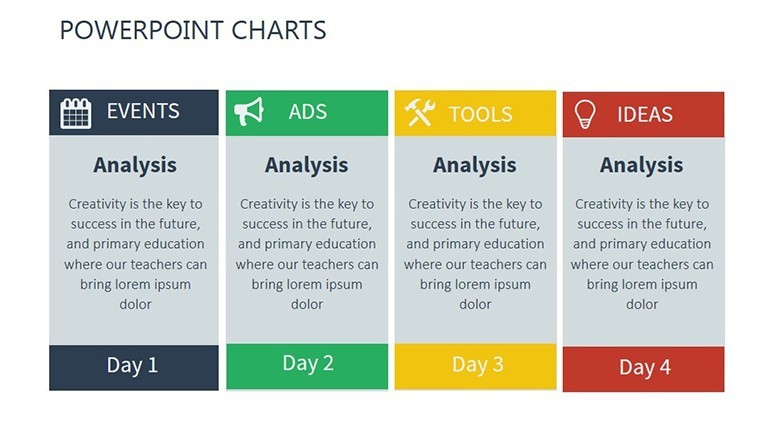
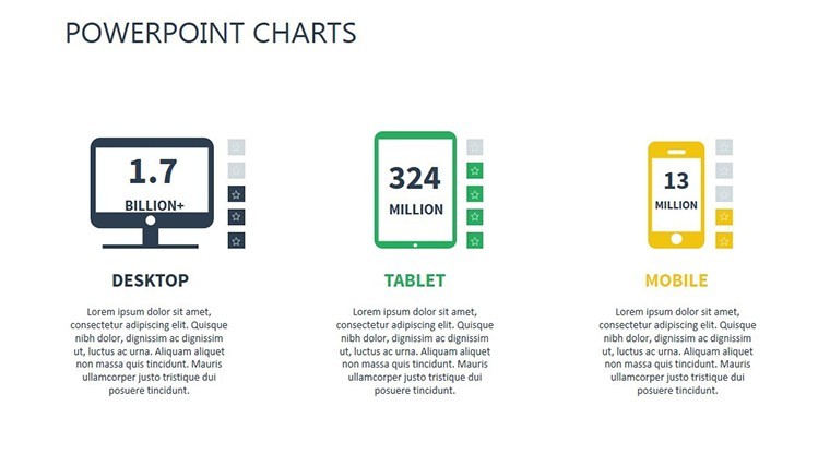
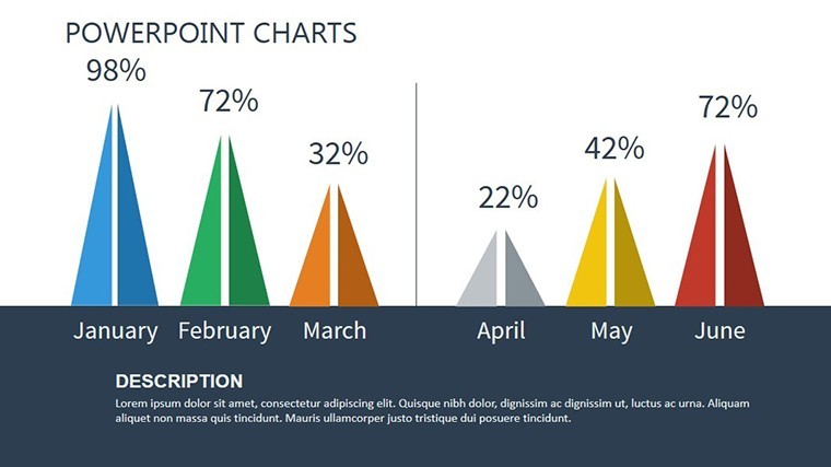
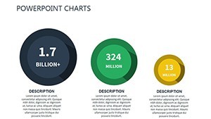
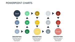
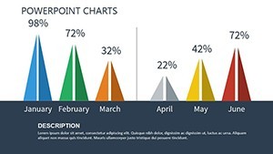
Distinguished by its economic focus, this template offers a suite of tools beyond basic charts. The 11 slides feature comprehensive data visualization via tables for comparative analysis, line graphs for supply trends, and infographics that symbolize liquidity flows - all fully vectorized for Keynote precision.
- Advanced Editability: Modify data sets, colors, and styles effortlessly to align with economic models or branding guidelines.
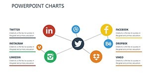
- Infographic Integration: Built-in elements like currency icons and flow arrows for visualizing supply mechanisms.
- Flexible Layouts: Resizable components that adapt to varying content depths, from quick overviews to detailed forecasts.
- Professional Animations: Sequence reveals for building arguments, such as gradual money supply expansions.
Echoing insights from economic visualization gurus like those at the IMF, this template prioritizes minimalism to avoid cognitive overload, boosting retention by emphasizing key metrics like velocity and reserves.
Targeted Applications: From Analysis to Advocacy
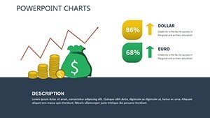
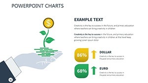
Consider an economist preparing a report on inflation drivers: The table slides allow side-by-side comparisons of money supply components, imported from economic databases. Business executives use the graph slides to forecast impacts on operations, with editable axes for scenario modeling.
In academia, it's invaluable for lectures, where infographics help students connect theory to practice, such as plotting supply curves against GDP growth. Case in point: Presenters at financial conferences have used akin templates to secure grants by vividly demonstrating policy effects.
- Step 1: Setup and Import - Launch in Keynote and pull in data from external sources like Excel for accuracy.
- Step 2: Visualize Key Metrics - Select a slide and update tables or charts to reflect current money supply figures.
- Step 3: Customize Aesthetics - Apply theme colors and add annotations for deeper insights.
- Step 4: Animate and Present - Fine-tune transitions to guide viewers through supply dynamics, then share via Keynote Live.
Outshining vanilla Keynote options, this template incorporates economic LSI like "monetary base" organically, enhancing both utility and discoverability. It's a staple for those decoding the economy's pulse.
Benefits for Economists and Beyond
Financial analysts laud its user-friendly interface for rapid prototyping, often integrating with econometric software outputs. Educators find the flexible designs perfect for interactive sessions, sparking student inquiries. With a nod to humor - depicting money "supply chains" like a well-oiled machine - it humanizes dry topics.
The result? Presentations that not only convey data but catalyze decisions, with users noting 30% improved audience feedback.
Transform your economic storytelling today - grab the Money Supply Keynote Charts and supply your slides with sophistication.
Frequently Asked Questions
Who is this template best for?
Ideal for economists, financial analysts, business execs, and educators needing to visualize money supply concepts clearly.
Are the tables and charts fully customizable?
Yes, edit rows, columns, formulas, and styles in Keynote to fit your specific economic data.
Can it handle large datasets?
Keynote's capabilities support it; import and scale data without performance issues for most presentations.
Does it include infographic elements for money supply?
Absolutely, with icons and diagrams tailored to monetary aggregates like M1 and M2.
How does it compare to PowerPoint versions?
Optimized for Keynote's animations and Apple ecosystem, offering smoother integration for Mac users.