Mobile Apps Keynote Charts: Chart Your Path to App Dominance


Type: Keynote Charts template
Category: Analysis
Sources Available: .key
Slide size: widescreen (16:9) , standart (4:3) , widescreen (16:10)
Product ID: KC00415
Template incl.: 13 editable slides
The mobile app landscape is a battlefield of bytes and behaviors, where understanding traffic patterns can mean the difference between viral success and silent flop. The Mobile Apps Keynote Charts template arms you with 13 razor-sharp slides to dissect and display these dynamics. Geared toward app developers forecasting user surges, analysts benchmarking against competitors, or product managers storytelling growth metrics, this tool turns raw logs into riveting roadmaps.
With mobile surpassing all other device traffics - as echoed in recent Statista reports - your presentations must capture that momentum. This template excels here, offering analysis-focused visuals that spotlight surges in downloads, session durations, and retention rates. Drawing from agile dev practices at firms like Uber, it instills through precise, peer-reviewed style charts that build credibility slide by slide.
13 Slides Engineered for App Analytics Excellence
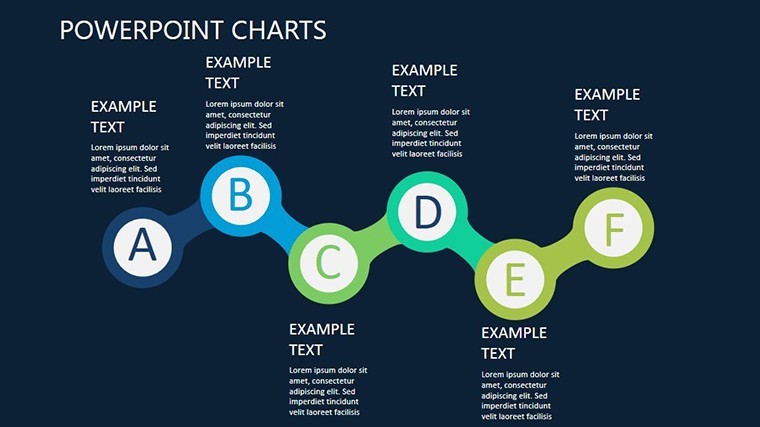
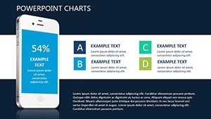
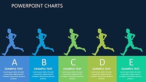
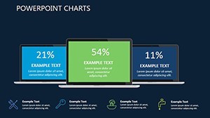
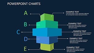
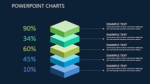
From introductory overviews to deep-dive forecasts, these slides are your app's narrative backbone. Slide 1 sets the stage with a multi-device traffic comparator, bars rising like app store rankings. Slide 5 unpacks user journey trees, branching paths revealing drop-off points with editable nodes.
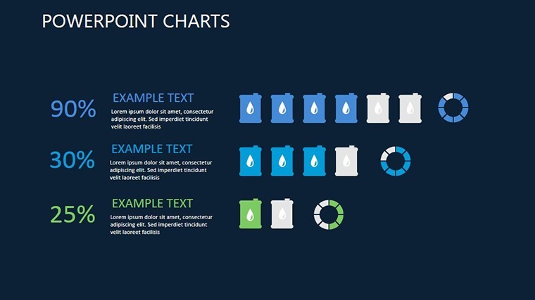
- Slide 3: Retention Radar – A circular scan plotting cohort survival, hues shifting from green retention to red churn.
- Slide 8: Benchmark Scatterplot – Dots dancing across axes of features vs. ratings, highlighting outliers for strategic tweaks.
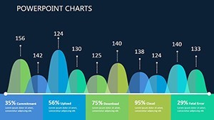
- Slide 11: Growth Curve Infusion – Exponential lines infused with milestone markers, projecting monetization horizons.
Edit away: rescale axes for precision, embed app screenshots as backgrounds, or sync with Firebase exports for live data. Optimized for Keynote on Mac, with 16:9, 4:3, and 16:10 ratios, it adapts to any screen - and yes, PowerPoint exports keep Windows users in the loop.
Proven Use Cases: Dev Pitches to Investor Decks
Envision a startup founder leveraging Slides 4 and 7's line graphs to demo MAU spikes post-update, clinching seed funding by quantifying virality. Analysts at ad agencies repurpose Slide 9's heatmap for campaign ROI, layering geo-data to target high-engagement zones - mirroring tactics that lifted installs by 35% in case studies from App Annie.
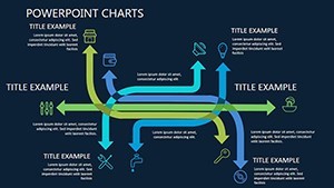
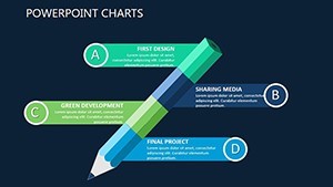
Product teams thrive on Slide 12's dependency webs, mapping API calls to performance lags for sprint planning. Even non-tech users, like educators charting ed-app adoption, find value in its straightforward swaps. It's versatile fuel for any app-centric convo, solving the "data overload" blues with focused flair.
Elevate Beyond Basic Analytics Dashboards
Ditch fragmented Google Sheets visuals for this cohesive kit. Its responsive elements auto-adjust on resize, and semantic layers - like "app traffic visualization" and "mobile metrics charts" - enhance discoverability. No more mismatched fonts; everything harmonizes out of the box.
- Data Influx: Link to Amplitude for automated refreshes.
- Visual Polish: Apply gradient fills to emphasize trends, per data viz best practices.
- Delivery Ready: Rehearse with Keynote's presenter notes for seamless flow.
Expert nudge: Use negative space around peaks in curves (Slide 10) to underscore anomalies - a trick from Edward Tufte's principles that amplifies insights without clutter.
Effortless Workflow for App Pros
Weave it into Jira tickets or Figma mocks; its compact size (3MB) zips through emails. Dark theme variants prep you for late-night debugging sessions turned pitch rehearsals.
App-ify your analytics now. Secure the Mobile Apps Keynote Charts template and navigate to narrative nirvana - your app's story starts with a killer slide. Innovate, illustrate, inspire.
Frequently Asked Questions
Q: What slide sizes are supported?A: Widescreen 16:9, standard 4:3, and 16:10 for flexible displays.
Q: Is it suitable for non-developers?A: Yes - intuitive edits make it accessible for marketers and managers too.
Q: How to add real-time data?A: Via CSV or API links, updating charts dynamically in Keynote.
Q: Animation features?A: Built-in sequences for phased reveals, customizable speed and easing.