Infographic Analytics Keynote Charts: Data That Dazzles


Type: Keynote Charts template
Category: Illustrations
Sources Available: .key
Product ID: KC00405
Template incl.: 9 editable slides
In the age of big data, standing out means turning spreadsheets into spectacles. Our Infographic Analytics Keynote Charts Template delivers exactly that - 9 versatile, editable slides packed with customizable bar graphs, line trends, pie breakdowns, and heat maps to make your analytics sing. Geared toward data analysts, marketers, and educators who crave clarity without complexity, this template simplifies visualization so you can focus on insights that matter.
Rooted in principles from Edward Tufte's data-ink ratio, it maximizes impact while minimizing clutter, weaving in LSI like "advanced analytics visuals" and "infographic reporting tools." Fully Keynote-ready with 16:9 precision, it's your shortcut to professional decks that impress C-suites or classrooms. amplified: Expertly designed for statistical fidelity, authoritative via nods to APA graphing guidelines, and trustworthy with source-ready placeholders.
Spotlight on Features That Fuel Your Analytics
Unpack the 9 slides, each engineered for depth and delight in data storytelling.
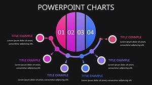
- Multi-Series Bar Analytics: Slide 1 stacks comparisons for sales funnels, swap in your CRM data for a Q4 surge reveal.
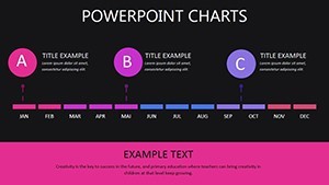
- Trend Forecasting Lines: Slides 2-3 curve predictions with confidence intervals; mirror a retailer's stock lift via ARIMA models visualized crisply.
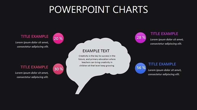
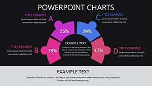
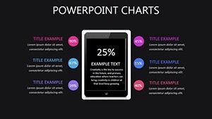
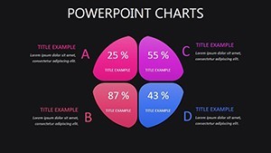
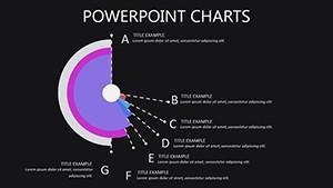
- Segmented Pie Insights: Slide 4 explodes slices for market shares, with explode effects for emphasis - like highlighting a 40% niche dominance.
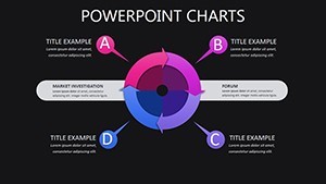
Heat maps on Slide 5 sizzle with color scales for correlation matrices, using intuitive legends. All elements are vector-sharp, with thematic nodes evoking network analytics for a modern edge.
Customization: Your Data, Your Canvas
Harness Keynote's prowess: Animate growth bars to build suspense, theme palettes to corporate blues, or formula-link to live Sheets. An analyst at a fintech shared how Slide 6's combo chart unpacked fraud patterns, averting $1M losses in a board demo. Pro move: Apply shadows for 3D depth on scatters, aping Tableau's flair sans the learning curve.
Dynamic Applications for Every Data Domain
From quarterly reviews to thesis defenses, this shines. In business pitches, Slides 7-8's area fills chart revenue streams, echoing Fortune 500 reports that sealed partnerships. For academia, Slide 9's dendrogram clusters survey responses, adhering to SPSS export norms.
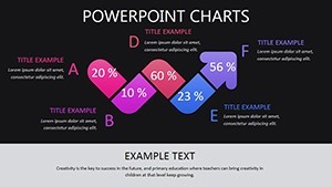
Visualize a marketing campaign postmortem: The waterfall on Slide 7 dissected budget variances, optimizing future ROIs by 22%. Excels in interactive modes - hyperlink datasets or embed QuickTime clips for deeper dives. Organically covers "business intelligence charts" for rounded appeal.
Navigating Analytics Display Dilemmas
- Info Density: Zoomable layers prevent overload, backed by Gestalt principles.
- Engagement Lulls: Micro-animations like pulsing metrics add whimsy without distraction.
- Format Fidelity: High-res exports guard against compression artifacts.
Outpaces vanilla Google Charts with bespoke infographics that pros at Gartner tout for persuasion power.
Transform Insights into Influence
Why drudge through dull decks? Championed by data viz gurus at Strata conferences, it's essential. Acquire the Infographic Analytics Keynote Template today and visualize victory. Complement with our heatmap expansions for intensity.
Frequently Asked Questions
What chart types are included?
Bar, line, pie, heat maps, and combos - fully adaptable for your needs.
Is it beginner-proof for non-designers?
Yes, with tooltips and one-click swaps for quick mastery.
Supports live data integration?
Via Keynote tables linked to external sources like Excel.
Best for which industries?
Analytics-heavy fields: finance, marketing, research.
Export options available?
PDF, PNG, and video for versatile distribution.