World Development Keynote Charts Template - Fully Editable | Instant Download


Type: Keynote Charts template
Category: Cycle
Sources Available: .key
Product ID: KC00402
Template incl.: 9 editable slides
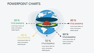
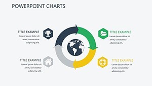
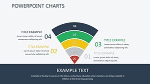
Present global progress with 9 editable infographic slides featuring GDP arcs, poverty lines and sustainability indices. Perfect for diplomats and researchers. Instant Keynote download.
What's Included
The World Development Keynote Charts template supplies 9 editable infographic slides in .key format. Each slide visualizes economic threads, GDP arcs, poverty lines and sustainability indices as described on the product page. The complete file is ready for Mac Keynote with no extra files needed.
Infographic Focus
All 9 slides are optimized for international discourse and data storytelling rather than dense spreadsheets.
Key Features
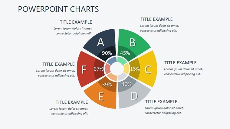
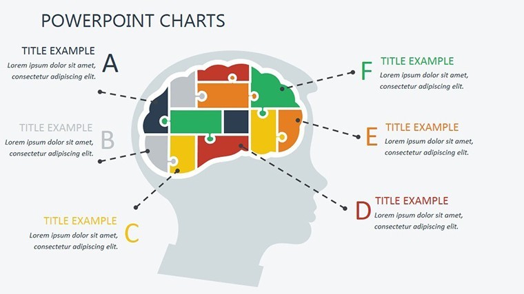
This set stands out with its 9 compact infographic gems that use blooming desert-oasis metaphors and soaring arcs for visual impact. Elements are fully editable and grouped for quick updates.
Unique Layout Style
Unlike the Executive Decision 3D puzzle or Mortgage Transfer Venn templates in related products, this collection uses 9 infographic gems centered on global advancement rather than corporate decisions or financial overlaps.
Professional Use Cases
International Conference Presentations
A policy researcher at a United Nations agency used the GDP arc slides to present poverty reduction trends to member states. The visual metaphors turned abstract indices into memorable equity stories that drove policy discussions forward.
Academic Research Seminars
An economics professor displayed the sustainability index infographics during a graduate seminar. Students immediately connected the blooming visuals to real-world development outcomes, improving engagement and retention of complex global data.
How to Customize
Download the .key file, open in Keynote, select any arc or index element, replace the data values, adjust colors to your institutional palette and update text placeholders. All infographic elements remain perfectly aligned. Finish in minutes and export for projection.
Why Choose This Template
Manually creating 9 professional global development infographics in Keynote usually consumes 3-4 hours of precise alignment work. This template provides pre-designed arcs and indices that already follow international report standards, saving time and elevating quality. The specific design choice of soaring arcs and blooming visuals helps diplomats and researchers communicate hope and equity more effectively than plain charts.
FAQ
Are the 9 infographic slides fully editable?
Yes, every GDP arc, poverty line, sustainability index and text element can be edited directly in Keynote. The product page confirms 9 editable infographics, so you control the entire global progress narrative without design barriers.
What software is required to open the file?
Only Apple Keynote on Mac. The .key file opens instantly with all infographic elements intact. It is not compatible with PowerPoint or web-based tools.
Is commercial use allowed for conferences?
Yes, the license permits commercial and institutional use including conference presentations. You may use the 9 slides freely in professional settings while keeping the original file private.
Do the slides cover sustainability and GDP metrics?
Yes, all 9 infographics focus on GDP arcs, poverty lines and sustainability indices exactly as described on the product page. No filler content - every slide advances the global progress story.
What is the refund policy?
14-day full refund guarantee. If the 9 infographic slides do not meet your global development presentation needs after opening in Keynote, contact support for immediate refund.
Can I adjust colors for my organization?
Yes, all color elements are simple fills editable in Keynote. Update to your exact brand or institutional palette while preserving the soaring arc and blooming visual metaphors.