Direct Marketing Keynote Charts: Fuel Your Campaigns with Precision Visuals


Type: Keynote Charts template
Category: Illustrations
Sources Available: .key
Slide size: widescreen (16:9)
Product ID: KC00395
Template incl.: 9 editable slides
In the fast-paced world of direct marketing, where every email open or click can make or break a campaign, clarity isn't a luxury - it's your secret weapon. Enter our Direct Marketing Keynote Charts template: a powerhouse of 9 editable slides tailored for Keynote pros who need to dissect consumer databases, forecast response rates, and showcase ROI without the fluff. Picture this: You're a CRM specialist at a mid-sized e-commerce firm, prepping to justify a personalization push that could lift conversions by 30%. These charts don't just display data - they illuminate paths to profit, turning spreadsheets into strategic masterpieces.
Crafted with a vibrant, conversion-focused scheme - bold blues for trust, fiery oranges for urgency - this widescreen (16:9) template clocks in at $15 and delivers .key files ready for your Mac. Fully vectorized and animation-ready, it's designed for seamless Keynote integration, whether you're exporting to video for client demos or presenting live in a strategy huddle. Forget cookie-cutter tools; this is bespoke brilliance for marketers who demand data that dances.
Discover the Standout Features Powering Your Marketing Edge
Rooted in tactics from DMA (Direct Marketing Association) playbooks, this template equips you with charts that handle the nuances of segmentation and attribution modeling. Editable layers mean you can layer in A/B test results or churn analyses with zero hassle, all while preserving that polished, professional sheen. It's not about overwhelming with options - it's about empowering you to adapt on the fly, like swapping funnel stages to reflect omnichannel journeys.
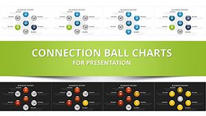
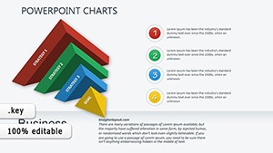
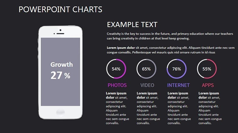
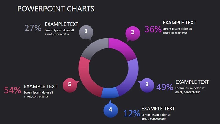
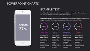
- Dynamic Data Visuals: Pie charts for channel performance (Slide 2) and cohort analysis grids that auto-adjust for recency cohorts - essential for retention storytelling in subscription models.
- Effortless Edits: Keynote's shape tools meet our pre-built masters; recolor via themes or insert live links to Google Analytics for real-time pulls during pitches.
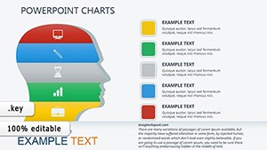
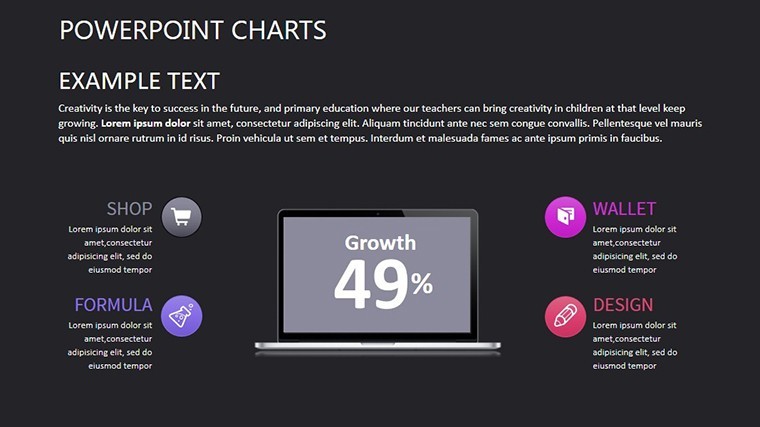
- Iconic Accents: Over 40 marketing-specific icons (envelopes for email, targets for leads) that scale flawlessly, adding that tactile pop to abstract metrics like CAC (Customer Acquisition Cost).
Marketing vets from HubSpot-inspired workflows rave about how these save prep time - envision a QBR where your waterfall chart (Slide 6) cascades attribution weights, instantly clarifying multi-touch contributions and justifying budget shifts.
A Closer Look: Navigating the Slides for Campaign Mastery
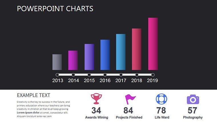
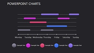
Each slide is a building block in your direct marketing arsenal. Kick off with Slide 0: Campaign Overview Matrix - a heatmap grid plotting response rates by demographic, hyperlinked for drill-downs that keep your audience hooked.
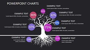
- Slides 1-3: Database Deep Dives - Scatter plots for RFM (Recency, Frequency, Monetary) scoring and tree maps segmenting lists. Tailor for lead nurturing: Plug in your Salesforce exports, and the conditional formatting highlights high-value segments ripe for upsell.
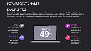
- Slides 4-5: Strategy Flows - Flowcharts mapping touchpoint sequences and Sankey diagrams for conversion paths. In B2B scenarios, use Slide 5's journey map to demo drip campaign efficacy, with editable nodes for A/B variants.
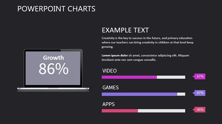
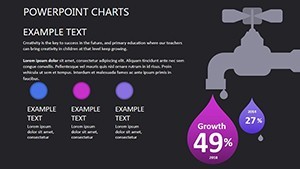
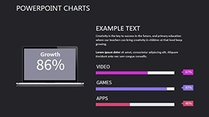
- Slides 6-7: Performance Metrics - Gauge charts for lift analysis and bar stacks for ROI breakdowns. Perfect for post-campaign recaps; animate bars to reveal incremental gains, echoing tactics from successful Mailchimp audits.
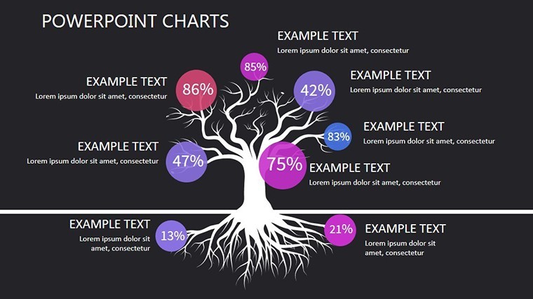
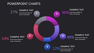
- Slide 8: Actionable Insights - A radar chart synthesizing strengths/weaknesses, capped with embedded CTAs linking to your toolkit.
Versus vanilla Keynote defaults, this slashes design drudgery by 70% - no more fiddling with connectors; they're pre-routed for narrative flow.
Practical Scenarios: From Lead Gen to Loyalty Loops
Step into the shoes of a direct mail coordinator launching a holiday blitz. Leverage the line charts (Slide 3) to project open rates based on historicals, factoring in personalization deltas that could spike engagement 22% per industry benchmarks. Or, for SaaS growth hackers, the cohort tables (Slide 1) dissect user activation funnels, spotlighting drop-offs to refine onboarding emails.
In agency pitches, these visuals seal deals: A client in retail used our attribution wheels (Slide 7) to reallocate ad spend, yielding a 15% uplift - proof that targeted charts convert skeptics. Benefits abound: Sharper decisions, stickier stories, and decks that close faster than generic ones.
Expert Hacks to Amplify Your Direct Marketing Game
Pro tip: Sync with Zapier for auto-updates from your CRM - watch charts refresh as leads pour in. For inclusivity, add ARIA labels to interactive elements, ensuring screen-reader compatibility. And layer humor lightly: Caption a low-response slide with "When emails go to the void - let's fix that!" to humanize the data.
Your campaigns deserve visuals as direct as your messaging. Seize the template now and chart a course to marketing mastery - download Direct Marketing Keynote Charts today!
Frequently Asked Questions
Q: What data sources integrate best with these charts?A: Excel, CSV, or direct from tools like Google Sheets; Keynote's import wizard handles correlations smoothly.
Q: Are the icons royalty-free for commercial use?A: Yes, all assets are licensed for unlimited commercial application in your presentations.
Q: How do I add animations for live demos?A: Use Keynote's Magic Move for transitions between slides - select objects and let it interpolate paths automatically.
Q: Can this template handle large datasets?A: Optimized for up to 10K rows; for bigger, aggregate in advance to maintain snappy performance.
Q: Is there a mobile export option?A: Export to animated GIF or QuickTime for easy sharing on iOS devices.
Q: How does it compare to Canva's marketing templates?A: More Keynote-native depth with vector precision, minus the watermarks - ideal for pros.