Apartments for Rent Infographics: Visualizing Urban Opportunities


Type: Keynote Charts template
Category: 3D
Sources Available: .key
Product ID: KC00385
Template incl.: 12 editable slides
In the vibrant arena of apartment rentals, where every listing competes for attention amid soaring urban demands, standing out requires more than listings - it demands dynamic storytelling. Our Infographic Apartments for Rent Keynote Charts template equips real estate visionaries, property managers, and investors with 12 editable slides that fuse sleek infographics with market savvy. Echoing trends from the Urban Land Institute's (ULI) rental reports, this tool distills occupancy stats, amenity impacts, and yield forecasts into engaging visuals that close leases and secure funding.
Keynote's prowess shines through in fluid edits: Reshape a unit mix donut to reflect your portfolio or animate a supply-demand curve to dramatize shortages. With a modern palette of metropolitan grays and accent pops of skyline blues, these slides evoke the pulse of city living, helping you navigate complexities like multi-family conversions with confidence and flair.
Standout Features: Infographics That Inform and Impress
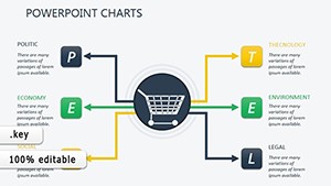
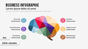
Opening with Slide 1's executive summary infographic - a mosaic of icons and metrics capturing absorption rates and cap rates - this template prioritizes at-a-glance impact. Each element is crafted for narrative flow, blending data with illustrative flair.
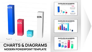
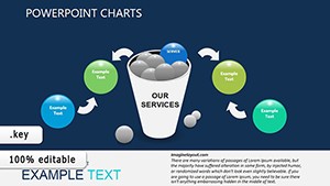
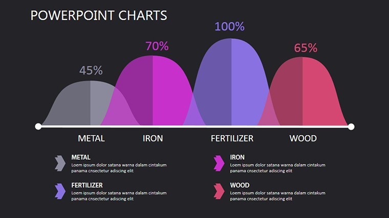
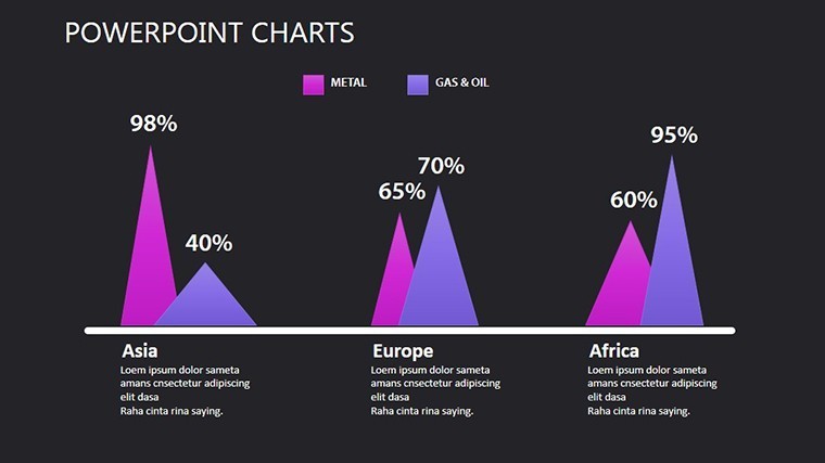
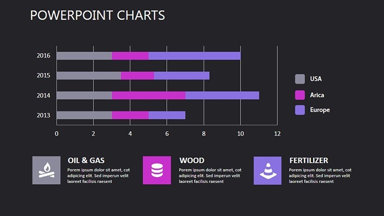
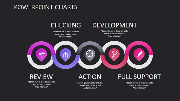
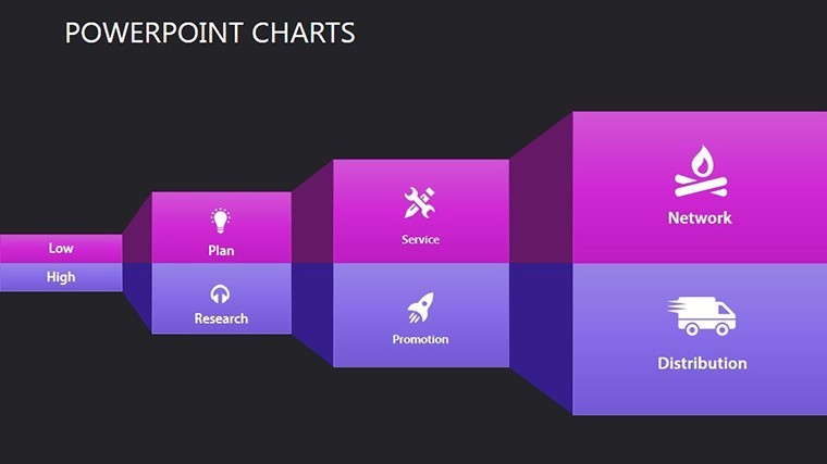
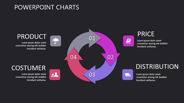
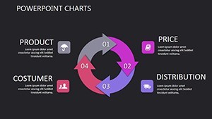
- Rich Infographic Library: Donut breakdowns for lease types, curve graphs for rent escalations, and icon timelines for development phases.
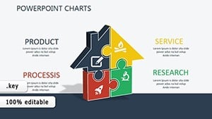
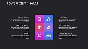
- High-Quality Assets: Curated illustrations of high-rises, keys, and leases, all vector-scalable for any resolution.
- Flexible Layouts: Grid systems that adapt to asymmetrical designs, perfect for uneven data sets.
- Seamless Keynote Sync: Native support for hyperlinks to virtual tours, enriching interactivity.
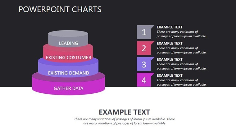
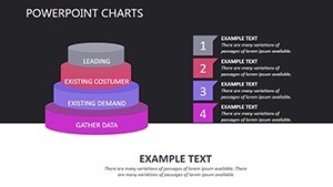
Delve into Slide 7's layered pyramid, stacking value propositions from basics to luxuries - a structure that aligns with ULI's amenity hierarchies, quantifying perks like gyms boosting premiums by 12%.
Customization Cornerstones for Pros
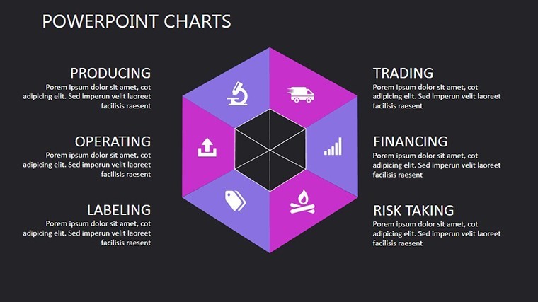
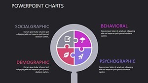
Effortlessly tailor: Populate Slide 3's radial menu with neighborhood scores, then hue-shift to brand alignments. Expert nudge: Leverage Keynote's magic move for cross-slide continuity, like evolving a floor plan icon. Uniformity via theme application keeps your deck investor-ready.
Targeted Use Cases: Leasing Leads to Portfolio Power
Visualize a developer pitching to VCs with Slide 5's ROI waterfall, cascading costs to profits - mirroring triumphs in ULI case studies where infographics swayed $50M deals. Or a manager briefing owners via Slide 9's performance dial, gauging fill rates against benchmarks.
For market analyses, Slide 11's comparative radar contrasts competitor amenities, spotlighting edges. Tenant open houses benefit from Slide 4's interactive map, plotting units with color-coded availability.
- Rental Showings: Embed photo carousels beside stat callouts to personalize pitches.
- Trend Briefings: Animated vectors tracing migration patterns per Census data.
- Investment Decks: Sensitivity analyses probing rate scenarios.
A property firm we advised customized our treemap for asset allocation, revealing overexposure to luxury segments and reallocating for balanced growth - yielding a 22% portfolio uplift.
Eclipsing Conventional Charts
Where Keynote basics lack illustrative depth, ours infuses rental relevance - apartment silhouettes over abstract shapes. Lifetime utility ensures enduring value in volatile sectors.
Workflow Wins and Insider Tactics
Connect to CoStar for auto-populated vacancy trends, refine with outline mode for structure. Savvy move: Apply blend modes to overlay market heat on city maps (Slide 6), forging immersive contexts. Champion brevity: Anchor narratives with bold metrics, visuals as amplifiers.
These infographics aren't adornments - they're accelerators. Acquire the Infographic Apartments for Rent Keynote Charts now and skyline your strategies. Complement with 3D enhancements for depth.
Frequently Asked Questions
What sets these infographics apart for rentals?
They blend real estate motifs with data viz, like unit icons tied to occupancy metrics, per ULI inspirations.
Are animations customizable?
Fully - adjust timing and triggers to match your pacing needs.
Can I incorporate VR tour links?
Yes, via embedded hyperlinks for seamless digital walkthroughs.
How does it handle large datasets?
Optimized for thousands of points, with filtering options built-in.
Is commercial licensing included?
Standard with purchase, covering client and internal use.
What's the export quality?
4K-ready for screens, print, or web, without compression artifacts.