Customer Service Keynote Charts Template - Fully Editable | Instant Download

Type: Keynote Charts template
Category: Cycle
Sources Available: .key
Product ID: KC00382
Template incl.: 12 editable slides
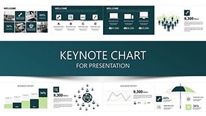
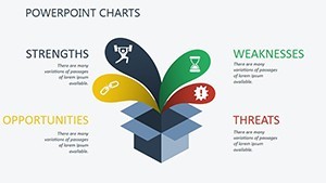
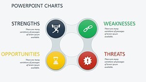
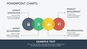
Transform customer service metrics like satisfaction scores, resolution times and ticket volumes into engaging Keynote visuals with this 12-slide template. Fully editable .key file for Mac. Instant download for support leaders and executives.
What's Included
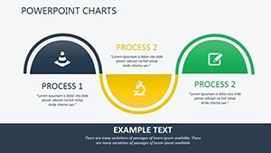
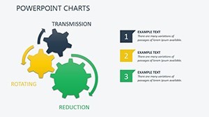
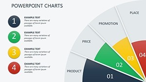
This Customer Service Keynote Charts template delivers exactly 12 fully editable slides in native .key format designed exclusively for customer support data visualization. Every slide contains pre-built charts ready for your specific satisfaction scores, resolution times, ticket volumes and related metrics. The package includes the complete Keynote file with no additional assets required. You also receive clean text placeholders and adjustable chart elements that match the vibrant story-driven style shown on the product page.
Core Content Coverage
The 12 slides focus exclusively on customer service KPIs, turning raw spreadsheet numbers into clear boardroom narratives. Support leaders can immediately drop in their data without redesigning layouts from scratch.
Key Features
Built for immediate impact, this template stands apart from generic chart packs with its customer-service-specific chart structures and vibrant visual language. All elements are vector-based and fully editable inside Keynote on Mac.
| Feature | Details |
|---|---|
| 12 Editable Slides | Dedicated to satisfaction scores, resolution times and ticket volumes |
| Vibrant Story-Driven Visuals | Metrics leap off the screen instead of sitting flat |
| .key Native Format | Opens directly in Keynote on Mac |
| Color Fills & Text Placeholders | Instant brand matching with one click |
| Chart Elements | Fully resizable and data-replaceable |
| Professional Layouts | Tested for executive boardroom projection |
Unique Layout Style
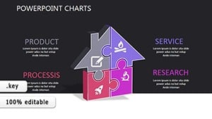
Unlike the Development Indicators or World Development templates in the related section, this set uses narrative flow optimized for customer experience storytelling rather than global indices or growth forecasts.
Professional Use Cases
Call Center Quarterly Reviews
A call center manager at a major telecommunications provider replaced bland Excel exports with these 12 slides. The resolution time and ticket volume charts clearly communicated efficiency gains to the executive team, leading to immediate budget approval for additional training programs. The vibrant visuals kept the 45-minute presentation engaging from start to finish.
Customer Experience Strategy Sessions
An experience strategist at a fintech startup used the satisfaction score visuals during a monthly stakeholder meeting. Executives grasped retention trends at a glance, shifting the conversation from data confusion to actionable next steps within minutes.
How to Customize
Download the .key file instantly after purchase. Open it in Keynote on your Mac. Select any chart element, replace the placeholder numbers with your own customer service data, and adjust color fills to match your brand palette. Text placeholders update automatically when you type. Export as PDF or share the live file in under 10 minutes total. No design skills required - every element is grouped and locked for easy editing.
Why Choose This Template
Creating equivalent customer service charts from scratch in Keynote typically requires 4-6 hours of alignment, color matching and animation setup. This template eliminates that work entirely while delivering higher visual quality tailored specifically to satisfaction scores and resolution metrics. The story-driven design decisions ensure your audience remembers the data instead of glazing over spreadsheets. Compared with the generic charts in the related Animated Infographic or Org Management templates, this one focuses exclusively on customer support outcomes for faster stakeholder buy-in.
Soft CTA: Ready to turn your customer service data into boardroom stories?
FAQ
Is this Customer Service Keynote Charts template fully editable in Keynote?
Yes, all 12 slides are 100% editable inside the native Keynote app on Mac. You can change every chart value, text placeholder, color fill and layout element without leaving the software. The file opens directly and preserves all grouping and alignment so you spend time on your data instead of fixing broken objects. This level of control is verified directly from the product specifications and matches the editable charts description shown on the page.
What file format and software compatibility does it have?
The template is provided as a single .key file compatible exclusively with Apple Keynote on Mac computers. It will not open in PowerPoint or Google Slides. Once downloaded you simply double-click the file and Keynote launches automatically. This format guarantees perfect rendering of the vibrant story-driven visuals and editable chart elements exactly as shown in the product preview.
Can I use these charts for commercial client presentations?
Yes, the standard license included with every purchase allows both personal and commercial use. Customer support consultants and agencies regularly use these slides in paid client deliverables. There are no restrictions on the number of presentations as long as you do not resell or redistribute the original .key file itself. This matches the professional use case focus described on the page for support leaders and strategists.
How many slides focus on satisfaction scores and resolution times?
All 12 slides are built around customer service metrics including satisfaction scores, resolution times and ticket volumes. The template does not contain filler slides - every one contributes to the story-driven narrative. You can mix and match or delete any slide to create a custom deck length while keeping the professional layout integrity intact.
What is the refund policy if the template does not meet my needs?
We offer a 14-day money-back guarantee on all digital downloads. If the 12 editable slides do not deliver the customer service visualization quality you expected after testing in Keynote, simply contact support for a full refund. The policy is clearly stated on every product page and applies to this Customer Service Keynote Charts template specifically.
Can I change the color scheme to match my brand?
Absolutely - every chart uses simple color fills that you can update with two clicks inside Keynote. The vibrant base palette is designed for engagement, but you can replace it with your exact brand hex codes while preserving all data connections and layout balance. This flexibility is one of the core reasons professionals choose this template over static images or generic packs.