HR Analytics Charts Keynote Template


Type: Keynote Charts template
Category: Relationship, Analysis
Sources Available: .key
Product ID: KC00381
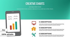
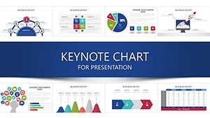
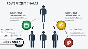
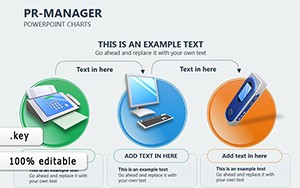
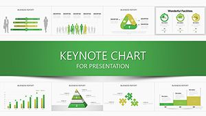
Template incl.: 20 editable slides
As someone who's spent years crafting presentations for HR teams at growing startups and established firms, I know the drill: you need to turn raw employee data into something that sparks action, not just nods. That's where this HR Analytics Charts Keynote Template steps in. It's built for those moments when you're prepping a talent review, mapping out development paths, or pitching retention strategies to leadership. With 20 ready-to-tweak slides, you get a full toolkit to visualize competencies, track productivity flows, and highlight growth opportunities - without starting from a blank canvas every time.
I've used templates like this in weekly strategy sessions with client teams, and the difference is night and day. Instead of fumbling with default shapes to approximate a radar chart, you have polished, animated visuals that load your data and tell the story. Picture briefing a C-suite on skill gaps: the slides handle the heavy lifting, letting you focus on the conversation that drives decisions.
Why This Template Fits Your HR Workflow
HR isn't just about numbers - it's about people and potential. This template bridges that gap by focusing on qualitative and quantitative insights alike. For project managers juggling team allocations, it offers clear ways to assess bandwidth without overwhelming detail. Consultants presenting to clients? These charts make complex audits feel approachable, turning dense reports into digestible overviews. And for educators training the next wave of HR leaders, the slides serve as live examples of data storytelling in action.
What sets it apart is the emphasis on dynamics. Every chart isn't static; subtle animations guide the eye from input to outcome, mimicking how talent develops over time. I've seen managers use these in one-on-ones to celebrate wins, like a team's rising collaboration scores, making feedback sessions more engaging and less like a checklist.
Breakdown of the Key Slides
Let's walk through the core slides so you can see exactly how they'd slot into your next deck. Each one is fully editable in Keynote, with vector elements that scale perfectly and icons that swap out effortlessly.
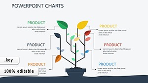
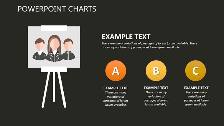
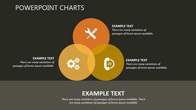
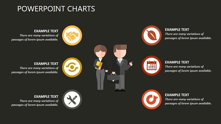
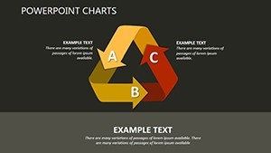
- Competency Radar Slide: At the heart of skills assessment, this circular chart plots attributes like leadership, technical prowess, and adaptability on spokes that extend outward. Imagine loading in anonymized profiles for your department - the radar spins gently to reveal strengths in one quadrant and opportunities in another. It's ideal for quarterly reviews, where you need to show balanced growth across roles.
- Productivity Sankey Diagram: This one's a game-changer for tracing effort through stages, from ideation to execution. Thick flows narrow or widen based on efficiency, highlighting bottlenecks like delayed approvals. In my experience with marketing teams, we've used it to reroute creative workflows, cutting waste and boosting delivery times.
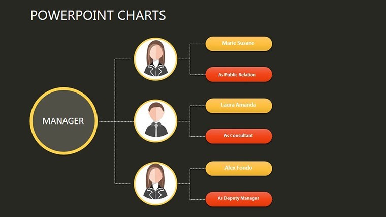
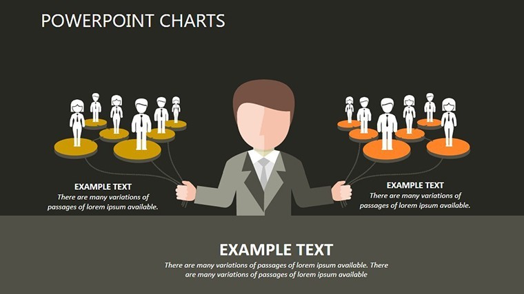
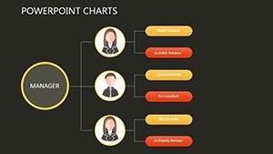
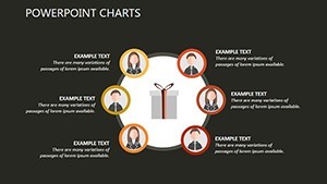
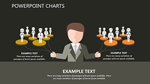
- Skill Assessment Web: Think of it as a constellation of interconnected nodes, each representing a core competency linked by threads of dependency. Add your team's data, and the web lights up patterns - say, how communication ties into every project success. Project leads love this for onboarding new hires, as it visualizes the ecosystem they'll step into.
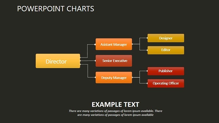
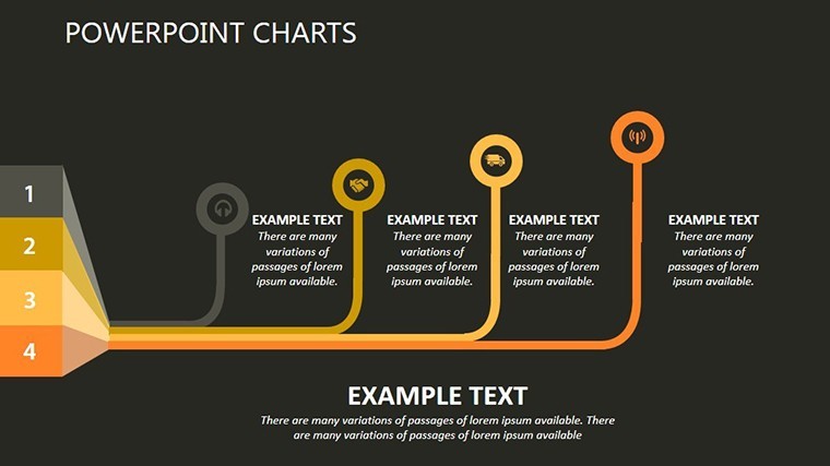
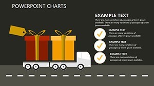
- Productivity Flow Path: A sleek, curved diagram that maps output chains, with milestones marked along the way. It's like a river chart: smooth where things flow well, branching where decisions fork. Founders pitching to investors have leaned on this to demonstrate scalable team processes, making abstract ops feel tangible.
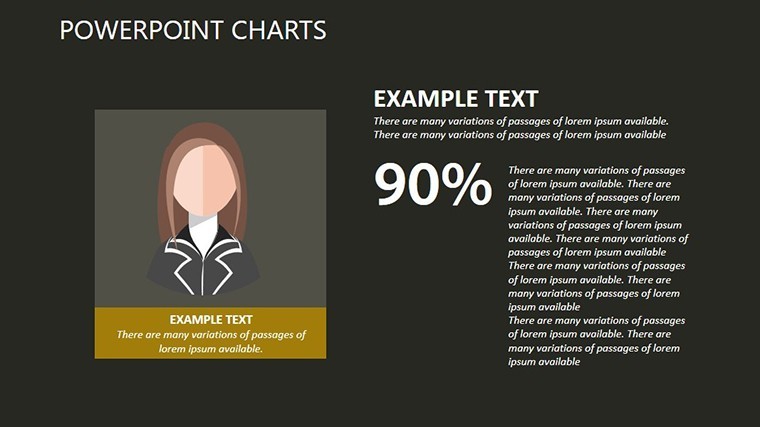
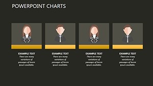
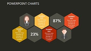
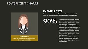
- Quality Quotient Bar: Segmented bars that break down soft skills into measurable chunks - resilience here, innovation there. Color-code by department, and you've got a snapshot for benchmarking against industry norms. I've pulled this into board meetings for non-profits, where it underscores volunteer impact without jargon.
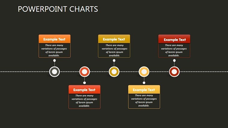
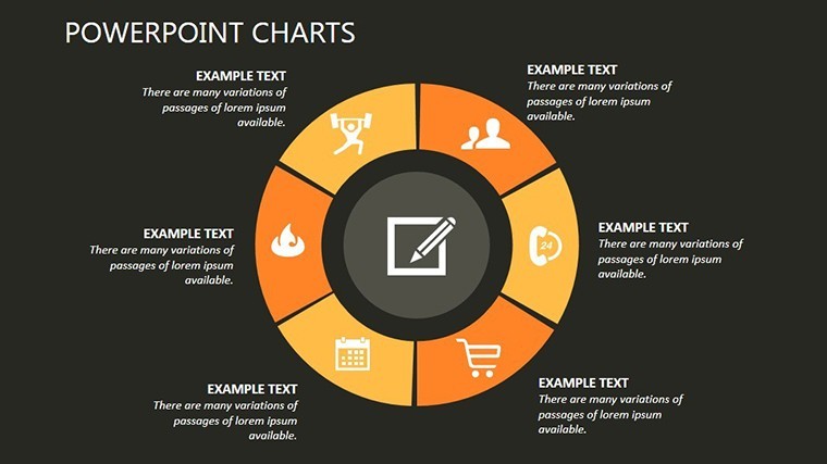
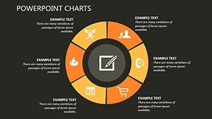
That's just the starters; the full set rounds out with supporting visuals like timeline integrations for longitudinal tracking and comparative overlays for year-over-year shifts. All 20 slides share a clean, modern aesthetic - minimalist backgrounds in soft neutrals, ensuring your data pops without distraction.
Customization That Saves You Hours
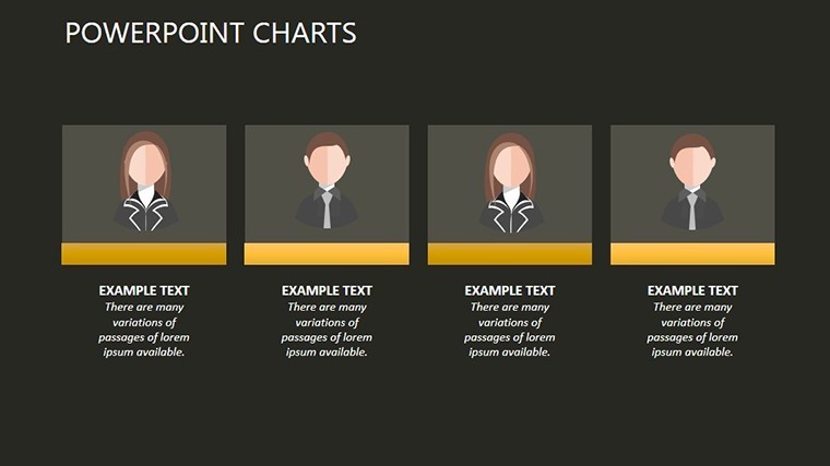
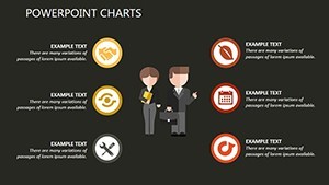
One of the reasons I keep coming back to structured templates is the speed. Drop in your CSV exports from performance tools, tweak colors to match your brand palette, and adjust animation timings via Keynote's intuitive timeline. Need a high-contrast version for accessibility? It's a quick variant export. Or pair it with avatars for a human touch in remote workshops - the PNG library covers diverse representations out of the box.
For educators, this means prepping case studies in half the time; consultants can white-label for multiple clients seamlessly. And since it's optimized for both widescreen and standard formats, your deck travels well across devices, from MacBooks in the office to iPads in the field.
Real-World Applications Across Roles
Take a mid-sized tech firm auditing remote teams: the Sankey and flow slides revealed hidden drags in collaboration tools, leading to targeted training that lifted overall output. Or consider a consulting gig for a retail chain - the radar charts helped prioritize upskilling for frontline staff, aligning hires with seasonal demands.
Marketers dissecting campaign teams find the web diagrams perfect for mapping cross-functional dependencies, while founders scaling operations use the bars to forecast hiring needs. Even in educational settings, like university HR workshops, these visuals make abstract concepts stick, turning lectures into interactive explorations.
The beauty is in the flexibility - it's not locked to HR silos. Blend it with sales pipelines for customer-facing roles or integrate into project recaps for managers tracking deliverables. Every time, it elevates the discussion from "what happened" to "what's next."
Open It in Keynote and Start Building Insights
Ready to see your team's potential laid out clearly? This template gets you there with minimal setup, freeing you to lead with confidence.
Frequently Asked Questions
What makes these charts suitable for HR presentations?
They combine quantitative metrics with qualitative insights, using animations to reveal patterns in skills and productivity that drive actionable discussions in talent reviews or strategy sessions.
Can I adjust the animations for different presentation paces?
Yes, Keynote's timeline lets you fine-tune speeds, triggers, and sequences, so a quick board overview differs from a detailed workshop deep-dive.
Does the template work with data from common HR software?
Absolutely - import CSVs or copy-paste from tools like Workday or BambooHR, then let the charts auto-adjust for a seamless fit.
Is it easy to change colors and add company branding?
One-click edits handle text, fills, and accents; the vector design ensures crisp results even after heavy personalization.
How many slides come with the download, and what formats?
You get 20 fully built slides in .key format, plus exports for 16:9 widescreen, 4:3 standard, and 16:10 for versatility across setups.
Can non-designers like project managers use this effectively?
Definitely - intuitive drag-and-drop for data entry and icons means anyone familiar with Keynote can produce pro-level visuals in minutes.