Analytical Data Charts Keynote Template - Fully Editable | Instant Download


Type: Keynote Charts template
Category: Illustrations
Sources Available: .key
Product ID: KC00350
Template incl.: 17 editable slides
Download the Analytical Data Charts Keynote Template with 17 editable slides including heat maps, Sankey flows, and scatter plots. Ideal for business analysts and marketing teams. Instant .key download for data-driven Keynote presentations.
What's Included
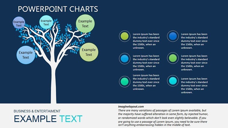
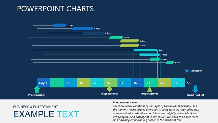
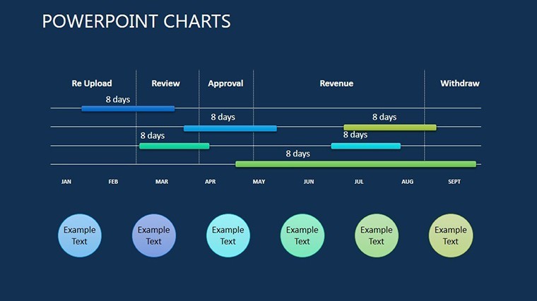
The Analytical Data Charts Keynote Template offers 17 editable slides in native .key format with heat maps, scatter plots, layered diagrams, Sankey flows, bubble clusters, and radial infographics. All elements include recolorable gradients, animate builds, icon libraries, and hyperlink support for interactive storytelling.
Data Visualization Assets
Slides are optimized for Mac and iPad with high-contrast modes and opacity overlays ready for complex analytics.
Key Features
This template excels with Sankey flows and heat map layers inspired by visualization experts - unique compared to bar table or social network templates in related products. The illustration category focus delivers clean, narrative-driven layouts for deep data exploration.
| Feature | Details in This Template |
|---|---|
| Slide Count | 17 editable slides |
| File Format | Native Keynote .key |
| Chart Types | Heat maps, Sankey, scatter |
| Interactivity | Hyperlinks and builds |
| Adaptability | iPad touch editing |
| Style | Alberto Cairo influence |
Professional Use Cases
A business analyst at a research firm used Sankey flow slides to compare pre- and post-renovation energy metrics for an architecture client, clarifying LEED points and winning the sustainability consulting contract. A marketing team leveraged scatter plots and bubble clusters to gauge ROI across campaigns, enabling data-backed budget reallocation that increased quarterly returns.
Analytics Scenarios
Eco-architects and sales pipeline managers rely on heat maps and layered diagrams for trend forecasting and probability visualization.
How to Customize
Download the .key file, open in Keynote, update linked data tables for automatic chart refresh, recolor gradients, add hyperlinks, and adjust animation builds. The responsive design adapts to iPad touch edits for on-the-go refinements.
Workflow Efficiency
Use opacity overlays for comparisons and export high-contrast PDFs for accessibility-compliant reports.
Why Choose This Template
Unlike Custom Bar Table or Active Social Networks templates in related listings, this analytical set specializes in Sankey flows and heat maps with expert-inspired clarity. Building equivalent infographics manually would consume days of layering work; the pre-optimized 17 slides deliver narrative power immediately while maintaining professional integrity.
Frequently Asked Questions
Is the Analytical Data Charts Keynote Template compatible with current Keynote?
Yes, the 17 slides are native .key files that function seamlessly in latest Keynote versions. Sankey flows and heat maps animate and update on both Mac and iPad without conversion.
How do I customize heat maps and Sankey diagrams?
Edit data tables for instant refresh, recolor gradients via inspector, adjust opacity layers, and add hyperlinks. Animation builds update automatically while preserving expert-level visual hierarchy.
What file format and delivery is provided?
One optimized .key file is sent via instant download containing all 17 slides and icon libraries. Open directly in Keynote with zero setup.
Can I use this for commercial analytics reports?
Yes, commercial use is allowed for business analysis, marketing, and architecture presentations. Export decks or PDFs for client delivery while retaining source file ownership.
How does this template differ from other data infographic packs?
It specializes in Sankey flows, heat maps, and bubble clusters with Alberto Cairo-inspired design - unlike bar table or pyramid templates. The 17-slide analytical focus delivers narrative depth unmatched by general illustration collections.