Marketing Charts Keynote Template


Type: Keynote Charts template
Category: Analysis
Sources Available: .key
Product ID: KC00345
Template incl.: 15 editable slides
As a consultant who`s built dozens of client pitches around data-driven stories, I know how a single muddled chart can derail an entire presentation. That`s why this Marketing Charts Keynote Template has become my go-to for turning raw metrics into clear, persuasive visuals. Whether you`re leading an agency team through campaign performance or advising a startup on channel optimization, these slides let you focus on the narrative, not the formatting.
Picture this: you`re in a boardroom, screen lit up with a radar chart that instantly reveals strengths in your organic reach while highlighting paid ad gaps. No more wrestling with Keynote`s default tools to align bars or tweak axes - these 15 editable slides come pre-configured for the metrics that matter most in marketing, like conversion rates, customer acquisition costs (CAC), and lifetime value (CLV). Export seamlessly to PowerPoint or Google Slides if your team mixes tools, keeping everything widescreen-ready at 16:9.
Core Features That Streamline Your Data Storytelling
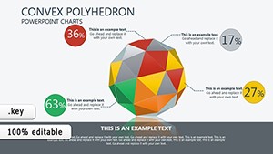
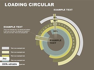
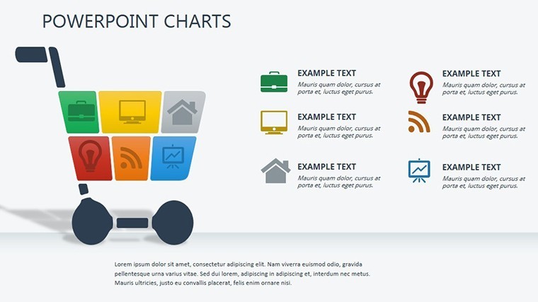
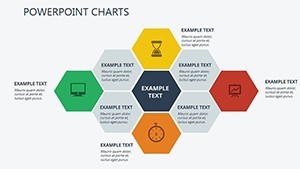
Every slide here is engineered for quick adaptation, drawing from frameworks I`ve used in real client sessions to make complex data feel approachable. Start with the efficiency matrix on slide 2: it plots spend against impact in color-coded quadrants, so you can spot high-ROI tactics at a glance. Drag in your numbers, and the quadrants auto-adjust - perfect for a mid-campaign review where time is tight.
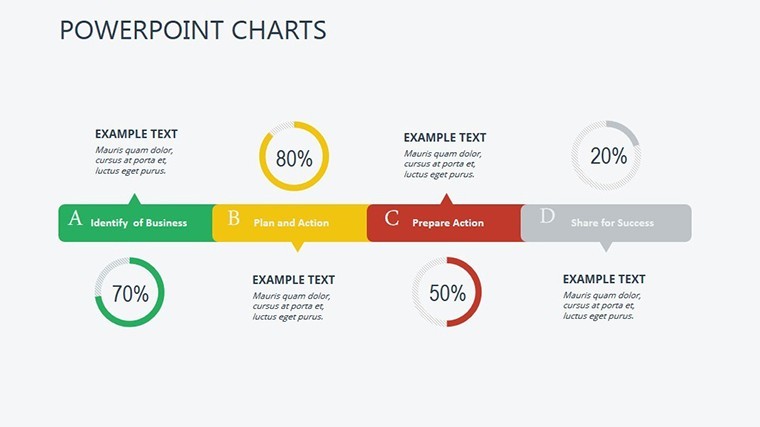
Move to slide 5 for side-by-side comparisons of organic versus paid channels. Shaded areas call out quality differences, like engagement drops in social ads, helping project managers justify budget shifts without endless explanations. Then, slides 7 through 9 deliver executive summaries with boxed key takeaways. These are lifesavers for founders wrapping up investor updates; one glance shows the big wins, like a 20% bounce rate reduction, without burying the audience in details.
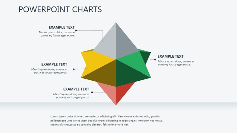
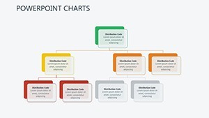
Forecasting gets a boost on slide 12 with smooth trend lines that extend your historical data into the future. I`ve used this to guide educators in curriculum planning, projecting enrollment trends based on past marketing efforts. And for those departmental deep dives, slide 14 blends Gantt timelines with pyramid structures to map tasks to outcomes - ideal for marketers auditing content calendars against delivery dates.
Use Cases That Fit Your Real-World Workflow
For agency pros, this template shines in client audits. Import Google Analytics exports via CSV, link them to the built-in formulas, and watch funnels populate with drop-off points. Suddenly, your pitch isn`t just numbers - it`s a roadmap to better conversions, complete with hyperlinks for drill-downs during Q&A.
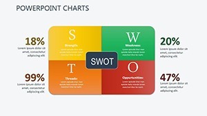
Founders pitching to VCs will appreciate the SWOT-integrated slides, where you layer competitive landscapes over your own metrics. It positions your growth story as strategic, not speculative. And educators? Use the radar overviews to compare student engagement across platforms, making lesson plans more targeted and data-backed.
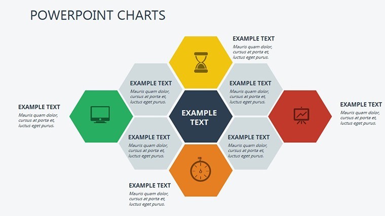
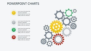
Project managers in larger teams find the modularity a game-changer. One base slide morphs into custom reports: add thematic icons like megaphones for awareness metrics or gears for process tweaks. The neutral-yet-vibrant color palette shifts easily for seasonal themes - think cool blues for Q4 planning or warm tones for summer campaigns - ensuring your visuals always align with the brand vibe.
From Raw Data to Polished Delivery: A Simple Workflow
I`ve walked countless teams through this process, and it boils down to four straightforward steps. First, drop your dataset into the linked charts - Keynote`s interactivity handles the rest, updating visuals in real time. Next, swap pre-labeled indicators for your specifics; CAC becomes whatever custom KPI you`re tracking, with no reformatting needed.
Third, layer in the story: progressive animations reveal metrics one by one, building tension like a good plot twist. Finally, rehearse with the hyperlinks - click a funnel segment to zoom into sub-data, keeping your audience hooked. Export to PDF for handouts or PowerPoint for collaborative edits, all while preserving the crisp vectors that scale without pixelation.
This isn`t about flashy effects; it`s precision that lets you emphasize outliers, like an unexpected engagement spike, with auto-highlights. In my experience consulting for creative agencies, this cuts prep time in half, freeing you to refine the message that closes deals.
Why This Template Elevates Everyday Presentations
Consultants often tell me their biggest hurdle is making data feel human. These slides solve that with report-ready layouts that guide the eye naturally - from broad overviews to granular breakdowns. No more default Keynote clutter; instead, you get a toolkit that`s Keynote-native, with fluid animations and universal indicators ready for any marketing scenario.
For marketers juggling multiple campaigns, the benchmarking elements provide context without extra slides. Compare your CLV trends against industry norms right in the template, turning a standard update into a forward-looking strategy session. It`s the kind of tool that feels custom-built because it adapts to you, not the other way around.
"These charts turned my quarterly review from a slide-fest into a conversation starter - clients actually leaned in." - A note from my own files after a recent workshop.
Open it in Keynote and tweak a slide or two; you`ll see how it anticipates the tweaks you`d make anyway.