Pyramid Chart Template for Keynote


Type: Keynote Charts template
Category: Relationship, Pyramids
Sources Available: .key
Product ID: KC00343
Template incl.: 13 editable slides
As someone who`s crafted presentations for economic think tanks and corporate strategy sessions week in and week out, I can tell you this: nothing clarifies complex hierarchies like a well-structured pyramid chart. Whether you`re breaking down supply chain dependencies for a manufacturing client or illustrating consumer motivation layers in a marketing pitch, this template turns vague concepts into crystal-clear visuals that stick with your audience.
I`ve used pyramid diagrams countless times to help founders visualize resource allocation from the ground up - starting with basic inputs at the base and climbing to high-level innovation at the top. It`s that straightforward progression that makes these charts so powerful; they mirror how real economic systems build upon each other, making your points land with authority and ease.
Why Pyramid Charts Cut Through the Noise in Your Presentations
In my experience working with project managers and educators, audiences tune out when data feels flat. Pyramid charts flip that script by adding natural depth and flow. Imagine presenting to a team of executives: instead of bullet points listing market challenges, you reveal a tiered structure where each level builds logically on the last. It invites them to follow the ascent, spotting connections they might otherwise miss.
This template shines in scenarios like economic forecasting workshops or business development reviews. For instance, during a recent session with a logistics firm, I layered their operational needs - from raw material sourcing at the foundation to demand forecasting at the peak - and watched the room light up as risks and opportunities became visually obvious. No more endless explanations; just a single slide that guides the conversation forward.
What`s Inside: 13 Slides Built for Real-World Impact
Every slide in this set is designed with the practical presenter in mind - clean, resizable, and ready to adapt without starting from scratch. Here`s a walkthrough of what you`ll find, so you can envision dropping them straight into your next deck.
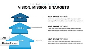
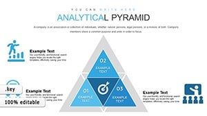
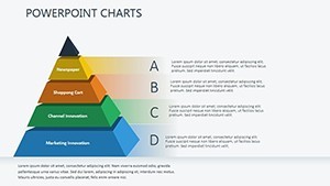
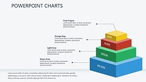
The opening slide kicks things off with a simple three-tier pyramid, perfect for introducing core resource needs. Picture broad foundational blocks at the bottom holding up narrower sections above, each labeled for essentials like capital and labor. It`s your entry point for any hierarchy discussion, scalable for quick overviews.
Building on that, the next layout expands to a full foundational model. Here, the pyramid divides into distinct layers: the base covers raw materials and supply stability, the middle focuses on workforce and process efficiency, and the apex highlights market growth drivers. I`ve customized this one for client pitches, swapping in specific metrics to show how bottlenecks in one layer ripple upward - it`s a conversation starter every time.
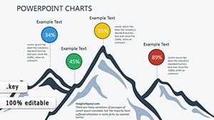
Dive deeper with the supply chain-focused slide, where the pyramid incorporates KPI slots right into the tiers. Envision color-coded segments for inventory levels, transit times, and vendor reliability; it`s tailored for project managers tracking operational flows, with space for annotations that highlight pressure points without cluttering the view.
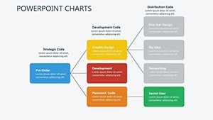
Then come three interconnected pyramid slides that really elevate your storytelling. These show multiple structures side by side or overlapping, illustrating how micro-level decisions feed into macro outcomes. One version maps interplays between economic sectors - think energy at the base supporting tech innovation at the top - while another traces ripple effects from policy changes. They`re ideal for consultants explaining systemic ties, and the subtle connections between shapes make dependencies pop.
Moving into temporal elements, there`s a slide dedicated to economic stages over time. This pyramid evolves layer by layer, with arrows indicating progression from recession recovery to expansion peaks. It`s been a go-to for my economic educator clients, who use it to frame historical trends without overwhelming timelines.
Another standout stacks historical data into a growing pyramid, complete with callout bubbles for key events or figures. Imagine layering eras from post-war booms to digital shifts, each block proportionally sized to reflect impact - great for lectures or reports where context builds credibility.
For a focused snapshot, the phases slide isolates time intervals within a single pyramid. Each tier represents a distinct period, like quarterly fiscal shifts, emphasizing transitions without linear clutter. Project leads love this for quarterly reviews, as it spotlights isolated achievements while hinting at the bigger climb.
The final trio pushes into advanced territory: one integrates evolutionary economic principles with branching paths from the apex, another layers complex hierarchies for multi-stakeholder analyses, and the last blends all elements into a comprehensive model. These are for those deeper dives - say, strategy sessions with C-suite folks - where you need to convey nuance without losing momentum.
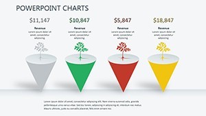
Across all 13, you`ll get over 50 integrated icons, from currency flows to upward arrows, all vector-based for sharp scaling. Text boxes hug the shapes intuitively, and placeholders await your data, ensuring everything aligns effortlessly.
How This Template Solves Everyday Presentation Headaches
Let`s get concrete: if you`re a strategist tired of rebuilding diagrams from generic shapes, this eliminates that grind. Drag layers, tweak gradients for emphasis, and animate reveals to pace your narrative - I`ve shaved hours off prep for busy clients this way.
For marketers, it demystifies audience segmentation; layer demographics at the base, behaviors in the middle, and conversion tactics up top. Educators find it invaluable for theory breakdowns, like ascending from basic economic principles to advanced models. And for founders pitching investors? It frames your business model as an unshakeable pyramid, base solid with market validation, peaking with scalable vision.
The neutral blues and grays lend a professional sheen that builds trust - adaptable to your brand colors in seconds. Plus, it`s widescreen-ready for Keynote on Mac or iPad, with easy exports to PowerPoint for cross-team shares. No compatibility quirks, just smooth integration into your workflow.
In one consulting gig last month, I adapted a slide to map a client`s innovation pipeline; the visual hierarchy made their funding ask feel inevitable. That`s the quiet confidence these charts bring - your ideas ascend logically, pulling the audience along.
Make It Yours Without the Fuss
Ready to layer your next presentation with this kind of depth? Open it in Keynote and start stacking your story in minutes - it`s that intuitive.
Frequently Asked Questions
What makes pyramid charts effective for economic presentations?
Pyramid charts excel by showing foundational elements supporting higher levels, making it easy to convey how basic resources enable strategic goals in economic contexts.
Can I use this template for non-economic topics like team structures?
Absolutely - the flexible layers adapt seamlessly to organizational hierarchies, skill development paths, or any tiered concept.
Does the template include animations for Keynote?
Yes, subtle build-in animations are pre-set for each layer, allowing controlled reveals during your talk.
How many slides come with this pyramid chart set?
There are 13 fully editable slides, ranging from basic to advanced layouts for varied presentation needs.
Is it compatible with PowerPoint if I need to share with Windows users?
It exports cleanly to PowerPoint, preserving layouts, icons, and formatting for hassle-free collaboration.
Can I customize the colors to match my company`s branding?
Definitely - the color scheme is fully editable, with gradients and fills that swap out quickly for any palette.