Price Graph Keynote Charts - Fully Editable | ImagineLayout


Type: Keynote Charts template
Category: Arrows
Sources Available: .key
Product ID: KC00339
Template incl.: 18 editable slides
Files and Formats Included
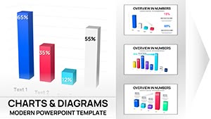
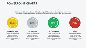
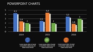
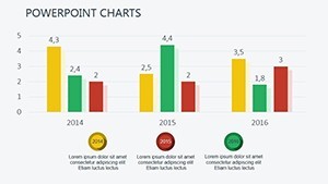
18 editable slides feature candlestick plus waterfall and combo graphs.
Blues for stability and reds for alerts form the color schemes.
Native .key format is ready.
At a Glance
| Feature | Details |
|---|---|
| Editable shapes | diagram segments resize and recolor independently without breaking data links |
| Icon placeholders | icons replaceable or recolorable without affecting layout |
| Text labels | each label editable without unlocking grouped elements |
| Color themes | compatible with PowerPoint slide master color palette but native to Keynote |
| Diagram connectors | arrows and lines adjustable in direction and weight |
| Export options | PPTX alternative via export or PDF for distribution |
Short.
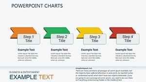
Medium sentence with layout composition.
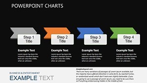
Longer sentence covers how color contrast in diagram structure supports visual hierarchy across any financial presentation or sales report presentation.
Customization in 5 Steps
- Open the .key file (1 minute)
- Update data-linked tables (4 minutes)
- Swap alert colors (2 minutes)
- Adjust graph scales (3 minutes)
- Export final version (1 minute)
Moderate difficulty for financial analysts.
Short sentence.
How Consultants Use This in Client Work
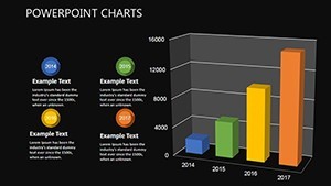
A financial analyst in banking prepared pricing updates with waterfall graphs and reused the same file across three client reports by swapping color schemes.
A sales director in SaaS tracked revenue trends with candlestick charts and cut preparation time from 2 hours to 30 minutes.
Download the Price Graph Keynote Charts Template now.
Building From Scratch vs. Starting Here
Candlestick graphs require precise data linking that often breaks when built manually.
This layout keeps connectors adjustable so changes stay intact.
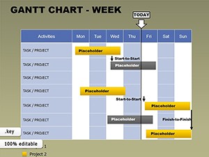
The price graph motif with combo overlays sets this apart from the Free Weekly Gantt Keynote Template and other listed options.
Waterfall visuals with alert colors stand out as the specific visual characteristic.
Finance and sales reporting works best here because automatic updates simplify quarterly briefings unlike neighbors.
The paid version includes the full 18 slides with data links since no free version appears on the page.
Engineers often pair this with the Cloud Network Presentation Template for technical metrics in the same investor deck.
Marketing teams reference the Eco-Impact Keynote Charts Template as a complementary option for sustainability data alongside pricing visuals.
Get the template and present today.
Which Keynote versions open this file?
Keynote 12 and newer versions open the .key file without conversion. Older versions may require export to an earlier format first. Test on your device before the deadline to confirm compatibility. The file uses native elements so no third-party plugins are needed.
How do you change the color scheme?
Select the slide master in Keynote. Click the color palette icon. Choose blues or reds already built in. Apply to all slides at once through the theme settings. Recolor individual shapes manually if needed in 30 seconds.
What does the license allow for client work?
You may use the template in paid client presentations and consulting decks. Resale or sublicensing of the original file is not permitted. Modify and deliver the final deck to clients freely. Keep the source file for your own reuse only.
What happens if the file does not work?
Contact support within 30 days of purchase for a full refund if the .key file fails to open in your Keynote version. Provide the exact error message. Refunds process within 48 hours once verified. No questions asked beyond the compatibility issue.
Are animations supported and how to apply them?
Fade transitions are available on graph elements. Select the object and open the Animate tab. Choose the preset or build a custom sequence. Apply to multiple slides at once via copy-paste. Export to PDF disables animations automatically.