World Economy Charts Keynote Template - Fully Editable | ImagineLayout


Type: Keynote Charts template
Category: Illustrations
Sources Available: .key
Product ID: KC00328
Template incl.: 12 editable slides
Package Contents
The download packs one .key file containing 12 slides.
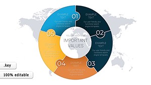
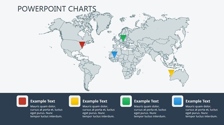
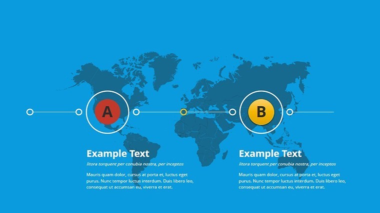
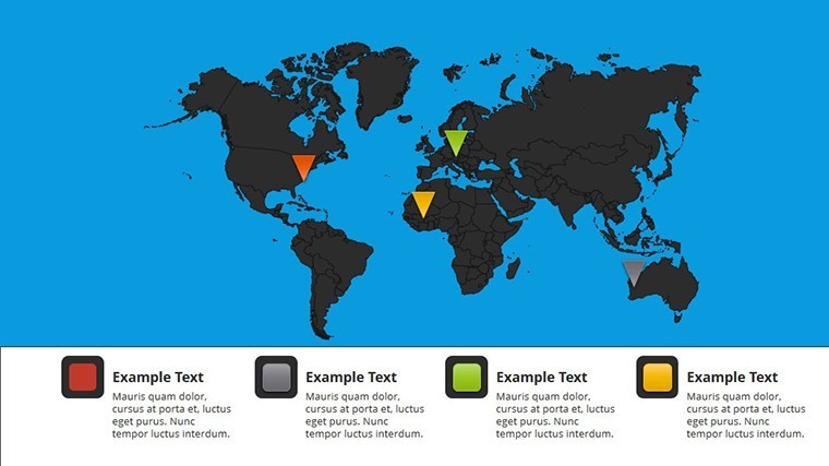
World economy charts stand apart from Creative Economy Graph Keynote Charts Template, Education-Focused Keynote Charts Pack and Geothermal Energy Charts for Keynote in the related section by using cartography world maps with bubbles and networks instead of single graphs or energy visuals.
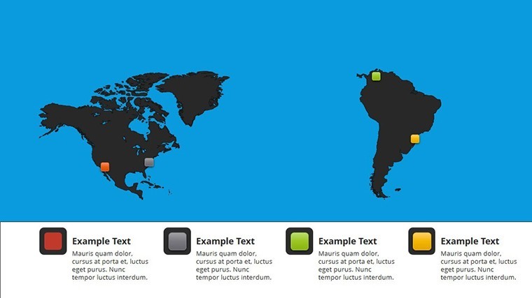
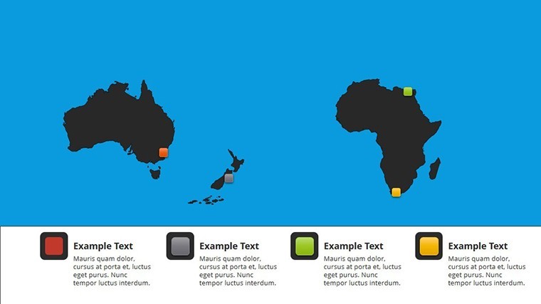
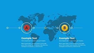
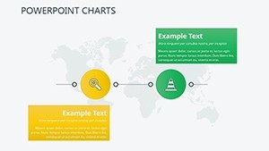
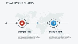
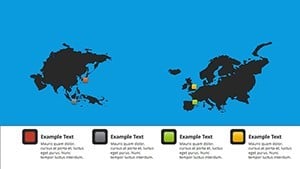
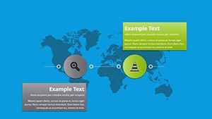
The specific visual characteristic is network diagram connectors over global maps.
This template works best for global strategy because the maps allow quick region highlighting over the static alternatives in those neighbors.
The paid version includes the full set of 12 editable diagrams in .key format that free previews lack.
Key Specifications
| Feature | Details |
|---|---|
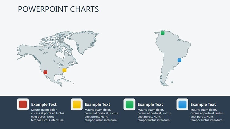
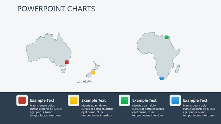
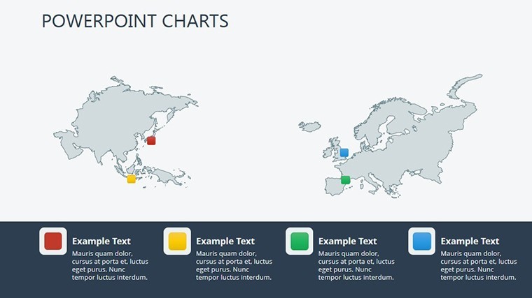
| Slides included | 12 slides with maps and charts |
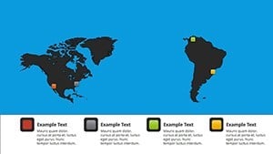
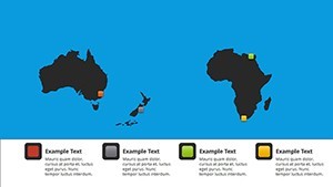
| Diagram categories | world maps, bubble charts, network diagrams |
| Editable elements | bubbles, network lines, map regions, labels |
| Aspect ratio | 16:9 optimized for Keynote presentations |
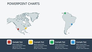
| PowerPoint compatibility | Native Keynote only with export to PDF |
| Color themes | Adjustable through slide master palette |
| Animation support | Basic transitions for data reveal |
| Icon layers | Replaceable without breaking zone segmentation |
| File formats | Single .key file |
| Free vs Paid differences | Paid delivers complete 12 slides; free not specified on page |
Adapting the Template to Your Brand
Editing difficulty is Moderate.
- Open the .key file in Keynote 12+ (1 minute).
- Replace placeholder data in maps and bubbles (8 minutes).
- Adjust color theme via master (3 minutes).
- Add labels or export to PDF (2 minutes).
Typical Use Cases by Role
Economist in Global Strategy
Economists in global strategy use this during board briefings to highlight regions.
They cut deck preparation from 3 hours to 45 minutes by updating network data.
Project Manager in International Business
Project managers in international business reuse the same file across three reports by swapping color schemes.
They maintain layout composition consistency in reviews.
Download the World Economy Charts Keynote Template Now
Compared to Starting From Zero
Building 12 world maps and network diagrams manually requires advanced cartography skills and connector alignment that often fails on projection screens.
This template avoids that by providing pre-drawn maps.
Many presentations place network labels inside shapes causing readability issues.
This one keeps labels outside with thin connectors improving clarity during live meetings without extra effort.
Pair it with Pill Pharmaceutical Medical Keynote Charts Template for sector-specific views.
See more in the Illustrations category for map options.
Combine with Creative Economy Graph Keynote Charts Template when expanding analysis.
FAQ
Which Keynote versions does this template support?
It opens in Keynote 12 and newer on Mac and iPadOS. Older versions may need export conversion. Test compatibility by opening the .key file directly. The layout remains intact across supported releases.
How do I change the color scheme?
Open slide master then select color palette and apply to all slides. Update individual elements if needed afterward. Takes under 3 minutes total. Works with any brand colors through diagram structure adjustments.
What license permissions apply for client work?
The license permits use in paid client presentations and reports. Resale or sublicensing of the template itself is not allowed. You can modify and distribute the final decks. Check the terms for full details on commercial use.
What does the paid version include compared to free?
The paid version delivers the complete .key file with all editable charts. Free options on the site typically show previews only. Full customization requires the paid download. No partial files are available otherwise.
Which file formats are included and what software is required?
Only the native .key format is provided. Apple Keynote is required to edit. Export to PDF or images for sharing. No PowerPoint version included.