Infographic Organization Staff Keynote Charts: Structure Your Story


Type: Keynote Charts template
Category: Organizational, Tables
Sources Available: .key
Product ID: KC00327
Template incl.: 15 editable slides
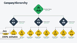
Organizations thrive on people, but communicating that human architecture - departments, roles, reporting lines - can feel like herding cats in a flowchart. For HR leads, team managers, and consultants navigating restructures, the Infographic Organization Staff Keynote Charts template is your blueprint to brilliance. This 15-slide gem, honed for Apple Keynote, transforms org charts from bland boxes into vibrant infographics that reveal dynamics, celebrate contributions, and forecast growth, all while keeping everyone aligned.
Why this template? It goes beyond hierarchies to capture the pulse of your workforce: from skill matrices to diversity breakdowns, using color-coded arcs and nodes that echo real org psych principles like those in Gallup's engagement models. At $20, it's a steal for its widescreen polish, vector flexibility, and subtle animations that unfold layers like peeling an onion - minus the tears. Tailored for teachers diagramming school staffs or entrepreneurs scaling startups, it ensures your message resonates, fostering trust and transparency in every slide.
Building Blocks: From Solo to Symphony
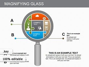
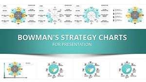
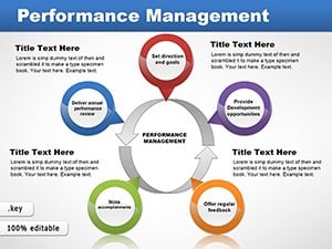
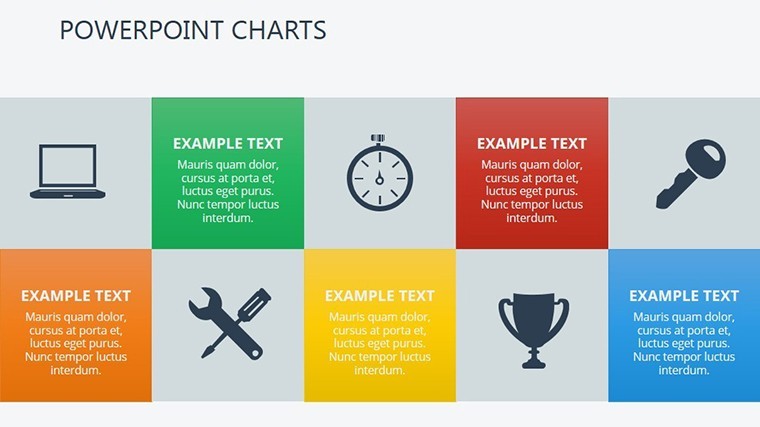
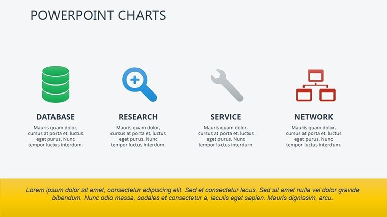
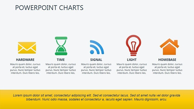
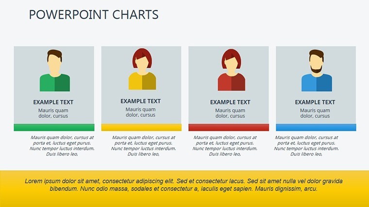
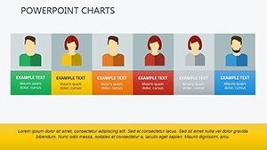
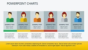
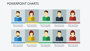
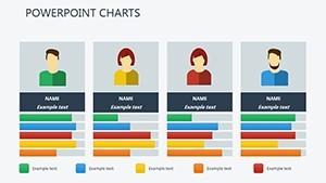
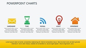
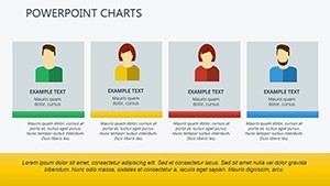
Slide 1 sets the stage with a holistic org overview - a radial staff map where central nodes represent leadership, branching into functional silos with proportional sizing for headcounts. Slides 2-5 delve into positional pyramids: Stack roles vertically, animating from base (entry-level) to apex (C-suite), with icons for professions that add personality - think briefcases for execs, lightbulbs for innovators.
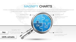
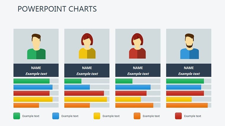
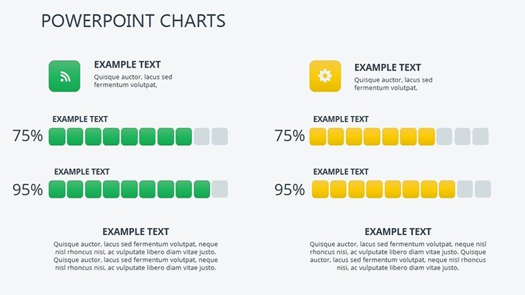
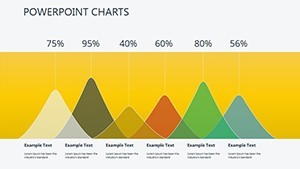
Skill-level spotlights shine in Slides 6-10: Horizontal semicircles segment expertise tiers, perfect for talent audits. Color gradients signal proficiencies (deep blue for masters, light for learners), drawing from competency frameworks like SHRM standards. Then, Slides 11-14 tackle complexity - overlapping Venns for cross-functional teams, revealing synergies or silos at a glance.
- Slide 15: Forward-Looking Forecast – A timeline-infused chart projecting hires and promotions, with draggable milestones for scenario planning.
Tweaks are intuitive: Keynote's shape library lets you morph nodes into custom avatars, and transition effects cascade updates like a digital org chart in motion. Fun fact: These designs subtly incorporate whitespace principles from Edward Tufte, ensuring clarity amid complexity.
Stories from the Structure: Impactful Implementations
A nonprofit in Seattle revamped their volunteer coordination using these infographics, visualizing 200+ roles in a single slide that boosted retention by 18%. Or a corporate merger: Consultants layered staff overlaps to highlight redundancies, smoothing integration and saving millions in overlap costs.
For small biz owners, it's empowerment: Embed photos for a personal touch, turning abstract structures into familiar faces. Outshining rigid Visio exports, this Keynote pack integrates music cues for virtual town halls, making restructures feel celebratory rather than clinical.
Layer by Layer: Assembling Your Org Masterpiece
- Map the Matrix: Input from HRIS like BambooHR into node labels.
- Infuse Identity: Assign thematic colors per department - green for growth teams, purple for creative.
- Animate Alignment: Build hierarchies bottom-up to build narrative tension.
- Validate Vibes: Share drafts via Keynote Live for team feedback loops.
- Archive Actively: Version control with iCloud, evolving as your org does.
This sequence, inspired by agile HR practices, turns one-off decks into living documents, adaptable as teams evolve.
Elevate Every Layer of Your Org
Uniqueness lies in its empathetic design: Charts that humanize hierarchies, animations that invite exploration, and scalability for global firms or garage startups. Backed by pros in org design, it's your ally for inclusive comms. Elevate your structure visuals - download the Infographic Organization Staff Keynote Charts today. Link up with our tables category for deeper dives.
Frequently Asked Questions
How complex can the org structures get?
Up to 100+ nodes per slide, with nesting for multi-level hierarchies, all vector-smooth.
Does it support photo integration for staff?
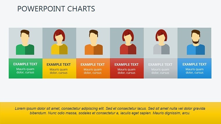
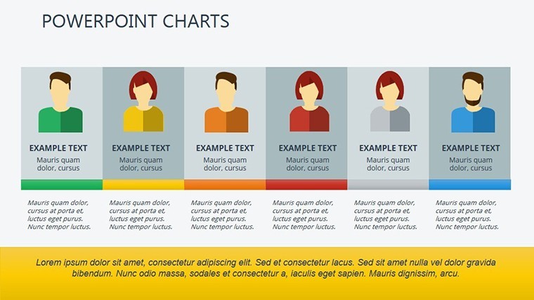
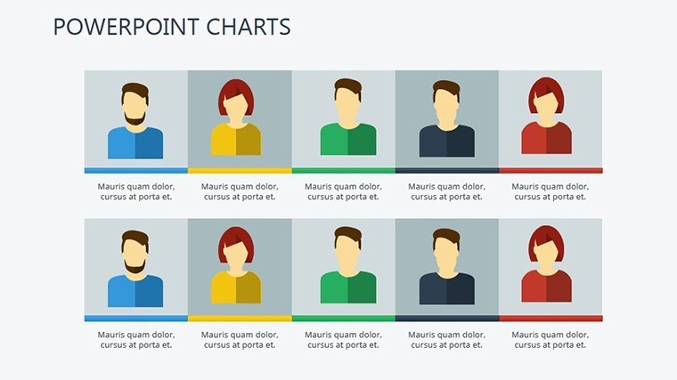
Yes, drag-and-drop circles for headshots, enhancing relatability in remote settings.
Are animations customizable for different audiences?
Fully - dial subtlety for execs or flair for all-hands meetings via Keynote's effect presets.
What's best for non-profits or small teams?
Scalable slides focus on roles over headcount, ideal for volunteer or lean ops visuals.
Can I export for print materials?
High-res PDF output preserves vectors for posters or handbooks.
How does it align with HR compliance?
Anonymous modes for sensitive data, plus editable labels for policy tweaks.