Working on Computer Equipment Keynote Charts: Power Up Your Tech Talks


Type: Keynote Charts template
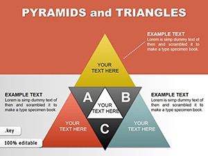
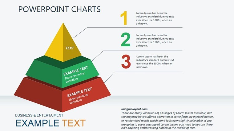
Category: Illustrations, Pyramids
Sources Available: .key
Product ID: KC00326
Template incl.: 30 editable slides
Ever stared at a spreadsheet of server logs or asset inventories, wondering how to make it sing in a presentation? In the realm of IT management and tech consulting, where hardware hums and data flows endlessly, clarity isn't optional - it's your edge. Enter the Working on Computer Equipment Keynote Charts template: a 30-slide powerhouse crafted for IT pros, sysadmins, and tech educators who need to demystify equipment audits, performance metrics, and upgrade roadmaps. Native to Apple Keynote, this template blends qualitative depth with quantitative punch, turning dense docs into digestible, animated narratives that land every time.
At its core, this isn't a generic chart pack; it's a specialized suite for dissecting computer ecosystems - from qualitative reviews of vendor statements to predictive models of ROI on new gear. Priced affordably at $20, it promises widescreen readiness, vector scalability, and those "wow" animations that make pie charts pulse and timelines twist like fiber optics. Whether you're briefing C-suite on cybersecurity spends or training juniors on network topologies, these slides elevate your message, saving you from the slog of manual designs while ensuring your visuals align with industry standards like ISO 27001 for info sec visuals.
From Cables to Clouds: Decoding Equipment Analysis
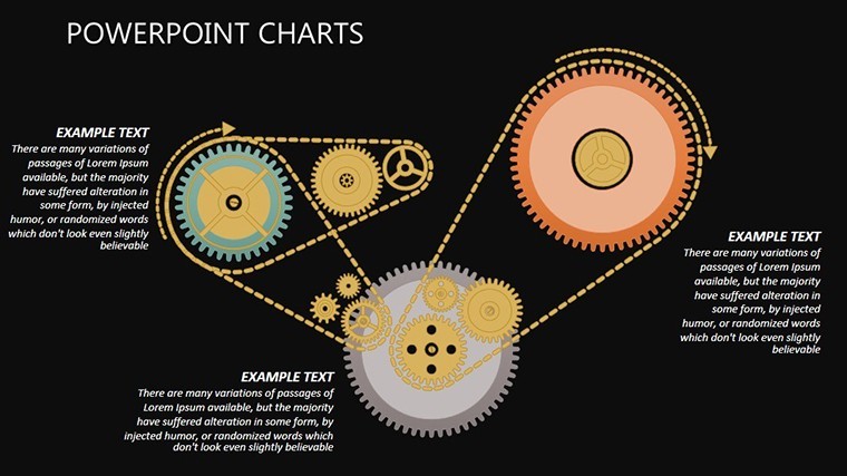
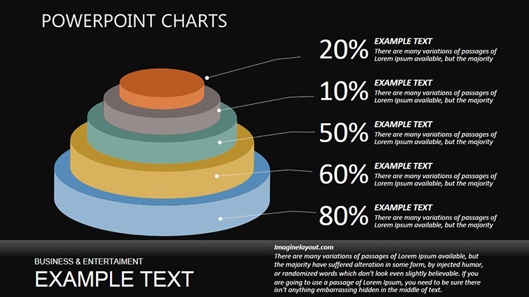
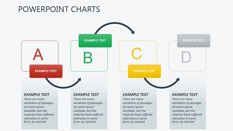
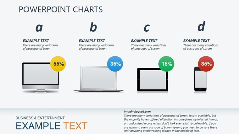
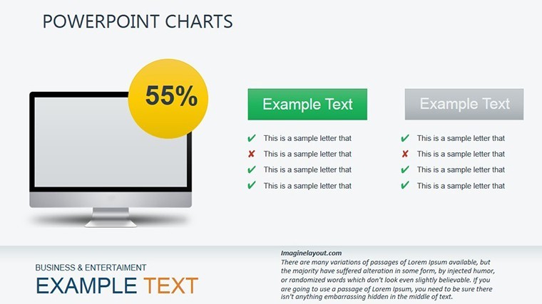
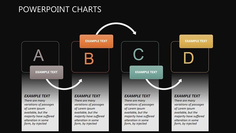
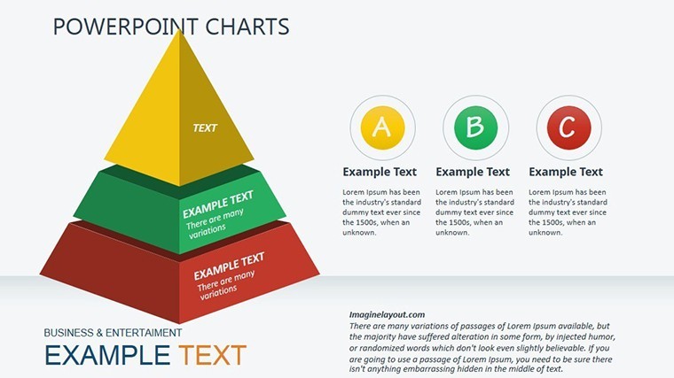
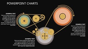
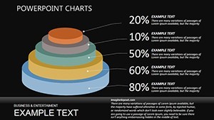
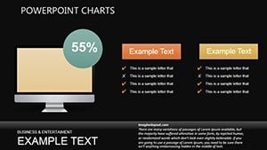
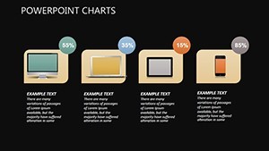
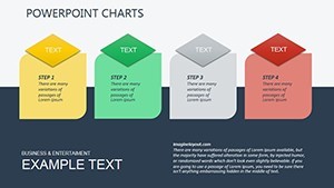
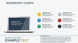
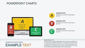
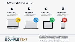
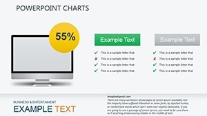
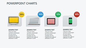
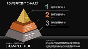
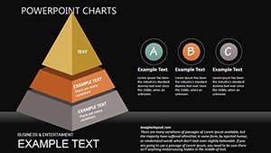
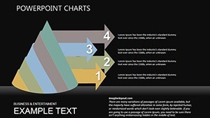
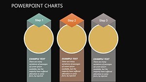
The magic starts with methods that bridge qual and quant: Slide 1 introduces a radial equipment overview, segmenting desktops, servers, and peripherals in vibrant hues that scream efficiency. Slides 2-10 zoom into document analysis - think bar hybrids evaluating asset values, with stacked segments forecasting maintenance costs over five years, inspired by real asset management frameworks from Gartner reports.
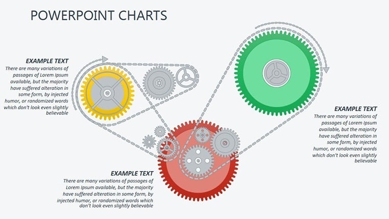
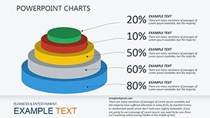
Moving to predictive prowess, Slides 11-20 feature flowcharts for upgrade paths: Animate arrows along curved paths showing migration from on-prem to cloud, complete with icon overlays for routers, firewalls, and VMs. These aren't static; Keynote's magic builds reveal bottlenecks first, then solutions, mimicking a diagnostic scan. For quantitative fans, Slides 21-28 deliver scatter plots and heat maps for performance data - plot CPU loads against uptime, color-coded for instant red flags.
- Slide 29: Integrated Dashboard – A holistic view tying equipment stats to business impact, with draggable gauges for live tweaks.
- Slide 30: Future-Proof Summary – Trend lines projecting hardware lifecycles, ready for your bold recommendations.
Editing? Effortless. Vector objects stretch like ethernet cables, and media embeds let you drop in spec sheets or demo videos without breaking stride. A light-hearted note: If your last deck felt like debugging legacy code, this template is your refactor - clean, modular, and surprisingly fun to tweak.
Case Studies in Circuits: Real Tech Triumphs
Recall a SaaS company in Austin overhauling their data center: Using these charts, they visualized a 25% cost slash via virtualization, charts flowing from asset audits to savings projections, clinching board buy-in. Or an edtech firm training remote teams - our timeline slides mapped device compatibility across OS versions, boosting adoption rates by 30%.
For freelancers, it's workflow gold: Link charts to Airtable bases for auto-updates, keeping decks fresh amid rapid tech shifts. Versus clunky Excel exports, this Keynote set offers seamless transitions that feel cinematic, plus thematic elements like circuit icons that nod to hardware heritage without dated vibes.
Your Quick-Start Guide to IT Viz Mastery
- Gather Intel: Pull logs from tools like Nagios into Keynote via CSV.
- Color Code Chaos: Assign palettes - blue for stable, orange for alerts - to evoke control.
- Animate the Flow: Sequence builds to simulate data streams, syncing with your script.
- Rehearse Rigorous: Use Keynote's notes for tech jargon bridges.
- Distribute Dynamically: Share as interactive .key or export to QuickTime clips.
This workflow, honed from IT conference keynotes, cuts prep by half, letting you focus on the strategy, not the slides.
Stand Out in a Byte-Sized World
What elevates this template? Its blend of pro design with user empathy - animations that inform without distracting, layouts that adapt to portrait or landscape. Trusted by educators and execs alike, it's your shortcut to visuals that don't just show data but sell solutions. Secure your copy of the Working on Computer Equipment Keynote Charts now and wire your next talk for success. Peek at our process category for complementary flows.
Frequently Asked Questions
What makes these charts ideal for IT equipment analysis?
They specialize in qual/quant breakdowns, with vectors for precise asset mapping and animations for dynamic forecasting.
Can I add videos or photos to the slides?
Absolutely - Keynote supports embeds, perfect for hardware demos or spec visuals.
Is the template widescreen only?
Primarily 16:9, but resizable elements work for 4:3 if needed.
How do animations enhance tech presentations?
They simulate processes like data flows, making abstract concepts tangible and engaging.
What's the file size for quick sharing?
Compact at under 10MB, zips easily for email or cloud drops.
Any tips for integrating with BI tools?
Use Keynote's data merge for live links to Tableau exports or Google Sheets.