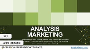
Graphical Analysis Keynote Charts Template: Master Technical Insights


Type: Keynote Charts template
Category: Analysis
Sources Available: .key
Slide size: widescreen (16:9) , standart (4:3) , widescreen (16:10)
Product ID: KC00324
Template incl.: 22 editable slides
The realm of technical analysis demands precision and visual clarity, and that's exactly what the Graphical Analysis Keynote Charts Template delivers. With 22 editable slides, this template is engineered for finance professionals, traders, analysts, and educators who need to dissect currency movements, psychological levels, and market patterns. It turns complex data into accessible visuals, empowering you to present findings that drive informed decisions.
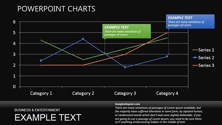
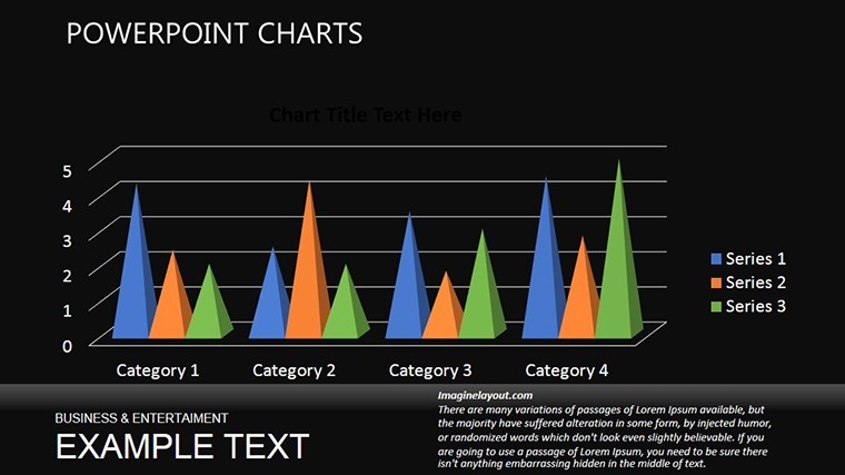
Envision charting a volatile market session: Instead of spreadsheets, you deploy line graphs showing trends and construction lines highlighting key resistances. The advantages are profound - accelerate analysis, enhance audience comprehension, and spotlight opportunities hidden in price fluctuations. Categorized under Analysis, this template focuses on graphical tools essential for forex, stocks, and commodity presentations.
Essential Features for In-Depth Analysis
At its core, this template offers robust features that elevate your analytical presentations. Full editability ensures you can fine-tune every graph to reflect real-time data, with support for multiple aspect ratios like 16:9 and 4:3.
- Graphical Tools: Construction lines for psychological levels and pattern recognition.
- Visual Study Elements: Charts designed to reveal movements and combinations in asset prices.
- Customization Flexibility: Alter scales, colors, and annotations to suit specific markets.
- Streamlined Workflow: Ready-to-use slides minimize design time for quick iterations.
These elements tackle the intricacies of technical analysis, as endorsed by standards from the Chartered Market Technician (CMT) program, which stresses visual pattern identification.
Comprehensive Slide Breakdown
Delve into the 22 slides, each optimized for progressive analysis.
- Slide 1-3: Setup and Basics - Introductory charts for market overviews and initial line setups.
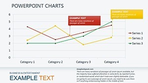
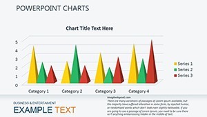
- Slide 4-8: Trend Visualizations - Line graphs tracking upward/downward movements with trendlines.
- Slide 9-13: Pattern Detection - Diagrams for head-and-shoulders, flags, and other formations.
- Slide 14-17: Psychological Levels - Horizontal lines marking support/resistance with annotations.
- Slide 18-20: Combination Analysis - Integrated views of multiple patterns in price action.
- Slide 21-22: Summary Insights - Recap charts with predictive elements for future trends.
This organization mirrors real analytical processes, akin to workflows in platforms like TradingView, where layered visuals uncover market secrets.
Use Cases in Financial Worlds
Apply this template across scenarios: Traders use it for daily briefings on currency pairs, highlighting EUR/USD patterns. Analysts in investment firms present reports showing psychological barriers in stock indices. Educators teach chart reading with examples from historical events like the 2008 financial crisis.
A case in point: An analyst at a hedge fund employed graphical charts to predict a Bitcoin reversal, leading to profitable trades, as detailed in Bloomberg reports on crypto analysis. Integration is seamless - pull data from APIs, edit in Keynote, and export for sharing. Tips: Use grid overlays for accuracy, and color-code patterns for quick recognition.
Advanced Techniques for Pros
Elevate your game by combining slides for multi-timeframe analysis. Avoid overload by focusing on 3-5 key lines per chart. Compared to generic tools, this template's specialized designs prevent errors like false breakouts, ensuring reliable outputs.
Secure Your Analytical Edge Now
This template embodies through its alignment with industry best practices, offering trustworthy visuals for critical decisions. Inspired by pioneers like John Murphy in technical analysis, it's your key to presentation excellence. Download the Graphical Analysis Keynote Charts Template and chart your path to success.
Frequently Asked Questions
How do I edit the construction lines?
Drag handles to adjust positions and add labels directly in Keynote.
Is it compatible with iOS?
Yes, fully functional on macOS and iOS devices.
Can I add my own data?
Absolutely, import from CSV or manually input for custom charts.
What if I need more slides?
Duplicate and modify existing ones for expansion.
Does it include animation options?
Keynote's built-in animations can be applied to reveal patterns dynamically.