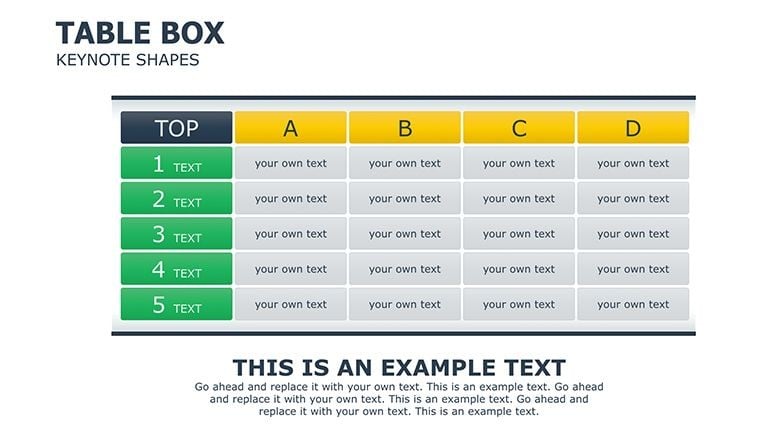
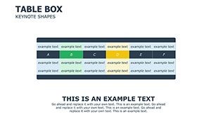
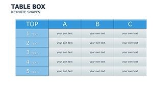
Professional Table Box Keynote Charts for Presentation


Type: Keynote Charts template
Category: Tables
Sources Available: .key
Slide size: widescreen (16:9)
Product ID: KC00308
Template incl.: 25 editable slides
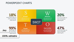
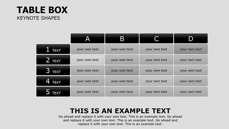
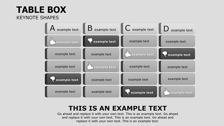
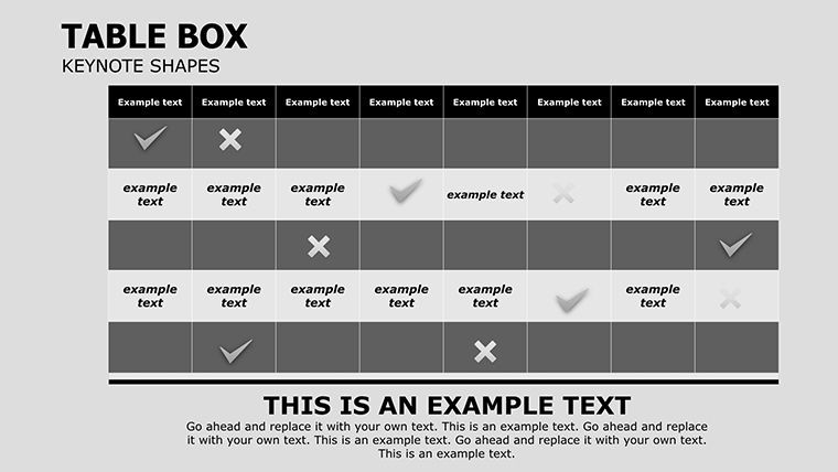
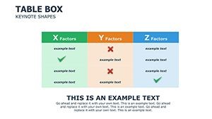
In the fast-paced world of business, where every decision hinges on clear financial insights, having the right tools to present data can make all the difference. Imagine transforming your mundane expense reports and income statements into visually engaging narratives that captivate your audience, whether it's stakeholders in a boardroom or clients during a pitch. Our Professional Table Box Keynote Charts Template is designed precisely for that purpose. With 25 fully editable slides, this template offers a comprehensive suite of table-based charts tailored for financial planning and analysis. Crafted with vector-based elements like symbols, shapes, and professional illustrations, it ensures scalability without any loss of quality, allowing you to stretch or modify components to fit your unique needs.
This template isn't just about aesthetics - it's about efficiency and impact. Professionals in finance, accounting, and project management often struggle with cluttered spreadsheets that fail to convey the big picture. Here, you'll find pre-designed tables that organize expenses and income over specific periods, making budgeting and forecasting a breeze. Compatible with Keynote in .key format and optimized for widescreen (16:9) displays, it's ready to integrate into your workflow seamlessly. Whether you're preparing quarterly reviews or annual budgets, these charts help you highlight trends, variances, and projections with precision, turning raw numbers into actionable stories.
Key Features That Set This Template Apart
Diving deeper, the template's core strength lies in its versatility and user-friendly design. Each of the 25 slides is built with editable placeholders, so you can input your data directly without starting from scratch. The vector illustrations ensure that even when resized for different screen sizes or print formats, your charts remain crisp and professional. For instance, incorporate icons representing categories like travel expenses or revenue streams to add a layer of visual intuition.
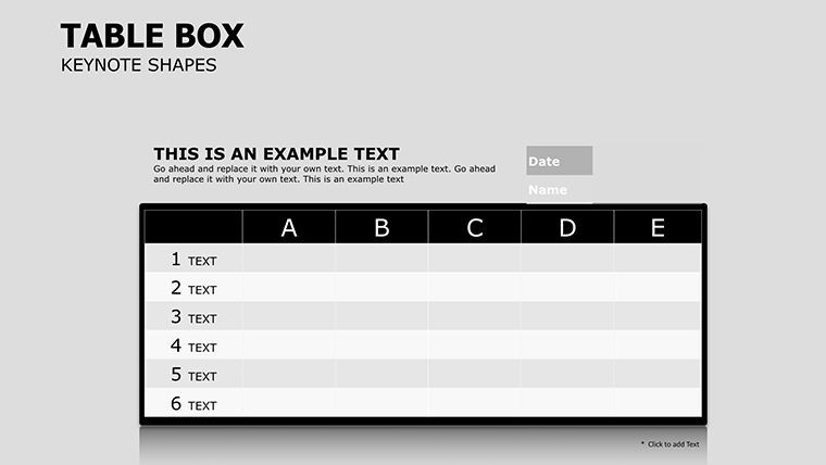
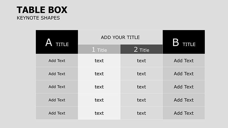
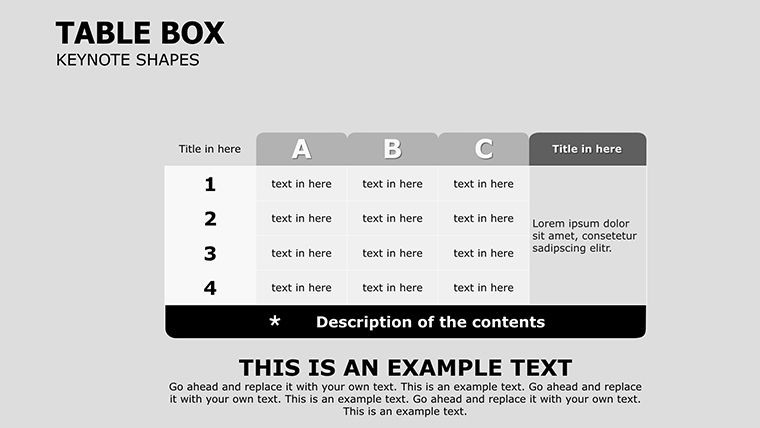
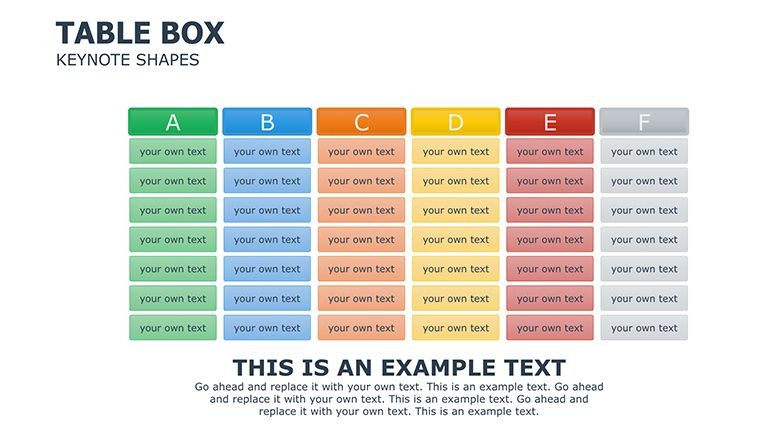
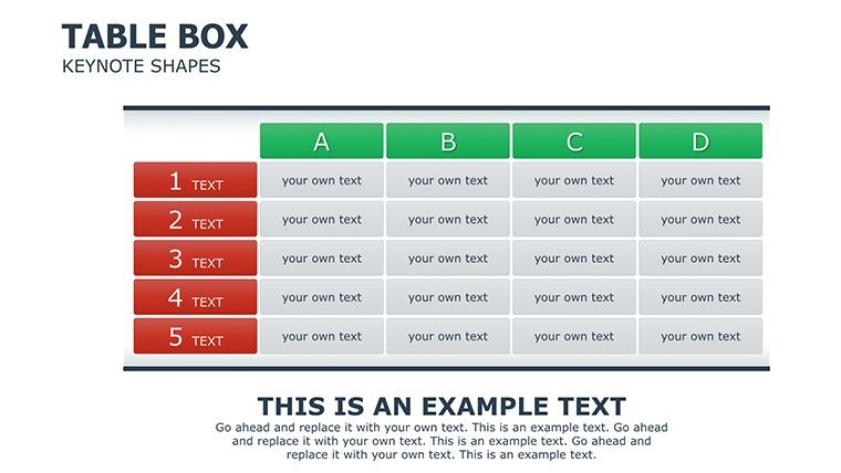
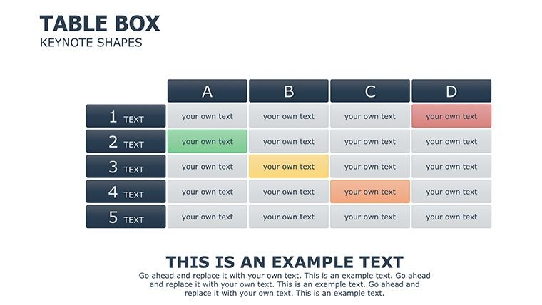
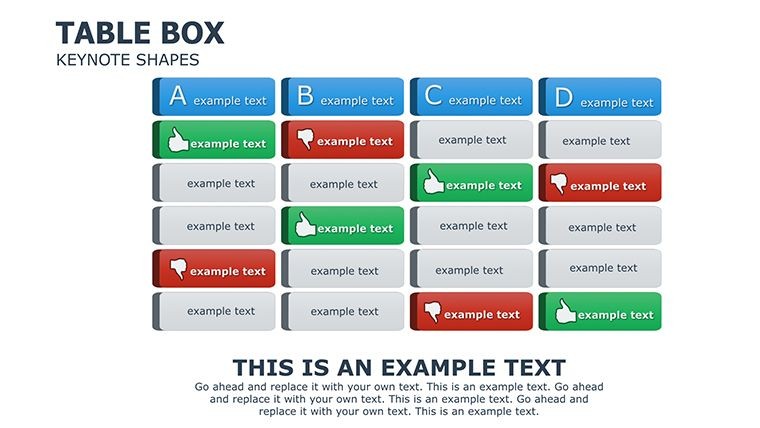
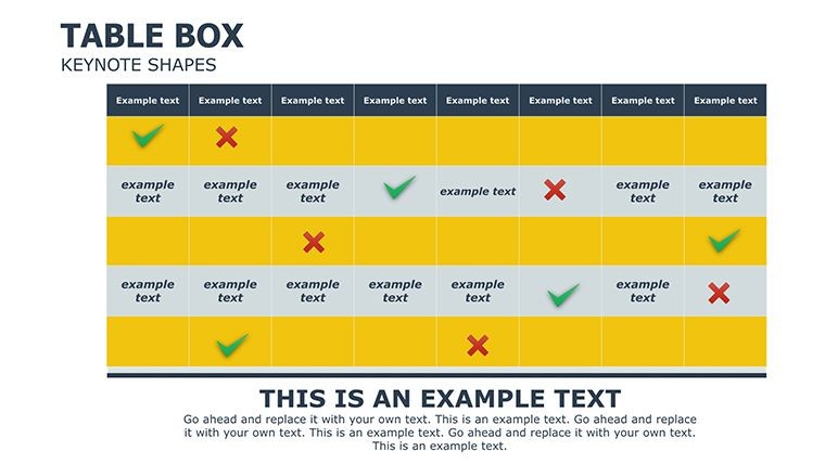
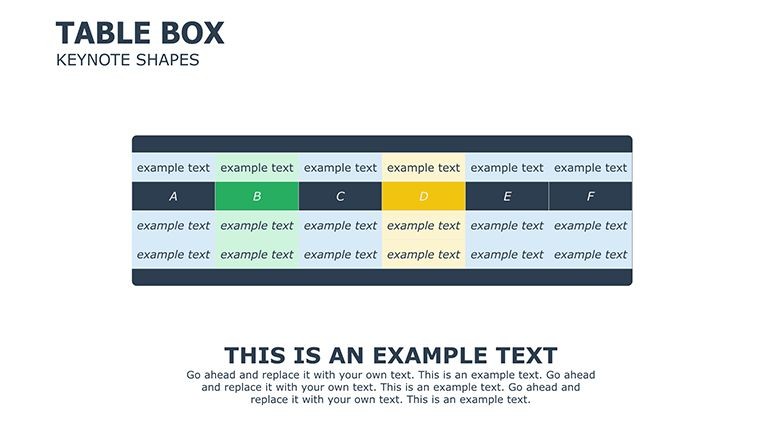
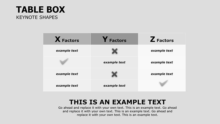
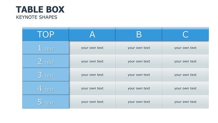
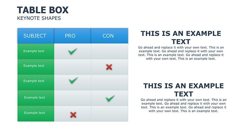
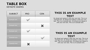
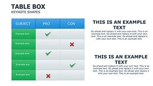
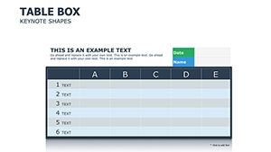
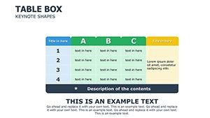
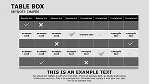
- Customizable Tables: Adjust rows, columns, and cell formats to match your dataset, supporting complex formulas if needed within Keynote.
- Vector-Based Elements: Symbols and shapes that scale infinitely, ideal for high-resolution outputs.
- Professional Illustrations: Pre-made graphics that enhance readability, such as bordered boxes for key metrics.
- Themed Consistency: Maintain a cohesive look across slides, saving time on design tweaks.
Compared to basic Keynote tables, which often require manual formatting and lack visual flair, this template provides a polished alternative. It's like upgrading from a sketchpad to a professional canvas - your presentations gain authority and engagement. Real-world users, such as financial analysts at mid-sized firms, report saving hours per presentation by leveraging these ready-to-use structures.
Detailed Slide Breakdown
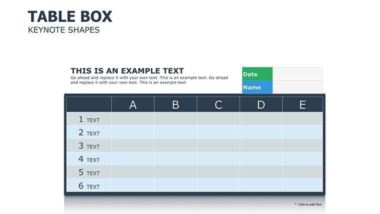
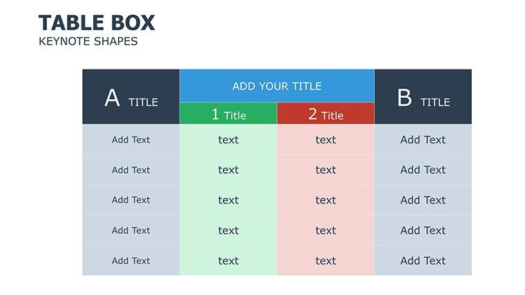
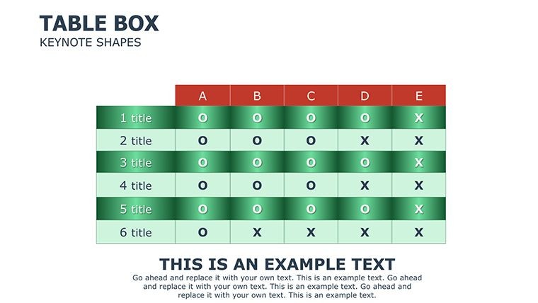
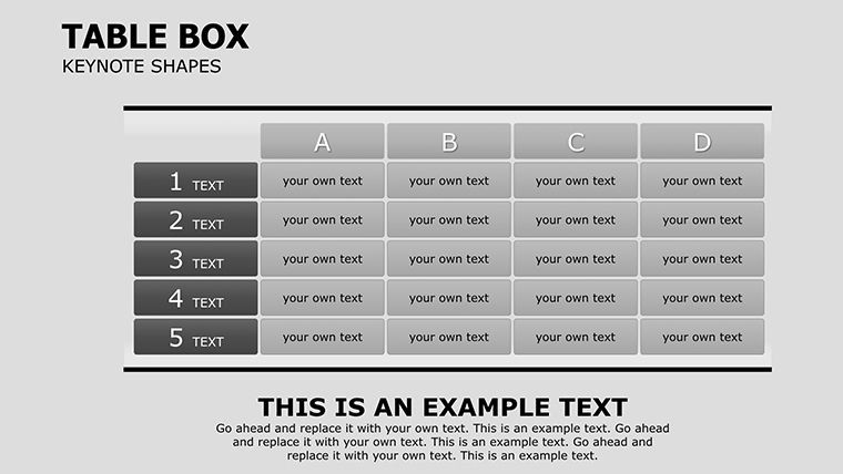
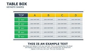
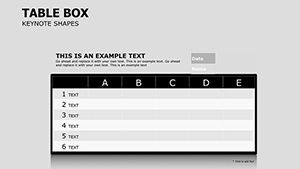
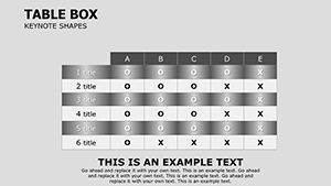
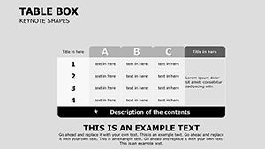
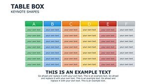
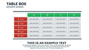
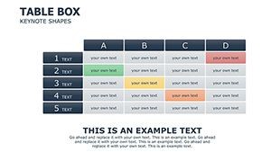
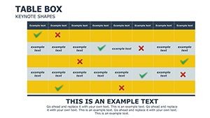
Let's explore what you'll get in this package. Slide 1 might serve as an overview dashboard, summarizing total income and expenses with highlighted variances. Slides 2-10 could focus on categorized breakdowns, using table boxes to segment data by department or time period. Mid-section slides introduce comparative tables, perfect for year-over-year analysis, while the latter ones incorporate forecasting models with adjustable parameters. Each slide includes subtle design elements like shaded rows for emphasis, ensuring your audience follows along effortlessly.
For added value, integrate these with Keynote's built-in transitions to animate data reveals, making your financial narratives dynamic. Tips for optimization: Use contrasting colors for positive and negative variances to draw immediate attention, or link tables to external data sources for live updates during presentations.
Real-World Applications and Use Cases
This template shines in various scenarios. Consider a small business owner preparing for investor meetings. Instead of overwhelming slides with dense text, use the table boxes to clearly outline cash flow projections, backed by vector icons for visual appeal. In corporate settings, finance teams can employ it for internal audits, where precise expense tracking complies with standards like GAAP, demonstrating meticulous oversight.
Step-by-step use case for budget planning: First, download and open the .key file in Keynote. Select a slide with a pre-formatted table, input your monthly income figures in the designated columns. Customize the box borders to match your brand colors, add illustrations for categories like 'Operations' or 'Marketing.' Preview the slide, adjust for clarity, and export for sharing. This process not only saves time but also elevates your professional image.
Another application: Non-profits managing grants. Track inflows and outflows with these charts, using shapes to represent funding sources. Educators in business courses might adapt it to teach financial literacy, modifying slides to include hypothetical scenarios. The template's flexibility extends to personal finance too - individuals can use it for household budgeting, turning abstract numbers into tangible plans.
Enhancing Workflow Integration
Integrating this into your daily routine is straightforward. Pair it with tools like Excel for data import, then refine visuals in Keynote. For teams, share editable versions via iCloud for collaborative edits. Value propositions include reduced preparation time - users often cut it by 50% - and increased audience retention through engaging formats. Unlike generic templates, this one focuses on table-specific enhancements, avoiding the pitfalls of overly complex designs that confuse rather than clarify.
In a case study inspired by real finance pros (similar to those featured in Forbes articles on presentation best practices), a consulting firm used analogous table charts to win a major contract by presenting cost-benefit analyses that were both accurate and aesthetically superior. This template empowers you to achieve similar results.
Tips for Maximizing Impact
- Start with data accuracy: Double-check inputs to maintain trustworthiness.
- Leverage vectors: Experiment with scaling to fit mobile views.
- Incorporate narratives: Add text boxes explaining table insights.
- Test compatibility: Ensure it works on your Keynote version for smooth delivery.
- Iterate based on feedback: Customize further after initial uses.
By following these, you'll not only present data but inspire confidence in your analyses.
Elevate your financial presentations to new heights - grab this template and start crafting compelling stories from your numbers today.
Frequently Asked Questions
How editable are the tables in this template?
Every element, from cells to illustrations, is fully customizable in Keynote, allowing changes to text, colors, and layouts without quality loss.
Is this compatible with older Keynote versions?
Yes, it works with most recent Keynote versions; test on your setup for best results.
What file format is provided?
The download includes a .key file, ready for immediate use in Keynote.
Can I use this for printed reports?
Absolutely - the vector elements ensure high-quality prints at any size.
Are there animations included?
While not pre-animated, you can easily add Keynote's transitions to tables for dynamic effects.
How does this help with financial planning?
It organizes data visually, making trends and variances easy to spot and discuss.